Andrea Torres BalaguerUntitled from hypnogogia series (2013)

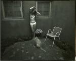
It’s probably just a knee-jerk response but there’s something about this image that feels melancholic.

I mean: yes, it’s a function of the rain; it’s also how the image is composed. From left to right, we see what is presumably a boy dressed in black trying to climb up on the rock and the young woman already atop the rock but her position there looking decidedly temporary–as if she’s going to jump down as soon as the boy manages to climb onto the rock.

It feels very cyclic–a play on the notion of the yin-yang symbol.

But looking at this I can’t help but thinking of two children on a playground. One sitting at the top of the slide and the other climbing the ladder to the slide–the endless repetition of work and reward–climbing the ladder, hurtling down the slide. Again and again and again–all day long if the bell never rang calling all back to desks, books and irritable teachers.

Historically, Mozart remains a psychological anomaly–an artist from who work emerged Athena-like, fully formed and final drafted on the first go round. And as valuable as repetition is to learning and mastery, the educational faculties insist that at a certain point, we should be able to crap out work that’s good enough on the first try. This is actually a dangerous precedent to accept. Unless you’re writing a fugue–which I can say from experience is difficult as fuck–repetition is one of many tools that contributes to the notionality of a ‘form’,

It’s a shame that we allow what we deem worthy of repeated actions generally orbits a sense of social obligation. I go to work each day in order to pay my bills. Whereas we feel as if we’ve wasted time by watching a movie we love or listening to a song that moves us for the billionth time. We feel that the former is a good use of time and the latter extravagant, frivolous–wasteful even.

However, the things that truly matter, we pursue with that same dogged child-like determination–up the ladder, down the slide. Repeat ad infinitum.

Larry WoodmannFrancesca for self-control (2014)

An image maker with the last name Woodmann (even with the extra N), working with a model named Francesca, it really would be foolish to think that the resulting work is going to somehow riff on that.

What I find most interesting is the way this image mirrors my all-time favorite image by Francesca Woodman.

I don’t think the above is nearly as strong of an image but I do really appreciate the attention to detail. It absolutely lacks the subtlety of Ms. Woodman’s photograph but it operates similarly by establishing distracting the viewers attention away from the graphic sexual implication of the images–the hornet on Ms. Woodman’s throat dominates the viewers attention because of the threat of this woman being stung, diverting attention away from the masturbatory gesture she’s making with her left hand and right index finger.

The focus of the above image is the highlighted edge of her face and the thin disruption of the necklace chain encircling her neck. It’s nice, I think.

urbanfaerietalesTitle Unknown (201X)

The above images are interesting–if a bit muddled. Yet, the way in which they’re muddled suggests several things to me about visual grammar. So like good Wittgensteinians, let us conduct a grammatical investigation!

A lone photo or image must stand on its own. However, as soon as you position photos or images adjacent to one another–each subtly shapes and informs how we read not just the one image or photo but how we read both of them together.

In the loosest sense there are two ways that photographs can relate to each other: as polyptychs or as sequences.

The above is not a triptych.

Strictly speaking, a diptych means ‘two-fold’. A triptych would indicate three folds. As such you can see panel A alone, panel B alone, panel C alone or panel A & B together or B & C together or A & C together or A, B & C all at once.

While polyptychs can be seen as relating to each other in a way that conveys are broader, overarching narrative–their construction is not intrinsically narrative. The each panel stands alone but that together each comment, enliven and enrich each other so that the piece as a whole comes to constitute more than the sum of its parts.

A sequence, on the other hand is fundamentally tied up with the movement of time. (To be 100% clear, a polyptych can be sequential but a sequence is not automatically a polyptych.)

There’s several things the above sequence does well. First off, the use of depth of field to direct the viewers eye is totally on point–in the first panel, only the top of the head in the foreground is in focus while everything else goes soft; in the second panel, the focus point is ever-so-slightly behind the kneeling figure; the final panel shifts the focus towards the middle ground between the two lovers.

Compositionally, the first and last panel are #skinnyframebullshit–there is absolutely no effing reason given the frame that vertical orientation contributes fuck all to the logical consistency of the whole.

In the first panel, the way the supine figure’s legs open up to the room begs for landscape orientation, further given the narrative auspices of the piece as a whole–it’s extraordinarily poor form to employ portrait orientation.)

The contrast and overall tonal range are best in the third panel; however, the frame feels constricted; it makes me nervous that it’s so clearly supposed to be set in this room but the view of the room is so claustrophobically limited.

The second panel is actually a fabulous example of when a vertical orientation actually serves a goddamn purpose–the frame reads up and down and by fitting it to a form that is predisposed to that sort of scanning, the image maker employs the appropriate visual grammar to convey to the viewer how to best engage with the image.

In summary, there is a great deal of raw potential here. I’m of a mind that this would’ve been more effective if all the images had been landscape oriented or if the second panel had been extracted and presented independent of the others (I do think you’d lose something but the image is strong enough to stand on its own).

Alternately–and probably even stronger–would have been if the first and third image were landscape oriented and the second image remains in its current, portrait orientation. This would’ve pushed things more in the direction of a polyptych and would’ve also suggested an altar piece–which is more in keeping given the almost liturgical tone of the images.

And that’s why I make such a big deal about using portrait orientation correctly. Maintaining that it doesn’t matter is the same as saying that the comma in Let’s eat Grandma vs Let’s eat, Grandma doesn’t make any difference in the end result.

Sebastián GherrëFirework cum (2016)

Revisiting the first instance of Gherrë’s work I posted, I realize I equivocated a bit too much.

Further encounters with his work have caused me to warm to his so-blunt you can only call it heavy-handed and acontextual style.

I’m not usually a fan of the throw everything at the wall and see what sticks approach. (My nemesis when I was a photography MFA student had exactly such an approach–in the interest of full disclosure, she’s one of two people in a class of 17 that is paying her bills with her creative endeavors.) But with Gherrë there’s a sense of both openness to experimentation that is damn near playful more often than not wed to a commitment to an unflinching and omnivorous eye.

It’s a little too pat to compare his work to someone like Ren Hang–an artist whose is equally out and who works with similar prolific profusion. (In fact, lately I find myself rather put off by what I feel are Hang’s tendency to be casually shallow, mean-spirited and cruel in his work.)

But it is an interesting comparison, in so far as Gherrë‘s photos show ever sign of becoming less focused on provocation and more focused the inherent provocation in moments presented without context and therefore rely upon success or failure with what the convey about immediacy.

The above print is actually enormously clever in it’s composition. The viewers eye follows the boys white inner right thigh down into the frame at a diagonal. A lesser talent would’ve sought a bilateral top-to-bottom symmetry, but they inner left leg juts off at a different angle, pulling the dick in hand off a rigid top-to-bottom mid-line. (The frame is bottom heavy, but the angle of the blanket manages to tie everything together so that it doesn’t feel unbalanced.)

There’s also the way the slight curve of the boys erection and the way it forms a sort of ever so subtle s curve from the base of the cock through the spurting line of ejaculate–allowing for one of those serendipitous moments where things line up almost magically and the lead semen globule floats perfectly aligned with the boy’s suprasternal notch.

And honestly, this is the closest I’ve seen to a photo I’ve been trying to make for almost a decade now.

Victoria Baraga – [←] Self-portrait (2012); [→] Self-portrait II (2012)

I could’ve sworn I posted the Self-portrait II previously–but I’ve spent the last half-hour trying to find it and I see no trace, so…

It’s possible I had it saved as a draft and subsequently opted not to post it.

There’s not one but two layers of ubiquity working against these images. The TLR, waist level finder in the mirror trope deserves every bit of shit the bathroom mirror selfie gets. (Folks who pursue the former tend to get a pass they shouldn’t because they’re doing it the old-fashioned way and it’s not as straight forward was aiming the camera and pushing a button–but both tend to be devoid of any vivacity.)

There are exceptions of course. Laura Kampman does some exquisite things within very narrowly circumscribed margins–i.e. there’s a ridiculous degree of technical mastery at work in her better photos. Baraga, on the other hand, tends to fixate on capturing herself in the act of watching herself.

The result is conceptual satisfying–the viewer watches her watch herself, while she watches herself experience intimacy. It’s a clever deconstruction of the triad where the photography use the camera in an effort to parse time and space in such a way that the viewer of the resulting photo see much in the same way the photographer did in the moment of making the image. In this case, the mirror is an impartial arbiter allowing her to focus on one relationship in the triad–photographer to subject and subject to photographer in a fashion that presumes an empathetic response from the viewer.

There’s life an artfulness to these images that far exceeds 98% of comparable work out there.

Zanele MuholiBeloved II (2005)

I’ve pointed to Muholi’s splendid work before.

I purposely limited my commentary to factual tidbits. This was partly due to the fact that–contrary to how things may appear with my writing here–I don’t think expression is always the best response. Sometimes it’s necessary to sit and be silently present with resonate work. (If you’re a creative individual, a strong sensitivity precedes the development of vocabulary to explain in detail the way in which you respond to the work that moves you.)

The other reason is that although I am hyper-aware of pervasive (and entirely fucking justified) concerns over a lack of diversity in the arts and entertainment, I have no interest in participating in the who’s more ‘woke’, ally pissing contest that is just an elevation of gross tokenism to the status of virtue.

However, looking at this image, my brain automatically jumps to issues of representation. Specifically, like just about everyone else on Tumblr, I’m fond of the series Black Mirror.

When Season 3 was released several months back, a plurality of folks fell all over themselves telling me I had to drop everything and watch the San Junipero episode.

I resisted until I realized it was Black Mirror’s ‘gay’ episode and in the wake of the election and the subsequent spike in hate crimes, and then it seemed like the only thing that seemed like it might be worth watching.

I’m not interested in spoiling it. I’ll only say that I’ve since watched it a half a dozen times. It is every bit as good as I was led to believe. But, there’s something more bittersweet to it that I haven’t be able to put my finger on…

Looking at the image above, I realize what it is–for all the things San Junipero gets right (and trust me, it does get a lot right, a whole lot), the post-coital conversations are flat. I mean they’re shot flat, under too dim lighting. But the interactions are flat, too–I mean compare these scenes with the scenes where they are sitting outside Kelly’s beach rental and talking about their real world lives–some of the most on point dialogue in ages.

Charlie Brooker, the Black Mirror show runner, originally wrote the script to feature a hetero couple. But opted to change it–partly to be subversive (gay marriage wasn’t legal in 1987) and partly for issues of representation. And it works because it’s guided by a fundamental sense of empathy.

Yet, where it falls short, is the assumption that just because self-transcendent love looks the same no matter the race or gender of the lovers, the ways people in that sort of love reach out to each other might as well be as distinct as a thumbprint. These scenes adopt a hetero-post-coital conventional coding–which comes off as flat and lazy.

And that’s why we desperately need greater diversity in not just the characters that populate the stories we see on big and small screens alike; we need the people guiding those stories to tell their stories not according to tradition or convention but from deeply felt personal experience.

Imagine if Yorkie asking Kelly when she knew she was bisexual, had played out in a shot like Muholi’s above instead of the shot-reverse shot of the episode as it is? That would’ve been something because of separating the characters–from each other–you show them together negotiating the context that will come to be their mutual reality as a couple. Small, seemingly insignificant things like this make a world of difference. Or, to borrow advice I was given by someone much wiser than me: sweat the small stuff, the big picture’ll take care of itself.

Viki Kollerová – On Being an Apple (2011)

After dinner, the weather being warm, we went into the garden &
drank [tea] under the shade of some apple tree; only he & myself […a]mid other discourse, he told me, he was just in the same situation,
as when formerly the notion of gravitation came into his mind. Why
sh[oul]d that apple always descend perpendicularly to the ground,
thought he to himself; occasion’d by the fall of an apple, as he sat in
contemplative mood.

Why sh[oul]d it not go sideways, or upwards? But constantly to the
Earth’s centre? Assuredly the reason is, that the Earth draws it. There
must be a drawing power in matter. And the sum of the drawing power in
the matter of the Earth must be in the Earth’s centre, not in any side
of the Earth.

Therefore does this apple fall perpendicularly or towards the
centre? If matter thus draws matter; it must be proportion of its
quantity. Therefore the apple draws the Earth, as well as the Earth
draws the apple.

William Stukeley reports an early version of Isaac Newton’s famous falling-apple-inspires-theory-of-gravity anecdote