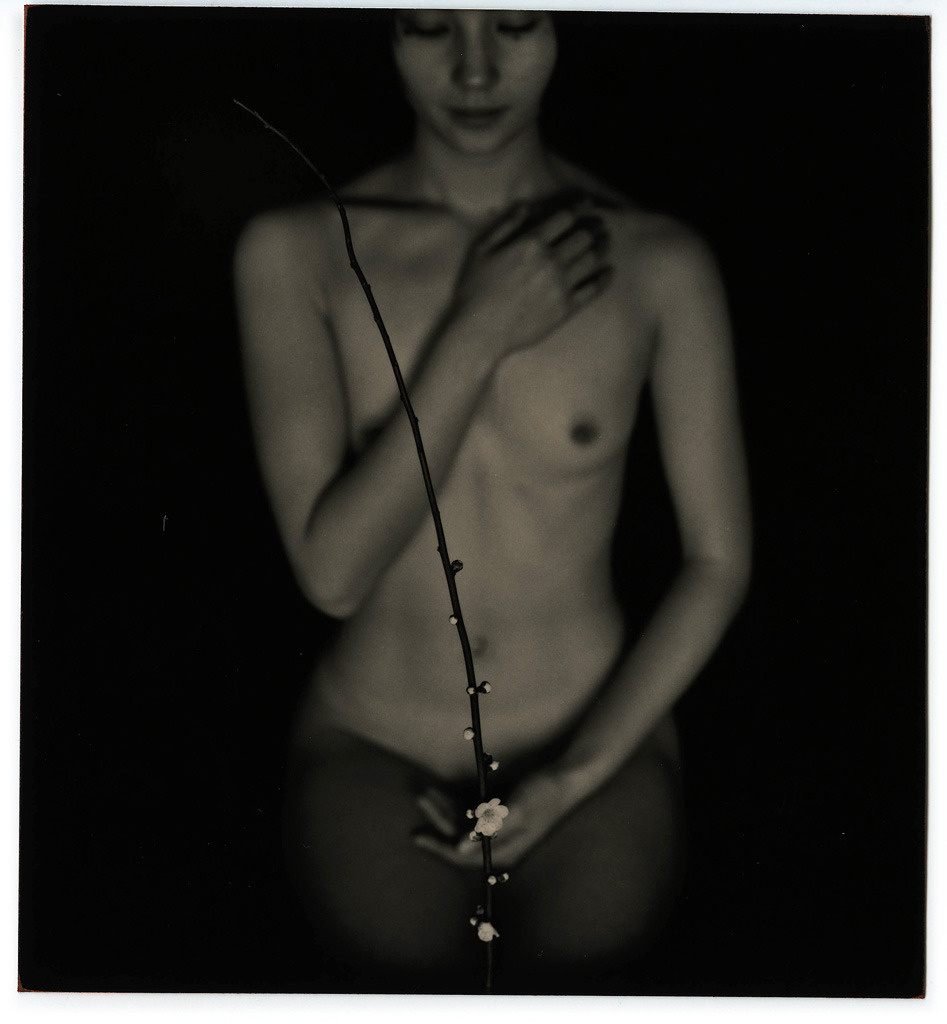
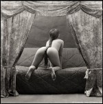
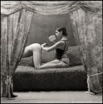
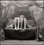
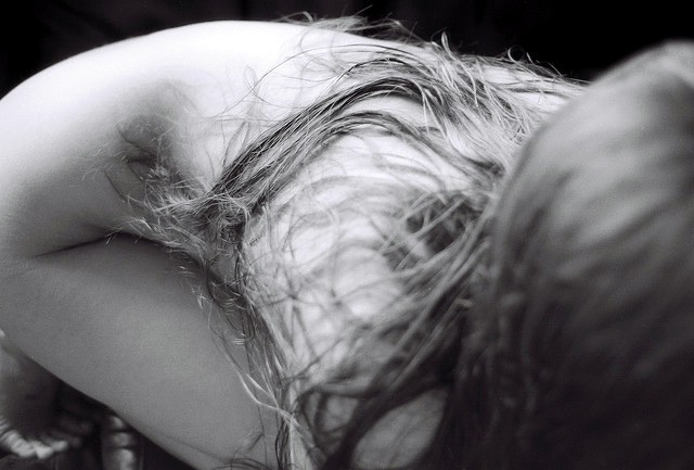
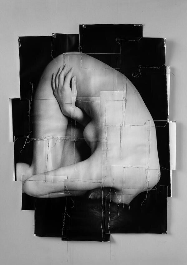
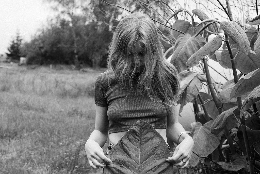
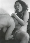
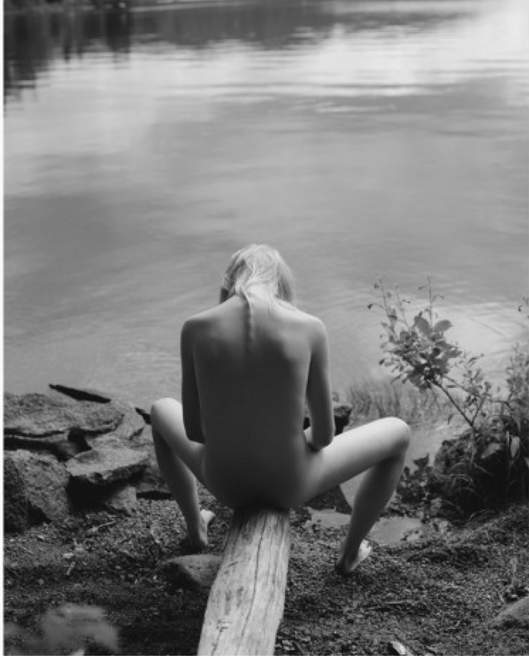
Cem Edisboylu – [↑] FRG3519 from Flash of Light series (2015); [←] KOW3207 from Fräulein Kowalski series (2014); [+] ALG2968 from Alessa Ghoulish series (2014); [→] KAD2723 from Sofie seires (2014)

I’m not prepared to endorse Edisboylu’s wholesale. I’m pretty sure it’s digital–and let’s be real there is no reason an image maker with fine art aspiration would ever bother shooting non-analogue B&W.

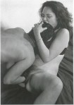
Further, the nudes-for-nudity’s-sake work reads as both awkward and clunky.

Not to say it’s all bad–I think the above images are all actually brilliant; the central image of Fräulein Kowalski is, in fact, goddamn fucking breathtaking.

And how good the three portraits are–where the focus is on immediacy, intimacy and a sort of Buber-ian relationship, where any nudity serves in an ancillary capacity–is part of why the other work seems so godawfully boring by comparison. If the image maker can do so much with so little, it would follow that with more the viewer would be reasonable in expecting expanded and not diminished returns.

But what I really appreciate about Edisboylu is a feature of his presentation you’ll probably miss if you don’t have fat fingers and aren’t clumsy as fuck like I am. All the images in his portfolio–so long as you open into a new tab–lead to a more in-depth selection of images from the same shoot. This is a badass feature for two reasons.

  1. It shines a light on the darker corridors of individual process and in this case it’s easy to understand why the image maker has chosen the images he has to represent the shoot. (I’m always talking about editing. This is what I’m referring to–the process whereby you pare down the multitude of images to the best and brightest. Given the sampling of other shots, it’s easy to follow the shown work on why each image was chosen.
  2. You can actually interpolate even more about the shoot. For example: Edisboylu clearly shoots a lot during his sessions. The cross section of the shoot with Fräulein Kowalski, for example, seems to suggest that he tends to adopt the loathsome spray-and-pray approach that digital imaging facilitates. Yet, as much as I detest that approach, there does appear to be at least some respect for the audience. Consider the handful of Tumblr famous photographers who go to great lengths to post several new images every single day. I want to see and appreciate an artist’s best work, not experience a continual watering down of quality in an effort to build a sense of brand constancy. I’ll always take two marshmallows later over one marshmallow right now. It’s appealing that Ebisboylu seems to understand that. His work is definitely better for his reserve.

Evgeny Mokhorev – Girls from Teenagers of St. Petersburg series (1996)

This is edgy in all the ways I crave for photography to be edgy.

Beyond that I’m not sure what else I can say about it. Except, except… OMFG, it reminds me of Myroslav Slaboshpytskiy’s The Tribe. (TRIGGER WARNING: if you are a person with any sort of trigger, this film will unquestionably be a problem for you; proceed with caution.)

If you haven’t heard of it’s the story of the seedy underbelly of a Ukrainian boarding school for deaf teens. There is zero spoken dialogue; everything is in sign language and subtitles are intentionally withheld.

It’s riveting and brilliant and unconscionably brutal.

It’s also ballsy as fuck–almost every scene occurs in a single uninterrupted long take, which if not up to the standards of someone like Béla Tarr you are pretty much required to overlook the sometimes less than perfect framing by virtue of the fact of how completely batshit fucking crazy camera tai chi several of the scenes are.

wonderlust photoworksEcho from Address the Void series (2009)

To my Darkness and my Light,

I
unfold myself; you, in turn, call to me with your warm and aching
mouth— its tongue, a delicate command I will not long withstand.

Your lips spill sighs; I drink until your thirst is sated.

Trembling
hands steady me beneath you.  You guide me toward your deepest
acceptance.  I find a center in you; you grasp me and gasp.

(You
shudder— hands bracing the afternoon light dying against such white
walls.  I see your ineffable Beauty with the eye of god.  I fall and
place this feeble kiss to caress the spine as I pass.)

With you I experience annihilations most will never know.

After
I am restless; you know what I want is what I will never achieve
alone— you coax from my every ending its next beginning.

We must map these new and nameless oblivions together.

Masao YamamotoTitle Unknown (19XX)

When I learned about the haiku form in like 7th grade or some shit, what I took from the lesson was the whole 5-7-5 syllable patterning and that they all seemed to be meditative on nature.

For probably a good decade, my approach to the form was on par with South Park.

But what gets glossed over is the connection between the first 12 and the disjunction/rupture inherent in the final 5 syllables.

In effect, the above image is a photographic approximation of a haiku. There are two distinct planes in the frame–differentiated by depth of field; the blossoming cherry branch in the foreground, the young woman in the mid-ground.

This was almost certainly shot with a telephoto lens–which has the effect of magnifying the subject. However, telephoto lenses also compressed the distance between objects. Thus although there may be twenty feet between the subject and a wall, it appears as if the subject is relatively close to the wall. (The famous cinematographic example of this is that famous scene in the Coen Brothers’ Raising Arizona with the baby in the car seat in the middle of the road with a station wagon barreling down on it.)

Given that the background in this print is so pitch dark that it seems like an Edward Weston wet dream and that the blossoming branch in the foreground is so dark–only remaining visible due to the body separating it from the background, what originally appeared as discrete planes, interpenetrate.

Bonus factoid: Apparently, Yamamoto isfond of employing tea to stain his prints.

Victor Ivanovski – [↖] A Tail; [↗] Defloration-I ¼; [+] School 1/3; [↙] Treatment of Constipation; [↘] Young Lovers from Boudoir Stories series (2001)

I have mixed feelings about Ivanovski’s work. Yes, it’s rarefied quality is immune to argument. And for as much as it’s perfunctory inclusions of non-heteronormative experience come across as tokenism, there is still something absolutely vital to the moments I’ve selected above.

A long braid as tail, but instead of positioned to play obviously towards the camera, the pose is angled just enough to create questions as to whether or not the viewer is the intended voyeur.

The potential momentum of the mallet’s arc and the angle of the spike and the cast of her eye triangulate the focus but also draw attention to the fact that there is some resignation to her resolve to follow through–her eyes are focused not at the point of impact but just above the blunt head.

As much as I consider cunnilingus perhaps the greatest of all possible sex acts, what appeals to me so viscerally in this is the way she’s holding her dress both so that her friends can watch but also so that she can see everything too.

The cartoonishness of the second instance of mallet and spike would have easily ruined a lesser image. The fact that her expression is really almost goofy along with the way she’s holding the spike in a manner both intended not to cause accidental pain but that could also be utilitarian. Also, that she’s wearing a watch and her fingers wrapped around the mallet handle show off her nail polish are just happy accidents for me.

Boudoir stories features several suggestions of lesbianism. And I find all of them off putting. The last image here is the only exception. And it’s actually my favorite of the bunch because without any explicit flourishes it perfectly demonstrates that clumsy–to mix pop music metaphors–constant craving for more fumbling toward ecstasy that so aptly characterizes the experience of new mutual desire.

Chris Little – Title Unknown (20XX)

Initially, this image caused my brain to crackle a lil’.

See one of my photographic preoccupations is conveying an entire (or at least the implication of an entire) narrative in a single static frame.

This image is not narrative. The framing is odd and it doesn’t work all that well but the subject is striking enough to round up to interesting.

But: it does provide an unintended cue with regard to the question of the distinction between narrative photography and cinematography.

Namely, images with a narrative slant tend to feature many of the same key aspects of that characteristic bedrock of cinematography: mise-en-scène.

Now, in still images (especially portraits) there is a tendency to place the subject in an environment and then effectively highly and underline the portrait-ness of the image by abstracting the environment. This process is called bokeh; and people will spend thousands of dollars on ultra fast 85mm lenses to maximize their bokeh aesthetic.

Narrative images, on the other hand, tend to go the Greg Toland deep focus/Group f/64 route–presenting an expansive depth of field so that the characters are contextual grounded in their environment.

And I’m not saying that there isn’t a cinematic cross-pollination which borrows from still bokeh and huge depth of field. Yet, what there isn’t really in still images, is the sort of David Fincher-esque shallow depth of field and bokeh wherein, something is blurry and abstract in the foreground, the subject in the mid ground is in sharp focus and the background falls off again towards abstraction. (This isn’t exactly the best example for someone new to the concept but for those who have their footing, it’s hard not to stare at this and not want to furious jill off to the effortless control this shot evinces.)

The thing I wasn’t expecting was to find next to nothing on the photographer. He doesn’t seem to have a web presence anymore. I was able to dig up a version of his old personal website cached on Ye Olde Wayback Machine.  It’s heady stuff–like Noah Kalina, Ryan McGinley and Petra Collins got mad hopped up on methamphetamine at the Hopscotch Festival and passed a 35mm disposable camera back and forth between them.

Koo BohnchangIn The Beginning #41 (1995)

It occurs to me that maybe what separates an aesthetically pleasing image from Art has something to do with connectivity–how carefully it is stitched together and to the world surrounding it.

For example, Bohnchang’s body of work entitled Soap, is clearly an exercise in typology. It’s antecedent being the preeminent practitioners of photographic typology Bernd and Hilda Becher. Followed by Ed Ruscha’s Every Building on the Sunset Strip and Chuck Close’s portraits and Sugimoto’s luminous Seascapes.

The thing is: once you start considering typology as a motivation for image making it’s difficult to know where to cease application. In effect, I can’t think of a single so-called fine art photographer whose work in terms of genre, subject or process can’t be interpreted as a inherently typological. (Francesca Woodman would perhaps provide the exception that proved the rule.)

There is something obsessive about typology. So what separates a genuine work of art from something compulsively collected–and I acknowledge the distinction between making the thing you collect and simply acquiring an object.

Bohnchang, in his own words, describes his motivation to make images as being driven “not [by] flinging a camera over my shoulder and heading off to some
unexplored place. For me the thing of real value is looking for what is
inside of me.

I could take the easy way out here and attribute this sentiment to a sort of process as an act of mindfulness. And while I think it is, at least in part, exactly that, there’s also something of an underlying awareness of the connection between that mindful exercise, the form taken by that exercise and the historical interpenetration.

The Becher’s work is genius not because of obsessivenes, it’s brilliant because it finds dignity and beauty in the ugly and ordinary; Ruscha’s efforts and not extraordinary because of their comprehensiveness, they are vital because they expandied the way that photography can present the world as continuous within the scope of singe, static frames; Sugimoto’s ocean as landscape are straight up hypnotic as fuck.

Though I don’t love all Bohnchang’s work, it’s definitely Art. And the reason it is comes as a result of the way his work always contorts in on itself to draw attention to the process that brought it about.

I feel that Matthew Weiner‘s–despite how horribly enormously problematic I find him is as a creator–oft trotted quote fits here:

Artists frequently hide the steps that lead to their masterpieces. They
want their work and their career to be shrouded in the mystery that it
all came out at once. It’s called hiding the brushstrokes, and those who
do it are doing a disservice to people who admire their work and seek
to emulate them. If you don’t get to see the notes, the rewrites, and
the steps, it’s easy to look at a finished product and be under the
illusion that it just came pouring out of someone’s head like that.
People who are young, or still struggling, can get easily discouraged,
because they can’t do it like they thought it was done. An artwork is a
finished product, and it should be, but I always swore to myself that I
would not hide my brushstrokes.

The difference between Weiner and Bonchang is that the former’s brushstrokes point self-consciously to the creator whereas, the latter’s seams point to the historical context, the process of creation and the work itself.

Sophie van der PerreSarah (2014)

Overall, I find der Perre’s work perhaps a little too self-consciously editorial/fashion in genre.

I do not mean to suggest it’s bad. It’s just that there’s almost a self-same ubiquity to it and it looks to me like all the rest of effectively executed, even thoughtful but ultimately dull editorial/fashion work I see.

But I do really like this image and a few others in her Flickr photostream. And although I could make easy correlations to Lina Scheynius or Chip Willis, I am more interested in my realization that although I consider Erica Shires to be one of the best photographers working today, der Perre’s work actually suggested the closest thing I have to a criticism of Shires’ work: namely, her didactic use of nudity.

Shires is teaching a workshop in Tuscany this month. And one of the first topics she mentions in her course description is: [s]hooting nudity but being thoughtful about it. Does it make sense? Go beyond the literal.

This sensibility is pervasive in her work. And I feel that now that I know to look for it, a great deal of the nudity in her images comes across as preachy.

It is always a very fine line between leading by example and insisting on leading by example. I feel it’s actually the same margin between showing and telling. But one should never tell where it is possible to show and I think what der Perre does is feature nudity in images that are intrinsic to the images themselves. There’s no question of how it happened or whether it was motivated, it merely is a discrete, moment presented without commentary as-is.

The result is playful without being the least bit coquettish or flirtatious.

Morgan Gwenwald – Untitled (1992)

All I’ve been able to learn about Gwenwald is that she was a photographer active in NYC primarily during the late-70s and throughout the 80s.

Most of her work appears to be documentary in nature. (The most comprehensive collection can be accessed via the Lesbian Herstory Archives.)

However, it seems that she was also very active in efforts to reappropriate depictions of the vulva from mainstream pornography. There’s mention in a couple of places about a notable image entitled Incorrect View of the Beloved. ( can’t actually find an example of it online, but there is a reasonably specific description here.)

Massimo LeardiniUntitled from Scandinavian Girls (2013)

This wears its influences on its sleeve–Jock Sturges and Arno Rafael Minkkinen.

One out of two isn’t bad.

But it also shares common ground with Taiwanese genius Yung Cheng Lin insofar as it chooses implicit insinuation over explicit denotation, i.e. this could be nothing more than a simple image of a sprite nude young woman in nature, yet the pose here can just as easily be read as a sort of adolescent body curiosity which is perhaps even masturbatory; also the positioning of the log could reference Freudian misogyny or–I’ll pretend I’m an optimist today: an underdeveloped theme of genderfuckery. (I don’t really think that last suggestion fits because in this case the vertical composition is logically consistent with the image; yeah, it’s phallic as fuck but at least the skinny frame is logically consistent.)

In other words, I’m into this image on a conceptual level and not so much w/r/t technique–there’s almost no highlight detail which limits contrast and tonal separation by hazing out the middle greys. (Imagine what this would’ve looked like with the 3D pop that you can get when you effing nail the exposure with an appropriately contrasty film stock.)