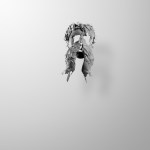
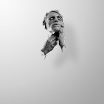
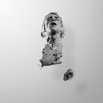
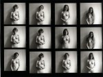
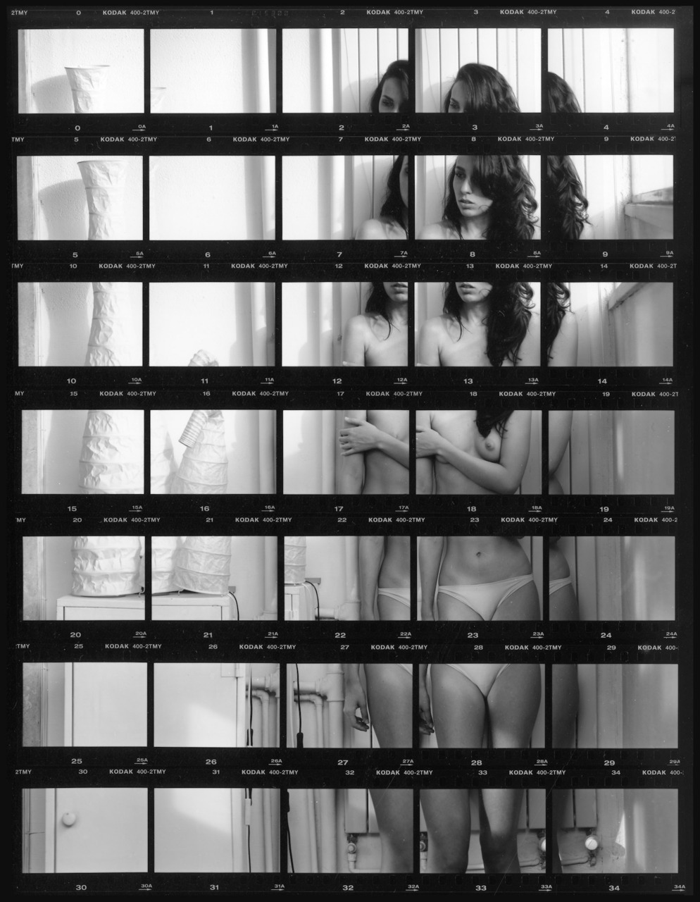
Alejandro Maestre GasteaziEL HOMBRE QUE SE CREA (2010)

Julián is a good friend who I deeply respect; he is a multidisciplinary artist and complete artist. He is, at the same time, [a] film director, sculptor, painter, photographer and writer. [A while ago] he suggested… the idea of doing a portrait of him that could describe his capacity of creating and his constant research to understand his body and spirit. All these [considerations] made me think about his work and helped me develop the [concept for this project].

Therefore, with this photograph[ic] series I intend to show an artist fighting to get to know and shape himself [become] a better human being.

Jan Scholzaliane (2014)

Scholz uses an arsenal of analog cameras, among them the  Pentax 67; given the shallow depth of field, I suspect this was made with the Holy Grail of Pentax 67 lenses: the 75mm F2.8.

I am not a fan of bokeh; focusing attention on the subject at the expense of reducing surrounding context to blurred abstraction isn’t my bag.

In medium format, the fastest lens is typical f2.4–or 1.5 times the depth of field of a 35mm format f1.4 lens.

It serves nicely here: clearly intimating a living room while thwarting any greater specificity. This could just as easily be the photographer’s domicile, the subjects house or some bungalow borrowed for an out of town weekend.

Scholz prefers Kodak Tri-X stock. Again, I really would be hard pressed to be any less of a fan; so it is startling for me to see someone coax such delectable tones from it.

Jan SaudekThe Dancer (2001)

Consider:

  • the staggering tonal range and varied texture in the concrete backdrop,
  • the painstakingly graded skin tone (for me invoking little as much as the incisive crosshatching in Dürer’s etchings),
  • the obvious resemblance to Michelangelo’s David,
  • the subject is presented slightly off-center, cheated toward the source of light at frame left and formally balancing every aspect of the composition.

There’s no denying Saudek’s mastery; sadly, I find my frustration with his proclivity for shooting the same/image images in perpetuity an insurmountable obstacle to engaging with his work.

I absolutely see inspired flashes of anti-authoritarian glee, subversion and rebellion amidst the cloying repetition–all attitudes that resonate strongly with me. Ultimately, the work either commands my eye or it doesn’t.

This is one is just motherfucking goddamn incredible.

Stephan BrigidiFrancesca Woodman contact sheets (1978)

Despite the absence of her characteristic compositional asymmetry and murky mid-tones, these are frequently attributed to Woodman instead of Brigidi.

(I only sourced them because it seemed odd–given my familiarity with Woodman’s oeuvre–that I had no recollection whatsoever of these contacts.)

If nothing, the instinct to impose false attribution is not entirely misguided. After all, the prevailing art historical framing holds Woodman as the progenitor of the current surfeit of confessional self-portraiture.

This conceit has always frustrated me. First, Self portrait at thirteen demonstrates a more comprehensive grasp of photography as Art than 95% of the legacy claimers.

Second, the rule every seventh grade literature student leans the writer and the narrator aren’t necessarily the same individual is ignored.

To my mind, there’s a reason only one of her images explicitly bears the ‘self-portrait’ designation: Woodman only documented herself in the strictest sense. Really, it was more that hue was playing a character in a single frame film.

This is made clearest with her flirtation with an alter ego, Sloan, resemblances to Lewis Carroll’s Alice and her On Becoming an Angel series.

My feeling has always been that Woodman’s images are much closer to a sort of alchemical fiction–being by way of photography a means of becoming. As if all the identities in the world are dresses hung in a wardrobe and image making offered a mode of trying them all on one-by-one to see which ones fit, which ones pinched and which ones did little more than hang like limp sails in horse latitude doldrums.

On top of that, there is a sort of underlying menace to her experiments. Whenever I look at her images, I have a feeling similar to someone I care about showing me scars from self-harm. To an extent, I think photography served as an externalizing stand in for cutting–at least initially, at least through her arrival in Rome; at which point her flirtations with magical realism shifting toward a darker obsession with potential to harness the interplay of light, shadows and skin in the conjuring of malevolent maledictions.

Source: Unknown

While I object to the sepia tinge, strobe vignetting and canted frame, the pervert in my is intrigued by this image.

I have certain reservations about imagery depicting threesomes; therefore, I appreciate how the above eschews the typically stultifying heteronormative script.

I read something about fluid sexual orientation. Namely, I don’t stop to ask is that boy gay or bi. (Although I admit that with the way his head is being forced into the woman’s pubis, I could understand that reading.)

Does it really matter? Everyone here is clearly enthusiastically engaged/invested in the proceedings.

‘Straight’, ‘gay’, ‘bisexual’ and ‘genderqueer’ are words, labels. Increasingly, treated as if it were a discrete street addresses: 123 Main Street, Podunkville, ID.

I don’t think it’s that simple. At best, ‘bisexual’ is comparable to one New Yorker telling another she lives in Brooklyn–as opposed to Manhattan, Queens or the Bronx. (As far as I’m concerned there are only four boroughs.)

Saying I am a bisexual woman who prefers women to men is analogous to mentioning that she lives off the Lorimer L stop.

If she really trusts the person with whom she is talking, she might say: I’m on Ainslie between Leonard and Manhattan.

Even that falls short. Each of us manifests a singular sexual persona; labels are broad, vague and ambiguous, they will always fail to summarize the intricacies of our desires. Words merely facilitate communication by nudge us toward a better heading, towards the truth.

Josh WoolAmanda – Brooklyn (2014)

You are probably familiar with Wool’s work whether you know it or not: he handled the darkroom/chemical processing of Victoria Will’s Sundance tintypes—which included the final photograph of Philip Seymour Hoffman.

This is a killer portrait. Just fucking lovely. But although I don’t want to slight Wool, I am much more interested in the subject: Amanda Jasnowski.

Full disclosure: I think Jasnowski is blushing-while-staring-at-the-top-of-my-Docs-and-kicking-dirt pretty.

But in light of my previous Jacs-Fishburne-is-a-goddess post, I wanted to take a moment to indicate Jasnowski as another artist who is not only a photographer willing to put herself in front of the camera, she also shares glimpses of her inner world via social media.

As a photographer her work which ranges from unnervingly precocious (i.e. Julia, November) to sloppy whimsicality of the All’s Well That Ends Well series.

That sounds like more of a criticism than I intend and I am not sure it’s envisioned that way but with Jasnowksi, her persona seems less curated and more openly experimental. As if in an age of the NSA, PRISM and digital encroachment into individual privacy, she appears to be externalizing the inner in a purposeful manner—showing her work, owning her process, successes, missteps, mistakes and all.

Which brings me back to this image—there’s a way in which every facet of the presentation cancels out other facets. There’s a vulnerability and a defiance. Softness of hair and light the hardness of the nose, the sharp, uneven crease between her lips. Her hair looped around her neck logically segments the composition which emphasizing the face but also suggests a noose.

It fits with Jasnowski’s persona: accepting the revealing as an act of concealment and merely reporting it as it is.

Mario ZanariaAlessia from Pianosequenza series (2011)

When I see this I think immediately of Ed Ruscha’s Every Building on the Sunset Strip(Also, his use of contact sheets.)

There’s also something maybe vaguely Cubist about it, too.

Regarding the work, Mr. Zanaria offers the following statement:

The Pianosequenza (“long take”) project came about through a reflection upon a tool that is closely associated with analog photography, something that has been almost totally forgotten, despite its crucial role in defining the history of photography as we know it.

Usually, contact sheets are used as a working tool. They are utensils needed to make an initial selection from the images captured on film, destined to be forgotten once they have fulfilled this transitory function. Although, when viewed as a whole, they narrate much broader and more complex stories than those visible in the few images chosen, these tales are known only to the photographer and to the few people involved in viewing the “contacts”.

In this sense, it could be said that they have a dual identity: they are fundamental for the photographer in choosing which images will come to life through being printed and made public. However, for those who later view those photographs, which have been selected precisely thanks to the contacts, they remain a complete mystery, or at best, an amusing curiosity.

In Pianosequenza, the roles are inverted: the individual photographs lose their original function as stand alone images, and become the building blocks of a greater whole, making them barely significant (if not indeed pointless) without each other. At the same time, the contact sheet goes from being mere container of frames to be selected, to being the central character, the essential element required for the final image to be revealed.

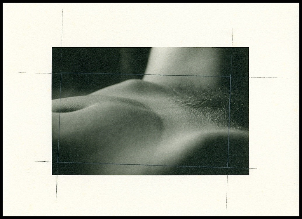
The end of this project is symbolically represented by portraits of some of the Masters of photography, who have grappled with this tool in the course of their careers. Here, the technique used not only refers to the sitters own work, but also highlights the complexity and wealth found in the setting of the portrait. The individual shots thus become clues, traces of a world that can only be reconstructed by viewing the contact sheet in it’s entirety.

Lastly, the title, which was inspired by the cinematographic technique of filming a scene without interruptions, editing it directly from a camera during a take. As in the cinema, here too the image is edited at the moment in which it is captured, with the frames shot according to a sequence based on the way in which the film will be cut during printing. The final image will only be successful if each single element is functional to the overall view, thus creating a sort of “Pianosequenza”.

Le sigh.

Pianosequenza translates as: ‘sequence plan.’ Due to the pre-planning and necessarily painstaking execution, the title isn’t incorrect in any denotative sense.

The connotation, however, is steeped in cinematographic tradition: Welles Touch of Evil opening, the oeuvre of Andrei Tarkovsky, Chantal Akerman, Theo Angelopolous and Bela Tarr; more recently and sadly plagued by verging-on (if-not-full-on) racist tropes: Cary Joji Fukunaga’s True Detective six-minute nail bitter.

Allowing Zanaria leeway and as far as pianosequenza go, I can’t exactly argue with the assertion that a single frame will be rendered meaningless when divorced from sequential context.

But strictly speaking it’s the replacement of one single, flickering still image with another–the illusion of seamless fluid motion that distinguishes cinema from photography.

In this work, the viewer sees everything at once. Zanaria argues that the presentation de-emphasizes the individual frames in favor of the larger context of the contact sheet whole. I can’t accept that because individual images are not as insignificant–to my eye–as insisted upon by their creator. If nothing else the overarching plan lends an artfulness to them, suggests a seeing of the foreign in the familiar.

One must also bear in mind the conceptual disconnect: pianosequenza are predicated upon a lack of interruption/absence of montage. The work is fundamentally built on montage–smaller pieces strung together to create a broader whole. Further a true pianosequenza would dictate an uncut strip of cinema film; while, the 35mm contact sheet involves at least five cuts.

Ignoring the statement, I am pretty into this work. The trouble is the statement is so overwrought, logically flawed and at a remove from how the work reads that I have to admit I am rather put off by it in the final analysis.

Nina Ai-Artyan10 (20XX)

What draws me to this image is ultimately what alienates me from it: the impossible-ness of the boundary between middle-grey and nearly-black running along the inside of her left arm.

It’s meant to look like an analog print–although I’d wager it’s a digitally post-processed negative scan.

There are two dead give-aways:

  1. Although it is possible to exert God-like control over a traditional darkroom wet print; even with Edward/Cole Weston caliber perfect prints, the result will never be as clean as this.
  2. The white at the right-edge and especially in the upper right corner would not produce a tone distinguishable from the paper backing.

Ai-Artyan has done traditional darkroom work. Yes, her prints are sloppy; but accompanying the mess is a sense of struggle, of painstaking labor, a sense ennobling the resulting work in a way from which her remaining work is bereft.

I don’t mean to be overly harsh–the necessary raw materials for greatness are present. All that’s missing are some shift in perspective–inspiration maybe, more likely desperation–and a commitment to the truth underlying the image above everything else.