[
Normal
0
false
false
false
EN-US
X-NONE
X-NONE
/* Style Definitions */
table.MsoNormalTable
{mso-style-name:”Table Normal”;
mso-tstyle-rowband-size:0;
mso-tstyle-colband-size:0;
mso-style-noshow:yes;
mso-style-priority:99;
mso-style-parent:””;
mso-padding-alt:0in 5.4pt 0in 5.4pt;
mso-para-margin-top:0in;
mso-para-margin-right:0in;
mso-para-margin-bottom:10.0pt;
mso-para-margin-left:0in;
line-height:115%;
mso-pagination:widow-orphan;
font-size:12.0pt;
mso-bidi-font-size:11.0pt;
font-family:”Garamond”,”serif”;}
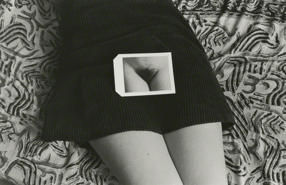
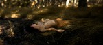
↑] Les Krims – Fall, Fargo Avenue, Facing the West Side Armory, Buffalo, New York (1969)
[
Normal
0
false
false
false
EN-US
X-NONE
X-NONE
/* Style Definitions */
table.MsoNormalTable
{mso-style-name:”Table Normal”;
mso-tstyle-rowband-size:0;
mso-tstyle-colband-size:0;
mso-style-noshow:yes;
mso-style-priority:99;
mso-style-parent:””;
mso-padding-alt:0in 5.4pt 0in 5.4pt;
mso-para-margin-top:0in;
mso-para-margin-right:0in;
mso-para-margin-bottom:10.0pt;
mso-para-margin-left:0in;
line-height:115%;
mso-pagination:widow-orphan;
font-size:12.0pt;
mso-bidi-font-size:11.0pt;
font-family:”Garamond”,”serif”;}
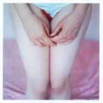
↓] Masha Sardari – The Ashen Heart (2013)
Juxtaposition as commentary.