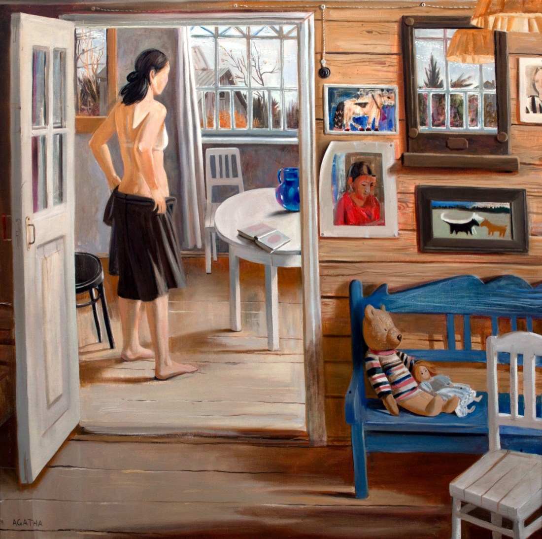
Agatha Belaya – The morning (200X)
I like to revisit things, dwell with them for long spells. It’s why I travel to the same places over and over again. Relisten to the same albums for the 400th time. I like things that unfold over-time; that still reveal new things to me, after years of time, effort and energy invested in them.
I first saw this image while I was in Iceland. I knew immediately that the artist was located in some Nordic clime–in this case Saint Petersburg.
So many people go to Iceland because of how wild and alien it is. But part of what makes it so astonishingly magical is the arctic light–and what this painting manages to capture stunningly is the grey-on-white-on-blue color cast of that light.
As I’ve returned to this–knowing I want to post it, but not knowing what I want to convey about it–I keep noticing new details. For example: check the mirror on the wall in the upper right third of the canvas–you can see the shade of the hanging lamp reflected in it; also you get a glimpse of a window along the fourth wall.
This is brilliant for a number of reasons. It opens the frame. It implies the viewer as voyeur. It also cleverly enhances the direction of the light. For example the light in the reflection of the window along the fourth wall is brighter than the light seen through the window in the background–which would be what you would expect given the angle of the shadow the woman is casting.
The thing I just realized though is why things look a bit wawkerjawed. There are definitely some minor issues with scale. (I would conjecture that they are intended to convey a sense of oneirinism not unlike the rotoscoping in Waking Life.)
My mom has these antique-y wood block landscapes by this artist Theodore Degroot that she adores. (I’ve always found them positively garish.) But the floor in Belaya’s painting resembles them. And for whatever reason my rotten brain got on the subject of perspective.
Belaya’s painting is implicitly one point perspective. (Let go of the white chair in the foreground for a bit, I’ll get back to that…)
I can illustrate what I mean better than I can describe it. Here’s a drawing in one point perspective:

Now consider this detail:

In the master frame, it’s fine. But in the detail, the scale seems exaggerated, things seem a bit off.
I think this is a function of a number of things. It is possible to render something in one point perspective with the vanishing point either within the frame or outside it. It strikes me that when viewing things that are ordered and linear, we accept images where the vanishing point is within the frame as being more realistic in appearance to our eye (because we notice what is closer and more detailed and since the pattern essentially repeats as things move from foreground to background, the shift in scale gets glossed over.
More often than not–architectural order does not prevail, however. The majority of the world does not conform to the specifications taught by visual perspective.
And here let’s return to that white chair… what happens if you have an object oriented in two point perspective in an otherwise one point vantage?

It almost works but there’s always going to be something off about it.
So yes, with Belaya there’s a dream-like feel to things. But also, she’s definitely playing with the tension between the order of squares and rectangles in architecture but she’s also acknowledging that sometimes living in a space necessarily imposes a disorder to it.
Also, I think here image is actually in a more rigid perspective than you’d otherwise notice, except we’re getting a Matisse view instead of a Bruegel view. (Given the Bruegel view, it would be easier to see what I mean but the point isn’t to spell it out. It’s to get you to see it for yourself. Which reminds me of Borges story about the map so detailed that it became larger than the area it depicted and it end up folded up and moldering in the desert–there’s something about the contentious relationship between photography and fine art here that someone brighter than myself might try to tease out.)