
Inside Flesh – Meditation II (2016)
“Art is the communication of ecstasy.” –P.D. Ouspensky

Source unknown – Title Unknown (201X)
We live only to discover beauty. All else is a form of waiting.
—
Kahlil Gibrán (via afroui)

Kirill Kikiboy – Title unknown (2016)
Under the usual circumstances, I’d advise you to steer clear of this guy and his work. It’s just another example in an interminable string of dime-a-dozen cishet asshat male image makers who possess a modicum of technical acumen and believe this gives them the right–nay: obligation–to produce work that has no raison d’etre whatsoever beyond the beatific rendering of sexually objectified femininity.
But as much as I detest the rest of his work, this image is difficult to disavow.
I find it exceptional because of the way that it uses the extremely shallow depth of field to shift the emphasis away from her genitalia and to the way he’s holding her foot. (If I was a better person, I’d say that bokeh is consistent with Canon glass.)
This being the case: the focus is less implicitly carnal and more tied up in a symbolic shift in power dynamics.
Another point: I won’t suggest this is #skinnyframebullshit–given the angle of her left leg, it reads up and down as opposed to left and right.
Interestingly though, while there is a compositional logic to support the vertical orientation, I’m pretty sure this was originally a horizontally oriented frame that was cropped down in post. (I think this for a number of reasons but the main two are that it’s not exactly easy to square a camera vertically with only one hand–you end up with your elbow thrown up like you’re doing the funky chicken in a Jazzercise class; also, the top 15% of the frame is negative space–yes, it ends up balancing out the fact the the image is decidedly bottom heavy… yet that’s not something that would be easy to see in the moment of trying to visually parse the scene.
I’d actually be super interested in the original framing of this–assuming my gut feeling on this is correct. I think it’s probably a more immersive image for the added narrative implication.
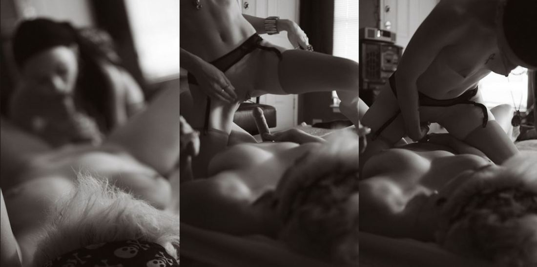
urbanfaerietales – Title Unknown (201X)
The above images are interesting–if a bit muddled. Yet, the way in which they’re muddled suggests several things to me about visual grammar. So like good Wittgensteinians, let us conduct a grammatical investigation!
A lone photo or image must stand on its own. However, as soon as you position photos or images adjacent to one another–each subtly shapes and informs how we read not just the one image or photo but how we read both of them together.
In the loosest sense there are two ways that photographs can relate to each other: as polyptychs or as sequences.
The above is not a triptych.
Strictly speaking, a diptych means ‘two-fold’. A triptych would indicate three folds. As such you can see panel A alone, panel B alone, panel C alone or panel A & B together or B & C together or A & C together or A, B & C all at once.
While polyptychs can be seen as relating to each other in a way that conveys are broader, overarching narrative–their construction is not intrinsically narrative. The each panel stands alone but that together each comment, enliven and enrich each other so that the piece as a whole comes to constitute more than the sum of its parts.
A sequence, on the other hand is fundamentally tied up with the movement of time. (To be 100% clear, a polyptych can be sequential but a sequence is not automatically a polyptych.)
There’s several things the above sequence does well. First off, the use of depth of field to direct the viewers eye is totally on point–in the first panel, only the top of the head in the foreground is in focus while everything else goes soft; in the second panel, the focus point is ever-so-slightly behind the kneeling figure; the final panel shifts the focus towards the middle ground between the two lovers.
Compositionally, the first and last panel are #skinnyframebullshit–there is absolutely no effing reason given the frame that vertical orientation contributes fuck all to the logical consistency of the whole.
In the first panel, the way the supine figure’s legs open up to the room begs for landscape orientation, further given the narrative auspices of the piece as a whole–it’s extraordinarily poor form to employ portrait orientation.)
The contrast and overall tonal range are best in the third panel; however, the frame feels constricted; it makes me nervous that it’s so clearly supposed to be set in this room but the view of the room is so claustrophobically limited.
The second panel is actually a fabulous example of when a vertical orientation actually serves a goddamn purpose–the frame reads up and down and by fitting it to a form that is predisposed to that sort of scanning, the image maker employs the appropriate visual grammar to convey to the viewer how to best engage with the image.
In summary, there is a great deal of raw potential here. I’m of a mind that this would’ve been more effective if all the images had been landscape oriented or if the second panel had been extracted and presented independent of the others (I do think you’d lose something but the image is strong enough to stand on its own).
Alternately–and probably even stronger–would have been if the first and third image were landscape oriented and the second image remains in its current, portrait orientation. This would’ve pushed things more in the direction of a polyptych and would’ve also suggested an altar piece–which is more in keeping given the almost liturgical tone of the images.
And that’s why I make such a big deal about using portrait orientation correctly. Maintaining that it doesn’t matter is the same as saying that the comma in Let’s eat Grandma vs Let’s eat, Grandma doesn’t make any difference in the end result.

Jo Jankowski – Title Unknown (2014)
I am intrigued by the odd confluences acting in Jankowski’s work.
I’ve maintained for years that there is a Russian/Eastern European visual aesthetic. Perhaps, it’s just a psychosis from spending entirely too long immersed in Russian cinema, but I feel like there’s a certain grimy patina leavened with pre-fab brutalism, an ostentatious minimalism and an almost obsessive mediation between extremes–labor perpetually balanced against leisure, dour pessimism countering a perhaps misplaced belief in better days to come. (It’s something I’ve thought for ages–but wasn’t something I was certain of until after I spent so much time exploring Berlin. The wall may be gone and the permeability has been in place for so long that while it’s no less glaring–you fundamentally feel the difference between East and West as you move from one to the other.)
Jankowski has that Russian/European it-ness.
If you go solely based on his website, it would be easy to lump him in with his fellow countryman Fred Huening–there’s a large degree of overlap in their conceptual and thematic elements.
But that’s not as interesting as examining how there’s an essential French-ness to his work also. I mean the look and feel of his images is heavily informed by Cartier-Bresson. But there’s also whole cloth from Brassai and Atget.
I don’t believe it’s an unconscious affectation on his part. For example: there’s a way in which his work–at least to my eye–is obsessed with questions of revealing vs concealing. It’s not something you’d automatically get from the above image. But it’s a little more clear in this:
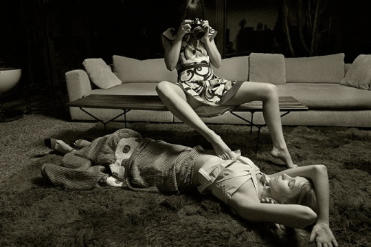
Pay attention to the way the reveal–the woman with the camera using her foot to hike up the model’s blouse seems to be revealing but is merely contributing an erotic charge to the parabola of the woman with the camera’s skirt hem.
Further, I can’t look at this image and not think of this shot by Helmut Newton. Newton’s image hinges on lurid colors and insinuations of lesbianism; a thinly coded, sugary confection designed to do little more than superficially titillate. Jankowski–by contrast–is not interested in serving up kink for kink’s sake. Instead he shows us a scene where we’re allowed to see but are shut out from any sort of interaction. The scene isn’t for or about us–we’re just being granted an opportunity to observe it.

Sergei Shekherov – I Hadn’t Anyone till You (2015)
This would be utterly unremarkable were it not for two things:
Taken in the context of Shekherov’s status as a citizen of the Russian Federation and given that nation’s open hostility to LGBTQ+ folk, there’s a tension between the prosaic studio setting and the audacity of what is depicted.
The title speaks to something universal: the human feeling of being alone in the world and desperately seeking out a partner. Add the gayness of the work and the meaning deepens, encompassing the complexity of looking for someone when your experience and expression of sexuality is outside the mainstream norm–and how much more finding someone with whom you can share your authentic self means.
Then there’s the undeniable similarity to David along with the fact that unless I’m mistaken the clothed man is Shekherov–pointing to an experience of the erotic in relationship to masters and masterworks of art. (It reminds me more than a little of Luisa Terminiello work hard.

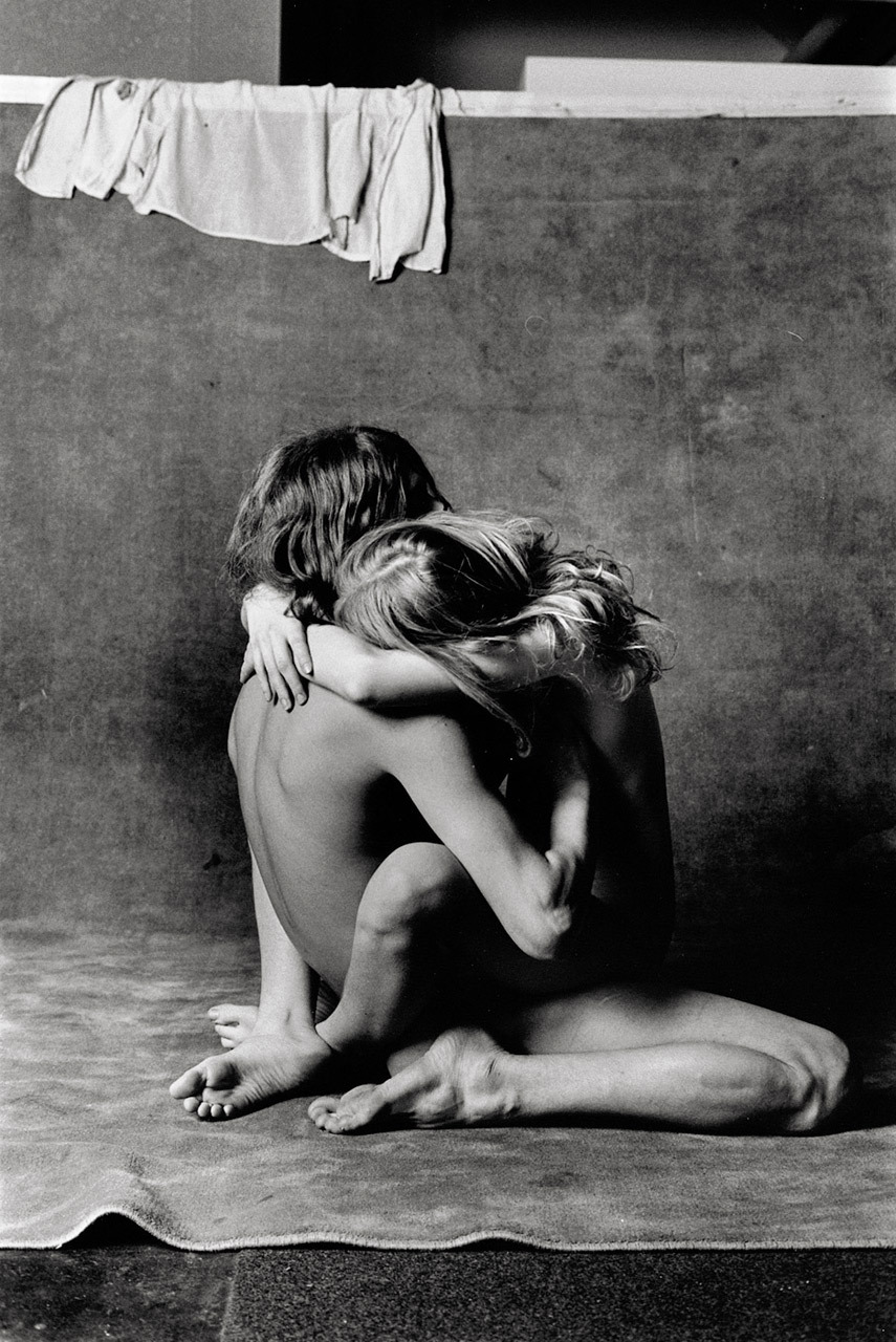
Source unknown – Title unknown (201X)
I have no idea where this image comes from but I absolutely love it.
It’s partially an aesthetic thing. Customarily, I’m not a fan of close-ups–to my way of thinking they excise too many crucial contextual cues/clues.
An acquaintance who attends the same monthly book club I do and is currently pursuing a Philosophy PhD has pointed out to me that she doesn’t completely buy my objection as she seems something valuable in close-ups ability to essentially build a context that allows one to see the foreign in the familiar.
I counter that this sounds an awful lot like those awful activities in children’s magazines where they show a close-up of the pattern on a manhole cover and invite the reader to identify the object they’re viewing.
She’ll fire back with Suren Manvelyan as an example of how an identical framing can serve as an impetus for the creation of art.
And I get tripped up because I don’t know whether I’m inclined to suggest her example is the exception that proves the distinction I’m drawing or if due to the dual notion of infinite–i.e. both the set of all real number extending in both negative and positive directions endless, while also the endlessly divisible space between any number in the above set–that Manvelyan is actually terribly disingenuous to the spirit of the initial premise. (Yeah, I know: I’m insufferable.)
A third thought occurs to me writing this now: perhaps, I’m not being entirely honest, either. I mean: I really dig a good bit of Lina Scheynius’ work–and she employs close-ups frequently–granted with just enough of a hint of context that you can usual fill-in any requisite blanks.
Come to think of it, the above image is actually something very much in keeping with Scheynius’ work. The perspective, angle of view and how the scene is presented in a fashion which pinpoints a specific, emotionally resonant detail and then provides enough of the surrounding context to insinuate an idea is very much a skill set she exemplifies. (Despite compositional and tonal similarities as well as the implication of bathing/water, it’s definitely not her work–the color is entirely too saturated to be hers.)
…
I’ve had this image lurking in my drafts for the better part of a year–knowing unequivocally that I am going to absolutely post it at some point.
The trouble is I’ve never really know what to say beyond the above knee-jerk reflection; however, the events of the last three months–in particular–and the last three years in general, render this image especially meaningful at present.
I’ve at least twice (1 + 2) before about how thoroughly amazing my living situation was during my junior year of college. Amadine, who is mentioned in the second post and that’s also not her real name, and I recently reconnected. It was intense–in a wonderful way and the immediacy and profound intimacy of the way we interact with one another has set my brain on fire.
The realization that I’ve come to is that being a severely damaged individual, I seek out others who have also been broken by life. I’ve spent most of my life surrounding myself with folks who have hard eyes and sharpened edges.
More and more, those are not the people I want to share my mind, my energies and my body with. I think that due to growing up in an environment where kind words weren’t offered unless they were inextricably tangled up in bitter, criticism. For example, my parents would always be like: oh, you could be doing so much better at this if you just tried and it’s disappointing for us but it doesn’t make us love you any less. Like what the actual fuck?
Increasingly, I’m attracted to kindness. Amadine was the first person who was ever kind to me seemingly without any sort of selfish motivation. And if I’m being honest, I am more than a bit smitten with her. But our respective situations make these feelings (which have been validated as mutual, or did I imagine a subtext that wasn’t present yet again?) extremely complicated. Also, we are tentatively discussing collaborating on the most ambitious creative project I’ve undertaken in more than a decade…
Really, that’s why I’m finally posting this because the feeling in this image holds a faint glimmer of what it’s like to share time and space with Amadine… for whatever that admission is worth and means to any of you out there.
Will McBride – Rocky & Julia (1972)
One of the most amazing teachers of my life taught Sociology 101 in community college. (She was breathtakingly brilliant and could’ve taught anywhere but as a committed Marxist, she viewed it as her duty to provide the same degree of academic rigor to students who might not necessarily have the resources to attend an Ivy League institution.)
I still refer back to notes from her class a handful of times every year. This time it was to remember the term cultural lag.
The gist of the concept is technological innovation moves at a much faster speed than cultural evolution. As a result it can take a really fucking long time for society to come to terms with advances in technology.
…
If you are unfamiliar with McBride, he’s notable for his collaboration with Helga Fleischhauer-Hardt, a psychiatrist, on a picture book designed as a resource to help parents educate their children about sex.
The book was called Zeig Mal! (or, Show Me!) and it included frank discussions about sex accompanying age appropriate images of nude children and graphic depictions of teens and adults engaging in sexual activity.
It was well received in Germany–and received a second printing. But it’s publication in the U.S. was more troubled. It was quickly libeled as ‘child pornography’–and despite the fact that it exonerate in court on four different occasions as not obscene.
However, there was a convoluted back and forth about whether or not distributing non-obscene depictions of nude children was protected by the first amendment. To be on the safe side, the publisher opted not to continue to publish the title in the U.S.
…
The notion of cultural lag doesn’t strictly apply to McBride–if anything the culture was fine until puritanical prudery arrived on the scene.
There is something potentially valuable to consider here; namely: that as long as we remain unclear on what constitutes pornography and what does not, we’re going to continue to have problems like this.
If you disagree think about teens who are getting added to sex offender registries for consensually sexting nudes to other teens.
The pervasive attitude of puritanical prudes is that education/preparation is implicit acceptance of the activity. (The reason so many idiots are against contraception is truly less out of any well-meaning desire to keep kids and teens safe and more born of the fact that “if we provide free condoms, then they’re certainly going to use them.” It’s entirely about control–no more, no less. Fear and coercion only work so long as they keep you from eating of the fruit of the tree of the knowledge of good and evil; once you’ve eaten, you want to continue to eat–you just have the associated guilt over eating in the first place to work through before you can truly enjoy the feast. (Sadly some people never make it.)
Consider another analogy: of the kids I went to a parochial high school with, only one never struggled with the sudden freedom of self-determination upon going off to college. All of them struggled with binge drinking and addiction except the class salutatorian–whose parents wisely allowed her to have a glass of wine with dinner and an occasional beer here and there from the age of twelve onward.
Similarly, the people I know with the healthiest attitudes towards sex are those whose parents refused to teach their children that some sort of shame surrounded their bodies/nudity and who modeled sexual attraction/behaviors in an open but appropriate fashion.
Or, to put it another way: in my experience if a child can formulate a question on a particular topic they are generally more than ready for an honest answer.
We–as a culture–really need to do better about this kind of thing.
…
Anyway, I have no idea from what body of work the above image emerged. It would’ve preceded Show Me! by half a decade. But you do have to appreciate the seemingly post-coital intimacy that manages somehow to avoid both sentimentality and salaciousness.
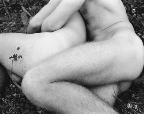
Nicholas Nixon – Y.A., J.S., Vevey, Switzerland (2000)
Viewing Nixon’s work I am reminded of Emmet Gowin. Both share an interest in portraiture and more-or-less abstracted landscapes.
I prefer Nixon’s trajectory more–as he’s pursued both tracks over the course of his career; whereas Gowin has all but stopped making portraits.
However, even though Nixon has made more consistently engaging work–it’s never quite managed to invoke the same intense and simple clarity as Gowin’s pre-aerial photography work.
The above frame is actually emblematic of what frustrates me about Nixon. He’s using a large format camera. Awesome. I totally support that and if I could afford to, I’d only shoot large format (although I prefer 4×5 over 8×10 because beyond a point, dragging large, heavy equipment around is a turn off). And I really like the way it toes the line with regard to a degree of gender ambiguity. (It took me almost 30 seconds to note the protruding scrotum of the little spoon.)
I just don’t think that ambiguity actually balances out against the lack of broader contextual clues as far as the setting. Nixon uses standardized naming conventions when titling his work. A brief description of what is pictures, where the photo was taken and the year it was produced. With much of the rest of his work it doesn’t bother me. (The tact is–after all–endemic in fine art photography.)
Here though, it reads like an effort to activate the work in a way that the purely visual does not.
Yet, then there’s the broader context of the work within which this photograph coexists–a project documenting amorous couples. This resonates strongly with the ambiguity of gender in the presentation. And while I don’t think it has the immediacy or empathy of other images in the same series it is nice to see effort made to represent the act of love as non-hetero exclusive.

Dorotheya Dimitrova – [] (2014)
“I ache in all the place where others get pleasure[.]”–Antonin Artaud
