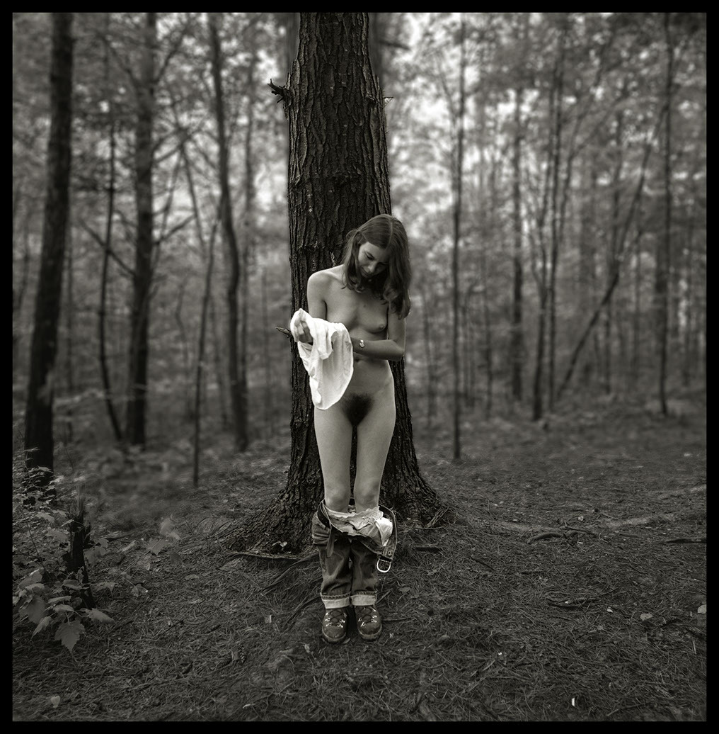
Alexander Gonzalez DelgadoUntitled feat. eddgein2 from somewhere in my head series (2018)

I like that this is analog. I like that the depth of field is such that the point of focus is actually somewhere behind Alice’s body but above the floor.

I also like the way the milk trailing down her body trails back to the bowl–due to the DoF, it’s all but devoid of texture (which adds to the sense of flowing liquidity.)

However, the way Alice’s body is dismembered by the frame edges–double amputation mid-thigh and having the top of her body removed feels like coded misogynistic essentialism (i.e. a woman’s body exists solely for the gratification of male sexual pleasure).

Also, I’m just really super not here for the whole milk bowl/cat/pussy riffing. (Several cat lovers have informed me that cats are by and large lactose intolerant.)

At the same time this feels of a kind with Marat Safin and I’d argue more honest than his in embracing the work’s fundamental depravity (in a value judgment-less sense…)

R. Michael WalkerMelissa Undressing, Red River Gorge, KY (1979)

Malcolm Gladwell’s assertion that it takes 10,000 hours of deliberate practice to become world class in any discipline has–by now–been thoroughly debunked. Simply from that standpoint of stifling elitism, I consider the kibosh that’s been put on this a tender mercy. Except…

I don’t think the notion that it takes time to hone your craft is actually–in any way–bad advice. If a young photographer/image maker came to me and asked what advice I have for them as far as achieving their dream, my response would probably be inline with what I was told when I first started making photos: lock yourself in your room and read until your eyes burn and don’t touch a camera for five years.

Or, that’s how I would’ve put it until recently. I think there’s a balance between doing and fueling the doing. And the 10,000 hours probably have less to do with conditioning and more to do with forcing you into a give and take relationship with your craft where you realize that sometimes you do it when you don’t feel like it and sometimes doing it when you don’t feel like it is detrimental to the doing. It’s only through trial and error that you figure it out.

Also, fueling your doing is less fulfilling but it’s easier to learn things that may take you much longer to address in your own work.

For example: the above image has crystallized for me a number of things I’ve been grappling with in my own work.

Long story, Cliff’s Notes ™ version–it’s only in the last 18 months that I’ve begun to see photos as dimensional. And by that I mean more than just the separation between foreground, mid-ground and background. It’s more than a little like Lotte Reinger’s multiplane camera–except expanding so the entire space in the frame is represented by distinct planes.

The experience of seeing space as constructed of layers has actually slowly shifted the way I think about composition. It’s still at a point where I’m not so great at articulate it but there’s a very clear feeling of it.

My notion of seeing space as layers of planes relates to depth of field. And generally depth of field has very proscribed uses. The majority of photographers/images makers think of bokeh as a means of emphasizing the subject while still conveying a sense of the subject in space without all the decontextualization that comes from staging things in a studio space. (In fact, it’s arguable that the quality of bokeh is usual measured across cameras and lenses by giving consideration to the bokeh offered by the fastest lenses available in an 85mm–or equivalent–focal length.)

(As a brief digression: if you’ve read anything written by folks who have worked as cinematographers for several decades, you’ll hear them talk about how different lenses are best suited for shots of a particular scale. I’m increasingly realizing that there is actually a good bit of truth to those claims.)

But the point is there’s a tendency to either go for the shallowest depth of field possible–the reason why fast 85mm lenses are considered the bokeh gold standard because they tend to support the shallowest DoF; or, for deep focus a la Group F/64 or Gregg Toland’s work on Citizen Kane.

In my own work, I favor a shallower depth of field but as I’m frequently working in medium or specialty formats, I’m limited by lenses that by and large are only considered fast in large format.

Really, your DoF should be used as a tool to help the viewer know how to read the frame you’re presenting them. The photo above for example: was most likely faster film shot in low-ish light with a mid-range aperture. Note how all the foreground is in focus and the focus starts to go soft at the rear of the tree directly behind Melissa. Note how this forms a compositional wedge from the lower corners through Melissa to the tree. The subject is pulled forward whereas the forest is pushed backwards. (Yes, digital devotees, you can capture your images in raw with everything in focus and then selectively unsharpen in post but it’s never going to look as organic as the above.)

Point is: I don’t think I’ve ever seen DoF used to quite this effect and I like it rather a lot.

Oliver RathDer Sommer Kommt feat. Phan Toma (2012)

I’m not sure whether this is a good image or not–but there is definitely a lot going on with it.

The depth of field is such that although it’s ostensibly clear that the person in the foreground is supposed to appear as if they are using electric clippers to remove pubic hair. (I am not entirely sure whether Rath paid Phan Toma to shave for the photos or if this was someone else’s hair and the scene was staged. My gut says it’s the later–although with Rath, it really could just as easily have been the former. In the favor of the latter is the fact that electric clippers don’t really get things that clean shaven–usually you need to use the clippers first and then bring a razor to bear.)

Also, although the toilet is not the venue I’d ever recommend as ideal for this sort of thing. The image has been staged in such a fashion as to make it read clearly that the model is in a bathroom and removing pubic hair. That post cannot be especially comfortable and usually the idea is that you sit on the toilet so that it’s less muscle strain and the hair can just be flushed. (Although, come to thinking of it: I think I’ve only ever known it to be dudes who favor the flush the pubes depilatory routine. (I don’t know a woman who does it like this–I lay out newspapers like I was taught by other women.)

I have mixed feelings about the fact that you can see the photographer bear feet and legs in the image. On the one hand: I am inclined to agree with the sentiments of those who find shots like this creepy AF. Further: the fact that this is a model and the photographer is straddling a leg while taking a picture of the removal of pubic hair is… intimate–but intimate in a way that the photo gives us zero context to discern whether or not the intimacy is consensual or coercive.

The image reads very clearly but in so doing it trades in ambiguity that is more interesting that any of the sum of its parts. The trouble is the ambiguity hinges on questions of voyeurism and propriety but relies upon the ambiguity of the presentation to head off any criticisms at the pass.

Isa MarcelliUntitled from Toccata series (2015-16)

In music, toccata means literally ‘light touch’ and is a designation afforded to a pieces (usually keyboard based but also sometimes including string instruments) which are notoriously difficult to perform but allow the musician to show off their deftly virtuositic lightness of touch.

With the image above, there are several layers of meaning to draw from this. First that the woman is holding an egg resonates with the title. (And I can’t help but recall the apocryphal account of Brunelleschi carrying a basket of eggs and dropping them as a result of his shock upon encountering Masaccio’s Holy Trinity Fresco.) Secondly, Marcelli is using collodion to produce ferrotypes. (Collodion wet plates experienced their widest usage during the U.S. Civil War–during which time collodion was actually used to close up severe wounds; but through a process involving a number of extremely hazardous chemicals, i.e. ether and cyanide, it was possible to produce a resilient negative image on transparent glass.) Also: collodion is not exactly the most user friendly format as you have roughly 12 minutes to evenly coat the plate, load it into your camera, expose and process the resulting image.

Marcel van der VlugtPassion Flower 4 from The Women series (1999)

There are so many things I dig about this that I kind of don’t even know where to begin…

I guess since it was made using analogy processes, it’s an actual instance of photography–so maybe let’s start with light.

When you’re Dutch–and van der Vlugt is ostensibly a Dutch surname–and as such, you hail from the same rich environment that produced Rembrandt and Vermeer, then there’s a decision to make: whether you continue the tradition of illuminating your scene with light traveling from left to right (the same way the eye is inclined to move over items that are intended to be ‘read’) or whether you try a different tact.

That’s why the layout of this is so intriguing. The light and the position of the model all push left. Look at the above image. Now I want you to close your eyes but before you close them I want you to remind yourself that you’re going to pay extra close attention to the details that jump out to you based on how your eyes scan the photo. Go for it.

Now: I want you to do the same thing only with this variation of the image.

To my way of seeing, this variation is nowhere near as effective as the original. The light and push of the pose in combination with the natural inclination to read images from left to right, makes the variation very much right side dominant. You notice the sublime lighting on the back of her head, the crown of flowers, the silhouette of her lips (which is my favorite part about this) but you lose the holistic totality of the photo that the original offers. (Like in the variation, I don’t notice the is it carpet covering the top of a table or is this something that was taken in a carpeted stairwell where the model is leaning against those intolerable Dutch staircases? I like to think it’s the latter; also, the light on her back and the tonal nuance in the soft gradient of the key light on the wall behind her.)

Allison WhiteScrubbed Clean (2014)

Looking at this I can’t help but compare and contrast with another image by janies. I featured 1.5ish years ago.

Comparing how and why both images work and in what ways that functionality is tied into the decision over whether they are in B&W or color are a worthwhile exercise.

I’ll leave that as sort of a bonus assignment because I’m currently fixating on a different association; namely: Juul Kraijer & specifically this photograph.

Wait! You admonish, wait… what does a high contrast image of a neck speckled with loam have fuck all to do with an low contrast image of a hand covered in twenty ladybugs?

Well, it’s partly the angle of view. White and Kraijer both favor a similar perspective. The former is more dimensional, the presentation of the latter, flatter but they both share a disembodied separation from any sort of definitive contextual connection.

I have zero way of knowing whether White knows Kraijer. But I appreciate the overlap in stylistic considerations and the work that those considerations is rendering far more than a certain other image maker who is currently shamelessly and one dimensionally aping Kraijer’s approach. (Looking at you, Evelyn Bencicova. Further, note how Bencicova’s borrowing of content without any obvious understanding of the unity between form and function in the work she’s referencing results in yes, pretty but ultimately muddled images.)