
Yaroslav F. – aliona i. offside2016. lviv. {desaturated & cropped} (2016)
Whoever desaturated and cropped this is a colossal fucking asshat.
Consider the original:
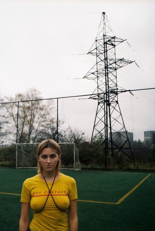
Yes, the original is far from perfect– the yellow t-shirt together with yellow line against the green field is a decently observant with regard to using color in composition. (I’m not sure about how the crossbar of the goal looks a bit like one of those prop headband arrows that makes it appear as if there’s an arrow sticking through your skull, the fence, the electrical line armature or apartment buildings in the distance add anything to the photo.)
But compare the original to the desaturated and cropped version: the former is a reasonable idea that suffers from a deficit of attention to all the details; whereas the edit reduces the portrait-esque aspect of the picture to a more overt provocation–the thin t-shirt sans bra presents a feminist tinged visual commentary, i.e. eye contact above this line and the crossed black cord either indicating a negation of the command or an insinuation of a preference for kink.
Further the focus on the setting is different. In the color original, there’s the emphasis on the soccer field within a larger context of the area immediately surrounding it. In the desaturated crop, the frame is centered on the goal and there’s a feeling that given that this is a soccer pitch and that this person is facing the camera (and ostensibly the viewer) that Aliona–and by dint of the ostensibly feminist message of her clothing–is an obstacle between the viewer and the goal.
In other words, the original picture is imperfect but it has a certain knee jerk charm but the edit is designed in such a way to sharpen a sexist narrative that is not present in the original.


