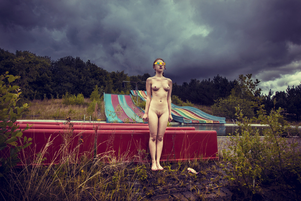
Jan Emil Christiansen – Book II (20??)

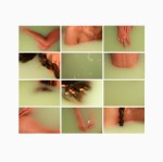
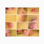
The colors in this are in-goddamn-sane. the punchy yellow of the 3D glasses…

…the cream + peach + magenta of the skin tone against the red plastic…

…and the exhaust blue + gun metal grey of the storm-roiled sky.

Still, something is missing…something about those glasses triggers a series of questions:

  • Why is she wearing them?
  • What is she seeing?
  • Isn’t she worried about the weather?
  • Why is she nude?
  • How in the hell did she get here?

For me, the patent lack of answers is not charmingly ambiguous, it’s fucking frustrating.

So… I breeze over to Christiansen’s website since his Flickr no longer has any shared content.

Frustration rapidly transforms into confusion. + I don’t mean confusion in the usual sense of being lost or uncertain. I mean more: how in the exact fuck did this cat ever make such a killer image?

Le sigh.

Jan Emil Christiansen is an Urban explorer; the above, ostensibly (not that you can realy tell) an Urbex image; making it the least Urbex-y Urbex image I’ve ever seen–which probably also makes it the best. (I give negative shits about Miru Kim’s ‘thinly veiled’ narcissism.)

Not to be all Debbie Downer on Urbex. I vaguely orbit the scene + in truth urban exploration environs figure prominently in my own work.

This issue is making images in such environs demands a hodgepodge of bastardized and otherwise degraded photographic conventions: a little bit o’ landscape, some documentary and some architecture thrown in for leavening.

Put another way: if an urban explorer is there  has a camera, there is a sense that the resulting images have an in-built relevance.

Mostly he abject wonder that motivates most urbex folks to bother taking a picture usually serves the resulting work. The trouble arises when airs emerge + pretense begins to take root.

Christiansen thrills at mixing his beloved hobby with a gumbo of contradictory ends in mind: documentary, horror films, erotic + portraiture. Excepting this image the single unifying aspect of his work its the appalling discontinuity between concept and enactment.

To see these tendencies in this image, you need to look no further than what stands out the most in the frame: the 3D glasses. They do tie the frame together fabulously.

But as has been noted, their presence suggests questions for which the image contains no answers. This has to do with Christiansen’s pick and choose approach to image making blissfully unaware that the glasses shift the image away from an uncomplicated ‘document’ and veer toward a mise-en-scène, of sorts. + the audience has no recourse to fill in the blanks necessary to suspend their disbelief, unravel the story and surrender to the image.

This could have been so fucking lovely; but all just sound and fury, signifying nothing–a fact which depresses + infuriates me me all at once.

choomathy:

this series was fun. I remember my tutor tried to get all “damn girl I love your work with feminism what a deep concept” and I was like nah I just like baths and … nipples

Baths and nipples, indeed.

Jaw, meet the floor. Floor, jaw. Get familiar with each other because every time I look at these my brain explodes.

I guess I can see reading a feminist agenda into this but I’m inclined to immediately link it with Bernd and Hilla Becher’s industrial typologies.

But either way, this as precocious as it is astonishing. Crazy props to Chloe Killip for not only having something captivating to say but finding the most breath-taking way of saying it.

mpdrolet:

Sisters #045, Prague, 1989

Stéphane Coutelle

I love everything about this image–the poses, expressions, tones and textures.

There’s something beyond aesthetic attraction, something more analogous to sympathetic resonance.

The location and the year: Prague, 1989–the eve of the Velvet Revolution.

Then it hit me: bodily closeness, dreams and wanting to touch, be touched.

And I flashback hard to Wim WendersWings of Desire–one of the greatest masterpieces of cinema about an angel who decides to become human after falling in love with a trapeze artist.

It’s one of my favorite films. But what really interests me is how both it and this invert the notion of installation (art inhabiting space) and allow space to inhabit art.

Maybe I am insane but gazing at this image I can very nearly feel the vibration of change like a train telegraphing its arrival along the rails.

Yes, we drift like worried fire but we hope and love and believe beauty will save the world.

Yann FaucherUntitled (2012)

Frustrating and illogical composition aside, there is so much to love here: suffused summer light bleeding from the window like a wound, suffusing the fringe of a beautiful body and clotting—white and diaphanous—on curtain gauze; eyes closed lightly, mouth open just a little; long arms dangle, finger tips tracing the textured braille of the bed sheets; above his right knee, and the forgotten change left on the sill that will stick for a moment when he stands again.

The content of the work is stunning, trading in sincere portraits of primarily nude male-bodied models. When [gender neutral pronoun] does make images of female-bodied individuals, the result is a sort of Fassbinder-ian waiting for those quiet moments wherein women are no longer divided into a me & the-me-the-world-sees and are finally alone with their thoughts.

It kills me to say it but all this potential is greatly diminished by Faucher’s thoughtless reliance on #skinnyframebullshit. I don’t know what it is more insufferable or sloppy.

There needs to be a reason, a compositional logic behind a vertical frame. I don’t know if in making portraits Faucher considers portrait orientation more fitting—though [insert gender neutral possessive] grasp of the technical seems more nuanced than that. It might also be an effort to comment on the way audiences view images (what with smartphones leading the #skinnyframebullshit charge). If that was the case, I could accept it. (I am not against vertical frames; I am against using them without any good reason.)

I admit that I haven’t looked closely at the rest of Faucher’s images; but the sense driving the framing seems to be the grievously mistaken notion that the frame should echo the length of the window. Only, due to the camera’s pan and the lenses wide angle of view, the visible portion of the window is closer to a square than a rectangle.

The window bay’s leftmost vertical angle does not align with the left frame edge. A small point, yes; nonetheless one that would have been de-emphasized with landscape orientation.

In this case the oddity of the angle indicates other glaring inconsistencies: the boy’s body is not balanced within the frame– the top of his left knee is lopped off by the right frame edge, his left foot hacked through the ankle and heel by the bottom frame edge. Then there’s the dead space directly above his head…

Don’t get me wrong the work is good; but it also has the potential to be so fucking much better. Unrealized potential pisses me off. (However, I suspect this says more about me than Faucher.)

knitphilia:

phillipdvorak:

This is “Missy” – one of my etchings, hand-colored with gouache and watercolor.

There’s something very Schiele-ish about this – and yet it’s a softer femme than his female nudes. ❤

Knitphilia has already tackled the Schiele parallels. (For me it’s the interplay between stance, framing and the articulation of her elbows, wrists and knees more than the lines themselves.)

The circuit this flips in my head that connects it with Schiele has less to do with any of that though. Full disclosure: I am not exactly intimately familiar with Schiele’s work but: I can’t look at any of it without straining to fit it to a context that isn’t the Austro-Hungarian Empire.

What do I mean? Well, some of it reminds me of manga–probably the suffusion of shaping lines and hard, preternatural intense precision of the outlines. Others remind me of hand-drawn fashion ads from the 20s & 30s.

Looking in the other direction: you can feel the influence of Klimt more than you ever see it. Yet, what’s interesting to me is Klimt’s content was so outlandish and/or clutch-the-pearls scandalous that his use of gold leaf is too frequently attributed to decorative ends. But really, what is being missed is the similarities to Russian religious ikons. (Specifically: I am thinking of Rublev’s Trinity here.)

And that is where I notice overlap: An unblinking effort to depict not only the truth of the scene but to use whatever methods are available to convey the intensity of humanness, it’s accompanying flaws, weaknesses and also it’s dignified potential.

But I’ve had a rough week and have been awake for thirty-something hours, so maybe I am just making shit up.

ziggyp0p:

You are not defined by your body.

Normal
0

false
false
false

EN-US
X-NONE
X-NONE

/* Style Definitions */
table.MsoNormalTable
{mso-style-name:”Table Normal”;
mso-tstyle-rowband-size:0;
mso-tstyle-colband-size:0;
mso-style-noshow:yes;
mso-style-priority:99;
mso-style-parent:””;
mso-padding-alt:0in 5.4pt 0in 5.4pt;
mso-para-margin-top:0in;
mso-para-margin-right:0in;
mso-para-margin-bottom:10.0pt;
mso-para-margin-left:0in;
line-height:115%;
mso-pagination:widow-orphan;
font-size:12.0pt;
mso-bidi-font-size:11.0pt;
font-family:”Garamond”,”serif”;}

¡¡¡♥!!!

P.S

. OMG so fucking gorgeous. Goosebumps and tears.

P.P.S. More like this, please.

danish-principle:

Joanna Szproch [also : The Quiet Front & Dripbook]

Welcome to Swoon Town. Population: me.

This. Is. Just… woah & woah again & amen.

Yes, it flouts conventions I drone on & on about: hands cut off at the left frame edge, legs amputated mid-calf by the right third of the upper margin.

Underlying these choices, however, is a logic strengthening the ambiguity of Eva’s pose: is she being lowered into the water or pulled from it?

& ambiguity in keeping with the image’s liminality; lingering as it does between color & desaturation; at once strong & vulnerable, artful & lascivious.

I cannot even begin to list the host of things that go through my head when I look at this image. But two things seem vital to mention. First, I am jealous of Eva. Not because she is so much prettier than me & not because I wish this was me instead of her (even though I do a little, okay: a lot.). It’s that I want to be seen by someone (anyone, honestly) the way Szporch sees Eva through her camera.

Also, in the interest of full disclosure: I wish I had made this image. It is chapter & verse the sort of work I try–& more of than not fail–to make.

Igor Mukhin

Normal
0

false
false
false

EN-US
X-NONE
X-NONE

/* Style Definitions */
table.MsoNormalTable
{mso-style-name:”Table Normal”;
mso-tstyle-rowband-size:0;
mso-tstyle-colband-size:0;
mso-style-noshow:yes;
mso-style-priority:99;
mso-style-parent:””;
mso-padding-alt:0in 5.4pt 0in 5.4pt;
mso-para-margin-top:0in;
mso-para-margin-right:0in;
mso-para-margin-bottom:10.0pt;
mso-para-margin-left:0in;
line-height:115%;
mso-pagination:widow-orphan;
font-size:12.0pt;
mso-bidi-font-size:11.0pt;
font-family:”Garamond”,”serif”;}

If it moves, Igor Mukhin likely shoots it; if it doesn’t, he’ll still take aim.

With nearly 5000 images—split between B&W film scans and Leica AG M9 captures, amassed over 6.5 years—perusing his photostream is like mainlining a hyper-distilled, chaotic mélange of interesting, occasionally ingenious work.

My head doesn’t wrap around such profligate excess easily—limitation is too central a feature in my own process. (Read: I am poor.) But I can let that slide. What I fail to fathom is how Mukhin’s haphazard, throw-it-at-the-wall-to-see-what-sticks curatorial approach works at all, let alone results in such jaw-dropping examples of all that photography should embody.

(To avoid unnecessary disappointment, skip his staid personal website.)