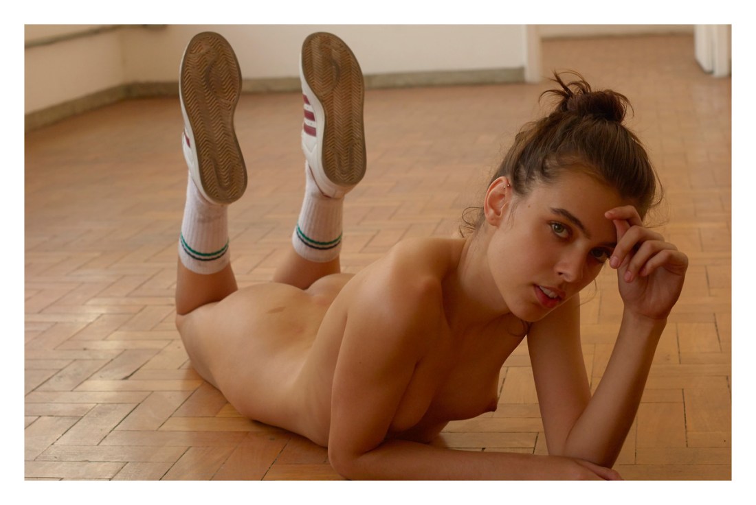
Igor MukhinKsenia, Moscow (2011)

I’m sure there are more technical photographers out there–but for my money, Mukhin is unrivaled.

Take this photo, for instance; it works because he seems to have obvious thought forget about shadow detail in her hair, I need something to anchor the composition. (This decision has the added benefit of emphasizing the way the light on her hair to the left look exceedingly sultry.)

He realize that the rest of the room is going to blow out and opts for an aperture that will give him just enough of a slice of in-focus depth of field that the sharpest focus begins just in front of her right knee and grows ever so slightly shallow just ahead of her face–which is tilted forward slightly. (Again, every so flattering but it also serves to separate her from the table she’s leaning against.)

And Oh My! but look at the same the entire frame demonstrates what Leica optics with do in correlation with film grain w/r/t over and under exposure and shallow depth of field.

Rebekah CampbellGrace Hartzel for Odda Magazine (2017)

Hartzel is a fantastic model. (I’ve featured her work with Roe Ethridge previously.)

However–although I definitely dig this image–I’m posting it primarily as a means of correcting something I realize I fucked up a while back; namely: I referred to the gesture in classical oil paintings that was used as a shorthand to indicate the person making the symbol as Jesus.

It occurred to me that the gesture–although based upon anointing parishioners with consecrated oil–is actually also startlingly similar to the configuration commonly used to stimulate the G-spot.

In my cursory research, I noted that the positioning of the fingers was supposed to spell ICXC–which is the ancient Greek abbreviation for Jesus Christ.

Well, I was incorrect. There are two gestures–one associated with Catholics, the other localized to Greek and Eastern Orthodox.

The gesture that Hartzel is making is the Catholic variation–it does not spell out ICXC. (And it is definitely the same gesture most commonly associated with stimulating the G-spot.)

The Orthodox gesture is actually comparable to what the kids these days call The Shocker–or two in the pink, one in the stink.

I vaguely remember reading somewhere that frequently–Xtianity, esp. Catholicism, appropriated it’s symbols from various cults, frequently doing little beyond futzing with their orientation before deploying them. (The essay I’m thinking of mentioned how the upside down cross is actually the original orientation–as it was associated with a decidedly anti-Roman fertility cult; however, Catholicism–being linked with Rome–inverted the symbol to reorient things in line with the Roman context of Christ’s Crucifixion and ‘resurrection’. Thus, the cross in the upright orientation is actually the perverted symbol with regard to the context of its place in ecumenical/liturgical usage.)

Pavel KiselevKate (2017)

If you’ve spent any time plumbing the depths of :::air quotes::: fine art nude photography/image making on the Interwebz, you’ll be familiar with Kiselev: he made a bunch of images of women lounging around in various stages of undress inside a cabin on a sleeper car aboard a train. He eventually edited these images down and released them as a photo book called Railway novel.

His work has always been interesting in a knee-jerk, voyeuristic fashion–he’s clearly most comfortable when his work pursues a measured but by no means reserved eroticism.

This portrait of Kate (above) is surprising for a number of reasons. The eroticism is understated. Yes: there’s the cherry pinched between her teeth, hair partially obscuring her left nipple and her knickers pulled down and up draw attention to the shadowed cleft between her thighs.

The way she meets the gaze of the camera though suggests–to me at least–that it’s all a carefully constructed ruse to command attention. I mean: leaving the eroticism and voyeuristic impetus for a minute–the use of color is actually effing fantastic; the dark navy of her sailors collar, the matching skirt (darker for less lights reflecting off it) and the darker blue of her denim shoes.

And the blue is perfectly balanced by the green brown to yellow motif of the autumnal leaves. (Hell, the attention to texture is even hitting and sticking: the brushed chrome of the legs on the bistro chair, the vinyl of the white seat cushion–even the texture of her stockings registers.

I am not 100% sure what the haze in the upper left corner is exactly. I’m guessing it’s supposed to look like fog–or, what in painting is termed: sfumato. It’s not evenly applied across the area, however; and my gut says it’s that thing you see often in documenting products for commercial campaigns where you reflected light directly into the lens. (You can do this with a white sheet of paper or the blade of a knife held at an angle just on the periphery of the lens’ angle of view.)

I’m bothering to point this out for a number of reasons but mainly to demonstrate that if you keep making pictures–merely the act of continuously creating will improve your work.

However, those who both consistently create work and consume work will always progress faster and more organically than others. Like I’d put money on the fact that Kiselev knows the work of the Ninja Turtles namesakes. But, looking at this, I suspect he’s also familiar with Otto Dix. (This portrait of Kate reminds me of Dix’s 1926 Portrait of Sylvia von Harden–I suspect that’s not an accident.)

Rimantas DichavičiusUntitled from Žiedai tarp žiedų (1965-1989)

When my absence doesn’t alter your life, my presence has no meaning in it.
–Unknown

If I say of myself that it is only from my own case that I know what the word “pain” means—must I not say the same of other people too? And how can I generalize the one case so irresponsibly?
Now someone tells me that he knows what pain is only from his own case!–Suppose everyone had a box with something in it: we call it a “beetle”. No one can look into anyone else’s box, and everyone says he knows what a beetle is only by looking at his beetle.—Here it would be quite possible for everyone to have something different in his box. One might even imagine such a thing constantly changing.—But suppose the word “beetle” had a use in these people’s language?—If so it would not be used as the name of a thing. The thing in the box has no place in the language-game at all; not even as a something: for the box might even be empty.—No, one can ‘divide through’ by the thing in the box; it cancels out, whatever it is.
That is to say: if we construe the grammar of the expression of sensation on the model of ‘object and designation’ the object drops out of consideration as irrelevant.
Ludwig Wittgenstein, Philosophical Investigations §293