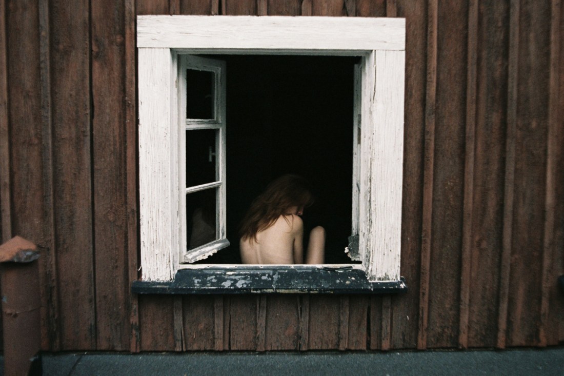
Chadwick TylerAli Michael for P Magazine (2015)

I get a lot of guff from people when it comes to my notions of what constitutes logical framing decisions.

I suppose my two responses to that would be something like:

  1. The received wisdom that one needs to learn the rules before breaking them applies, and
  2. That I am aware that I tend towards dogma with regard to certain aspects of image making–so take what I saw with a big old boulder size grain of salt.

In truth, I don’t really spend a lot of time thinking about it. The proliferation of lens based imaging methods has democratized visual culture only insofar as anyone who can lay hands on the equipment now claims to know what they’re doing. In my experience, however, the predicted increase in vitality of work turned out to be a trumped up pipe dream.

I really don’t like this frame. It’s clearly trying very hard to seem like a shot from the hip, every second of living the hip lifestyle obsession circle jerk is pure fashion poetry waiting to be memorialized by a snapping shutter. (If it was legitimately that, I’d be non-plussed but generally accepting of it.)

I don’t like that this is so carefully posturing as that but it’s difficult to hold the grudge since the Michael’s pose is so spontaneous and clearly unintended. (The fashion/glamour everything that’s not airbrushed must go aesthetic, infuriates me.)

So I find awkward poses like this–when they ever see the light of day–to be endearing. It’s like an admonition to remember that people are beautiful not only when they are trying to be or not succeding at being, they are beautiful because they are people doing the best they can with what they have.

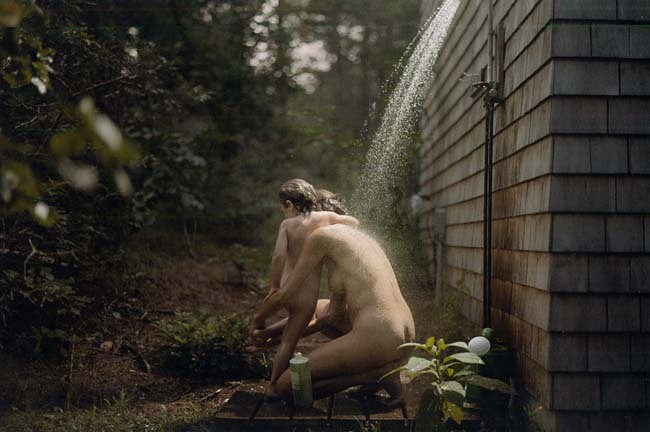
The pose also reminds me of another image I had saved as a draft but I didn’t know how to address.

Source unknown – Title Unknown (20XX)

@knitphilia one of my all-time favorite Tumblr’s and one of the  the handful of the few I sort of know AFK, posted several years ago that:

Beautiful [A]gony was possibly the first (visual) porn I looked at unironically.

I suspect there are a good number of folks out there with similar experiences. I know I’d pretty much sworn off porn until I discovered I Feel Myself.

Lately, I’ve been feeling conflicted about even IFM. For example: this clip by Anabel. It’s definitely hot–I love watching folks give themselves pleasure. But there’s this one cut away to a close up of her vulva, ostensibly to demonstrate how aroused she is. It’s a beautiful shot and you can see that she is really, really wet.

But I feel like that localizes pleasure at the genitals. And from a standpoint of porn to which I’m likely to personally masturbate–I prefer something like Clayton Cubitt’s Hysterical Literature with Stoya (Lord God Almighty, the thought of her hands as she’s orgasming makes me get weak in the knees) or the above–which I love everything about: it looks like shitty iPhone video but with a little focus on framing and lighting, the aesthetic suggests a VHS dub that has been watched so much it’s wearing out; it’s far more graphic in concept than execution and the way she keeps masturbating vigorously throughout her orgasm is remarkable. (At a certain point my nervous system shuts down and I literally can’t keep going because my body locks up. The way her body responds is exactly what happens to me when someone else makes me orgasm and keeps going beyond the point where I couldn’t have on my own. It’s been 6.5 years… I can’t tell you how much I miss it.)

Weronika IzdebskaF1020013 (2014)

I’ve always wondered why certain historical epochs contribute more than their far share of stunning Art: the Italian Renaissance, Holland during the Dutch Golden Age; Hong Kong cinema circa the early 1990s; The Romanian New Wave for roughly the last decade.

As far as photography and image making go, I can’t think of a single place in the world that is killing it like Poland.  [I actually have about a dozen pages of notes for an essay on the politics of visual representation and identity in the work of contemporary women making photographs in Poland–that’s how rich the landscape is at present.]

Izdebska work belongs to this milieu.

The image above is in one way uncharacteristic of most of her images: she usually employs a rigorously centered symmetry and then places those she shoots strategically off balance in the frame, conferring an oneiric feel to the scenes that’s straight out of mid-to-late Soviet cinema–here the camera is not square with the building; note the askew verticals compared to the frame edge as well as the lower boundary between the paneling and concrete.

It’s a small annoyance given the overall quality of the image. The limiting of the color palate is sublime and the tone that shimmers in the margin between dream and nightmare.

Also, there’s more than a casual similarity to Wynn Bullock’s famous Woman and Thistle.

(In the interest of full disclosure–I probably should admit that it’s difficult for me to be completely impartial when it comes to other image makers who are also similarly transfixed with the Icelandic landscape.)

vextape:

fourchambers:

oviduct

(support more projects)

I am gross and I love putting my fingers in things they don’t belong and I dooooon’t careeeeeee 

Awhile back one of my followers advised me that Duke University was attempting to start a Porn Studies PhD program.

I flipped my shit a lil. I mean what I’m attempting with this blog is a less formally academnified version of exactly that premise. And as much as I feel alienated from academia these days–there is a part of me that knows that if nothing else I function exceedingly well in that framework.

I looked into it and turns out the information was only about 10% true. A professor of Film Studies and Rhetoric at UC-Berkley named Linda Williams published a book called Porn Studies through Duke University’s press in 2004.

But Williams’ notions are absolutely fascinating. Via Wikipedia:

[S]he argues that horror, melodrama, and pornography all fall into the
category of “body genres”, since they are each designed to elicit
physical reactions on the part of viewers. Horror is designed to elicit
spine-chilling, white-knuckled, eye-bulging terror (often through images
of blood); melodramas are designed to elicit sympathy (often through
images of tears); and pornography is designed to elicit sexual arousal
(often through images of “money shots”).

Two things about this relate directly to what Vex and Four Chambers do and do with beauty:

So-called “body genres” tend to be relegated to a default subset I’d term not-art. (Alien would be an exception but note that it’s first a sci-film and only secondly a horror piece; and so the skillful genre fusion allows critics to sidestep the horror isn’t art prejudice.)

The work being made by Four Chambers isn’t just of an exceedingly high production value, I would argue that it’s capital-A Art.

And as much as I’d like that argument to take a form similar to the Buddhist monk who when tasked with passing wisdom to those gathered to hear him speak, merely held up a lotus leaf for all to contemplate–in other words, I’d just point to this image and say: duh, of course this is Art; there is something else that applies.

The fantasy that the majority of porn sells is centered on cishet white male pleasure. It’s formulaic and sterile–the only mess pertains to the money shot.

But, in reality, sex–at least when you’re doing it right–is hell of messy. I swear there’s a dissertation for a Porn Studies PhD just waiting to be composed about how Four Champers represents sexuality as messy and rich with fluids. (Literally pick one of their videos at random and you’ll see what I mean. The one I happen to have handy is this image that I was going to save for a future post.)

You can call it gross or more honest or both even but whichever way you cut it, there is a subversive push to decentralize the fluid mess of sex from cishet white male pleasure. Not only is that hot as fuck, its importance and absolutely vital.

Philip-Lorca DiCorcia – Wellfleet [Emma and Naomi] (1992)

If any of you knew me AFK, you would quickly realize that I am always late to the party.

I stumbled onto my favorite band of all time just before they went on a more than decade long hiatus. It took me almost two years after all the initial hubbub and hype to stop and read Patti Smith’s Just Kids (which I’ll have you know accomplishes the rare feat of being unfathomably better than all the good stuff you’ve heard about it).

Same goes for DiCorcia. I had no idea who he was until the David Zwirner Gallery resurrected his exceptional Hustler series two years ago.

I didn’t make it to that show. (I mean to go to shows all the time. I’ve been meaning to make the Jeff Wall show on now at the Maria Goodman Gallery for more than a month but I never venture north of 32nd Street, so 57th might as well be on the other side of the country. I know that’s silly but that’s how my mental illness makes it feel.)

This image–although it is from a different series, namely A Storybook Life–  makes me realize missing the Hustlers show was a monumental mistake because it seems like he’s doing something fascinating with color.

I’m not sure I can do more to point to it but my instinct is refer to the above image as painterly. Intellectually, I know that’s something likely to get you cut by a fine art photographer. And I think what’s really going on is something very much anti- the-prevailing-conversation-about-the-place-of-color-in-fine-art-photography.

It feels like if the statement that B&W highlights the foreign in the familiar, then I think that DiCorcia is actually attempting to employ color in the same way that B&W is taken for granted. It’s an audacious conceit, actually.

Further–and I’ll own my bias from the outset by admitting my abject contempt for Jock Sturges–I feel like this is a kind of implicit critique of recurring Sturges motif of nudists showering, of which this is perhaps the most famous.

photominimal:

There and Back. With Suspended in Light: Montreal / Polaroid Automatic 100 / Fuji FP3000b

I am absolutely dead-to-rights, head-over-heals for this ‘Polaroid’.

Yes, the tonal variations are effing exquisite. Note the gradual grade from right to left–reversing the convention set by Dutch Golden Age (that’s been more or less continued uninterrupted ever since).

And the light slides into the frame in such a way as to imply a right triangle. There are so many grace notes: the way the sunlight accentuates the curve of the bottle like a hand that can’t quite decide whether to lift the object or merely luxuriate in the cool press against its palm. The two plants–how they are just illuminated enough to separate them from the background, rendering them legible. The way the brightest point in the image is the echoing right angle formed by Suspended In Light’s left forearm the sink edge and the side of her top.

Oh, and the way the light from her left thigh pops against the gloaming darkness. And the second bottle to the left of the mirror with the sprig of something standing at attention. And the light on her reflected face…

Instant film stocks tend to provide an unpredictable softness of focus. It is used to masterful effect here were the paneling, sink pedastal and skin all appear to have visual texture that almost seems as if were you to touch it, it would feel like wood, porcelain and flesh.

But I think what I love most is the washing machine and dryer nudging in along the lower left edge of the frame. Not only does it balance out what would have otherwise between a frame leaning decidedly off balance to the right, the inclusion renders a greater degree of interest in the frame as a whole. There is a timelessness feel to the image but it is clearly anchored in the present.

I especially admire this image because in my own work, I am generally loathe to work indoors. I always tell myself that one day I’ll be able to afford to live in a place like the apartment in Mirror. This image serves as a reminder that even if I had that apartment, I’d still struggle to shoot in it because when you’re working in close confines, at a certain point you have to play it as it lays. I’m too much of a control freak to do that–and I think my work suffers as a result.

msjanssen:

idiedatbirth:

I haven’t Tumblred in a while.

It’s cause this girl happened.

Deal with it.

this is an amazing image…

^I agree.

But I also think it could have perhaps been improved. In tone, form and content it reminds me of Jim Richardson’s A thunderstorm halts haying as two farmers watch the sky–which is less compositionally muddled and self-contained.

I say that not as a slight to the above–just as an example of how people who make images like the above need to think differently if they want fine art legitimacy.

Paola Rojas H. & David PérezVisceral series (2015)

True fact: I was born cross-eyed.

Still being the 70s and with my post-natal health care provided by the US military, I underwent surgery that evens out the eyes by snipping muscles.

The result almost four decades later is that I only truly have binocular vision for a very short time period each day. As my eyes tire, I only use one eye at a time. I tend to prefer my left (non-dominant) eye.

So in addition to having an autism spectrum level aversion to eye contact, most 3D movie spectacle is lost on me.  (Wenders’ Pina Bauch documentary was wonderful because the use is so minimal and used to subtly emphasize depth of field and in Mad Max: Fury Road the 3D contributed an amplified sense of post-apocalyptic setting and therefore rendered the over-the-top color design less obtrusive.)

Visceral‘s palette is two tone: red and blue. As with 3D movies red advances and blue recedes–bestowing an unusual dimensionality to what would otherwise be relatively flat studio work. (I think if you donned 3D glasses, this image would probably even pop a bit.)

@lisakimberly will tell you that I’m a bit of a Rojas detractor. But I should confess a change of heart. Reviewing her work now reveals how she’s pared down her muddled early work, focusing on the more sinister and surreal threads in her work.

On the surface, Visceral hits as a bit of a left turn but the simplicity of it puts a very fine point on her technical chops and finds a way of bridging the gap between fragmentation as literally depicted to a more scientific/poetic/conceptual exploration.

And although I’m not as fond as the rest of Visceral as I am with this image, it’s still exciting work from a talented image maker who appears to be fully coming into her own.