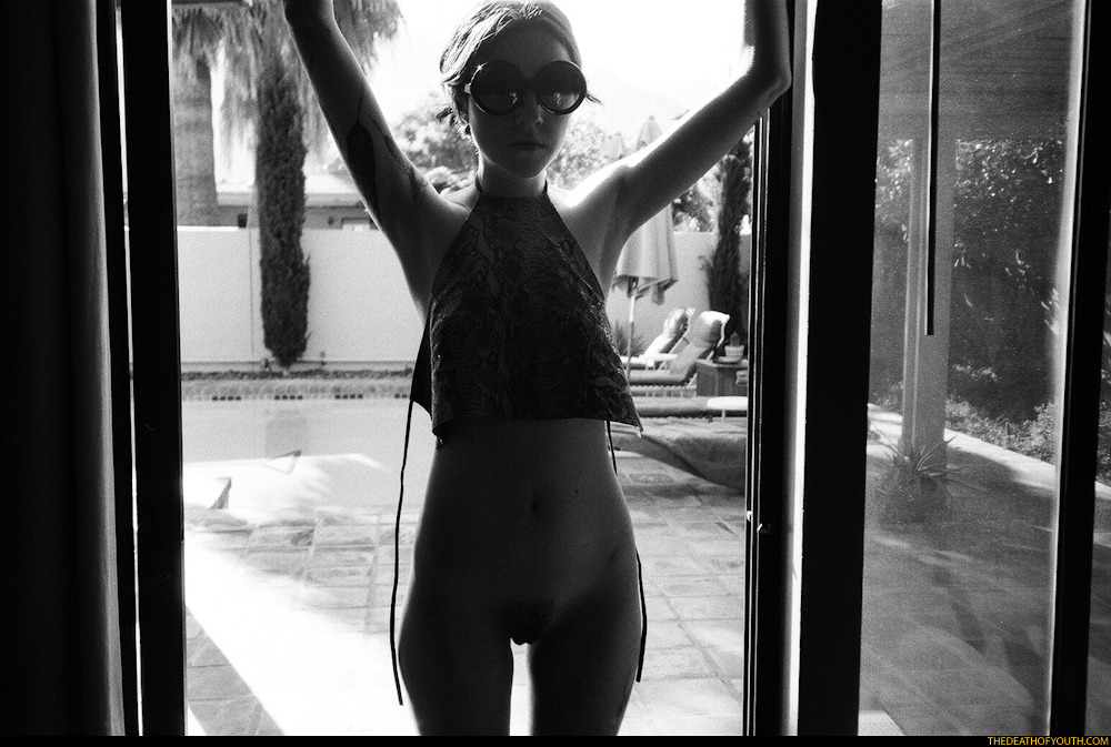
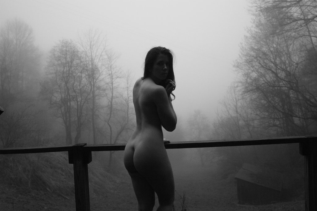
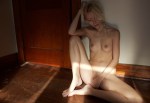
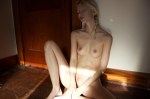
Édouard Chimot – Untitled (1930)

This is clearly a sketch. By that I mean the figures are posed for the artist to render them. Yet here, how they are rendered is interesting. The presumable draped dais upon which they are standing is rendered in the drawing in sculptural fashion–the base requiring strategic load bearing functionality to support the figures rising from it. (It bears mentioning that the shading to suggest depth is masterful and I love the simple line and asymmetrical form of the standing woman’s breasts–an incisive application of the classical contrapposto posture to a female figure.)

And although the poses are hardly exact matches, the tone does remind me very much of Gustav Vigeland’s Kneeling Man Embracing a Standing Woman.

Also, I really like the cartoon face in the margin that appears like what I’d imagine the main character would be in a Jean Vigo directed anime.

msjanssen:

lovely backlight!

The Death of YouthAlanna (2012)

@msjanssen has already covered ¾ of what’s so arresting about this image.

All I can add is that you also need to consider the angle of the light. Yes, it’s backlit; but while the background is bright and the foreground is dark, the angle of the light is falls in such a way that you can actually make out the general shape of Alanna’s face and unlike the flattening silhouetting effect of backlighting, her body has dimensionality–you can see the shape of her hips and tummy and just make her pubic thatch.

Also, you can gather enough to get a clear notion of the pattern of her top–which is super cute. The loose hanging strings contributing a casually coy hint of eroticism.

I’m generally put off by tDoY’s semi-slick, desert counter culture as new glamour aesthetic ethos. And while I think there’s room for improvement with the above image–Alanna’s left elbow gets lost in the shadowed doorframe and the down tilt of the wide angle lens renders the plumb lines of the door as converging instead of parallel and this encourages a downward cast of the gaze that walks a razor wire line between breathless appreciation and leering; in turn that renders the way both her arms and legs are amputated problematic regardless of which side the viewer tips toward.

Renée King AKA atlas-7self portrait at the cabin (2015)

I
can’t endorse the composition on this. The lower frame edge cuts right
across the knee, the off-center left position of the subject along with
the slant of the railing and that little protrusion just below the
center of the middle left frame edge set the image askew in a way that
to my eye distracts from the scene.

However, I do love pictures
featuring fog. There’s something magical about it–the foreign in the
familiar masking of it, an ephemeral, fairy tale otherworldlyness.

One of the best uses of fog I’ve encountered appears near the end of Theo AngelopoulosUlysses’ Gaze.
In the scene, fog descends on war ravaged Sarajevo, halting incessant
sniper fire–allowing folks a reprieve to walk around under its cover.
Harvey Keitel’s character walks around in a field of nearly translucent
white. It’s visually arresting in a way very few things ever achieve and
contributes a chilling weight to the subsequent events.

I feel
like what this falls short on with regards to composition is more than
made up for in tone. Only the shadows are solid. As things take on light
and shape suggests a solidity that while separate from the fog still
resembles it in texture and tone.

Andrew V. PashisRed Clover Meadow (2008)

This isn’t a good photo–the composition is more concerned with getting the shot than rendering the scene in a clear and legible fashion.

Plus, I’m really not a fan of simulation, fakery or pretense in depictions of sexuality.

However, neither trait prevents me from outright adoring this image and it’s audacity certainly helps with that. The sort of devil may care presentation reminds me that some of the best sex I’ve ever had has featured a comparable setting–i.e. a place that is exceedingly public yet simultaneously secluded enough to render the chance of getting caught with pants down or dress up is not absent but small enough to justify the risk.

The rest of Pashis’ work is significantly more thoughtful than the above. It’s possible to see the broad strokes of the visual it-factor that marks most if not all Eastern European and Russian work so that you can spot it forty yards out. The feeling that nudity although culturally mired to a degree with sexuality is more a by product of the intensity of surviving the harsh winters. A matter-of-factness about the mad desire to soak up sun with as much skin as possible during the white heat of summer.

But whereas someone like Mukhin seems charged with a certain higher octane vitality when his work witnesses the more transgressive features of Russian youth culture or someone Evgeny Mokhorev’s likely inappropriately edgy fixation on young bodies as the locus of a darker yet also truer sexual freedom, Pashis is more openly voyeuristic, classically inspired, contrived and at times unapologetically aggressive in his presentation.

Although mad props are in order for his transformation of one of Ryan McGinley’s worst images into something fantastically crackling with the unfettered potential of being young, free and if not immune to consequence then aware that there’s no bending heaven so you might as well raise some hell.

JoymiiWhat a Ride featuring Josephine and Den (2015)

There are a raft of reasons I ought not be posting this:

  • I am suspicious–at best–of close-ups (let alone extreme close-ups such as this)
  • It’s heteronormative in a way which really goddamned irks me
  • The above image has been cropped from the original (which I would’ve posted if it didn’t feature an intensely intrusive, dumb watermark).

All that BS aside, there is something not if not exactly substantive then I guess ‘considered’ about this. I don’t mean the polished gloss of it–although it certain supersedes that of quotidian porn.

What catches my eye is the extremely shallow depth of field–which allows both out of focus bits in the foreground and background.

Image makers are frequently obsessed with the flattering effects of so-called bokeh to isolate and emphasize the subject of the composition. But bokeh centers on rendering the background out of focus. Out of focus elements in the both the fore- and back- ground is more commonly associated with cinema–where due to the scene playing out of thousands of frames shifting focus can be used to guide who or what within the frame the audience is supposed to attend to. (I’ve written about this before.)

In the above image the point of sharpest focus draws attention to the act of genital penetration. In this crop, the action still manages to be ever-so-slightly off-center. No matter how pretty the soft focus, the image would’ve crumbled given knee-jerk dead center placement.

What’s interesting is in the uncropped version, everything shifts left and down. It’s a better frame by miles but I don’t think I’d have necessarily realized what I have about the image and why it appeals to me without comparing the crop and the original–although not strictly compliant, there are absolutely points of correlation with the composition and the Golden Ratio. (I recommend opening the diagram and the original side by side.)

Willy KesselsFemale nude from behind (19XX)

I’m too fuzzy on the the epoch to identify the progenitor here but this is reminiscent of both Edward Weston and Man Ray.

I’ve mentioned before that Weston’s enduring reputation is due to the brilliance of his skills as a print maker not especially as a result of his compositions.

And with Man Ray, who referred to images of himself as rayographs, there’s always a feeling I have when I look at his work that he felt the women he photographed were art only because they were fucking him at the time.

Kessels’ photo manages to skip the sentimental nostalgia for heated fumbling adolescent sexual exploration and present something unusually reserved, almost reverent.

w-y-s-f:

Hanna

Hanna GraceUntitled (2015)

Given several years, art historians are going to have to grapple with the fallout from this prevalent notion of the ‘selfie’.

For all intents and purposes, Wikipedia considers a selfie anything where the operator of a lens based imaging device produces an image of themselves. I think that’s more than a little problematic since it conflates self-portraiture with the selfie phenomenon.

What’s the difference? You might inquire. I’m not sure I have an answer and even if there were a way to flowchart things so that we can easily facilitate a distinction, I’m not sure that will ultimately be a good thing, though.

There is an art historical trend of associating women with mirrors. The most unequivocal of these instances is probably Charles Allan Gilbert’s All is Vanity–where a woman (who in an art historical perspective are always treated as if they have a corner on the vanity market) is staring at her own reflection in a mirror transforms via optical illusion into an enormous skull.

This knee jerk association of women with vanity is disingenuous considering many of the artists who ran with this motif also painted self-portraits which would have required them to stare at themselves in a mirror for countless hours. And the resulting work would be seen as meritorious and not at all vain.

More recently–the backlash over the sorority members more interested in taking selfies than paying attention to the baseball game they were attending. It’s all just an extension of the societal double standards with regard to performance of femininity: the fine line between prude and slut and regardless of how carefully you try to walk it, you’re still going to be cat-called on the streets and it’s going to be your fault for being a a woman.

But beyond that what does the term even mean? Ostensibly it means you hold the camera and take a picture of yourself. But with the advent of loathsome selfie sticks, where’s the line? Despite the visual limitations of the selfie, the results are frequently more appealing than the ubiquitous bathroom mirror reflection image.

I’m not one to poopoo any of it. If your preferred method of ontology involves self-portraiture, I am 120% an ally. (However, I do think like anything else there are pitfalls–I’m thinking of the young woman who recently acknowledged her Instagram wasn’t as candid as she presented it to the world and the toxic effect it had on her self-esteem.)

But most of all I don’t want work like the above images by Hanna Grace to be lumped in with the sort of casual, knee-jerk let’s take a picture because it’ll last longer motivation of selfies.

Maybe it’s snobbery but a part of me thinks if you take the time to set up a tripod and think about your framing, there’s more going on than something incidental. Not that making selfies is always easy–I saw two young woman on the Brooklyn Bridge several years back spend close to 15 minutes taking and retaking the same image to get it right. I won’t deny there’s an art to that but I think that the highest that a selfie can aspire to is probably a well-made document. There has to be more than just capturing the moment.

And that’s why I like these images so much. I’d hate to see them termed selfies. There’s thought behind them. A sense of the tone of the room, dynamic light. But also implicit interrogations over questions of the cultural sexualization of nudity–the way that the shining through the top of the window creates a frame within the frame that is aggressively controlled and shaped by the woman in the image. It conveys a totality of personhood.

I’m not sure these are effective as examples of fine art, necessarily. The pose grows increasingly confident/less awkward from top to bottom. The exposure is best in the middle image. Also, the middle image makes the best balance between the space occupied by Grace’s body in the frame contrasted with the room as negative space.

If you take the three together though and sort of take the mean average, I feel like they are sketches that could be used as fodder for a truly breath-taking image.

Rick Ochoadust and dusk (2014)

Ochoa passed away last year.

I didn’t know him and was not especially familiar with his work. But I did note the outpouring of grief regarding the loss of a dear friend, trusted co-conspirator and ally.

I’m a little late arriving but this image takes my goddamn breath away.

First of all it, reminds me of this iconic shot of Marlene Dietrich in Shanghai Express. Not in execution so much as substance–there’s a sense of individual agency, verve and independence. As if in the moment where the scrim separating performance of identity from bed rock selfness caught in a breeze and at the exact second the rift between the two was the largest, the shutter clicked.

Second there is something not unlike the tension in the best Vermeer’s, where you find yourself thinking that in a moment the maid will have poured all the milk out of the pitcher, that the letter will slip from the young woman’s hand and drift like an autumn leaf to the floor. Is the girl with the enormous pearl earring turning toward you or away from you?

Is the model Penelope Machine breaking eye contact to experience her own inner world exclusively on her own terms or is she about to make eye contact and share something devastatingly wordless but immediate and true in the way that only standing in the truth of the moment with another?

What I’m saying is that Ochoa–unlike so many of the rest of us who think Barthes’ notion that photography is death obsessed–find a way to make photos that if you turn your ear to them, you might well hear the faint ticking of a clock. Or in this case, the beating of a heart.

Daisuke YokotaUntitled from Taratine series (2015)

I can’t look at Yokota’s work without thinking about disintegration.

His work emphasizes imagery keen on eschewing concrete visual representation and instead offering something teetering on the brink of abstraction. The effect might best be described as a strobe used with infrared film shot in near complete darkness and the film subsequently pushed, over-developed or otherwise mangled post exposure. There’s frequently a fixation with grain enlarged to the size of golf balls, the space between grain as a sort of craquelure; fixer streaks mar the film, dust and hair become randomized, scintillating scotoma-esque focal points and the occasional hint of color reads somewhere between an opalescent oil smear on rainwet asphalt and B&W negs left to sit overnight in spent blix.

I’ll grant the use of color is masterful. But for the most part methinks the work doth seethe too much. It’s too bleak to be so entirely ambiguous about whether what it’s presenting is beautiful, a nightmare or a bit of both. (I’d wager that Yokota is probably very into Brakhage.)

That’s why the Taratine series appeals to me–unlike the rest of the work which seems clinical and detached. There’s a sense of relationship and involvement, something from which the rest of the work suffers from the abject lack of.

I object to a lot of the compositional decisions undertaken but there is something compelling about the poses in the above images. Except for the miasmatic haze hovering above the figure on the bed, the image on the right might very well be a lost Callahan of his beloved Eleanor. It’s all more painterly than that and I can’t help but think of someone like Titian or Goya.

Yet, what’s most fascinating is the image on the left. The pose is stunningly dynamic–but the visual dynamism of it is actually played away from the camera but in a way where it isn’t lost in the image.

It reminds me of Romanian auteur Cristian Mungiu’s post screening comments at the US premiere of Beyond the Hills. He spoke about working exclusively with long uninterrupted takes and how frequently at least one of the two phenomenally talented actresses wound up with their back to the camera. How does a performer convey emotion when at least half of their facilities for expressing that emotion are obscured? We in the modern world have a desire to see everything in an immediate, unmediated fashion; this urge is actually to our detriment as frequently what we don’t see is more compelling than what we do see and how an awareness of this notion permeated much of the blocking in the film.

If I had the opportunity to ask one question of Yokota, it would be: to what extent are you consciously aware of trying to formulate a new language of photographic representation of the human body exclusive to lens based visual culture?

It may not be at the forefront of his practice but it’s something that would very much be in keeping thematically with his work up to this point. Further, I think it’s actually an entirely crucial endeavor.