Source unknown – Title unknown (201X)


Source unknown – Title unknown (201X)


Source unknown – Title unknown (201X)
Usually, I’m a hard pass when it comes to close-ups.
It has to do with a certain lack of subtlety–like an insert shot in a movie where a character is shown gathering her things in order to leave the house and we see a shot of her grabbing her phone off her nightstand. It’s a knee jerk way of saying PAY ATTENTION TO THE PHONE, IT’LL TURN OUT TO BE IMPORTANT LATER.
A better example might be the detail in insert in an Art History text. You see Van Eyck’s Ghent Altarpiece in all it’s grandeur and then a close-up examination a of the strange fruit Eve is holding in it. Essentially, a close-up only really works/is necessary when it is presented in spatial and temporal context–i.e. cinema; or, it is intended to draw the viewers attention to something they might not otherwise notice.
And therein lays my beef with close-ups in still photography/digital imaging: unless the author is using polyptychs (and I can’t picture a way that would work off the top of my head), the close-up only functions when it conveys both its own context as well as clearly depict that to which the viewer is supposed to attend.
I like to think this is what Baudrillard had in mind when he noted (in Why Hasn’t Everything Already Disappeared?): “Behind every image, something has disappeared. And that is the source of its fascination…“
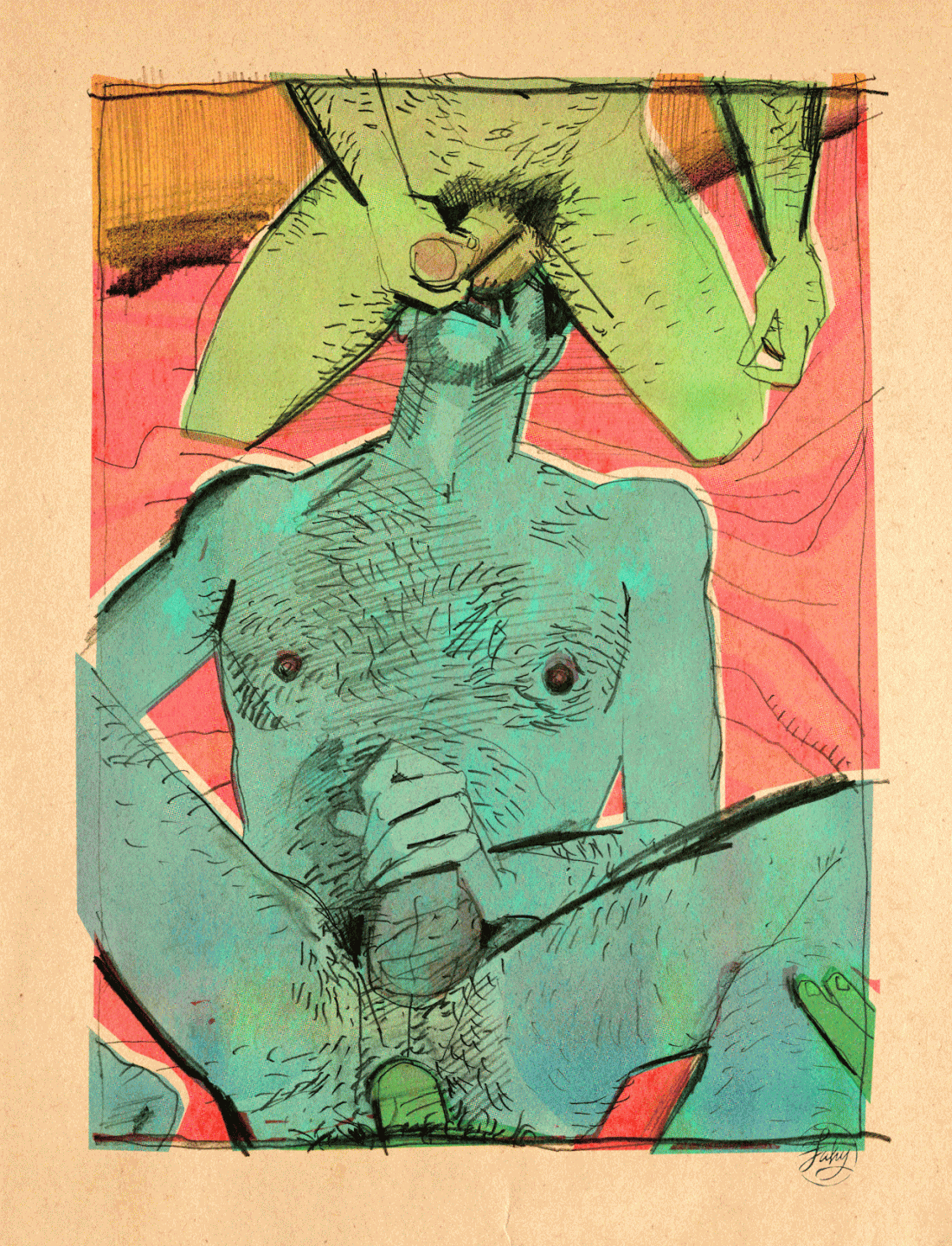
In the case of the above image–the scene has been reduced to two hands and –while I try very hard not to comment on the attractiveness of genitalia, these are some effing gorgeous gonads. (In the interest of equal representation, I’ve had this image sitting in queue for months. It’s a bit on the nose with the flower tattoo echoing Bailey Rayne’s labia–but it’s also an example of aesthetically breathtaking nether bits.)
What’s interesting here–at least for me–is that when you see ostensibly one body (the dangling balls and spread legs) with two hands there’s a tendency to attribute the scene to one person. And, actually, that isn’t the case here: this image shows a minimum of three different people.
It reminds me of the only David Foster Wallace book I’ve ever attempted to read. No, not Infinite Jest–I’m the only trash hipster girl who has never so much as pretended to read that one. I’m talking about Everything and More: A Compact History of Infinity.
The first 100 pages are breathless in their lucidity, wit and intrigue. The between the theoretical math and the footnotes I get completely lost.
But one of the things I learned is that we think of infinity as n+1 where n is any positive integer. But infinity is also n-1 where n is any negative integer. And! there is an infinite number of intervals between 1 and 2 and between -1 and -2. Infinities upon infinities.
Hold onto that bit for just a second. I’ll be getting back to it in a second.
I’ve also talked before about how there are times when the composition and order of a frame call for the viewer to consider what’s beyond the edge of the frame. Others, less so.
I’d venture to say that an effective close up is almost required to cause the viewer to consider what was cut out of the frame. (The above does this with aplomb.)
So I guess a good close up is kind of like infinity in that it finds a way to point to both the macro and micro. So, like David Foster Wallace, it’s not only interested in large and small, it’s interested in the infinite number of ways you can slice up the space between any two numbers.
Really, it’s not that close-ups are intrinsically bad–it’s that it requires a great deal more work to get them to operate with sensitivity, grace, subtlety and nuance.


[↑] neverlaandss – start somewhere (2015); [+] Source unknown – Title unknown (201X); [-] Source unknown – Title unknown (201X); [←] Boris Demur – Poem Flag of Spiral Deterministic Chaos in Spiral Yin Yang from Spiral Poems of a Flag series (20XX); [→] Carlos Cruz Diez – Title unknown (20XX); [_] theworldwithinthewords – for more than this is mind #12 (2017); [↖] Michael Storyteller – Stuck in the middle again (2015); [↗] Le Cam Romain – aida & jordan, paris (2015); [↙] Source unknown – Title unknown (201X) [↘] X-Art – In the Blind feat. Little Caprice (2014) … [↑] Source unknown – Title unknown feat. yhivi (201X); [+] Source unknown – Title unknown (201X); [↓] Jonas Mekas – As I Was Moving Ahead Occasionally I Saw Brief Glimpses of Beauty (2000)
The way I use Tumblr is that I follow the blogs I follow and once every day I scan my dash until I get to the point where I start repeating stuff from the previous day. I like what I like as I go.
On weekends, I treat my Likes page as if it were a smaller version of my daily dash and I pull from that into Drafts.
What governs the decision to save something to drafts is almost always more of a feeling of “I need to showcase this post” more than any notion of having something structured to say about it, as it were laying there ready made in my brain.
Frequently, things make it into Drafts and I just can’t figure out what to say about them or where exactly they fit.
The above started as an effort to clear out my drafts–which is beginning to become downright cumbersome to manage. It was strictly a counting exercise. One person. Two people. Three people. Then it morphed and became not exactly storyboards but sort of a loose thumbnail index of some sort of artsy porn video.
(A digression on process. I am not in a good place right now–mental health-wise. It’s actually really bad. I feel like I have nothing really to say about anything. It’s partly that my head is a mess. And partly that it’s becoming more and more clear that my ability to express myself sexually with another human is no longer something I have recourse to in this life. Whatever. Sucks to be me, I know–but what this exercise has demonstrated to me is that there is some merit to the creative advice that you just have to force yourself to sit down and do the work. I do think there’s some truth to the idea that sitting down and staring at a blank page for eight hours day in and day out is actually very detrimental. But I think it takes a while before you get to that point–like maybe three days. The problem is we frequently won’t sit down because we expect the outcome will be negative. You gotta make time to do the work.)
Anyway, I won’t argue that what I’ve stitched together here is good or even interesting but it did suggest several thoughts.
I wonder what the ratio is of production of pornographic vs Hollywood features in any given year? Probably at least 10-1 (porn to features), right? That’s a lot of content. I wonder why more artists don’t use it.
I mean I know some do. There’s those memes where you take porn scenes and photoshop over them so it looks like a starlet is eating an ice cream cone instead of fellating some stud. (Or, if you prefer things more arty….check out Brian Steinhoff’s Porn for the Whole Family series.)
It’s no secret that a veritable litany of art legends hired sex workers as models. So there’s even a precedent for this sort of thinking. But what I’m interested in–and another essay I’m unlikely to ever actually get around to writing: pornography as taxonomy.
Helix Studios in collaboration with Matt Lambert – Flower (2017)
(The link for the title connects directly to the clip. The comments below refer more to the video than the above stills.)
Okay, so the trend where image-makers place some object super close to the camera so that it blocks part of the scene but is so completely out of focus that you can’t tell what it is–I guess it’s supposed to contribute a fly-on-the-wall immediacy?– is really super irksome to me.
Moving beyond that: I don’t understand 90% of the composition choices in this video. Don’t get me wrong it looks reasonably good–a broad dynamic range between shadows and highlights, naturalistic color fidelity and an attention to enhancing light to set the tone for scenes. (Erika Lust could learn a fuck tonne from this–although admittedly her compositions tend to be far more thoughtful.)
I do like the attention to sound design–the way heavy breathing was recorded and mixed is awesome. I don’t like the unnecessary fragmentation–I think it’s supposed to be diegetic; I think the scenes that don’t happen at the party, in the bedroom (the night exteriors) represent fantasy that one of the participants in the foursome is having. (Formally though that doesn’t work since all the participants are featured more or less equally, there’s no way for the viewer to identify who is experiencing the fantasy.)
This clip also ties into something else I’ve been realizing recently: visually differentiating between celluloid and digital. It’s a bit like the question of whether a zebra is black with white stripes or white with black stripes.
The emulsion on a film strip is exposed to light, creating a photochemical reaction where darker areas appear brighter (on the negative) and brighter areas appear darker. Essentially what the emulsion does is burn away where things are brightest–leaving only a thin layer of textured residue, if any, behind. Similarly, where things are dark, the emulsion experiences less of a photochemical reaction, leaving more of the emulsion in place.
When you pass light through the film strip the places where there are still emulsion block light passing through–thus looking at the film strip it appears that light and dark are reversed. But when you shine light through the image onto a sheet of photo sensitive paper, light shining through the thinner patches of emulsion appears brighter than the darker areas where the emulsion blocks light passing through the film. (Also, because most modern film emulsions utilize some sort of layering in their manufacture, an expertly exposed frame possesses a dimensionality in the grain structure formation that if one is an astute printer, can actually contribute a nearly impossible depth to the printed image.)
Or, to be succinct–something at which I am almost always abyssmal: photography studies light by documenting shadows.
In digital formats, you have 255 gradiations between your brightest highlight and darkest shadows. Thus, when you are shooting any scene, you are essentially recording the available light by placing it into whatever cubby hole between 0 and 255 the pixel on the sensor deems the light to be.
As such, digital is a record of luminosity (light).
Back to the zebra analogy: A simple way to discern celluloid from digital is to ask: whether black dominates or whether white dominates–the former is a indication of film, the latter indicates digital. (The exception to this is Jonathan Glazer’s Under the Skin.)
The above video is a great example of highlights being dominant because that vast majority of the scenes are brightly backlit. But, if you are interested–and keep in mind that it’s less clear watching a digital version of something as opposed to going to a screening where film is projected–compare this video with Blade Runner and my point will become astonishingly clear to you.

Source unknown – Title unknown (201X)
“Maybe I’ll be able to look harder at the past by getting some experience in the present.”
–Nagata Kabi, My Lesbian Experience with Loneliness
Steven Meisel + Bruce Weber – Safe Sex Is Hot Sex campaign (1990)
Generally speaking, I am loathe to take taxis. My legs aren’t broken and with enough time I can walk just about anywhere I’m inclined to go. (Or, I can walk to a subway that will then take me to where I want to go.)
Recently, thought my flight got in super late and I had to be at work at 7am the next morning–so I cabbed it. Since I don’t take taxis, I don’t know if it’s just a NYC thing but the cab played this like 7 minute loop of commercials again and again.
One of them was an anti-drug campaign encouraging parents to talk to their kids about drugs. The premise was these teens in idyllic teen settings being–ostensibly–teens before asking the camera overly earnest questions about drugs.
The only reason I even noticed the commercials was because I was seeing it for like the fifth time. And like the third time I saw it, I’d remembered how it occurred to me late last year exactly how appallingly racist a lot of the anti-drug propaganda was in the mid-to-late 80s.
So it was through that filter that I saw the commercial and I realized something about almost all anti-drug adverts: their bread and butter is conflating drug use and drug abuse (two linguistically distinct terms–and that’s for a reason).
When you see things that way there’s only one option: eradication and selling that entails an abstinence only message. (Anyone who’s bothered to do any research into methods of decreasing drug use and abuse, knows the only statistically proven means of accomplishing this is through emphasizing harm reduction/education.)
But there’s more to it than all of that. The thing that struck me about the commercial I saw in the cab was that the kids in it were impossibly uncool. Like I remember seeing ads of this ilk when I was a teen and I just thought they were normal kids like me.
Yet watching the commercial I was like–these kids are lame as fuck. There’s this charmed naivete that each almost certainly had to be coached by the director to achieve. The notion that nothing bad ever happens in this world, nothing ever hurts and that if you trust in society’s virtue, you will be rewarded. And that’s just–such bullshit.
It’s not that abstinence (whether referring to drugs or sexuality) is a bad thing, it’s just how folks are or aren’t wired. The notion that if you teach someone about something they are more likely to do it is such rubbish. Education allows you to make more informed choices–it’s that simple.
And that’s what I love about these ads. Instead of being like sex is scary and should be avoided their like: sex is awesome, have as much as you can but be safe. It’s refreshing to see someone get it right for once.