


[↑]
Valery Todorovsky – The Thaw s1e5 feat. Anna Chipovskaya (2013); [-] Chris Heads – summer italia (2017); [↓] Zishy – On Answering Prayers feat. Basil Navas (2017)
Follow the thread.
[↑]
Valery Todorovsky – The Thaw s1e5 feat. Anna Chipovskaya (2013); [-] Chris Heads – summer italia (2017); [↓] Zishy – On Answering Prayers feat. Basil Navas (2017)
Follow the thread.

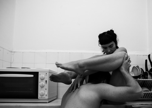
Paola Acebedo – Tiran Como Conejos (2012)
I’m of the mind that anyone/everyone is capable of making an objectively good image.
This begs the question: if anyone can do it, does that preclude lens based work from consideration as art?
Well, if you’re a photographer or image maker you already know the answer: of course not! There’s more to photography/image making than producing an objectively good image.
First off: you have to know a successful photo or image from an unsuccessful one. And this is one of the things with which photography/image making will forever struggle: each and every one of us has been inundated with lens based visual culture since birth–as such, everyone thinks they’re already a subject matter expert. (I’ve been running this blog for 5 years and I was a freaking MFA Photography student for a bit before I got seriously disenchanted with the whole charade and dropped out; point being I’ll be the first one to admit that my knowledge on the subject is found–more often than not–to be lacking.)
But distinguishing between a successful photo or image and an unsuccessful one isn’t always straight forward. Much in the way that you can ask a room full of 18 undergrads to define love and receive 36 different, often conflicting responses, show a group of folks an array of 36 different photos/images and while there’s likely to be more overlap than you did asking them to define love, there will be no immediate agreement.
I think: a lot of people privilege their own perspective. (And I do not mean that pronouncement as an implicit value judgment–only insofar as one is aware of and takes account for this bias; I will not abide blissful ignorance or arrogant equivocation.) Most beginning photography students believe themselves to be the next Cartier-Bresson just by virtue of the ontology of their status as a photo student. Hell, I did too when I first started.
The difficulty with that perspective is that you tend to use your misguided belief in your own creative infallibility as a means of justifying the importance of your Perspective. Yes, there is value in those truly outstanding makers who teach us new ways of seeing. However, of those, truly great visionaries–and pro-tip: a true visionary isn’t going to dub themselves as such (sick and tired of advertisements for hacky visual crap by the likes of dimwits like Zach Snyder and Gore Verbranski being termed ‘visionary’)–the ones who never bothered to scuffle along, stumbled and fell repeatedly trying to learn both the basics of visual grammar and the grown more intimately familiar with the history of the form, are the exception that proves the rule.
It’s dumb (again not a value judgment, more a noting of self-imposed limitation) to think you know better just because you’re doing the work.
Second, being able to distinguish between an objectively good image and an objectively bad image is one thing. Much in the same vein that we teach children to choose between right and wrong only for the child to grow up and realize that decision making in the real world rarely affords such simplicity. Frequently, you’re left with work that isn’t exactly bad but isn’t actually good either. (This is actually something I’m struggling with in my own work: the hard wired urge to include the objectively good over the technically muddled but luminously singular work.)
I’m not controverting @reverendbobbyanger‘s recent Sunday Post reminding that: good enough is not. I’m merely saying that photography and to a lesser extent image making–due to the rapidly advancing technology available for digital intervention/manipulation–WYSIWYG… it’s not like a painting where you can shift things around to suit your purposes after you’re well and truly off down the road.
But I’ve danced around enough the reason I’m getting into all of this is because I think the above image is a stellar example of reclaiming an image that was objectively muddled.
The image itself does not work. Yes, the compression of color is interesting–the cabinets, tile and dishwasher create a palate accentuating the skin tone in such a way that it sort of permeates the scene–much the way the smell of sweat and sexual effluvia swirls around the entwined bodies of spent lovers. There’s also something to the staging that seems exaggerated and awkward but at the same time conveys something of the experience of saying to a new love, I’m not sure I can get off again but maybe let’s try anyway.
Note how the camera is askew in alignment with the back wall–i.e. the right side of the camera is angled back and away from the wall, as opposed to being on a rigorously parallel plane to it. Further, the vertical frame edge is not squared with the seams of the cabinets/tiles in the backsplash; the slight uptilt only serves to exaggerate these flaws. (Emotionally, this was the right choice and it opens up the frame, providing more context; conversely, the dishwasher and the area in the top, right hand corner really screws with the visual flow as the eye scans the image.)
In other words, there are interesting things about the image. But it doesn’t exactly work. How do you solve a problem like that?
Well, Acebedo, broadens the context but presenting the image as if it were pinned to a page in an old album with yellowing scotch tape. It renders the image more inherently visceral. (Also, mysterious.)
But the thing I like most is how it preserves the anonymity of the participants. I cannot even begin to articulate how adamantly opposed I am to decapitating anyone in an image to preserve anonymity. There is always a way to include the head in the frame and then to–if need be–creatively obscure it. This is a great example.
Finally, I love that this adopts the fine art photographic tendency of naming a picture in such a fashion where the title merely describes the image. (A great way of underscoring that the image speaks for itself.) Here, you don’t have to have taken a day of Spanish to be able to perfectly translate the title: They fuck like rabbits.
Also, you really should check out Acebedo. There is something profoundly lonely about her work but it replaces sadness and longing with the feral possibility inherently in being alive and breathing.
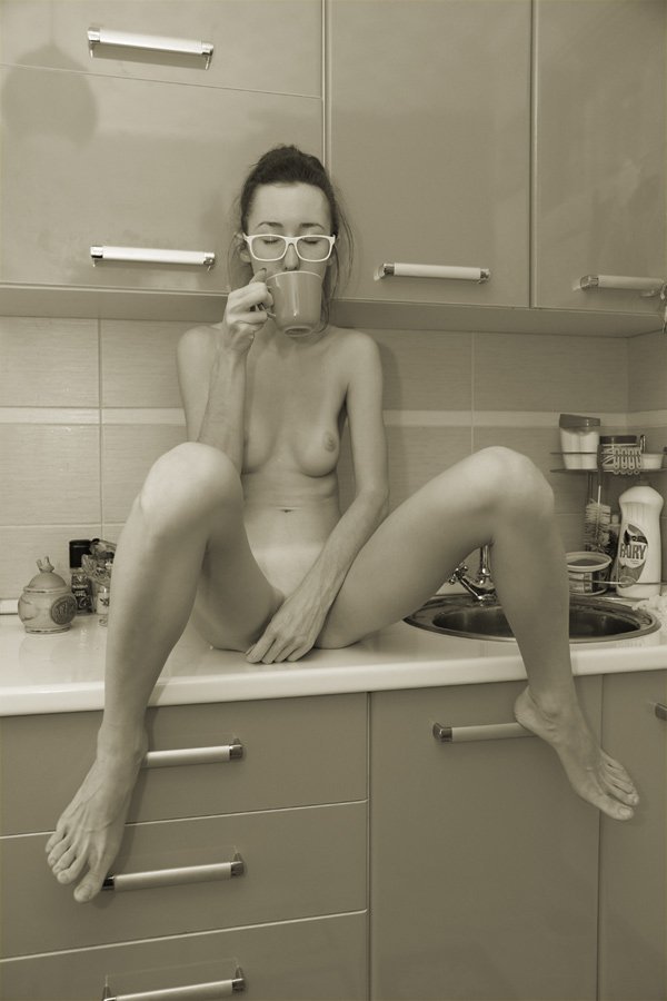
Source unknown – Title Unknown (2010)
For the record: this ISN’T #skinnyframebullshit.
Which is not to say I entirely understand or agree with the orientation, but there is a persistent logic to it–the verticals are level with the left and right frame edge and the way the horizontal seams stand in relationship to the horizontals recalls Piet Mondrian.
To understand, why the vertical composition isn’t as problematic here, it’s necessary to examine the complications presented by a horizontal frame. There’s only two ways it can go: either you increase the amount of the kitchen around the subject or you place the camera closer to her.
Both these options diminish compelling facets of the original. In the first case, a wider shot of the kitchen increases negative space while decreasing immediacy/intimacy; in the second, you’d lose a good bit of the way the upper cabinet’s glossy finish blurrily reflects the rest of the room the viewer cannot at present see–suggesting a holistic and somewhat immersive totality of space.
Thus, whether I completely agree with the orientation or not, there is a clear, legible logic guiding it.
Yet, that’s not even what I like most about this image. What gets me is the way that it manages to stipulate it’s own context. Namely, if you’ve spent any time on Tumblr you know that disgusting creeps who bully, belittle or attempt to shame folks who post nudes–as if naked bodies are always inherently sexual.
I 120% support people who want to post nudes and not get shit for it. At the same time, I do often wonder to what extent failure to address such work from the vantage of its position in a particular traditions, be that nudes or fine art nudes… I do feel that there is a pervasive thread of believing that the master’s tools will eventually dismantle the master’s house.
In other words, we all just need to do better. To insist our work isn’t about sex or sexuality when it includes nudity and that’s it. Unfortunately, that ignores a shit tonne of subtlety and nuance. It can be both or neither or something else entirely.
What I like about this is it feels like a self-portrait. A sort of this is who I am when I’m authentically me–I get up in the morning and sit my bare ass on the counter while I drink my coffee.
The image conveys a real sense of comfort in one’s own skin. Simultaneously, there’s an awareness of the relationship between the subject and the camera. A sort of hey, this is how I roll and I want to document that but at the same time someone else isn’t necessarily going to see it the same way I do.
The way her eyes are closed and the way her left hand is positioned completely frustrated any sexualization of the image. And the brilliant thing about the work is it makes it seem incidental. There’s no sense that I’m covering myself because I’m ashamed, it’s more an: oh, this way I’m sitting which is super comfortable to me might be more than you want to see of me, so I’m going to address that in a way that doesn’t diminish how comfortable I am rn.
PS Super bonus points to you if you noticed the Fairy dish soap. It’s apparently a brand distributed in the UK, in case you care.
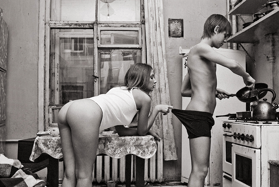
Igor Koshelev – Утро доброго дня (2010)
My Russian was never exactly, how you say: хорошо and the title of this seems untranslatable in an idiomatic sort of way. Best guess, it means something along the lines of the way you might pass a neighbor on the street and as if to indicate the pleasant weather, you were to say: looks like it’s gonna be a wonderful day.
…
I like the way the title functions here. It doesn’t add anything–only reifies what’s there. It’s the way a narrative image should be titled. Not that this is a narrative image, mind you but it’s at the very least on the right track: you have characters, setting and an inference of what’s happened previous and what will almost certainly follow (i.e. this is a new couple who’ve probably been up late into the night fucking and are about to digress into a diversion that will result in eating their breakfast cold).
There’s too many questions for me to suspend my disbelief enough to accept that this is representative of a narrative. I have no idea if this is her place or his. My suspicion is it’s neither–it feels like a while the parents are away the kids will play sort of scenario; yet there is nothing in the image that speaks to that question. (Also, I’m reasonably willing to bet this image was not taken in the morning. You stare at B&W negs long enough and you start to pick up subtle tones and textures. Gun to my head, I’d swear this was shot on an autumn evening in a decidedly northern latitude.)
…
This is really the only image of Koshelev that is tolerable. The rest are complete garbage–like truly fucking terrible–which is odd considering despite it’s flaws, this would seem to suggest that this might be the early work of a wonderful photographer.
Libby Edwards – there are no boundaries anymore/just purity/just us (2012)
You know that smart ass quip that there are two types of people in the world: normal folks and then those who separate the world up into two types.
Yes, there’s certainly a kernel of truth there–things in the desert of the real rarely divide cleanly or suggest such neat polarity with easily navigable spectra between.
However, as long as either/or dichotomies are invoked as a genesis point (a means to an end instead of an end in and of themselves), I think they can be useful.
Take this image. It’s crossed my dash probably several dozen times in the nearly two years I’ve run this blog. Technically, it has a heavenly choir of problems: the camera’s slight up tilt combined with counter top reinforcing the lower frame edge draws attention to the asymmetry of the corners where the walls meet on either side; I would wager this was taken with some sort of matrix metering setting–resulting in the skin tone being what I’d call a Zone IV instead of halfway between Zone VI & VII.
In other words, it’s technically flawed.
Now, I’ll be the first to admit that the technical interests me. I would even go so far as to say I consider quality of craft a major turn on. Still though all the technical know how in the world doesn’t count for fuck all if there’s no mojo.
What do I mean by the oh so technical term ‘mojo’; heart, honesty, integrity. For example: I can’t fucking stand Monet but you’ll never hear me question the importance of his work. Just because it doesn’t appeal to me doesn’t mean I can’t be convinced through and through that the way he painted was a painstaking effort to share the wonder he say in the world.
But back to my original notion–for the sake of argument: let’s say that there are two sides of the image making equation; namely, the technical and the spiritual.
This image is off-the-goddamn charts in terms of presenting the truth of a discrete moment. It’s technique could be improved but there’s enough merit to it as it is that it sort of diminishes any potential criticism that can be leveled here.


Normal
0
false
false
false
EN-US
X-NONE
X-NONE
/* Style Definitions */
table.MsoNormalTable
{mso-style-name:”Table Normal”;
mso-tstyle-rowband-size:0;
mso-tstyle-colband-size:0;
mso-style-noshow:yes;
mso-style-priority:99;
mso-style-parent:””;
mso-padding-alt:0in 5.4pt 0in 5.4pt;
mso-para-margin-top:0in;
mso-para-margin-right:0in;
mso-para-margin-bottom:10.0pt;
mso-para-margin-left:0in;
line-height:115%;
mso-pagination:widow-orphan;
font-size:12.0pt;
mso-bidi-font-size:11.0pt;
font-family:”Garamond”,”serif”;}
If it moves, Igor Mukhin likely shoots it; if it doesn’t, he’ll still take aim.
With nearly 5000 images—split between B&W film scans and Leica AG M9 captures, amassed over 6.5 years—perusing his photostream is like mainlining a hyper-distilled, chaotic mélange of interesting, occasionally ingenious work.
My head doesn’t wrap around such profligate excess easily—limitation is too central a feature in my own process. (Read: I am poor.) But I can let that slide. What I fail to fathom is how Mukhin’s haphazard, throw-it-at-the-wall-to-see-what-sticks curatorial approach works at all, let alone results in such jaw-dropping examples of all that photography should embody.
(To avoid unnecessary disappointment, skip his staid personal website.)
