danish-principle:
foxphotoart
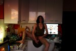
Fox Photo-Art – Glass Olive [from the Voyeurism Series] (2013)
Initially, I see the stone wall and sapling filtered, dappled light. All of it pulls up a step or two short of full blown flashback to strolling around Fort Tryon Park on a summer afternoon.
This feeling motivated me to look into Fox Photo-Art.
Le sigh. What is it with image makers bearing vulpine monikers and their privileged insistence upon producing self-important, creatively stunted dreck and deeming it ‘art’?
Usually, this attitude causes me to dismiss the work in totality; however, it somehow increases my appreciation of the above image even if there’s nothing especially inspired about it.
Yeah, the composition is solid: the angle of the ledge leads the eye to Glass Olive; her body is situated parallel to the focal plane so her legs can remain open toward the camera.
Unlike the more natural, obviously comfortable positioning of her legs, her upper body is rigidly posed in order to facilitate reflection of light from the bright white pages of Margot Mifflin’s Bodies of Subversion onto her face.
To my eye there’s a startlingly nuanced yet fraught conceptualization at work here: using Ms. Olive’s face to establish a counterpoint to the focus on her pubic area.
Glossing over the implications with regard to matters of heteronormative gaze and sexualization/objectification of female bodies, this strategy somewhat succeeds. Although, it should be pointed out this counterpoint unbalances the image; and only works due to the dimensionality contributed by the angle of Ms. Olive’s legs balanced against the essentially decorative negative space occupying the left third of the frame.
I am almost always appreciative of clever framing. But what fascinates me here is the degree to which the subject remains completely indifferent to being seen in spite of all the visual cues pointing to the precision with which the scene has been staged. The most obvious being that no matter how much you fidget, wiggle or kick, even given the audacity of sitting in such a way in a dress sans undergarments, dresses only fall like this as a result of being carefully arranged.
It’s like the Fox Photo-Art can’t decide whether he’s dealing in conventions of public nudity or upskirt shots.
Speaking of the latter: recently, I’ve seen some commendable efforts (like this) to recast an otherwise exploitative genre in a more consent-driven, body positive/sex positive manner.