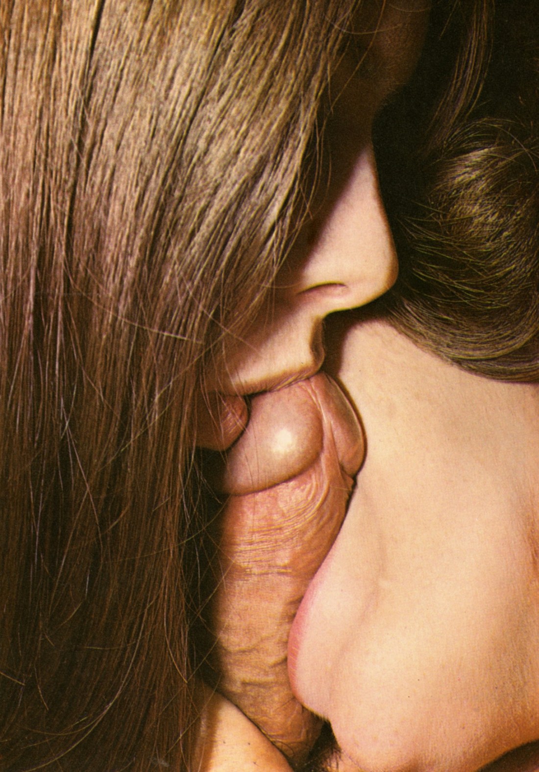
Source unknown – Title unknown (197X)
Don’t we touch each other just to prove we are still here?
— Ocean Vuong, from ‘On Earth We’re Briefly Gorgeous’ (via soracities)
Source unknown – Title unknown (197X)
Don’t we touch each other just to prove we are still here?
— Ocean Vuong, from ‘On Earth We’re Briefly Gorgeous’ (via soracities)

Denis Piel – Heat, Santa Fe, NM from New Mexico portfolio (1984)
Here’s an image which triggers so many associations/causes memories to effervesce unbidden, causing me question my own objectivity in appraising its merits.
The frame is bifurcated: upper half vs lower half. Several interesting things are going on with this. First, the upper half does take up slightly more of the frame (like just eyeballing it I’d say that top is 55% and the sand in the lower half is about 45%).
The upper half has all the detail, contrast, dynamic range–all the positive space; whereas the lower half remains (except for the inspiredly disturbed sand between her right elbow and his left hand and the contrast added to the texture of the sand to create a slightly darker swath of sand radiating up and rightward from the lower right corner of the frame).
This has an odd way of perfectly balancing the composition.
Perfect symmetry is one of my interests as an image maker. But once you get right down to it, actually perfect symmetry is virtually impossible. Even the best lenses have some sort of distortion. Thus, my interest is always piqued when photographers find ways of invoking the spirit of the law of symmetry without being slavishly beholden to the letter of those law.
But I’m also fascinated with this image because of the way it simultaneously reveals and conceals–which is a stellar example of the conceptual underpinnings of the image echoing the physical form (composition). It literally both reveals and conceals the lovers–rendering the visible but also wedged in deep shadows. There’s the desert sand juxtaposed with the chrome and tires. Also, this is ostensibly a public space wherein something that is supposedly private is occurring, presumably surreptitiously.
It’s a narrative image–even if it is too vaguely defined for the viewer to penetrate further than the scenario. A man and a woman taking shelter from the sweltering mid-day sun to communicate their physical passion for one another. There are no indicators of who they are–although I’m inclined to say she’s aristocratic (pale skin); whereas, judging by the depth of his tan, he would almost certainly have to worked outside under the sun for years.
What resonates about this most with me is it invokes a memory of my last trip to Iceland. I’d spent the day in Skaftafell and was taking the bus back to Reykjavik. The bus stopped at Seljalandsfoss in the final half an hour of light– Everything washed in an thin orange patina. I remember being impressed with the vistas but feeling that there wasn’t really a incantatory photo waiting to be discovered.
Yet, as we boarded the bus and continued on our way and the light emptied from the landscape and the sky, we passed through the seemingly endless stretches of lava fields between Seljalandsfoss and Skogafoss. Beside the road, there was what looked like a small campfire.
As the bus sped closer, I just had time to make out two young woman huddled with their backs against the front bumper of their rental car they’d pull off onto the shoulder–more screen and mud than shoulder–of the Ring Road. They were both extending their hands, warming them in the glow put off by one of those camp stoves you peel back the top and set alight. Thus I see something here that reminds me of the intimacy of shared shelter in inhospitable environments.
On top of that, I believe that the car is probably a more blunt symbol. you can also read the photo as if the couple has been run over. In my own experience, when physical intimacy is good, it very much makes you feel as if you’ve been run over but have some how survived uninjured and, in fact, more alive than you ever imagined you could be.

Paul Freeman – Adam Rexx from Outback Dusk (2015)
The technique employed here is nice–the waning golden hour light kissing everything with just enough light to limit highlights to the sky and making Rexx’s body push forward from the mid-ground ever so slightly. (If pushed I’d bet that some contrast was added back in during post and the black point was massaged a little.)
The limited available light imposes a truncated depth of field–I’d say about four feet from just in front of the foreground in the lower part of the frame; and the focus starts to go soft just beyond the back right edge of the armchair. (Providing some cine-style bokeh on the bushes, fence and mountains in the distance–which further emphasizes his body.
I do have two small criticisms:
The position of his legs is a little too obviously cheating his package so as to provide maximum visibility to the camera. The angle of his head and the several profile clashes with the rest of the body language.
Still, for those small objections, there is something to say about how this is an image fixated on the sexual potentiality of the nude male body–anchoring it in this setting muddles the conceptual underpinnings somewhat, because while the emphasis is the flaccid cock, there’s the presentation of the body anchored and clearly contextualized in space. (The opposite would be something like this where the image reads as a picture of a beautiful erect dick that also happens to be connected to a boy who is essentially extraneous to the image’s purpose.)
The chair sitting angled so perfectly on the shattered bricks is, yes: overly coy. The boots and hat add some kitschy fetish viability but also contribute to a sense of barely constrained awkwardness.
This is actually one of those images where I think perhaps making the sexual potentiality more explicit might have helped the image substantially. The thing about watching people fuck either themselves/someone else or multiple other parties is that while yes, it’s a crutch to use people fucking as a narrative crutch, there’s a degree of universality to the urge to get it on that’s so strong, waiting until a more appropriate moment isn’t an option.
Like with this image, if Rexx had a trail of semen on his abs and chest, the awkward bits of the image would be diminished to the point of insignificance–because the viewer will believe that he’s masturbated and in the moments after is worried if anyone has approached and he hasn’t heard them due to his breathless ecstasy.


Tereza Cervenova – [↖] Untitled from See Through series (2014); [↗] Untitled from Verse series (2014); [↙] Untitled from Verse series (2014); [↘] Untitled from See Through series (2014)
One need not be especially observant to notice that the art historical depiction of women has been inherently sexist.
It’s at least partly a question of representation. History–being written by the victorious (namely: white cishet men)–necessarily reflects its authors.
Throughout history there have always been women artists. But as the quip goes: Ginger Rogers did everything Fred Astaire did except backwards and wearing heels.* In other words: women have to do twice as much equal to their male peers to be considered by history as half as meritorious.
(As the art terrorists/activists Guerrilla Girls have pointed out: representation of women artists in targeted galleries was only 10% in 1985–just shy of 30 years later, representation has doubled but still is only a paltry 20%).
But not only is the art that has been deemed canonical decidedly authored by men, it’s also produced primarily for the consumption of white, cishet men–a fact so blatantly obvious it seems innocuous.
John Berger famously called this out in his seminal Ways of Seeing, when he took the rote objectification in art history to task–which he referred to as the male gaze. (Although limited to the tradition surrounding the female nude as a subject of Art, his criticism can and should be applied broadly and often to any and all means of plastic visual representation.)
Recently, there has been a trend of young women photographers and image makers whose work has been deemed an active and sustained subversive attack on the tradition surrounding the male gaze. Typically, this is referred to–knee-jerkishly–as ‘the female gaze’.
I’m using scare quotes very specifically here. I’ve taken issue with the term in a handful of previous posts. But I am going to resist the urge to repeat myself beyond saying that I think it could apply to the work of several artists, including Cervenova.
Yet, I suspect that like the other artists where I don’t feel it’s pretentious or arrogant for the artist to deploy such a term, I’d wager that Cervenova would be hesitant to embrace the term as applicable to her own work.
That’s noble enough–but here I think it lends a certain prescience to the work. Cervenova favors vertical orientation. I don’t think accusations of #skinnyframebullshit necessarily fit. (Yes, I’m not sure I’d choose to frame things in this fashion and given a sort of familiarity with landscape vs portrait orientation and the grammar surrounding each, her work doesn’t follow ‘the rules’ but is actually surprisingly consistent. Also, I’m fond of the way self-conscious cropping figures into her framing decisions.)
But rejecting the portrait vs landscape framework hardly makes work worthy of being subversive. What’s so intriguing about Cervenova’s work is the way the frame informs or parses the space the viewer is shown. There’s something solid about it. An authoritative flourish. The act of seeing as a type of intimate sharing.
I keep coming back to that Ginger Rogers line because here are elements in Cervenova’s work that are not unlike say Paul Barbera. Both have a similar interest in using light against type. But I feel like Barbera uses the short hand developed to goose the male gaze while Cervenova pushes things in a more experiential direction–by offering the viewer glimpses of fleeting mementos in limited and contained context. I won’t argue that her work is better but she is taking risks that many established male photographers have never been forced to because they can be safe and respected.
*It’s been pointed out to me that this Astaire/Rogers quip is, at best, myopic.

Source unknown – Title Unknown (201X)
It’s a damn shame this is floating around uncredited since it’s especially thoughtfully presented.
The fallen tree splits the frame diagonally–imposing parallel right triangles. The upper boundary of the wood forms the hypotenuse of the lower triangle. This decision serves the composition well.
The portion of the trunk in the lower left corner is the closest thing in the frame to the camera and is evenly illuminated–as such, it anchors the foreground; the portion of the trunk in the upper right corner is only partially illuminated–as if it is being slowly consumed by an approaching shadow tide; this bit of the trunk anchors the background.
It would be a clever compositional coup on it’s own but the depth of field runs closely parallel–the lower left corner appears in focus as does the upper right corner. (The indication of thicker woods behind the trunk in the upper right corner, go a bit bokeh blurry, which also adds nicely to the frame.)
Across this diagonal divide, there’s also a balance between positive and negative space. The upper triangle is negative space interspersed with small plant leaves and tendrils; while the lower triangle contains the majority of the structured, non-amorphous, subjective content.
The position of the man is also just about perfect. His pose creates a third triangle–this one more equilateral than the other two. He is positioned a bit off center–situating him within the frames positive space; but the arm raised to cover his face reaches into the negative space and creates a flowing interplay between positive and negative, light and dark, human and nature.
Yet, the thing I’m most impressed with is the where the top and bottom of the frame lay. In my own work, I try to perfectly balance the space between the top of my subject’s head to the upper edge of the frame with the space between the bottom of their feet and the lower edge of the frame.
In this case, the lower edge of teh frame actually cuts off just a sliver of his shins/feet, whereas there’s a wee bit of breathing room at the top. (Functionally, the angle of the trunk draws the eye from lower left to upper right, drawing attention to the otherwise implicit depth of field. The slight imbalance between the relationship of the subject to the bottom and top of the frame, respectively, gives a slight sense of upward momentum–which also helps to balance the slightly less pronounced negative space against the heavier positive space.
Source unknown – Title unknown (197X)
True alchemy lies in this formula: ‘Your memory and your senses are but the nourishment of your creative impulse’.
–Arthur Rimbaud Illuminations
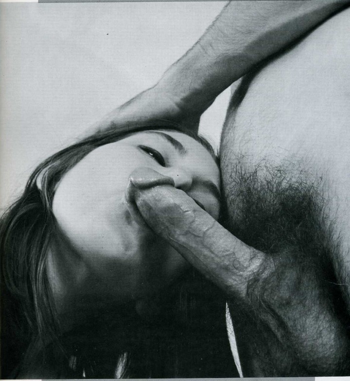
Source unknown – Title Unknown (2009)
Any halfway decent Philosophy 101 course is going to touch on the notion of an ontological argument.
The premise goes like this: God must exist because a God is perfect and that which exists is more perfect than that which does not exist.
I feel as if a lot of modern images suffer from an ontological raison d’etre–namely, the image you capture is better than the image you don’t because the former exists and the latter does not.
All sorts of justifications are employed to shore up this rationale: if I don’t take a photo I won’t remember or it seemed to suggest something that would make a pretty picture.
I call bullshit on both. On the one hand the notion that folks need to Instagram every prettily plated meal and a trendy eatery cheapens the notion of persistence of memory. I’m sure it was good and all but are the huevos rancheros you had a brunch really something you want to remember ten years from now? (It’s like they teach you early on in film making–there’s no need to shoot coverage of a scene with closeup inserts that show the protagonists movements. He grabs something off the counter and picks up something else on vanity in the vestibule. It’s unnecessary to show a close-up of his wallet and his keys, respectively; unless either figure prominently later in the plot.*)
But the second impetus–it seemed like it would make a pretty picture–is, at least, more fundamentally honest in that it assumes that someone else seeing the image will through seeing it gain something.
The proliferation of ready-at-hand imaging devices has not materially improved image making. This is due to the fact that the vast majority of the impetus to create images is grounded in the capitalist act of conspicuous consumption. It’s not enough that I eat and remember what I ate, it’s necessary to show that one is eating here there or having this or that unmediated experience.
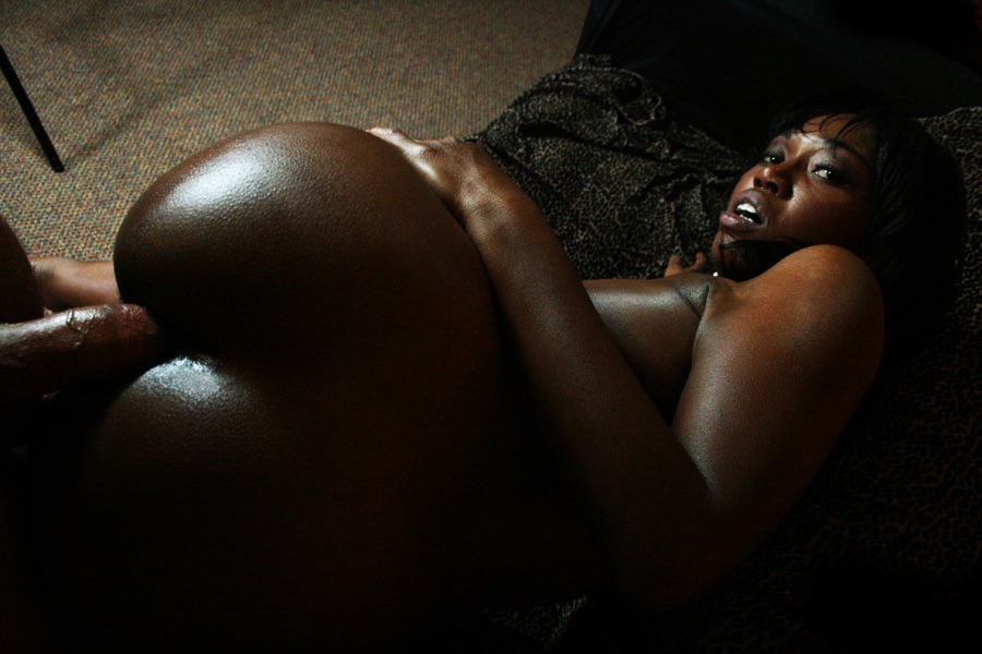
It gets even worse with porn. Consumers of erotic content are spoon fed a stylized and highly unrealistic version of sexuality. What I always find so completely bonkers about that is that–by and large–when folks set out to produce DIY porn, instead of asking themselves how do I convey what my experience of sex is like (or perhaps better: inquiring as to why they have the urge to produce such content and then exploring how to place what they want to show in line with what they create), porn provides an easily replicable template for making you the porn star or starlet of your own triple X scene.)
The above is–to my eye–quite different. It’s clear that the audience is seeing something pornographic in nature but the focus is on the expression of an intense, in-the-moment experience of physical pleasure. Yeah, it’s goes way too dark in areas and the shadow cast by the tripod in the upper left corner is detrimental to the immersive effect the image seems to be seeking; but, the way she’s looking back over her shoulder isn’t something that could be easily staged.

Sebastián Gherrë – Benja (2016)
I feel about Gherrë the way I’ve come to feel about Araki–namely: I don’t always get it but the work is consistently of high quality and in spite of the tendency for both artists to cover the same ground over-and-over-and-again, there remains surprising freshness and variation.
Also, I love that there’s someone out there who is still making traditional dark room prints. They just look so much better, damn it.

Laurent Benaim – Title unknown (2015)
I do not believe home
is where we’re born, or the place we grew up, not a birthright or an
inheritance, not a name, or blood or country. It is not even the soft
part that hurts when touched, that defines our loneliness the way a bowl
defines water. It will not be located in a smell or taste or talisman
or a word…Home is our first real mistake. It is the one error that changes
everything, the one lesson you could let destroy you. It is from this
moment that we begin to build our home in the world. It is this place
that we furnish with smell, taste, a talisman, a name.—Anne Michaels, The Winter Vault

Source unknown – Title unknown (201X)
One of my favorite things about sex with others is gap between orgasms, the space where everything is intensely sensitive. (It’s something with which I’m completely preoccupied with, if I’m honest.)
The way a-trusted-nother can guide you beyond any boundary you thought you knew yourself to have and to hold.
Pleasure is amplified–a river escaping its banks, flooding the levees. Senses sharpen–the smell, of sweat slick bed sheets, eucalyptus tinged summer breath through the screened window. The dewy drops dotting pubic fur–pearls and diamonds caught in a spider’s nest.
Saliva, sweat and orgasmic fluids layered, intermingled on the lips, skin, tongues and genitals of lovers. The holy taste of the holiest of communions.
