Source unknown – Title unknown (188X)

One thing you learn very quickly studying visual art in academia is the liability that is sentimentality.

The two exceptions I can think of are Nan Goldin–who, while her work is unsentimental, the raison d’etre for her work is fundamentally sentimental; and Sally Mann, whose work frequently borders on inexcusable sentimentality but always manages to maintain a rigorously formal foundation w/r/t to conceptual complexity and masterful execution.

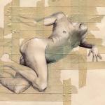
I’m not arguing that the above image is sentimental. It is, however, very earnest and I think all too often that disqualifies certain work from being considered as art.

There are certainly compositional flaws that detract from this. The entire frame is left heavy. As all the elements either shift the eye left or are gathered at the left half of the frame. The “24.” along the right frame edge is placed as if to counter-act some of that off kilterness–but it hardly makes up for it.

Additionally, the lower frame edge cutting at the knee is just inelegant and jarring.

Yet, there is a lot to praise here. The skin tone is lovely–the subtle gradation between the curve of his body and the backdrop, the way her skin is so much lighter than his.

The backdrop borders on ridiculous; however, with the careful drape of the rug and the position of the bodies with the aforementioned gradation, it all suggests a familiarity with classical modes of visual representation.

I also adore the way her arm is bent back and she’s looking directly into the camera. There’s something calculated about it–part defiance, part fascination. Also, the dirty soles of her feet splayed in the air is inspired.

It feels to me like the photographer wanted to make images of people fucking but didn’t want it to read as frivolous. Thus, there’s an attention to detail that although it doesn’t entirely work, it adds a ring of truth to the scene.

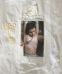
I have no idea about the origins of this image. But there does appear to be a scratch on it–bifurcating it more or less horizontally at the center as well as a dogeared corner. It may not be accurate but it’s possible to imagine someone keeping this photo secreted away in a coat pocket.

Source unknown – Title Unknown (201X)

People speak to me about boundaries.
This is work. That is play. This is public. That is private.
This is for friends. That is for lovers.
I don’t understand imaginary lines in the sand.

I want to know the ones like me. Daughters whose mothers
Left them to wolves, trusting the tutelage would
Lead–one day–to understanding the words
tattooed over their shivering hearts:

There are no lines. There are no boundaries.
A horse will run until it dies.
And death, death is better than dreaming about
what it might’ve been to run free
.

Barahona PossoloSweet (2013)

I love this.

Stylistically, it wouldn’t be out of pace displayed side-by-side with any of Caravaggio’s biblical paintings. (In fact, there would be a reasonably interesting paper comparing/contrasting the influence of both Caravaggio (with a distinction between his biblical vs mythological work) and Klimt‘s paintings after 1900 in Possolo’s work.)

Granted, such explicitly suggestive depictions don’t really exist in the Western Art Historical Canon. There certainly aren’t rigidly errect penii in Caravaggio–however, I believe there may be a few lurking in Klimt’s criminally under-appreciated sketches.

But my point here (as well as with this blog) is there is no reason there couldn’t be/shouldn’t be graphic depictions of sex in art.

And that’s not to say this completely works. Ostensibly, the fellow on the top left is ladling honey out of one of wide mouth wine glass with a wooden spoon and letting it drip onto the engorged glans of the man on the lower left. (Note: the wine glass bears more than a passing resemblance reminds me to a similar object in Vermeer’s The Wine Glass.)

On the right half of the frame, you have the exuberantly performative excitement/delight of the guy on the top and the transfixed and lets be honest clearly thirsty AF woman on the lower right.

Some of the other facets are much more difficult to decode. Like–there’s a feeling that all the men in the image are aware of each other but the woman seems oblivious to everything except the honey marinated hard-on. (Let’s be honest, that is the locus here.) This conjecture is at least supported by the strange elf like ears all the men have.

I’m not really sure what the bumble bee on the woman’s flank indicates either–given the context of the image it seems it could speak to her sexuality and contrast that against the seeming ambiguity of the elf-eared ones; yet if that’s the case there are potential ways in which it could be interpreted that the image erases gay, lesbian and bisexual women. (And that’s not ever cool.)

But what really strikes me about this image–and like so much of the way my brain works this isn’t an association I would have made if I hadn’t read this article several days ago–the way he of the honey slicked dick breaks the fourth wall reminds me of the way Robert Mapplethorpe performs a similar action in (arguably) his most notorious image. It’s as if both are saying: this is who I am. But in the case of this painting there’s an insouciance and arrogance in contrast to Mapplethorpe’s studied gravitas.

Barry MarréUntitled from The Last Boys book (2015)

There’s this zen aphorism: don’t put another head on top of the one you’ve already got.

At it’s core, it’s a statement about the relationship between conceptualization and praxis and relates to another far more familiar zen-ism: do or do not; there is now try.

One of my struggles–particularly with writing but it bleeds into every corner of my life–is a deeply rooted commitment to ‘being original’. More often than not, obsessing over whether or not the thing I am going to do has been done before transforms into an insurmountable obstacle to the doing itself.

The truth is: while I don’t exactly agree with the prognosis that it’s all been done already–in my experience the exceptions to that rule are so few and far between that they almost don’t even warrant discussion.

Take this image. The pose is clearly a reference (with some slight variation, namely the mirrored pose, the subject’s gaze acknowledging the camera and supporting leg bent instead of fully extended not only balances the composition–the available light falling from the implied window beyond the left edge of the frame balanced against the off-center right positioning of the bulk of the body) on Michelangelo’s Adam.

The light itself is reminiscent of later Caravaggio’s.

Yet for these obvious influences, the resulting work is hardly beholden or otherwise limited via similarities.

I feel like I’m circling what I really want to convey–my point has something to do with the way people who don’t have a great deal of experience posing for the camera frequently question what they are supposed to do with their hands. Yes, one solution is to throw it all at the wall and see what sticks but this is where an intimate familiarity with art history is a boon. As far as visual representation goes, when artists’ find something that works, it tends to become enshrined as a part of the form. You can consider contrapposto, pietas or the fascinating history of the coded visual language used to ‘label’ apostles and saints.

Such poses and coding function much like cliches–the present a ready, pat way of communicating something that is otherwise complicatedly nuanced. (And here I would note as an aside: one of the many purposes of good poetry is it’s mapping of new ways to express what would otherwise function as cliche–there may be a lesson here about what distinguishes lower case a art from upper case A Art.)

In other words: the conventions are there because they have proven to be an exceedingly relevant way of addressing universal concerns w/r/t visual representation of bodies. The convention is not unlike a platonic form–but as always the devil is in the details. The ideal form will always be sterile, lacking in resonance. It’s the slight variations, the obsessive fixation on the mechanics of gesture within a rigid framework that tilts beauty either towards abstraction or towards something grounded in an observed and unmediated moment of transcendent seeing.

Arthur Tress – Kent on Slide, N.Y. (1979)

As much as I like Tumblr, I think spending a lot of time on here ends up being a bit of a mixed bag. Yes, it’s reasonably on-point when it comes to keeping abreast of new work and new artists making work in lens based visual arts.

Unfortunately, the volume is such that I can’t always properly follow up on various makers.  I mean I have around two dozen names of people whose work resonated with me strongly after only a glance.

Tress’ name is on one of those post-its. I remember a while back Getty released a spate of images Tress made during the 60s where he staged children’s nightmares for his camera.

I was extremely impressed with several of the photss but ultimately haven’t made time to return to his work because it didn’t seem to fit the purview of this project. I’m now seeing my mistake.

Some of his more surrealist inflected work is nothing short of stunning. He takes a Minkkinen-esque approach as far as mood and tone but his images seem more grounded in an even-handed incisively observed eroticism. In other words, the work adopts the structure and form of a glimpse from a dream but it retains the same fluidity that inspires the dreamer to remain unaware that they are dreaming.

Lastly, Tress is clearly EXTREMELY familiar with photo history. Were I a photo teacher, I’d assign an essay wherein students could pick between Ralph Eugene Meatyard, Rodchenko or Ed Ruscha and compare/contrast with Tress.

Anna CladoniaVarious Portraits* (2010-2015)

I’ve been thinking about Emily Dickinson a lot lately.

Not due to any connection between It Sifts From Leaden Sieves and the fact it’s snowing balls outside right now. (Although I am hardly oblivious to the synchronicity.)

But, on that note, why do we teach Dickinson to middle schoolers by introducing them to the myriad complexities and nearly infinite scope of her work via the aforementioned poem and A Narrow Fellow in the Grass? It’s no wonder I hated her work until I revisited it in my twenties and immediately fell in love with the work and the incredible woman who made it. (Seriously: the think-question you tend to get asked on first dates about what person living or dead you’d most want to have dinner with, yeah… Emily Dickinson all the way. Even if I have grown to strongly prefer Bishop’s body of work.)

I promise… this seemingly self-indulgent ramble does relate to Cladonia’s devastating photographs–bear with me a bit longer.

My objection to the way Dickinson tends to be taught is that it tends to emphasize the allegorical (nature imagery) over the more metaphorical work. You’d do much better to start with the exquisite, goth-before-goth-was-a-scene I Felt a Funeral in my Brain… Couple that with the fact that the window to Dickinson’s bedroom overlooked a cemetery and even twelve year-old’s can easily grasp the incisive eye which uses words to describe the landscape of a morbid imagination.

However, once you dig into Dickinson–I mean really dig in–one line of hers takes on profound resonance: “my business is circumference.”

It’s an odd claim–especially from a woman who never traveled further than a day away from the house in which she was born. Yet, the acuity of her perception and her openness to the world and experiences in her immediate surroundings taught her in a fashion not unlike that of a storied traveler.

Cladonia exhibits a similarly circumscribed scope. Her photos are ostensibly portraits–largely shot in ramshackle Moscow apartments. But within those narrow parameters there’s evidence of an encyclopedic familiarity with the history of photography.

Beyond the essential Russian-ness of her work, the astute viewer can easily recognize winking references to virtually every Russian image maker I’ve ever posted on this blog–but especially to Igor Mukhin and Evgeny Mokhorev.

But there’s also grace notes from David Hamilton and Duane Michals.

Having and wearing your influences on your shirt sleeve doesn’t necessarily make for good work, unfortunately. But what Cladonia manages is less homage than a point of loving departure–she takes a great idea that resonates strongly with her and makes it her own.

In and of itself–that’s the mark of a truly great photographer. But there’s also the way she embraces and eschews obtrusive image grain, her spare and gorgeous use of autochrome-esque color (I + II). And that’s not even getting into her revelatorily explicit handling of masturbation and sexual expression.