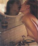
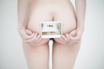
Victoria Baraga – [←] Self-portrait (2012); [→] Self-portrait II (2012)

I could’ve sworn I posted the Self-portrait II previously–but I’ve spent the last half-hour trying to find it and I see no trace, so…

It’s possible I had it saved as a draft and subsequently opted not to post it.

There’s not one but two layers of ubiquity working against these images. The TLR, waist level finder in the mirror trope deserves every bit of shit the bathroom mirror selfie gets. (Folks who pursue the former tend to get a pass they shouldn’t because they’re doing it the old-fashioned way and it’s not as straight forward was aiming the camera and pushing a button–but both tend to be devoid of any vivacity.)

There are exceptions of course. Laura Kampman does some exquisite things within very narrowly circumscribed margins–i.e. there’s a ridiculous degree of technical mastery at work in her better photos. Baraga, on the other hand, tends to fixate on capturing herself in the act of watching herself.

The result is conceptual satisfying–the viewer watches her watch herself, while she watches herself experience intimacy. It’s a clever deconstruction of the triad where the photography use the camera in an effort to parse time and space in such a way that the viewer of the resulting photo see much in the same way the photographer did in the moment of making the image. In this case, the mirror is an impartial arbiter allowing her to focus on one relationship in the triad–photographer to subject and subject to photographer in a fashion that presumes an empathetic response from the viewer.

There’s life an artfulness to these images that far exceeds 98% of comparable work out there.
Dmytro GurnickiUntitled (2016)

Strictly speaking, this frame is underexposed–the darkest shadow area should retain the vaguest insinuation of textured detail; and, as can be seen, along the lower right hand edge, there is zero shadow detail to distinguish from the frame edge.

In this case it’s not the end of the world, it’s easy to make out enough of the frame edge so as to interpolate and recreate the frame edge when making a print. (Note: that this isn’t the case with the left frame edge, which is actually very nearly perfectly rendered given the dim overall illumination.)

And while the rest of the frame is objectively underexposed, the effect is extremely flattering. (Ilford Delta Pro, at least in my mind, produces optimum results when you under- or over-expose it a smidgen.)

This is a strong image. But the main reason I posted it was because it exemplifies almost exactly what I was picturing in my mind when I was addressing the shortcomings of this Karel Temny image a couple of months back.

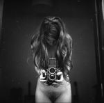
Laura KampmanUntitled (2015)

I’d post this just based on the exquisite tonal range and use of the depth of field–the mid-ground is soft while the background (both actual and reflected are sharp).

But really this deserves to be celebrated as a testament to discipline.

Anyone who’s ever tried to take a Traci Matlock-esque mirror self-portrait without looking through the viewfinder, knows it’s nowhere as easy as it looks.

But here Kampman is using a TLR–so she doesn’t even have the benefit of a  straight forward view as I’m reasonably certain that Rolleis mirror left to right in the waist level finder.

And she’s set things up with very thin margins as far as composition, so this is emblematic of a degree of mastery I’ll admit I lack the patience necessary to cultivate.

Edward YsaisUntitled (2013)

I’ve had this image saved as a draft for almost a year. There’s no arguing that it’s chiaroscuro is executed with skillful aplomb. It’s memorable, quality work and I like it… but I’m conflicted about it.

At first, I thought that the both women were the same person. That’s largely because I am absolutely awful when it comes to facial recognition. For example: If I’m meeting someone I don’t know all that well, when I scan a crowd I’m noting things like height, hair color, build and body language.

I don’t think these are the same women (it’s not entirely clear but the woman entwined with the man appears to have longer hair than the one in the mirror). So my initial impression of this as a critique of the male gaze–wherein the male surrenders to sexual bliss while the woman is condemned to a duality of experience wherein she not only experiences sensation but also stands detached monitoring and critiquing her the relationship between her experience and the male consumption of her experience.

Without that anchor, I’m not really sure what to make of the image. Is this a threesome? There’s a sheen on the woman in the mirror’s skin that could be suggestive of such a scenario. But it fears more like a nightmare–a woman dreaming about her lover cheating on her.

And that’s kind of where things start to unravel for me. In my experience as a dreamer, mirrors straight up DO NOT work like they are represented here. In other words, my experience is that the mirror only reflects a part of me–i.e. my head or I don’t have a reflection.

This dissonance opens a door to some critical considerations about the work. Yes, it’s pretty. Yes, the lighting is sumptuous. Yes, it’s almost certainly riffing on Velázquez‘s Las Meninas.

However, note the way Velázquez uses available light as the primary motivation for his composition. In other words, the perspective the viewer is presented is one which given the light renders a composition built around a masterful understanding of space–especially distance and depth.

Ysais’ image is alarmingly flat. The light functions to render the scene legible and in no way informs the composition. And once you follow that rabbit trail, you realize that due to the slight down tilt of the camera–presumably to compliment the mirror–the vertical slat of the partition at the extreme left of the frame is put askew. Further, the horizontal and vertical slats, transitioning to the bas relief to the damask pattern to the drape and the echoing drape in the reflection–the artifice of the frame becomes hard to suspend in favor of disbelief.

It’s something I’m discovering in my own work of late: the distance between a bad image and a good one is exponentially less than what separates good from great.

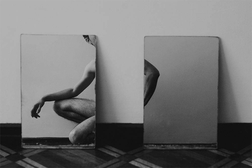
Faber Franco2rectangulos (2015)

When it comes to conceptualizing my own work, I’m like the cat that has to turn in circles a few times to find just the right spot/angle so that I can drift off.

I don’t know fuck all about Franco’s process; his work suggests a calculated effort in service of established momentum following a clearly planned trajectory. In other words, it’s less novice swordsman sheathing and unsheathing or otherwise sabre rattling, than samurai who only removes the sword from scabbard with the intent of using it to kill.

What I don’t understand is that although Franco seems to possess a complimentingly developed grasp of craft, I don’t follow his penchant for restricting the tonal range in his images.

Take the above for example: if it were mapped according to the zone system, we’d have roughly 5 full tones. In this the restricted tonal range does contribute to a sense of failing half-light (which is very much in character for the piece).

However, as there is a similar truncating of tonal range in virtually every image on Franco’s Flickr, it smacks a bit of a self-conscious stylistic ‘signature’–something I find frustrating given the overall quality of the work, taken as a whole.

I couldn’t swear to it but I’m reasonably sure there’s a Lynchian influence acting here–the primacy of angles in composition and interplay between super saturated complimentary colors.

And as much as I love most of Lynch’s work, I’m reminded of a criticism leveled against me after sighting Lynch as an influence back in college. Most of the people who claim or demonstrate influence from Lynch tend to use his work as an excuse to break rules before you’ve bothered to learn them properly.

In this case the tonal restrictions do evoke a Lynchian ambiance, while unfortunately overlooking the fact that although Lynch will definitely limit his tonal range for surrealistic effect, he almost always does so by amplifying those four or five zones to the moon while still maintaining a crisp, well defined luminous range. (As just one example consider Frederick Elmes’ cinematography in Blue Velvet, especially the scene where Jeffery finds Dorothy’s husband and the Yellow Man in Dorothy’s apartment.)

Plume Heters Tannenbaum – [↖] Je serai un combat; [↗] Je serai tes yeux; [↙] Je serai ton intérieur; [↘] Je serai tout ton amor featuring Misungui from GenderNoGender Room Series (2015)

GenderNoGender Room includes 30 images. It positively crackles with fascinating ideas. However, there is a very real sense that everything is a little too muddy, too abortively realized, too goddamn fucking frantic.

When it manages to remain still long enough to act with deliberation, it’s nothing short of spectacular. The problem is: it only really does that in maybe 1 out of every 5 images.

The seemingly random reframing of other images to create diptychs comes across as either arbitrary or so knee-jerk and lacking in subtlety as to be lazily feckless.

Yes, the conceptualization could be more tightly twined to the material but it’s not the improvised nature that irks me–there’s sort of a charming punk rock playful desperation to it which I find ridiculously charming. It’s really the presentation that dissimulates. The project as a whole needs to either make the throw everything at the wall to see what sticks approach more interpenetrative–it seems like there is supposed to be a notion of continuous physical space which is not at all supported by the work; or, the presentation needs to abide a more minimal approach.

This edit I’ve put together attempts to imply a sense of continuous physical space while attempting to invoke a minimalism in-line with Beatrix Mira.

I need to look at Tannenbaum’s work more closely but if it suggests as much raw potential as these images do, then she could easily become one of those artists I follow with something not unlike religious devotion.

Source unknown – Title Unknown (19XX)

This is not a good photograph. Good or not, it is goddamn fascinating.

The color is positively garish–render skin tones livid with blue green bruising. The two tone yellow of the tub and wall paper certainly doesn’t help matters.

But note how the reflection of the flash off the mirror–while absolutely contributing to the fucked up color balance–is rather lovely when you only consider the reflection.

And I do love the way the cunnilingus giver is supporting the receiver’s hips with her hands, the soapy wetness of the skin and the despite the unflattering angle, how the receiver’s reflection appears so unfeigned in its blissed outness.