
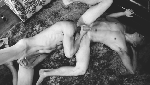
[↑] Source unknown – Title unknown {desaturated} (2010); [↓] Source unknown – Title unknown (201X)
Juxtaposition as commentary.
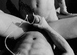
[↑] Source unknown – Title unknown {desaturated} (2010); [↓] Source unknown – Title unknown (201X)
Juxtaposition as commentary.

Source unknown – Title unknown (201X)
I’m not entirely sure if this is an actual instant photograph or if it’s one of those Photoshop jobs where someone takes a Polaroid mask and overlays it against another image.
The reason I’m not entirely sure is because this acts like a Polaroid–the compressed tonal range (essentially slight overexposure on the model’s stomach, the rest of the skin tone is more mid-tone and then everything falls off to black except for the back of the couch in the upper left third of the frame and the edge of the couch on the lower right), slight chromatic aberrations at the left and right edges as well as the almost selenium-ish tone.
I’m generally not fond of work that decapitates and amputates limbs but with this there is a sense that less was intended as more. (I’m not sure it completely works from the standpoint of eschewing the problematics of depicting women nude as a coding for presenting them as sexually available but the composition is self-consciously voyeuristic enough that I suspect this was made in such a fashion to at least implicitly complicate notions of sexual availability as necessarily passive.
Julie. NY. 2017. Leica M6.

[↑] Derek Woods – Julie. NY. (2017); [↓] Frank Ockenfels – Thumbelina (2015)
Juxtaposition as commentary

Source unknown – Title unknown (201X)
I’m pretty sure this is a digital collage. (The easiest way to tell is to look at the top of the woman who hugging the tree’s right thigh–there’s a seam between her and the background. From there you can see that the light falling on the background is coming from a different angle as the light that is falling on the couple vs the light on the woman up the tree. In the case of the background the light is lower in the sky and you would almost certainly have the sun in frame if this framing was panned so that the left frame edge started where the current right most frame edge is. The sun on the couple is higher in the sky–probably roughly early afternoon; it’s still coming from beyond frame right at least. The woman hugging the tree, however, has light that would be coming from the opposite direction as the couple.)
There’s also some small issues with scale. The woman up the tree is further back and therefore should appear smaller but she’s easily head and shoulders taller than the boy.
I’m not sure this completely works as a composition but the Photoshopping is surprisingly clever–even if it doesn’t completely work. I’d be curious to know who made this originally.
Lastly, several of my dude preferring women friends refer to guys they find hot by saying: I’d climb that like a tree.
@deluckas13 – untitled (2017)
Do something for me: use your hand to block the two finger tips you can barely see in the upper left corner. See how this renders the picture almost cartoonish in it’s exaggeration.
Remove your hand. See how that creates a tension where the cartoonish is constrained by a sense of equal and opposite resisting pressure.
I think there’s a valuable lesson here not only about the dynamics of dramatic composition but also about creative expression. Playing to your strengths fails to have the same effect once you remove them from their inter-penetrative connection with your limitations, shortcomings and weaknesses.
Craig Morey – Christelle (200X)
I see Morey as being of-a-kind with someone like Petter Hegre–folks with a quality stable of gear who generally toe a quantity as quality line in terms of their voluminous output.
You can split hairs; for example: Hegre has a better facility with color management (although his compositions, editing, conceptualizations and general familiarity with the history of photography seems knee-jerk at best); Morey, on the other hand, likely has an assiduously cultivated preoccupation with Jan Saudek (yes, Saudek would never get as close to his subjects as Morey but Morey favors imperfectly textured backdrops with little if any apparent separation between the subject and the background–which is all very Saudek-ian).
Honestly, the pose above is awkward AF. There’s a tension in the way the drape of her jacket is falling down her shoulders. It looks as if she’s doing the sort of thing where you rip off a bodice and stand their open to the world bosoms heaving. Except… her shoulders are not wide and squared, they are folded in. (I do this instinctively when folks stare at my chest, tbh.)
Also: you wouldn’t pull your shirt up like that. It’s likely that she’s hooked her thumb in the arm hole of her top but it looks as if Christelle is closer to trying to pull her tank down to cover herself.
This awkwardness would be distracting if it weren’t for her expression: it’s 100% what do you think you’re looking at? But that mien could cut either way: accusatory or flirtatious.
I’m not familiar enough with Morey’s oeuvre to definitively state that this is either/or dichotomy is a recurrent feature; however, based on what I have seen it seems plausible that it is.
If so, I think that’s actually something worth thinking about as far as making portraiture. In a lot of ways, taking a picture of someone the audience already knows is easier. Think pictures of celebs–we know them already so we’re filtering what we see through a prism of what we already know about the personality. It means that the portrait in a moment in time is designed to contribute to something that is already fully featured in the viewers’ minds.
And of course the photographer/image make knows the person they are portraying. But if the audience doesn’t–there’s a far greater burden for the author to use the scant space of a frame to convey some sense of the person. And I think this capturing the tension between experiential polarities is actually a damn fine tactic for accomplishing this. (It reminds me of the debate about whether or not one of the great portraits of all time Vermeer’s Girl with the Pearl Earring is turning towards or away from the viewer.)

Source unknown – Title unknown (201X)
As for me, I am tormented with an everlasting itch for things
remote. I love to sail forbidden seas, and land on barbarous coasts.


[↑] Source unknown – Title unknown (201X); [↖] Source unknown – Title unknown (201X); [+] Source unknown – Title unknown (201X); [↗] Helix Studios – Title unknown (201X); [-] Source unknown – Title unknown (201X); [↙] Source unknown – Title unknown (201X); [↘] Source unknown – Title unknown (201X)
Follow the thread: Pride edition.

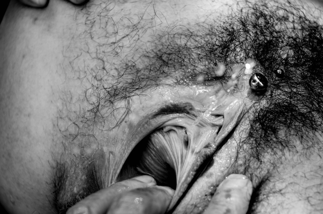
Chris Maher – 0876 Two Nude Women Abstract Vulval BW Photograph (2013)
One of the things I dig about photography/image making is that although I wouldn’t argue the form is inherently egalitarian, the line separating streamlined visual simplicity and lazy/creatively bankrupt work is an ultra fine one.
I think Maher’s work is actually 98% trash. And I wouldn’t say this is necessarily good–there’s some spill on the floor behind the left thigh of the rearmost subject which really should’ve been flagged off in order to underscore the interplay between bodies and landscape style abstraction.
It’s perhaps a bit essentializing but the simplicity of it and the clitoral piercing belonging to the subject closer to the camera manage to strengthen the tension between abstraction and concrete representation.
I think there’s arguably a way to take this general premise–stretch and otherwise complicate and enliven it so that it’s more than a simple (or, in this case, most likely lazy) meditation on form that is simultaneously tawdrily titillating.