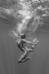

[↑] Marisa Papen & Christian Vizl – Untitled for Plastic Sushi (2016); [↓] Barbara Hazen – Title unknown part of GENUINE BEAUTY series (2016)
Juxtaposition as commentary
[↑] Marisa Papen & Christian Vizl – Untitled for Plastic Sushi (2016); [↓] Barbara Hazen – Title unknown part of GENUINE BEAUTY series (2016)
Juxtaposition as commentary

Source unknown* – Title unknown (????)
Lately, I’ve been thinking a lot about mutual masturbation.
Those thoughts are amorphous but I’m going to try to fit them to words:
I guess what I don’t understand–literally ever–is where the heteropatriarchy draws the line on what is and isn’t sex. I mean penis in vagina (henceforth PiV) sex is sex. Anal sex is sex.
Bill Clinton famously tried to suggest that oral sex wasn’t sex and I think folks general consider oral sex as sex these days.
What about mutual masturbation? And before someone claps back about it depends on whether you touch someone else’s genitals–is the above image a depiction of a sex act?
And why the hell do we categorize masturbation as not also sex because of the absence of a partner? What’s the problem with it all being sex?
…
As I’ve mentioned about a bazillion times: I grew up in a Xtian doomsday cult. I was taught that masturbation was a mortal sin. Even when the topic crept into conversations in my junior and senior year of high school–the response was I don’t do that and think anyone who does is a disgusting pervert.
Conversely–now that I’ve escaped that orbit–most of the folks I know have these wonderful stories about climbing into bed and pulling the covers up to their chins and then racing to orgasm or you be the boy and I’ll be the girl and you perform oral sex on me and then we’ll shift roles.
…
As far as masturbation goes it’s the type of sex I am the most comfortable with because it’s the most familiar.
I completely missed out on the experience of exploring my sexuality with those I essentially trust.
I think less these days about finding a partner and more about how to get a group of friend together solely for the purpose of a mutual masturbation party.
It would be something I think would be enjoyable and personally it would come closer to scratching the itch I have to have a reliable sexual partner–which just isn’t possible for me right now.
Le sigh.
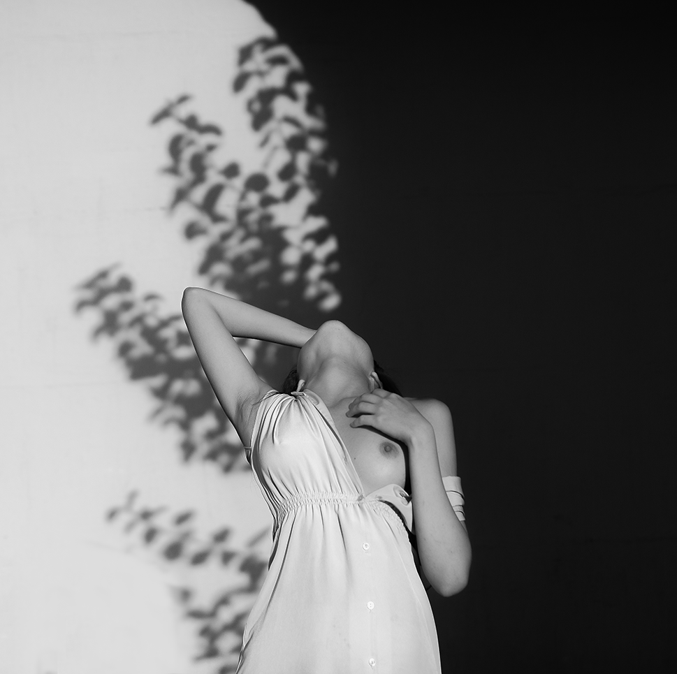
Donatas Zazirskas – i (2016)
I featured another of Zazirskas’ images in a post from almost exactly a year ago. (Incidentally: it’s probably the most popular OP in the history of this project.)
I’m still not over 100% on board with his work but I ran across this earlier in the week and I had a very strong reaction to it.
I’ll try to explain but in order to do that I do have to dissimulate–at least initially.
Nothing about this pose makes sense. You’re standing outside wearing a light dress. You bear your left breast while leaving the right covered touch your index and middle fingers to your collar bone while throwing your head back with the back of your palm seeming pressed against your forehead. Why?
The only thing that makes sense is that she’s trying to remain anonymous. As as much as I personally loathe images that decapitate the subject in order to preserve privacy–there is a fundamental contradiction between her pose and the mise en scene, i.e. she’s presented as being unaware of being observed but is also trying not to be seen while self-consciously revealing her breast; all with the background so carefully presented as to vertically bifurcate the frame.
That was my first reaction anyway. Running into it a year later, I’m almost willing to wager that this image is an extrapolation upon Fan Ho’s magnificent Approaching Shadow.
As far as an homage, it’s uneven. But if Zazirskas is actually spending time with Ho’s work then that would explain both my ambivalence about aspects of his work and the fact that I’m not exactly ready to dismiss it either.
Ho is a hell of a lot more formal and technically astute–however, I can’t suggest that it’s the wrong photographer given Zazirskas’ over style. The choice actually strikes me as thoroughly prescient.
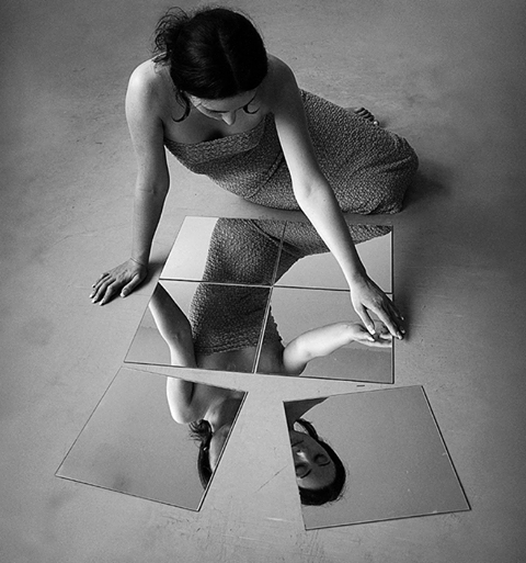
Alexei Aven – Do It Yourself (2012)
This has been cropped from the original. On one hand this action removes an especially ostentatious watermark–on the other hand, the only reason to motivate such an action would be to try to amputate any connection to the author (a super shitty motivation).
It also diminishes the impact of the composition. The longer frame contributes a greater downward push to the way the eye scans the work–increasing the sense of her loneliness as well as emphasize the attention to texture–the floor, the mirror, her dress, etc.
I don’t think I’ve ever seen mirrors used quite this way and whether or not the intent was to present the examination of reflection in terms that are conceptually linked to putting together a puzzle, that’s the net result.
The murk suggests low the ambient lighting conditions weren’t especially good (the subject is lit from above and behind–I’d wager some sort of clerestory window type set up over her right shoulder.)
I’d fault it–if it weren’t so refreshing to see after scrolling through his 500px for seemingly forever to find this image and in the process passing scads of work that embodies everything I detest about modern image making. (For example: you know how some chefs who aren’t vegetarians but who are required to serve food to vegetarians seem to think that ‘fresh’ and ‘healthy’ are tastes? Well, fuck those guys. And fuck folks who seem to have missed the memo that ‘commercial’ and ‘expensive’ are not traits of actual fine art photography.

[←] Hans Bellmer – Unica Zürn from Unica Tied Up (1958); [→] Source unknown – Title unknown (2015)
Juxtaposition as commentary
(via girlswithcameras)
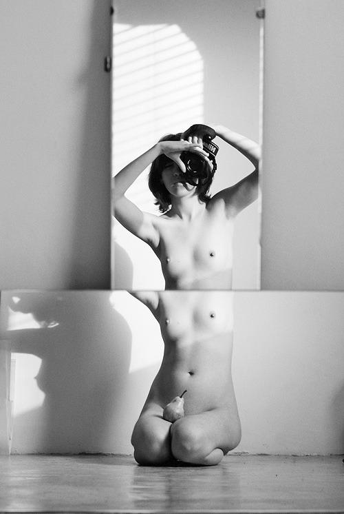
Nastasija Trill’ – Parts (2009)
As an image this doesn’t completely work. (Based on the way she’s holding the camera, this was taken at a cant and then cropped in post. This positioning was likely a result of wanting to keep her arms in this particular pose–which makes sense because check out the exquisite shadow that’s cast by her right breast on the wall behind her. Proper landscape orientation would’ve de-emphasized the up-thrust of the vertical mirror, drawn more attention to the angled light slanting through the slated shades and just overall made better balance between positive and negative space. I’ll stop short of labeling this #skinnyframebullshit, however–given the custom of horizontal orientation being a code for depicting secular conventions and vertical orientation being favored for spiritual consideration/prompting worship, this fits like a glove with the latter.)
It’s also a clever visual pun. There’s the pair in her lap and the pairing of a pair of breasts via the reflection. (My brain then subsequently rockets on to relating this to that bible story about Jesus allegedly feeding a multitude with only a small quantity of fish and loaves of bread and wondering if it was like a modern magic trick that used mirrors onto the statement about illusion smoke and mirrors… each and ever step of the way seeming to fit the image’s implications a little too astutely.)
[←] Ana Mendieta – Untitled from Stonewoman series (1983); [→] @anata39 – pois gourmands (2014)
Juxtaposition as commentary

Haruo Kaneko – Catharina (2017)
As an image, this doesn’t entirely work.
To make sense of the whys: visualize a vertical line dividing the frame into a left half and a right half. There’s a mass of shadow detail in the left half and a mass of highly detail in the right half.
Compositionally speaking this isn’t a terrible strategy. The difficulty is that there needs to be some unity between form and function–the balance between the two halves can only be considered effective insofar as it astutely parses the frame to make things more intuitively read by the viewer. (Catharina gazing to her left is an effort to addresses this shortcoming; however, given the left heavy, off-center staging doesn’t work anywhere close to well-enough to compensate. As such: the viewer only really considers the left 2/3 of the frame.)
What are some strategies that could have addressed these compositional flubs?
Given the left side having a heavy concentration of shadow detail (which we’re going to call positive space) vs the right being so heavily skewed toward highlight detail (which we’re going to call negative space), arguably the easiest fix would be to have Catharina sit in the right most chair and the shift so she’s looking back across the frame. (There’s a natural, subconscious urge to want to see what someone who is clearly looking at something is looking at–whether or not it’s possible to see the thing upon which their gaze alights. This is an astute strategy for directing the manner in which a viewer sees your composition.)
(Also–and I will admit to being extra persnickety in this one instance–given the clumping of positive space offset by negative space, it would seem wise to position Catharina so that she’s adding positive space to counter the compositional difficulties of this given frame. Plus, the plant behind her really does sort of look like it’s growing from her forehead.)
Also: this is neither centered nor oblique w/r/t position of the camera in relationship to the subject. The angle of the line of the slabs upon which the chairs sit is less something that draws the eye and more something that comes across as merely decorative. Given the discrepancy between positive and negative space, this halfway between angled and dead on centered works better the further you commit to either extreme. (Angled makes the more visually interesting composition however there’s a lot more room to make poor choices.)
The reason I’m posting this is less to call out aspects of it that are sloppy and more due to the fact I’ve been thinking a lot about poses recently. (And make no mistake Catharina’s pose here is fantastic.)
What makes it fantastic has several ingredients. Let’s break it down:
Generally speaking most nude photography/digital imagery deal to a certain degree in/with stylization w/r/t posing. A lot of hacky curators are pulling together shows on the female gaze without really giving much thought to the visual grammar of the work and more consideration to whether or not the photographer identifies as a woman.
It’s not just that presenting woman as sexually available is problematic. The inverse–and this is my fundamental disagreement with the notion of the so-called ‘female gaze’ is that it frequently adopts a similar tenor to a lot of fine art nude work made by folks who identify as men–in which there is a diminution of any emphasis on sexual availability and more of an emphasis on something more simultaneously chaste and titillating than more erotic/pornographic material.
There’s also the scores of photographers screaming about how nudity isn’t inherently sexual but then adopting the same stylistics of posing. The point I keep trying to make is that there’s a natural way of moving and being in a space where one is comfortable that what an observer might see could be considered salacious except that the bearing of the body is such that it conveys more of comfort or being completely and unself-consciously at ease. (I frequently lay on my back on my couch naked with one leg stretched out and the other kicked back over the back of the couch. I do it when I’m alone, I’d never do it while I had company over. (OK, that’s not completely true… it would depend on the company but then the company would change the context substantially.)
What I like about Catharina’s pose is that it’s part stylization. the shoulders back confidence vs the way her upper arms frame her breasts. Her hands run down at her feet–and it’s a bit like she doesn’t know what to do with them except that it almost looks like she’s scratching a bug bite of her foot when she was instructed to look to her left. There’s something that’s wonderfully unself-conscious about it, really.

Joana Choumali – Untitled from Emotions A Nu series (2013)
Choumali is an Ivorian image maker who focuses primarily on work featuring African woman.
Her focus is primarily vibrant, super-saturated color (and she’s really fabulous as using the intersections between non-complimentary colors to flatter her subjects.
She also works occasionally in monochrome–and her work here is rather audacious.
I’m not really a fan of studio work. And although that’s what Choumali does more or less exclusively and while I do consider her color work both incisive and bold, it is her monochrome stuff I can’t shake.
Part of it is that I will always be a fan of complication. By that I mean studio photography allows for more control. You can set up in advance, orchestrate the lights, get everything just so and then you can invite the subject and focus on interaction as opposed to juggling 18 other things at once.
Unfortunately, this tends to mean that studio work is pristine and allows for the setting to be decontextualized in favor of allow a laser sharp focus on the subject. Choumali pushes things–ambitiously–in quite a different direction.
Here the almost Pollock-esque speckled backdrop both separates the subject from the backdrop (enhanced with some perhaps less than as subtle as you’d really hope for dodging along the subject’s back and hips. It contributes a solidity to this woman that the shadow her body cases flattens back out.
The solidity is counter balanced expertly by an ephemerality that is echoed in the pose is the subject kneeling or rising? Is her pose contrite or self-accepting and joyful?
I speak virtually on the daily with photographers who are interested in shining a light on the notion of vulnerability with their work. Choumali does exactly that magnificently.
Paula Aparicio – Inés en casa, buenos aires, Diciembre (2017)
Aparicio is a fantastic photographer and image maker. (The above is digital; but she also works in analog.)
I’ve been working out how to tell you something about this for several days now. It’s not easy–not for lack of things to say but in the saying of something there is all too often an effort to demystify. Aparicio’s work resists that approach.
It occurred to me that although this is monochrome–it’s actually not dissimilar from the selection of Polaroids made by Andrei Tarkovsky’s released through Thames and Hudson entitled Instant Light.
My copy of that book is currently in storage–so I searched for some samples to include side by side with other work by Aparicio to illustrate similarities. Except the site I landed on was this and well, I’m inspired to run in rather a different direction.
As Michelle Aldredge points out–Tarkovsky was extremely anti-Hollywood. He felt that there were two predominant means of expressing ones vision: the descriptive and the poetic. He opted for something that was both third option and middle ground: metaphor.
Yet, he was adamant that what he was doing had little to do with symbolic coding. What he meant by metaphor was something along the lines of this:
I think people somehow got the idea that everything on screen should be
immediately understandable. In my opinion events of our everyday lives
are much more mysterious than those we can witness on screen. If we
attempted to recall all events, step by step, that took place during
just one day of our life and then showed them on screen, the result
would be hundred times more mysterious than my film
In other words, he sought to present the world of his films not as a story or exercise in formal decryption. It wasn’t even really supposed to mimic the function of dreaming, it was more an effort to use the immersive nature of cinema to convey an approximation of an experience that while not the whole experience might be somehow more than experience.
That’s what I admire so much about Aparicio’s work. The way it hones in on the magnificence and mystery in the mundane of lounging around on a sunny morning in a way that feels both foreign and familiar all at once.
Also: the lighting here is excellent. It appears almost backlit but the light is actually slanting left to right across the frame. The flattens Inés right arm against the overexposed backdrop, while emphasizing her face in profile and lending her body more solid dimensionality. (It also has the effect of making it seem as if she’s tilting towards the camera a bit.)
This would’ve been a good image without any other additions but there’s also the way the light catches her eyelashes and what look like burns from cigarette ashes on her underwear that makes this thoroughly mesmerizing.
(It’s also a bit like a Vermeer where you think that if you watch it long enough the picture will come to life and you’ll get a glimpse of what happens next–even though the medium makes that impossible.)
