Those who peruse what I write will be aware of how much I loathe fucking gratuitous/illogical use of portrait orientation.

I never tire of calling that bullshit out. But, for the sake of avoiding redundancy and not beating a dead horse on the subject, I am going to henceforth distill these criticisms to a pithy hash tag: #skinnyframebullshit.

#skinnyframebullshit should be applied here. Further, the awkwardness is compounded by the top frame line’s amputate the young woman’s legs. (And if one was inclined toward hair splitting: an argument can be made that with the angle of light it would’ve been preferable to swap the position of her head and feet.)

Even with these shortcomings, I dig this image a lot. Mainly because it dodges the usual questions of subject/object and exhibitionism/voyeurism back loaded into visual depictions of masturbation. It has the sort of masturbation as punk rock/do it yrself sex positive vibe I adore.

I hate making my bed. Always have. It’s simple cost-to-benefit analysis there’s no payoff that will ever justify the effort required of the task.

I feel similarly about “unwanted” body hair. Struggling to temporarily erase it takes energy, resources and time and becomes a vicious cycle.

Plus, I think body hair can be really fucking cute.

This image isn’t especially great—the camera is so close to the subject that any substantive context beyond the suggestion of a dark bedroom is lost; the flash renders her skin in tones of pink and way too white, drawing attention to her nipples. too white. (Though the graded shadow edging the outside of her left arm is delightful.)

What made me want to share this is what it made me flashback to…

It was one of those early summer days that plays like a coming attraction reel for high summer when everything is molten and shot-through with bayous of sepia toned sweat and everyone still staggering out of winter wool relishes the sheen of moist second skin as if it were the curious touch of a new lover.

I had been called down to wrangle a printer. (Pro-tip: printers are the swing sets and see-saws of the Devil’s playground meant to occupy idle hands.)

The window unit in the small office was spitting air only just less sweaty than the room.

The administrative staff had migrated to another less sweltering leaving a student to field calls. She was dressed in one of those super thin, nearly threadbare hipster graphic tees and a powder blue floral patterned loose knee-length skirt with yellow accents. It seemed like maybe three months ago she’d shaved the sides of her head to the skin, leaving violent curls to cascade darkly down the left side of her face.

She explained the problem was with the printer and went back to searching for the perfect word to fit the meter of some poetic line flickering before her on her MacBook.

The printer was rightly fucked and I wrestled with it while staring without appearing to stare.

As the printer whirred to life, she yawned and extended her hands above her head—stretching, a dizzyingly sexy fringe of hair peaked out above the edge of her sleeve.

She went back to her poem while finished up with the printer.

We ugly ducklings see the world for all it’s terrible fullness of beauty but it remains for us resolutely untouchable.

When printing something one is given two options: portrait or landscape.

As best I can tell this is a vestige of painting: vertically oriented images were favored for portraits while horizontal frames lent themselves to the panorama of landscapes.

Although arguably more of an unconscious convention in painting, this logic has been actively internalized by photographers and virtually enshrined by digital image makers.

The trouble is two-fold: the logic of photography is not interchangeable with the rules and precepts of painting (no matter how the latter interpenetrates the former). When applied to each other, these conventions produce schizoid, contradictory compositions.

Photography—and by dint digital imaging which however misguided is based upon it—has internalized the landscape orientation.  Unlike painting, I do not think this internalization has been unconscious—after all, if you have ever looked at a strip of 35mm film on a light-table there is an easy-to-see bias towards horizontal framing. (I am so accustomed to this that when I encounter vertical compositions now, I tend to tilt my head sideways when looking at them.)

Portrait orientation is not without its uses in photography and digital imaging. Unfortunately, it more often than not contributes very little to the compositional ‘sense’ of an image; serving expedience by quickly fitting the subject to the frame—instead of forcing the image maker to contemplate the discontinuity between the subject/frame and subsequently address it in a more artful manner.

The above has almost certain been cropped. But I would wager its orientation was originally vertical. (The individual responsible for the image contacted me with assurances that the image was originally horizontal but was cropped to accentuate the vertical.) And although I think horizontal framing would have worked better (EDIT: Having seen a sample of the original image, it is better), I will admit that unlike the vast majority of portrait orientations, the image maker is clearly aware of the manner in which the shift affects how the image is seen.

The frame echoes the subject’s form. On its own, that is the worst of lazy justifications; however, in this case the poses, the simple line work of what I find to be one of the sexiest tattoos I have ever seen and the narrowed view work as a visual approximation of the feeling one gets from indulging in a much needed stretch.

Further, the portrait orientation allowed the photographer to be closer to the model, lending a sense of heightened intimacy while also preserving anonymity.

Finally, I would be remiss not to admit a large part of my reason for posting this is the model’s unnerving resemblance to someone upon whom I currently have a maddening crush.

Suffering through a long bout of writer’s block years ago, someone trying to be ‘helpful’ mentioned George Polti’s notion that all literature boils down to Thirty-Six Dramatic Situations.

I considered the assertion bullshit and still do to an extent, though certain objections have softened; for example: I am inclined to accept newness mattering less with regard to dramatic situations than does innovations in their means of conveyance/form.

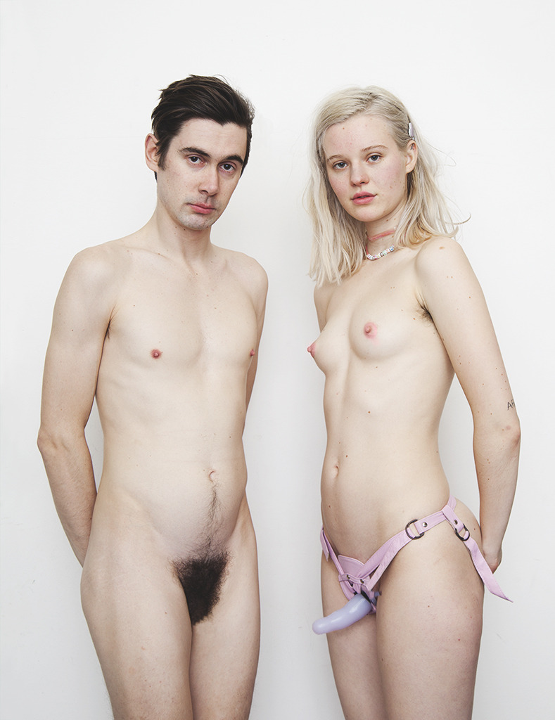
While I was thinking this well before starting this Tumblr, the stunning lack of variation in content and form of images crossing my dashboard supports Polti’s thesis.

Thus, when an image like this appears, it stands out.

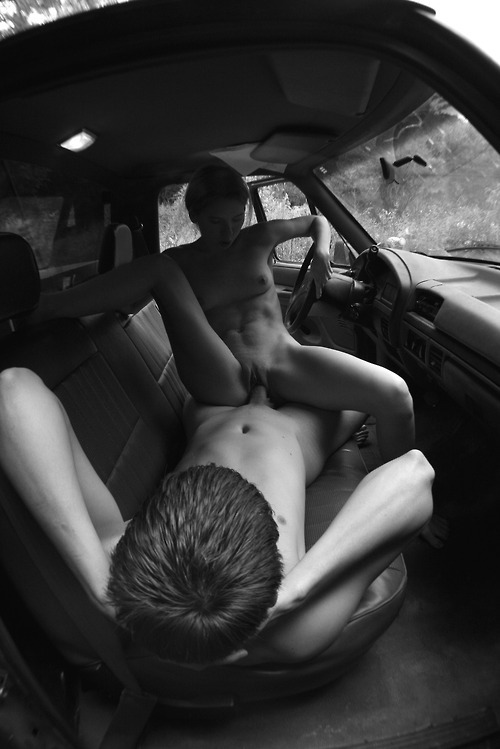
A young couple fucking in a vehicle—the content—is not as compelling as the execution—the inclusion of both their bodies full in frame and in doing so there is the suggestion of a broader context in which the scenario is unfolding (i.e. a truck cab parked somewhere in the woods).

I could toggle the greyed out heart icon to red and be done with it. But a technically accomplished and innovative shot is not enough for me. There has to be something more. Otherwise it is not unlike so many movies where a superb conceit gets squandered by half-assery.

And vertical framing is almost always half-assed. Let me spell it out as clearly as possible: ninety percent of the time identical information can be better conveyed by a horizontal frame. Of the remaining ten percent, eight consist of architectural images.

There is enough space above her head and below his that a horizontal frame would have provided the same information. I understand the existing frame echoes the positioning of the subjects. However, that logic is equivalent to the infamous parental famous because-I-said-so justification for nonsensical orders.

A horizontal frame unquestionably demands more and more difficult compositional choices be made. For example, do you keep the couple centered in frame or do you shift them off-center, letting more of either the windshield & hood or truck bed into the frame?

The implicit logic behind the vertical framing belies the real trouble with the image: it is self-consciously pornography.

That’s not a bad thing. The problem is pornography has a habit of separating sexuality from any interpersonal context: sex is an appetite, after all; all-too-often pornographers present appetites independent of the hunger that serves as their impetus. In other words, sex is presented as its own justification instead of something motivated by desire, passion and naked human need.

Imagine how much more moving this image would be if the boy didn’t appear to be doing a sit up, his head lulling back, biting the corner of his lip; his right hand caressing her left inner thigh.

The oft trotted proverb goes: good artists borrow; great artists steal.

Whether it was T. S. Eliot or Picasso who provided this sentiment and regardless of any inherent merit, this has become a prima apologia for shitty artists the world over.

With its focus on a scene unfolding in a room lit from frame left, this image ostensibly borrows from Vermeer. Yet, unlike Vermeer—whose canvases present their subjects en media res: reading the final lines of a letter, pouring milk—this woman actions are ambiguous, her pose highly contrived in an effort to appear natural; however, consider what situation might require her to so pull her gown up around her shoulders and face away from a readily available mirror in order to stare down at her nude body?

I would be very surprised if the individual responsible for this image was unfamiliar with Vermeer. However, borrowing here from Vermeer is like asking a friend to lend you a designer sweater to wear with your new backless red dress. 

The theft that does work is from an artist I would wager is unknown to the image maker: VelázquezLas Meninas specifically

Mirrors have a way of fucking with subjectivity. Velázquez depicts the subject—that is, the king and queen—only in a faint reflection; the scene instead focuses on the artist—presumably Velázquez himself—painting. At the same time, note the painter is considering both his subject and we the spectators.

The mirroring in the image above is less complicated but does produce, if accidentally, an interesting effect. By angling the camera so it views the reflection without being itself reflected, as well as the inclusion of the reflection of the young woman’s face reflected from a smaller mirror along the so-called fourth wall gives the room an implicit dimensionality. An implicit dimensionality that, in effect, deletes the physical presence of the camera from the scene; muddling matters of subject/object, observer/observed along with the questions of exhibitionism and voyeurism accompanying them.

Take these photographs—similar in form and content, starkly different in execution.

Top: a stunningly young woman stands on a lanai, skin suffused by white hot tropical light. A medallion—perhaps an inch and a half in diameter—dangles just below her supersternal notch from a thin black cord encircling her neck; a visual trick that succeeds in making her tiny breasts appear flat. Her carefully manicured hands hook a thumb each in the elastic waist of her bikini, offering a glimpse of her depilated pubic area and labia majora. With her head tilted forward and right slightly—she appears as if interrupted in looking down at her body, judging how much of herself to reveal—eyeing finding the aperture and the spectator lurking behind it.

Bottom: Alba, (photographed by the devastatingly talented Lina Scheynius), a stunning young woman stands naked before an amaranth backdrop. Warm amber light—presumably from a window beyond the left frame edge—angles across her chest mirroring the line of her collar bone. Another illumination echoes the angle of the window—correcting it downward slightly— casting white across her right elbow, stomach, hips, unshaven pubis, finally finding her left forearm/hand as a result of the vague contrapposto bearing of her pose. Shadowed, her head gaze downward; focused on something only she can see. A single stray strand of hair escapes the bun atop her head, dangles by her cheek.

I know I am always going on about the politics of frame lines. To what extent I mean that as pertaining to graphically sexual images or all images, I am not sure I can articulate yet.

There is a general “rule” on this matter when it comes to image making: if you have to amputate a limb with the frame edge cut midway between joints instead of closer to the joints; this creating a more life-like rendering. (Don’t ever decapitate! Seriously if you are concerned for your anonymity just take a normal picture and black out your face in Photoshop, already!)

Which of the above follows this rule? What is the effect?

Also, note how the vertical frame edges in the top image do not line up with the fence or the edge of the patio.

The young woman in the top photo is sexually appealing in the extreme. After first blush, she is perfect. At the same time, she is not someone I am convinced could ever be known in any sense. Her eye contact purports a false intimacy, implies that if our paths ever crossed I would be best served to view her as nothing more than her exquisite body instead of seeing her as someone with a life that goes well sometimes, others not so much; who has needs both met and unmet. I am not saying she is objectified so much as reduced to an archetypal idea.

On the other hand: with every shred of context removed except her body, I find myself wondering who this Alba is, what her inner life is like at the same time I am aware that she wouldn’t owe me an answer if I ever met but that if I were lucky she might not mind being asked.

In the end, the last image is for me sexier; like most of Scheynius’ photos its restraint, patience and passion sears itself like a brand onto your visual memory.

I love their closed eyes, the bright flush to their faces, the bodies tense with forestalled impatience— I want you to enjoy it, enjoy me enjoying you enjoying it—a full-blown sensory flashback: I remember my knees shaking and teeth transformed to mercury quivering in my gums and the weight of knowing— God himself did make us into corresponding shapes like puzzle pieces from the clay; knowing is not enough against wanting, wanting to see this through tired-tired eyes spread holy-holy awed and wide as the wet of lips meeting and our fumbling lead boned find those secret fleshy spaces with their tiny, tiny alters to bear and burn lonely so many offerings.

The pale one, her fingers slid up almost to the wrist into the others blue-grey briefs, deeper; while she is herself caressed through white knickers— I remember the slick groove of a dew pussy leeching through cotton and then glistening silken on gliding fingertips.

In his The Birth of Tragedy, Nietzsche—bear with me—suggests Athenian drama as the highest form of human art due to its seamless fusion of the two most basic human tendencies; he termed these: the Apollonian (critical) and the Dionysian (libidinal).

Perhaps, this is not a bad way of beginning to analyze whether and to what extent a work of intended as pornography can transcend the intention of its creation and be seen as art.

This image suggests an approach to me because I have two very equal and opposite responses to it that can more-or-less be mapped along axes of critical and sensual responses.

Looking at this image with a critical eye I appreciate that, excepting for her knees and feet extending beyond the edge of the frame, this young woman is presented intact within the frame. If she were to feel so inclined she could get up and walk away.

She is aware of herself being seen at the same time she refuses to engage the spectator by closing her eyes and positioning her feet in a way which ensures the focal point remains her body as a whole not just her vulva.

On the other hand, the kitchen backdrop is hell of problematic. Whether intended or not, it portends an unchallenged allegiance to prevalent patriarchal attitudes.

Technically, the image is over-exposed and would have benefited immeasurably from the photographer taking a half step back before clicking the shutter. Also, the bright light falling on both the subject and the wall behind her flattens the image.

My libidinal response to this image is less conflicted. This woman is my decidedly my type: petite brunette with Eastern European features and barely-there breasts; and wonder of wonders, she has pubic hair—a hairless pubis can be breath-taking when it is the exception not the rule but I prefer hair down there.

But I cannot read this either as an Apollonian or Dionysian. My gaze drifts until it locks in on the slight glimpse of the hollow held by her labial folds. Then her set against the (cold?) wood floor reintroduce the angle at which her porcelain legs. My eyes scan upward and I find myself faced again and again with another human who desires (and is desired), dreams(is dreamed of) and needs (and is needed).

(via captio)

A not insubstantial number of images indelibly imprinted on my mind have been made by Traci Matlock and Ashley MacLean—or, as they are perhaps better known: Rose and Olive of tetheredtothesun on Flickr and Nerve.com photo blog fame.

One cannot talk about Rose and Olive without addressing process. As I recall, they their work was always intended as a collaborative undertaking: Rose shot Olive and Olive shot Rose. The subject of the resulting image became the final authority on whether or not the image would ever see the light of day. In this way the subject is also a co-author of the work—an especially clever fuck-you to the proprietorial expectation of traditional male spectator.

Their work rings truer than most, resonating with a sense that this moment was something that happened just as you see it here.

The result has always been in my opinion some of the most sexual explicit photographs—if not so much in content, in implication—I have ever seen.

It’s possible to dismiss it as cloyingly exhibitionist, but the trust between the two is too wide-eyed in its unwaveringly dedicated sincerity.