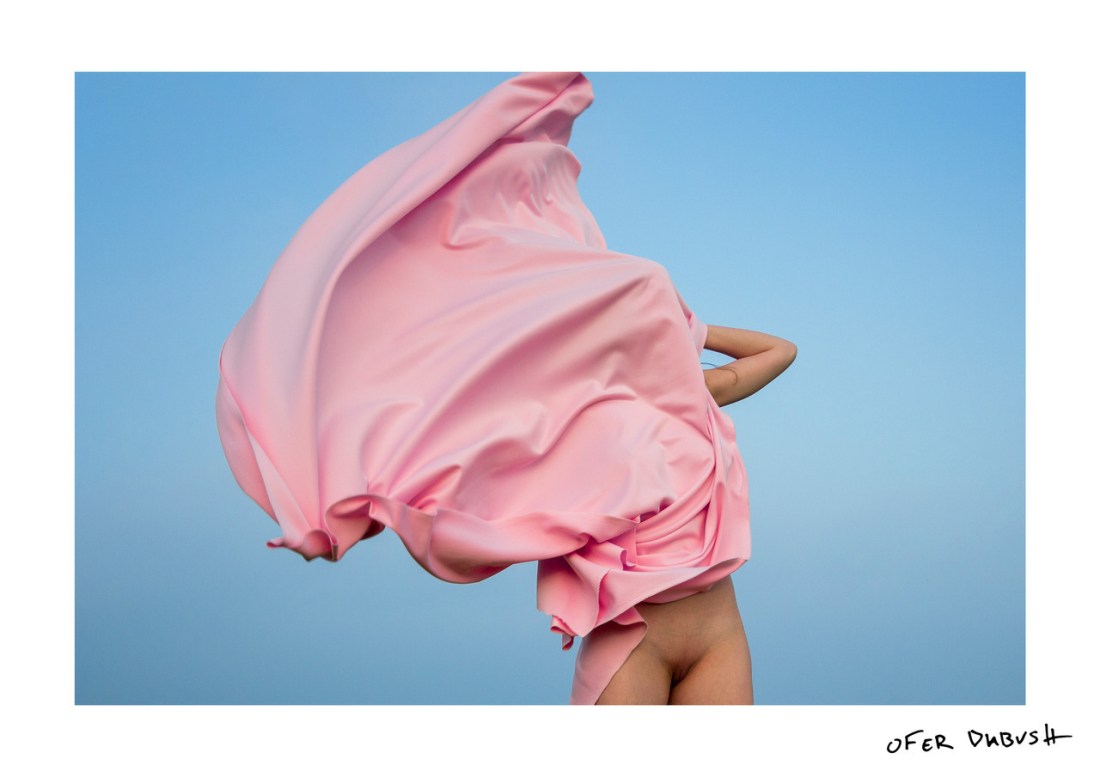
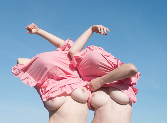
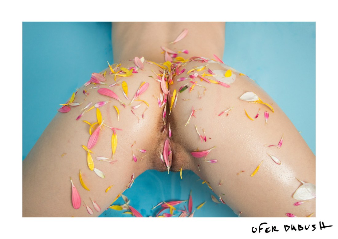
Ofer DabushUntitled (2017)

This is the fourth time I’ve featured Dabush’s work in ten months.

His work emphasizes an astute attention to the interplay between colors, an impeccable sense of composition as a mode of graphic design as well as a stripped bare minimalism as act of visceral confrontation–a confection as intriguing as it is intoxicating.

The struggle that I’m beginning to have with his work, however; is that I see him leaning heavily on experiments other photographers and image makers have already done a lot of heavy lifting on.

We all borrow and remix–there’d be no art or creative expression without those acts. Yet, who Dabush borrows so assiduously from is a bit more problematic.

One of my previous posts was meant to point out that several recent pieces of his might as well be direct visual quotes from Prue Stent. He’s also posted work highly reminiscent of Laurence Philomene’s. The above is of a kind with the predominant thrust of Joanne Leah’s work from the last several years.

I keep thinking of Watson and Crick vs. Rosalind Franklin. If you’re a science nerd, you’ll probably know this story already but Watson and Crick had been researching DNA but were more or less stuck. Someone introduced them to the work of Rosalind Franklin–who had discovered that DNA was arranged in a double helix formation. Watson and Crick realized that the discovery was huge and rushed to publish it, so they could stake their claim to it. It’s only recently that the two thieving bastards are started being treated as such and Franklin is only just beginning to receive her due.

Not saying that Dabush is necessarily stealing. (Correction: he 100% is in the case of Prue Stent, the rest are more nuanced and I believe given the rationale that it’s not stealing if you take something and make it better–I do think he is pushing the things he’s borrowing from other artists in meritorious directions. But it is still somewhat off putting to see a cisgender dude seemingly target the work of up and coming women artists.

Ofer DabushUntitled (2016)

This image doesn’t so much fit with this project. I’m including it for two reasons:

  1. I effing love it; and,
  2. the vast majority of Dabush’s work is of a piece with the rest of the stuff I feature here

Seriously, it’s really worth spending some time with his work. I don’t necessarily love all of it–he plays fast and super loose with compositional grammar and he frequently present work that’s miles of style with only a couple centimeters of conceptual depth–the two influences on his work that come through the most clearly (at least to me) are Ryan McGinley (whose work is gorgeous but almost entirely vapid) and Yung Cheng Lin

No matter: Dabush’s work is all capital Q Quality (as far as I can tell).

I’m especially interested in this because of the texture. The tightly knotted pile of the carpet as a backdrop for the linear forms of the ribbed knit pullovers against the softness of the women’s faces.

The .exif data on this was not stripped prior to upload. Take a gander:

image

The 29mm focal length suggests this is a zoom lens.

There are two kinds of lenses: prime lenses and zoom lenses. The characteristics are not interchangeable but let’s consider Canon’s 28mm f1.8 to establish some sort of framework.

The minimum focus distance for the 28mm f1.8 is .25 meters, a bit under 1 foot. Thus, with the lens dialed into the the nearest focus, something .25 meters from the camera will be in sharp focus.

BUT! The wider the angle of view provided by the lens, the greater the depth of field. (ex. a 28mm f1.8 lens will have a much greater depth of field when set to the minimum focus distance and widest aperture than a 85mm f1.8 set to the minimum focus distance and widest aperture).

As the aperture narrows, the depth of field increases. Thus, given that this is already a wide angle lens and the aperture is stopped down slightly less than halfway, you’ve got a reasonable slice of the area of view in focus. To say it another way, given these settings it would be difficult for you to not capture a frame that is in sharp focus.

What’s interesting and artful about the way this frame is handled is–unless my eyes deceive me: the camera is focused so that the majority of the area in focus in the frame is actually behind these two women. The carpet is very sharp, the sweaters still sharp but maybe a touch less so and you get an additional, softening flattering affect on their faces due to the fact that the near focus is just beginning to go a little soft.

But there’s a third element to what makes this work that is even more notable: color.

There’s this notion named chromostereopsis–it’s basically the idea that red advance and blue recedes, aka why 3D movies are a thing.

Yes, the carpet here is grey but it has blue in it and therefore it seems to recede from the focal plane, whereas the red pushes upward toward the viewer. The result is that although the red is just as close to the carpet and the camera as the yellow, the red stands out more and this illusion contributes dimensionality to the yellow, also.

Lastly, the yellow to red spectrum of the two sweaters include the skin tones of the two women; in combination with the grey-blue carpet this emphasizes their faces in the frame.

Great work from someone who is clearly an astute image maker.