Torbjørn RødlandPoolside (2017)

At some point I am actually going to be able to compose something coherent on Rødland’s work.

Today isn’t that day–unfortunately.

Thus, as a place holder please watch this interview produced by the Louisiana Museum of Modern Art. (The circumspect way he speaks about his work sets my teeth on edge. His positioning of his art as an outcropping of an effort to find value in the banality of stock photography, along with the influence of Jeff Wall and his frustration with realism are astute observations; however, I’m more interested in how his work seems to be the inheritor of Nobuyoshi Araki’s mantle–except Araki obsessively and explictly explored the intersections between pornography and art from the position of a pornographer, Rødland’s work strikes me as an inversion of Araki’s M.O. I’m just not yet to a point where I can coherently explain my thinking on the subject…)

Jim MalucciNereyda Bird for Lui Magazine (2017)

This is a veritable cornucopia of textural exquisiteness.

The chicken wire. Also, the shadow it’s casting.

The water droplets on Bird’s skin–and the variation in appearance: highlight aliased with shadow against highlight, shadow aliased by highlight on shadow.

The mottled refraction of light in the pool’s water.

Brick, concrete made to appear macadam-y.

Palm fronds.

There’s some compression going on that I suspect was introduced in post. Nereyda is noticeably separated from the water by noticeably dodging the exposure around her left side.

A remote flash unit bringing the trees in the background up a little would’ve helped make it pop even more.

The thing that I don’t understand here–and it’s really a small criticism–but with the depth of field the range of sharp focus seems to start on the shadow cast by the chicken wire–so behind the plane on which Nereyda’s face is positioned. The shadow of the chicken wire is all that is needed to convey what it is and how it relates to the overall image. I think I would’ve preferred a shallower depth of field combined with closer attention to her face. The location scans clearly whether it’s in focus or not and I think that it would’ve been better to trust the texture to sell the image than to salvage the concept of the image with selective editing that would’ve been unnecessary if the original image were made with a slightly different set of creative decisions.

Mike SteegmansKatrin Tonin (2016)

This was labeled as a Polaroid–but it’s not: Polaroid only made 1:1 and 1:21 aspect ratio instant film.

This is a 1:1.6 and change, making it Fuji Instax Wide.

Instant film (Polaroid/Impossible and/or Instax) is… well, let’s call a spade a space: a right royal pain in the arse to use. With Instax you’re talking roughly $0.75 cents a sheet and Impossible Spectra film is approx. $3 per sheet.

The Spectra gives you a bit more control but is EXTREMELY finicky; and as long as the flash doesn’t fire and you’ve positioned yourself to account for the shortcomings as far as the Instax Wide’s fine focus capabilities, it’s slightly more forgiving. (A caveat is that while I’m uncertain if they’ve fixed it in the new 300 model, the 210 featured one of the most lamebrained design snafus I’ve ever seen: the camera doesn’t have an off switch and as such it’s very easy for you to accidentally activate the lens without meaning to and if the lens cannot extend or retract unimpeded, it takes like ten seconds for the gear and groove mechanism to strip.)

All things being equal: it’s really a trade-off. Spectra can be much sharper than the Instax. But part of the allure of Instant formats is their limitations–a plastic lens is only gonna get so sharp. But that same plastic lens causes color diffusion–one of the reasons that a well executed instant film photo looks like nothing else.

(I used to say if cost weren’t a consideration, I’d use only instant film for color work. I’m learning that’s not entirely how I really feel. A well executed instant film photo presents color the way I personally see it–I tend not to notice color individually, I notice it in terms of opposition to or compliment for other colors. Yet when it comes to looking at representations of color, I’m more interested in conveying something experiential to the viewer (slide film is the better vehicale for that, I’ve found). A less abstract way of saying it might be to say that instant film always feels to me like This Is What I Saw vs slide film as this is what I saw joined with how what I saw made me feel.

Karmabella – Reflection (2010)

The subject in this image is a Flickr user who goes by the alias Tangolarina; she documents her life with an emphasis on a curious and unflinching examination of her own sexuality. (I’ve previously featured an image in which she captures herself masturbating.)

I can’t and won’t argue she’s a good image maker–though she does deserve credit for her brash audacity and seeming fearlessness in what she shows of herself.

The above image–presumably made by a friend–is from the stand point of technique–better than the majority of images in Tangolarina’s photostream.

Yes, it has a nice tonal range: it’s segmented between what you might call sepia-lite (in the skin tones), sepia-mid (in the area surrounding the subject) and sepia-heavy (in the reflection). The way it almost looks as if her reflection is staring back up at her is an inspired touch.

Unfortunately, the canted angle distracts from everything else. (What’s that? You say it’s a reference to the cinematic tradition of using an unleveled camera to convey a sense of nightmarish anxiety. Uh, no. I realize that the vast majority of photographers and image makers don’t have the budget of someone like say Annie Leibowitz. That means that we can’t always control everything about rendering the location an exact match to the initial vision. If the fence hadn’t been there, it’s arguably that this might have worked. (And it might’ve worked better given a vertical composition–the trade off being that the aspect of up-down flow would’ve been de-emphasized.)

My point is merely this reads like a back yard that someone is trying to use as an oneiric setting. The tilt isn’t severe enough to fully convey the aforementioned sense of expressionist foreboding and the fence actually blocks additional light that could’ve filled in allowing the reflected face to be fully visible.

As something between proof of concept and a preliminary storyboard, this is a stellar concept that I would like to see executed with greater attention to detail and working towards a clear conceptual end.

I really need to make one more crucial point here–and this is also sooo much more important than any of the preceding observations: I ADORE the way that Tangolarina is pushing the envelope on at what point depicting the body becomes pornographic. While some of her preoccupations and concerns are decidedly prurient, at no point does she allow things to drift across that nebulous line into the realm of pornography.

That alone is worth the time and energy necessary to explore her work.

Christine Godden – [↑] Light Touch #009 (197X); [←] Light Touch #008 (1970); [→] Light Touch #019 (197X); [↓] Light Touch #016 (1970)

In an interview with LENS Escuela de Artes Visuales in Madrid, Mark Steinmetz comments on the difference between B&W and color photography by saying something to the effect of if you’re shooting B&W you want to be on the blindingly bright side of the street; whereas if you’re shooting color you want to walk to the other side of the street and work in the shade.

Therefore–given the time when these images were created and given their ostensible fixation with capturing the interaction between bodies and light–it’s understandable that these were shot B&W.

Given the premise, these images were not necessarily destined for greatness. After all, ‘photography’ literally means ‘drawing with light’. And no one needs to look further than the parade of images on Instagram that serve no other purpose than to document the fall or angle of a certain precocious shaft of light.

To my mind what makes these images exquisite is their intimacy. However, instead of making that observation and then leaving it at that as I normally do–usually because I struggle so much with the unruly beast that is language and don’t know how to convey my thoughts clearly; I think it’s worthwhile to dig a bit deeper here.

Godden’s eye is unusually disciplined. The one thing that I believe holds true across her body of work is that through it’s revealings, it actually manages to conceal far more than it presents–the hiked up skirt hem, one erect nipple/the other concealed, a shift lifted to reveal allow a bare tummy to luxuriate in light and a nude body stretched out beside a pool.

Nothing is explicit; yet the photos are organized to point–seemingly incidentally–towards what remains unseen.

All of the above images are what I would term close-ups. I typically don’t like the close-up because I feel it tends to highlight a part of the whole instead of the part within the context of a whole. These images have a context–albeit a purposefully limited one.

What’s interesting is these images remind me quite a lot of glossy ads for luxury items from the late 80s/early 90s that I see beginning to bleed in around the edges in emerging ads that go over the top to commodify sexuality by aggressively conflating it with whaat ever the fuck is being sold–the pairing of several discrete elements that read as surreal juxtapositions.

In the case of such ads, it’s the product that unifies the disparate elements. But with Godden’s work, these carefully constructed images allow for the viewer to experience a sort of mirrored relationship between the photographer and her subjects. There’s very much something of seeing the world through someone elses eyes.

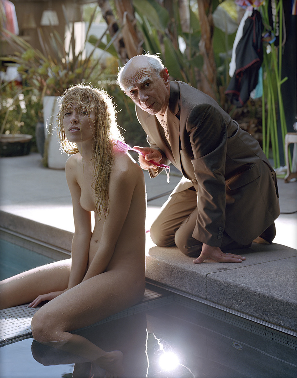
Source unknown – Ace, Joy and Erica (2008)

As a general rule: I don’t post images shot in color and subsequently desaturated. I’m making an exception with this because it’s literally a thousand times better than the low contrast, optically flat and unappealing original image.

Also, I really try not to post excerpts from shitty corporate porn often. I’ve noted the source here as unknown simply because this image has been licensed and relicensed so often, I really have no idea who the original author even is.

So with two strikes against it and the fact that even if the desaturation restores some desparately needed depth and contrast, it is still a compositional shit show–why the hell am I posting this?

Well, not unlike labeling oneself an anarchist unfairly welcomes correlation with Caucasian crust punk wannabe layabouts who smoke too much weed and have a less than nuanced appreciation for Bob Marley, I feel that the credo sex, drugs and rock n roll gets a similar bad rap by association.

That such a ready-made comparison exists is politically expedient. Thoughtful practice of anarchism is a threat to power structures in a way that few other -isms manage and sex, drugs and rock n roll as a baseline system of belief/motivating factor is similarly if not more dangerous because all three independently or amplified in combination have a proven track record of demonstrating to the individual the extent and degree to which learned limitations are bullshit.

I guess my point is that there is only so much you can to to push your own limitations. It’s like tickling–I can’t tickle myself, someone else is required for that.I know in my own experience that although best orgasm I’ve achieved through masturbation is only slightly better than the worst orgasm I’ve ever experienced during sex. You know what you’re going to do before you do it and you know what you like… there’s nothing unexpected about it. Whereas someone else can tease, cajole, surprise and push your body towards amazing experiences you never knew were possible.

And something with which I am preoccupied is the limitation of how much is too much, is too sensitive really a thing? In my experience, the answers are nothing and no, respectively. But I feel like I haven’t considered all the options and when I die, I don’t want to wonder if I was wrong I want to know with certainty that I was wrong or that as I suspect, I was right.

I think at the root of it that encapsulates my fascination with group sex in the face of the fact that I am a misanthrope with pronounced anti-social tendencies.