Davide RossiAlice Daniele (20XX)

Learning is a bit like a hat hook.

Say I’m wearing a knit hat–this one for example.

Further, say I’ve been trudging around in a snowstorm and it’s rather damp, so I peel it off and go to hang it up.

I can attempt to hang it on the wall all day but unless there’s a hat hook, all my efforts to hang it up are doomed to failure.

Learning is sort of like a hat hook. You can’t learn something until you have a place for what you learn to go–for lack of a better way of saying it: counter-intuitively, the learn something you have to already have some idea of what to do with what you are being taught.

I first encountered the notion of the Zone System in a cinematography workshop back in 2004. In hindsight the teacher was awful–he introducing it as a system of determining exposure codified by Ansel Adams and read this section from the Wikipedia article on the Zone System to us pretty much verbatim.

My response was well what the fuck does this have to do with fuck all else? (I lacked a hat hook (place) for my hat (what I was ‘taught’.)

Now that I do get the basic parameters of the Zone System, I have changed my tune a bit–it is EXTREMELY useful when producing a print or critiquing/responding to monochromatic work to employ the Zone System as a framework for analysis.

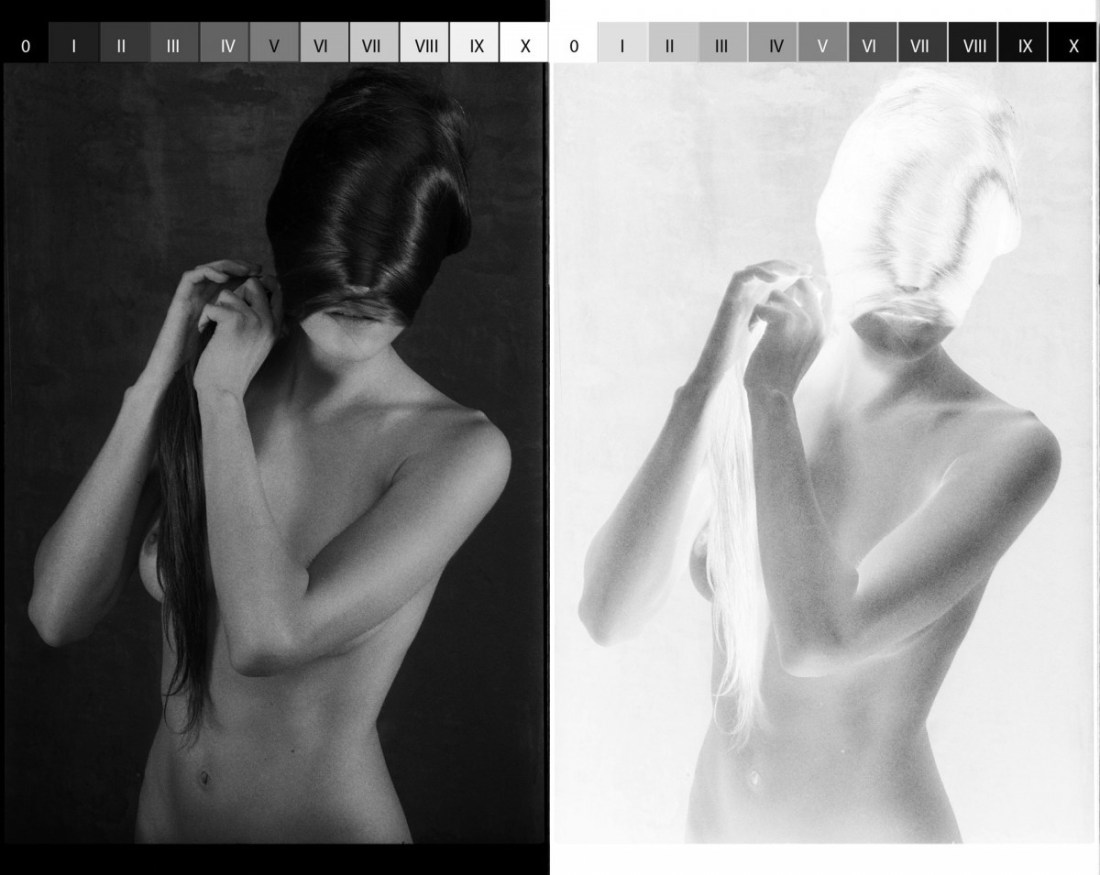
The image above is actually the first time it’s clicked in my head that the Zone System has application to not only printing and analysis/criticism, it has applications to the creation of the image itself, too.

Let’s back up a wee bit to get a nice running start. If you’ve ever taken a picture with any sort of attention, you’ll know that while modern cameras can do a reasonably good job left to their own devices. BUT! Should you want something a little more polished, you have to provide the camera some information. You can roughly encapsulate such information by suggesting the camera needs to know what’s white and how much light from the scene it should capture.

Modern cameras are super super smart about identifying what’s white–auto white balance is damn remarkable. The reason that we have manual white balancing functions is because you can creatively fuck with color by say holding a green sheet up paper in front of a sensor and telling the camera to recognize green as white. (As an example, the ubiquitous cinematography trend in the late 90s and early 00s, was to call pure white, white and then shoot under fluorescent lighting–which gives everything this nauseated green cast; think: Fight Club and to a lesser degree The Matrix.)

With B&W analog–everything is based off the notion of middle grey. (Zone V in both of the above images.)

In analog photography, you aren’t able to pre-visualize or relay on a histogram to determine optimum exposure (although if you’ve got megabucks like Daddy Warbucks, you can do Polaroid test shots… sigh, if only…).

In order to judge exposure analog photographers use a light meter. That light meter can be built in to the camera itself or be an independent handheld device–either way, it conveys what the optimum setting is to render an 18% middle grey value depending upon where you are taking the reading.

That last part is important. Like White Balance, you can selectively manipulate your image depending upon what you decide the camera should treat as middle grey.

I actually took the above image and chromakeyed out the tonality of all of the zones, individually. It looks like this:

Note: the fact that Zones VI-X are not represented within this image. (This would indicate that at the time the photo was made, an 18% grey value was attributed to a tone a good bit darker than actual middle grey.)

And while this is super useful in explaining the relationship between the negative (in this case Kodak’s Tri-X rated at 320iso) and ostensibly a print, to be ideally illustrative you’d want the image on the left above to appear all the way to right and to add a photo exposed to provide maximum dynamic range. Although that might end up detracting from the point since a pristine exposure will absolutely allow a talented print maker to replicate this effect in a print; however, a less than pristinely exposed image loses some of that latitude. (It’s hard to tell because I’m looking at a scan of a negative and not an actual negative and the relationship between the value of middle grey in digital vs what the human eye interprets is fundamentally different, still, it appears that this photo was underexpose by several stops from square one.)

alveoliphotography:

August, 2015.

Tiffany Helms x Alveoli Photography

This post is guest curated by @suspendedinlight.

As someone usually preoccupied with stillness, my favourite thing about
Alveoli Photography’s work is actually how it always feels on the verge
of coming to life. I can look at his images and feel that they are
moving and breathing. Also I genuinely think
Tiffany Helms is one of the most talented faces out there right now.
Her expressions are so genuine, she can tell an entire story, sell an
entire image with her eyes. I can’t decide with this one whether she
might be inviting the viewer in or walking them
out.

Meg AllenUntitled from Butch series (2013-2016)

Because dyke hands are the sexual organs of lesbian love,
they can be as shocking to view as the penis through an open fly, or as
bold (delicious) to behold as the breast of a woman suddenly uncovered.

–SDiane A. Bogus, Dyke Hands and Sutras: Erotic Lyric, 1988

(Note: @lesbianartandartists originally posted this content. I’m reposting only because I prefer to showcase images with greater resolution where available; I was also able to provide ever-so-slightly more specific attribution details. Still Lesbian Art and Artists is an indispensable resource and I hope you’re all follow their blog because it is one of the most consistently exceptional blogs on Tumblr. 10/10. Highly recommended.)

Julia KlemUntitled (2014)

I’ve been thinking a lot about the difference between ‘good’, ‘better’ and ‘best’.

As with most of my mental tangents, it started as a digression; specifically, a friend was talking to me about their post-election anxiety.

They said: I feel gutted.

Gutted: a harsh word–the choked G, the clot of Ts; a former presence (I had guts before) and current absence (I no longer have guts); an implicit violence resonates.

Good/better/best?

Gutted: a word intimately connected with hunting and fishing–you gut the fish you caught, the deer you shot before you can eat it. Something dies so that something else might live on. If you’re gutted the benefit of your body is no longer something for which you may lay claim/benefit.

Eviscerated?

Like ‘gutted’ it conveys a similar sense of former presence and current absence, except presence or absence are connected more to uselessness of the presence. The word itself is violent but there’s a matter-of-factness to the treatment that feels sterile–the corpse on a slap with a Y incision and the visera packed into a plastic bag placed somewhere off to the side on a scale.

Hollowed out?

The former presence is downplayed to focus on the current absence. Did it happen slowly? Was it violent. Is it figurative or literal?

Good? Better? Best?

Initially, I thought that ‘gutted’ was good; ‘eviscerated’ was better and ‘hollowed out’ was best.

Now I’m not so sure. I think if I were speaking, ‘hollowed out’ would be the best choice. For someone else, it might be different.

I’ve been thinking about this in terms of artistic influences–that’s the prism through which I’m approaching Klem’s fucking FANTASTIC photographs.

Any schmuck who knows a bit about Internet famous photographers, can probably spot the overlap between Klem and Laura Makabresku. (And there’s almost no way that Klem doesn’t consider LM an influence–it’s much more than the repeated crow motifs.)

I don’t like LM’s work; it’s Brooke Shaden directing a Stabbing Westward music video based upon a little known Edgar Allen Poe short story aesthetic has always struck me as pure posturing (at best) or sycophantic contrivance.

Is it unique? Without a doubt. But does her gauzy, soft-grunge aesthetic compliment yearning and mournful–or is it yearning to be mournful– favors concepts and content.

It’s almost like hearing someone say they felt ‘gutted’ and then every time they find yourself in a situation that they think is similar they respond by saying they feel ‘gutted.’

And that’s not necessarily a bad thing. We learn what feelings apply to which situations through empathy.

Artistic influence is not unlike this. We find comfort and derive solace from work that moves us. So it’s easy to say: this moves me the most and therefore I am going to make this the example that I follow. Our heroes say they feel gutted and we are inclined to follow suit.

But none of us are our heroes. And part of being a gifted artist is knowing when to stay the course and part ways.

I’ve always felt that LM say she feels “gutted” when she might be better served by identifying as “hollowed out”. 

That not a bad thing, inherently. Although in my experience is does limit the range, resonance and accessibility of the work. What frustrates me about LM is that her choices always seem to so completely undercut what I feel is the central tact of her work–slow dirge for new oneiric feminine; and she stands behind those choices with such bravado.

Why doesn’t that diminish the value of Klem’s work–I mean if she’s influenced by LM, then doesn’t that discount her work? I would argue no. There’s a way in which Klem’s work manages a unified aesthetic but the aesthetic expands outward to engage with concepts. (LM on the other hand tosses concepts like darts at the bullseye that is her aesthetic.)

In other words, Klem work is comparable to the person who says “hollowed out” because it’s the fullest way of expressing their own multiplicity of meaning even though ‘eviscerated’ might make her feel smarter and/or ‘gutted’ might appeal to her desire for visceral resonance.

The two other observations I can offer on approaching Klem’s work:

  1. While I’m less fond of her experiments with color but her use of it is entirely in keeping with notions of what role color should play in fine art photography–her color work insists on its own colorness in exactly the way color fine art photography should.
  2. Less in style or execution but when it comes to the relationship Klem seems to wish her audience to have with her subjects, there is more than a passing reminiscence to one of my favorite photographers of all time: Lynn Kastanovics.

Bonus: Klem really knows when and where to preference vertical orientation over landscape. (It’s actually a subject to which I  am considering the dedication of a future post .)

Sophie Harris-TaylorFrances (2016)

Like most of the rest of Tumblr, I just finished Stranger Things. (I have mixed feelings about it; I never really felt that it ever came together in any kind of totality. The mid-to-late 80s nostalgia comes across as heavy-handed and seems more designed to fuel a sort of instant-geek connection to the show than to actually provide any sort of substantive immersive world building. It’s saved by unusually committed acting and surprisingly dexterous attention to consistent application of visual form and spatial continuity.

When I saw the above image, the mussed dark hair and the shape of the model’s face reminded me rather strongly of Natalia Dyer’s character Nancy.

Like the show, I have mixed feelings about this image. The color is nice–a very rigidly circumscribed magenta spectrum from skin tone highlight to the ribbed peach top to the pink-red lipstick.

However, the pose is odd. Does anyone else wonder what in the hell is going on with her right arm? And the pose–the tentatively uncertain hovering of her hands near her neckline–almost like she’s fingering a beloved pendant. But it’s designed for her to stylistically pull the top up to reveal her breasts. Why? For whom? Things are a bit a-muddle with this as far as questions of voyeurism.

It reminds me of this image of Génia by PeterVR. Both feature awkward/odd, self-conscious poses. Harris-Taylor’s is technically superior. But I feel like PeterVR actually provides enough context where the self-consciousness actually dovetails nicely with a more consistent application of the conceptual underpinnings of the image–i.e. his image takes a definitive stand on whether or not the work is voyeuristic.

Jo SchwabUntitled (2015)

Studio work de-emphasize setting and by extension temporality. The notion–or at least the notion as I understand it–is that this contributes to an isolation of the subject and through that isolation any adornments or distractions are removed and the viewer is confronted by the visual embodiment of an individual identity.

I think what bothers me about studio work is that I’ve always felt it jumps up and down and screams: look, I’m telling you the truth! Unfortunately, I feel that other factors shift and upend the implicit truth value.

Arguably, good studio work requires image makers to remove their own intentions from the picture so that the image will function as a sort of confrontation of the viewer; the camera and the image maker disappear, in a fashion, and the audience is placed in direct correspondence, vis-a-vis another person.

But the relationship between the image maker and the subject isn’t some sort of catalyst that foments the reaction and completely burns away in the process. It fundamentally shapes the resulting image. In other words, the pose and composition are only half the equation. Invisible things–like the mood of the image maker, the mood of the subject, how warm or cold the studio is, the shape and form of the relationship between the subject and the image maker. (Does the image maker want me to like the subject? Be wary of them?)

There’s at least half a dozen reasons why I dig Schwab’s portraits. Partly, I feel like he gets out of the way more the most folks who embrace studio portraiture. There’s a simple, effortlessness–which I know enough to realize is anything but–to his images. You get the feeling that you aren’t face to face with someone who is trying to be liked or disliked. His work feels very much like that moment when the facade cracks and the real person shows through–like that de Botton line about hav[ing] to be quite heavily invested in someone to do them the honour of telling them you’re annoyed with them.

Not that Schwab’s subjects are annoyed with the viewer… it’s more that their expressions belie emotions outside the norm of decorous interpersonal interaction. The model in the above image seems that she could’ve been given the same instructions–give me a look of “world weary ennui” that Sally Mann gave her daughter in this image.

I especially like the lighting in the image above. It’s simple and imperfect. I’d guess a key light with a softbox on the left, overhead and angled down, with some sort of bounce board or reflector on the floor–giving that background just a little kiss of light to separate the subject from the background.

But note also how background behind her hair remains completely dark, pushing her hair forward in the composition, emphasizing the texture. In fact, I think that’s one thing that holds true of the work beyond the amazing expressions–there’s a ridiculous capacity to use extensive technical acumen to parse the frame in such a way that the subjects take on something more akin to a sculptural dimensionality.

It’s really quite impressive.

Natasha GudermaneRomy from Mademoiselles series (201X)

Mademoiselles feels like a complicated riff on Martin Gabriel Pavel’s Daily Portrait Berlin–probably better known as the naked Berliners 365 project.

Pavel took a picture of Elle and then gave the camera to Elle along with the challenge that she had to take a picture of a naked stranger the following day. Elle takes a picture of M and gives M the camera. And so forth.

As far as quality, the results are all over the place. I still love it because unlike the vast majority of stuff out there, there’s an fascination with context. You get to see not only Berliners but also a glimpse of them in their personal/private spaces. Since I feel an almost preternatural connection to Berlin and am myself so preoccupied with presenting bodies in context, I enjoy the project.

There’s a lot overlap between Daily Portrait Berlin and Gudermane’s Mademoiselles.

If you compare the two in terms of technical accomplishment, it’s not a contest: Gudermane wins hand’s down.

What’s odd is that while both projects feature inconsistencies, the inconsistencies of the Berliner project burnish the conceptual underpinnings. (Translation: of course, it’s gonna look different there’s a different person behind the camera each day.)

Whereas with Gudermane, there’s one person behind the camera but other than the content, I can’t say I’d necessarily be able to pick her images out of a line up.

One the one hand that’s suggests a more organic relationship between image maker and subject. Except there are a number of other disjunctions within the work.

First there’s quality. Some images are glossily picture perfect, others seem a little slap dash–like someone who knew their way around a camera took some OOTD pictures for a close friend.

Then there’s the ruptures between the subject acknowledging the camera and the subject depicted as if they are unaware they are being observed. And again, I think both approaches could probably fit within the parameters of this project.

They don’t though for two reasons: the edit is nowhere near tight enough and the discrepancy in approach and conceptualization through their inconsistency point to the fact that I can’t point to any sort of internal logic with regard to composition–for lack of a better way of putting it, it’s like Gudermane is less interested in how the frame is read by the viewer than that what the frame shows is deemed interesting by the viewer.

Take the above image. It’s designed to appear like a self-portrait snapped in a mirror where you can’t see the edges of the mirror. However, it’s really the the picture plane itself that is suggestive of a mirror due to how it’s arranged. (And here’s what I mean about the slight up-tilt in the frame. Yes, it’s clearly supposed to make you think of a large mirror sitting on a floor and leaned up against a wall. But the effect would’ve worked just as well without the tilt. There are little things in almost all of her frames that are similarly WTF? decisions.)

Yet, if you dive down to the most basic level of this, I do see her implicit removing of the image maker from the equation as a pretty precocious first step to addressing the objections I’ve listed here. If this wasn’t a one off–and unfortunately the rest of the images from Romy’s session appear to be just that–it would suggest that not only does Gudermane have a great deal of talent but she also has a keen understanding of her shortcomings as an image maker.

We’ll see. Her work has enough good to it that I’ll be checking in from time to time to see where she’s headed.

Kate SmuragaTitle Unknown from letter from the quiet town series (2015)

I suppose it’s a stretch to claim this ‘belongs’ here–that is: on this blog, interacting with more graphic fare.

It was several months ago when I first stumbled upon Smuraga’s work. There’s not really enough work to get a handle on whether she’s merely precocious or a solid image maker.

Still: there is a quality I find absolutely hypnotic. However, if someone were to ask me what about it I find so spellbinding, I’ve laacked a means of explaining beyond just repeating my initial assertion again.

I came across something today that made me finally recognize the pattern–it’s a quote from writer A. S. Byatt:

Ice burns, and it is hard to the warm-skinned to distinguish one sensation, fire, from the other, frost.

We think–generally–of the middle of a spectrum as being a sort of balance or fulcrum. Yet, there is usual something of one extremity contained within the other. Similar to the way that ice can both be felt to chill and to burn.

The thing that gets me about this image is I recognize the expression as a self-conscious between-ness: not yet an adult and no longer merely a child.

But such between-ness is not so much a halfway point as simultaneously occupying the extreme ends of quote-unquote conceptually incompatible spectra.

(Again, apples invoking the Eve mythos–and with that the simultaneous knowledge of good and evil.)

Smuraga is–in many ways–far more transgressive than most of the artists I post who spend a great deal of time and energy pursuing an agenda of transgression. Looking unblinkingly for transgression is one thing; looking without guile and seeing a wider matrix of connections and finding a way to incorporate them into a limiting frame is definitely the more difficult undertaking…

Pascal RenouxLizzie Saint Septembre (2007)

Orson Welles proclaimed “[t]he enemy of art is the absence of limitations.”

At first blush, it seems counter-intuitive. Exhibit A: centuries of extravagant excess in Western Art.

However, browsing Renoux’s work, I can’t help but notice how it does so much with so little.

I mean: if you’re at all familiar with the Tumblr fine art nude model community, you know there is no dearth of models huddling close to windows in tiny, dim and cramped apartments.

And the vast majority of those images play like a checklist of popular conventions: Dutch Golden Age light, beautiful bodies, oblique shadows. It tends to read more as look at this monument I erected to my own creative effort.

All the same tropes are active in Renoux’s work but their effect is much different. Whether or not you see the window in the frame or merely its illumination seems less a question dictated by the layout of the room and more organically in conversation with other compositional elements in the image. It’s the same with: eye contact vs an averted gaze or color vs B&W. Every element fits together with a breathless exactitude.

Back when I was a film student my only real rival–prior to running afoul of the administration–was this bat shit crazy kid named Igor. He was like the inverse of me. I became a film student because I wanted to make movies whereas he had always loved movies but his only training was in fine art photography.

I was working on a half dozen different projects that semester and had just returned from the lab with a batch of transfers. Igor had asked me to pick his footage up too while I was in Manhattan.

We met in the editing lab and we watched both his footage and my footage. He was intensely critical of the stuff I’d shot–going so far as to say that he could have produced better images with $10 dollars, no crew and tripping on mescaline.

One of my reels featured footage of waves rolling in on the shore. He was mesmerized by it. Made my play it back a half dozen times. He said: That’s good. Because no matter how hard someone tried, they could never–even with infinite resources–produce remotely similar images.

I wanted to strange him them. Truthfully, I still kind of want to strangle him now. But with the benefit of more than a decade to stew, I see his point more clearly.

To be Capital-A Art, work must be more than reverence for a nude body the raison d’etre must transcend monuments to individual creative effort. It’s something that many of Renoux’s images evidence in spades.

Yes, that’s really uselessly abstract. But I think I can actually illustrate what I mean (for once).

This image by Eric Englehardt was made with a 4×5 large format camera. It’s lovely. I dig the scale (you can see the subject head to toe in the frame) and there’s context (ostensibly a dumpster in what may be a junkyard or perhaps somewhat arid locale–in other words there’s an element of public vs private at play).

Here’s another from the same series. It’s medium format. You don’t have a wide enough angle of view to determine context. Like I know it’s a dumpster and I still think it looks like an empty freight train car. The eye contact with the camera, the splash of red nail polish, the windswept hair–all of it works together to make create something that is more than the sum of its parts.