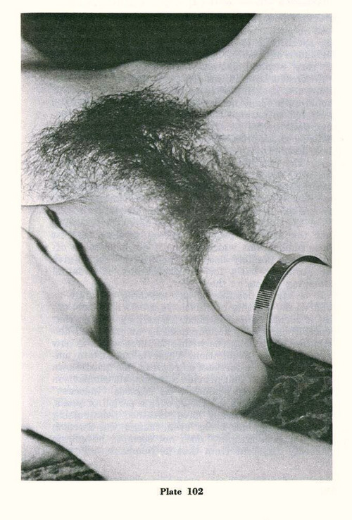
Un instant avec ElleMyself, intimate moment (2015)

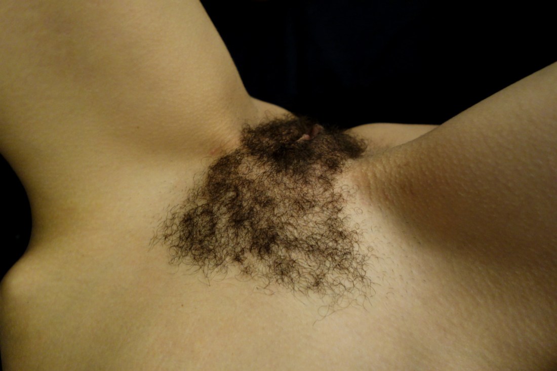
So here’s a picture which proves an exception to the rule of my general distaste for close-ups in image making.

The gist of my objection is that by diminishing contextual cues with regards to setting (interior, exterior), orientation relative to other subjects (or lack of other subjects for that matter) in a given space, time of day, historical epoch, etc., etc., the information the image can clearly convey is severely truncated. This truncation has a tendency to be employed to foster a sort of forced intimacy–this is especially true with regard to portraiture, where seeing something with one’s own eyes up close invites the viewer to bridge the absence of detailed information with a sort of god-like omniscience; or–to state it in a less abstract fashion–the close-up encourages spinning the inherent lack of certainty as to the identity of the subject into a sort of nebulous knowing predicated upon predictable tropes and societal preconceptions. The close-up works–more often than not–because it gives the viewer permission to fill in a number of blanks. And while this is the base nature of the eternal question with regard to what the frame includes and excludes, typically, I feel like close-ups encourage the viewer to fill in blanks they quite frankly have no business filling in.

This image succeeds partly due to its simplicity. There’s a balance between the warm tone light and the dense shadow space, a similar equivalence between smooth skin-tone and texture; also, flatness and dimensionality–the subtle shadows imposed by the musculature are luminous here.

The composition doesn’t quite work: one triangle is formed from the vertices of the shadow space adjacent to the left hip, between the legs and in the fall off at the right hip; while either leg form vertices with an implicit third point at the navel just beyond the lower edge of the frame. This results in the image having an unbalanced visual heft–with the scale tipping slightly to frame right, undermining the careful balance so stunningly apparent throughout the rest of the image.

However, there is one incredible astute conceptual conceit managing to eclipse this minor transgressions. It’s sort of hard to explain it but try something: invert the image and look at it; now, return it to it’s normal orientation. There is a way in which the grammar of an image suggests that the bottom of the frame is closer to viewer and the top of the frame is further way. Orienting the frame as above makes the action depicted not for the viewer. (Given the angle of the frame it’s not strictly a POV perspective either. In tandem with the caption, an intriguing tension is created between a voyeurism one is allowed to observe even though they are not invited to participate with.)

Chadwick Tyler Cora Keegan (2014)

I think there are all kinds of negative implications when you use the frame to dismember a body like this. HOWEVER, everything else about this is in-fucking-credible–the Albers-esque palate, the texture and semi-reflective opacity of the water, Keegan’s skin tone and pose, etc.

The other thing I want to point out here is to reiterate the notion that as bad as it is to amputate legs, it’s much MUCH worse to decapitate.

I know, I know, you want to reclaim your body autonomy while remaining anonymous. I hardcore support you. But there are literally hundreds of ways for you to post your nudes without resorting to offing your own head. The above is a stellar example. Yes, Cora Keegan is a famous model–but the principle still applies. A little creativity instead of the lazy head-out of frame strategy produces seismically better results.

Here are some more examples: Janosch Simon, Jakub P and Elene Usdin.

If you’re willing to think outside the box and engage your critical, creative problem solving skills, then you’ll likely be able to keep your head inside the box while making a better picture and remaining anonymous.

Nobuyoshi Araki Untitled (19XX)

After college, I moved to Greenpoint, Brooklyn. I’m not talking McGuinness & Nassau, either. We’re talking practically under the Kosciusko Bridge.

It was a 15 minute walk to the Nassau G and either 13 or 18 (depending on traffic) to the Graham L.

By New York standards, my room was enormous. But I shared a wall with a Dave Grohl wannabe sax player who constantly practiced atonal three note arpeggios at odd hours.

I was only working part time and after commutation expenses, it was a struggle to make rent each month.

At the time, my significant other was in a similar place. We spent a lot of time walking–which really and truly is the best way to get to know this city. We’d hang out at hip bars sipping a beer between us. Anything that was free and appealed to our mutual creative predispositions was a draw. But if you’ve spent any time in this city, you know it’s not a place you want to be poor.

It took us two months to discover the New York Public Library. Not the one with the Lion’s guarding the stairs but the one that’s caddy corner and a block down. Over the next few months, we spent hours there pouring over their photography section.

We scanned work the likes of Steiglitz, Friedlander and Goldin.

Thing was–and I swear I’m circling back to the image above, hang in there–the selection lacked any sort of breadth and instead focused on an obsessive depth. The number of fucking Araki’s books exceeded a plethora to the exponent of plethora.

I remember three things about the work:

  1. An image like this except with an orange and black flower with petals more like a daisy and Araki himself squatting beside the suspended model.
  2. It was the only thing besides Goldin where sexuality figured in any denotative fashion in the photos,
  3. I preferred Goldin even though I found her work exploitative.

My opinion w/r/t Goldin has evolved rather dramatically; my thinking w/r/t Araki has, yes, shifted but it’s less pronounced and far more complicated to explain.

See: on a purely formal level his work is on-point. His compositions are impeccably executed and his work is hugely influential: would Wolfgang Tillmans be a name anyone knew if Araki hadn’t shot highly styles hair and eyes? Probably not. (Also, the shit he shoots that subtly skewers skewers fake sets in high profile fashion shoots–looking at you, Tim Walker–are about as good as polemical provocations get.)

I can’t even really argue that Araki should pursue more aggressive edits. If he’s published it, it’s almost certainly publication worthy. My primary continued objection to his work (beyond the aggressive heteronormativity of it) has to do–synchronously enough–with an idea I encountered more or less concurrent with my first encounter with the work: William Ian Miller’s The Anatomy of Disgust. In it he attempts to analyze why humans experience feelings of disgust.

One of his points is that profusion is–almost counter-intuitively–a potential locus for disgust. I don’t completely recall the rational underlying this assertion but it absolutely serves in application to my queasiness regarding Araki: there’s too much that’s too good.

The thing that’s especially galling is the fact that almost seems to be the point of the exercise. And I’m no less sure how I feel about that now than I did eight years ago.

Source unknown – Title Unknown (19XX)

This reminds me of both Man Ray’s pornographic self-portraits with Kiki De Montparnasse and Hans Bellmer’s test photos for the cover of L’histoire de l’oeil.

But it mirrors (along a vertical axis) the infamous Mapplethorpe photograph.

I’m fairly certain this post-dates the first two and predates the latter. As much as I admire Bellmer’s audacity in presenting the extremity of sexuality without ever losing site of the hunger for physical pleasure that motivates it and how much the clean minimial aesthetic of Mapplethorpe’s image speaks to me, I think this may be if not the better image out of the aforementioned cohort, it is the most interesting.

There’s a way in which it contradicts itself. The intimacy of the extreme and extremely graphic close up with the bracelet dangling from the wrist–at once both private (an intimate document) and public (a jewelry advert). There’s the way the hand on the left hand on the leg can be seen bracing with an implicit violence to administer greater force or a calming/reassuring means of facilitating connection through an intense physical experience.

Jesús Llaríano head (2014)

As in tune as I can be with logging my own process of reading images, this short circuits everything.

I’m not sure I can explain it without getting a little TMI but it reminds me of being fifteen. (Not that I saw anything like this in the flesh until almost a decade later…)

It reminds me of random, mundane things that would inexplicably trigger arousal so extreme it was actually painful.

I had already been chasing the same oxytocin/prolactin buzz for seven years as a way of smoothing out the jagged edges of my abusive adolescent existence and suddenly it was also effecting some sort of vaguely imagined autonomy over my own body.

As a friend puts it: it’s a real wonder all the masturbation didn’t inflict permanent nerve damage.

So yes: initially seeing this image resulted in me having to release some sexual tension.

Afterwards, I found myself enchanted by the way the image works. Although I’m not sure it’s ever justifiable to employ a frame as a means of dismembering a woman’s body, I can’t technically refute the decision as Llaría observes the dictum of amputating between joints instead of at them.

And there is a notable compositional logic supporting his choice. Note the repeated angle of the elbow which is not the model’s, the line of the lower half of the dresses’ buttons, the way the seam to the left of the lower button line softens the angel to echo that of the model’s right thigh only to have the same angle emerge again in the cocked angle of her right leg.

There’s also the matter of palate: excluding her bush, the image consists of three hues. The rust colored earth figures at the darker end of a spectrum that would include the more magenta tones in her skin; while the white in her slipper and dress are virtually identical. The blue of the dress makes everything else pop.

Let’s not forget texture, either–something about which I am often preoccupied. The skin doesn’t really have texture in this image; except juxtaposed between the dirt and the fabric of the dress the absence of texture becomes a null field. Unlike the ground or the dress you can’t imagine touching the model’s legs but you can recall what it was like to have touched such legs. The visual synesthesia suggests an insistent anti-objectification that subtly reminds that this is no less or no more than what you have always known.

I would be dreadfully remiss for also not mentioning that even though I am not female bodied and if I were I would not be comfortable wearing a dress, I’m more than a little obsessed with the dress.

Maurycy GomulickiMINIMAL FETISH_9895 (2010)

This is problematic for the same reasons I took this gorgeous Kodachrome to task.

It’s a teensy bit off balance– the angle of the legs in relation to the lower corners and the uneven grading of the pistachio backdrop; however,  I’m unsure whether it’s a lazy approximation on the part of the artist or an expectation that viewer will get the jist instinctively round it up.

Don’t get me wrong, the interplay of colors is LOVELY. (So much so that when it disappeared from my likes before I could post it, wyoh enacted some of her ‘net wizardry and tracked it down from little more than my muddled recollection of it.)

Gomulicki is trained as a designer and painter. His work is fixated on both documentation and vibrant-to-the-point-of-surreality color palates. And I can’t look at this or any of his images without relating them to amandajas’.

I don’t think it’s difficult to see why: Jasnowski is an image maker preoccupied with image making as a mode of design, after all; and she deploys a strikingly similar palate in her work.

But that connection triggers another question: what is the relationship/where is the boundary between image making & design?

And how does any answer inform the question of the purpose of color in image making practice?

Rick PostonTullee (2012)

This image is such a mixed bag; but it’s a mixed bag  in a way that reflects a broad swath of conflicting feels I have w/r/t Poston’s work in general

As a strategy for preserving anonymity without dismemberment by frame edge, this pose is rather clever. Trouble is: Tullee is an established nude model; therefore anonymity wasn’t the concern.

Even it if had been, there’s the unsettling way this essentializies the female body. (That Poston is ostensibly standing over the scene holding the camera only exacerbates the matter).

Then there’s the random canting. I mean: it’s clear the aim was to align the junction of the two tile walls with the top-left corner. Interesting; but it’ll never happen handheld.

In turn, this misalignment skews the registration between the upper frame edge and the first horizontal tile seam. (Now, I understand the compositional logic here. But, I am not sure reiterating the framing so aggressively is the wisest choice when with a slight elevation of the camera, the frame would be opened to the vertical tile seams thus emphasizing one point perspective and drawing the eye downward at the same time as reiterating the actuality of the location.)

Yet, it’s not all bad. Sloppy composition notwithstanding the flubs do at least allow for a happy accident: the two little dribbled puddles where the soapy water has overflowed the tub remain visible.

Yes, it’s a thoroughly silly detail but it adds immeasurably to the truth of the image for me.

Now, if he just could’ve only bothered to slide that little sliver of that bath mat back two centimeters so it was out of the lower right third of the frame…

Misattributed source; proper attribution sought (The furthest I can trace it is TinEye’s entry–dated January 11, 2011 on a now defunct Tumblr.)

Sometime before the October Revolution, filmmaker Lem Kuleshov made a short film. The film consisted of the same shot of Ivan Mousjoukine wearing a blank look interspersed with footage of a bowl of soup, a child in a coffin and a woman splayed on a couch.

Despite there being no difference in the footage of Mousjoukine, the audience was extremely impressed with the depth of his craft–feeling that he was hungry when he saw the soup, grief stricken upon seeing the dead child and highly desirous of the reclining woman.

Today, film studies peeps refer to this projection of the audiences feelings in response to an image onto an actor/surrogate as the Kuleshov Effect.

(I argue this interpretation stops short: that which precedes informs with regard to the nature of the seeing, what follows contextualizes what has preceded.)

In other words: my experiences/prejudices not only color but dictate to a great extent what I see.

For example: one person may read the above as a trite riff on fashion photography voyeurism, giving the finger to prevailing tendencies for female-bodied folk to be openly arranged and displayed.

Someone else could claim it has D/s overtones.

Still another might be triggered due to similarities between the depiction and memories of past abuse.

What I see ties into the emerging trend of referring to physical intimacy as ‘sharing’ your body. To the extent that this phrase functions as sharing something neither party can own, I find it conceptually fulfilling. When it comes across as this is my toy and I am only letting you use out of my heart’s boundless kindness, I begin to have problems.

To me, this toes the line from the side I endorse.

What do you see?