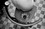
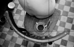
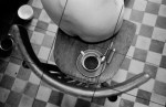
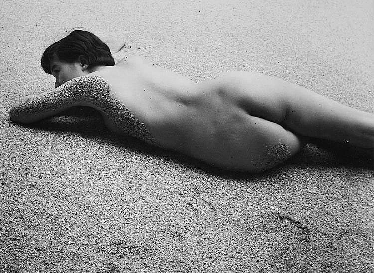
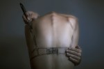
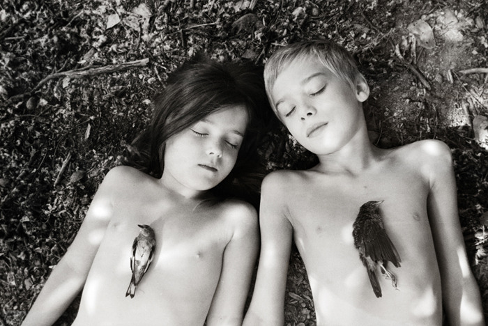
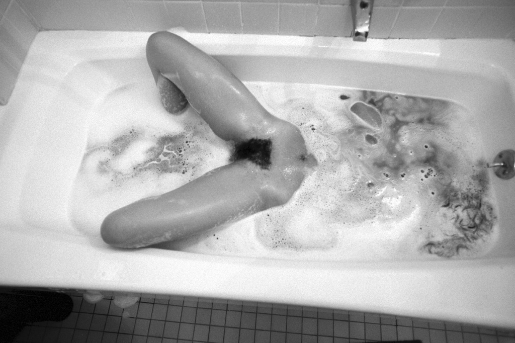
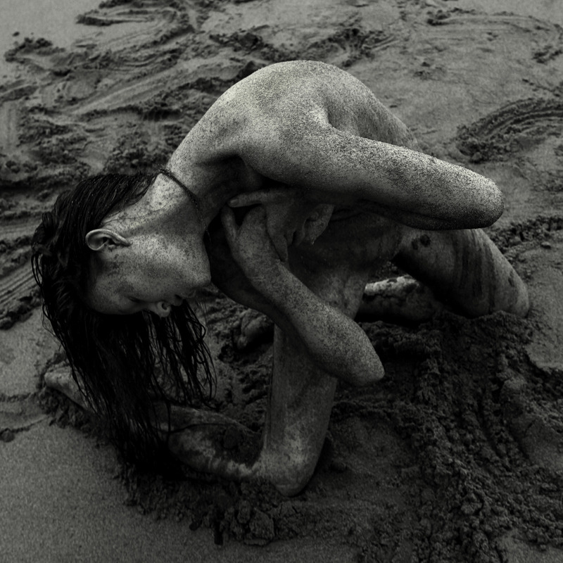
[↑] Igor MukhinUntitled (2010); [←] rule of thirds (overlay); [→] rule of thirds + 18° (overlay); [↓] grain density & depth of field (magnification sampling)

I talk to much and say too little. I decided to show as opposed to telling you the genius-tier visual math shit going on here.

Igor Mukhin has forgotten more about the photographic craft than most of us will ever hope to know.

Igor ChekachkovAbove (1 of 24) from Daily Lives series (2013)

There’s no sidestepping comparisons with Florian Beaudenon’s Instant Life.

Chekachov uses light in interesting ways but his composition chops lack Beaudenon’s rigor.

Yet, this image does two things Instant Life doesn’t: it demonstrates a patient reverence for the electric current of sensuality underlying bodily instantiation and an openness to being alone, together in the sometimes mundane, sometimes tempestuous sea of being.

Petra DolezovaUntitled (2011)

Have you ever come awake too soon from a beautiful dream? I’m talking one where you immediately roll over, screw your eyes shut and focus every bit of energy on descending bacl into it again?

If you can recover it, it’s never quite as vivid as it was the first time around. like a dream seen through gauze, in a mirror.

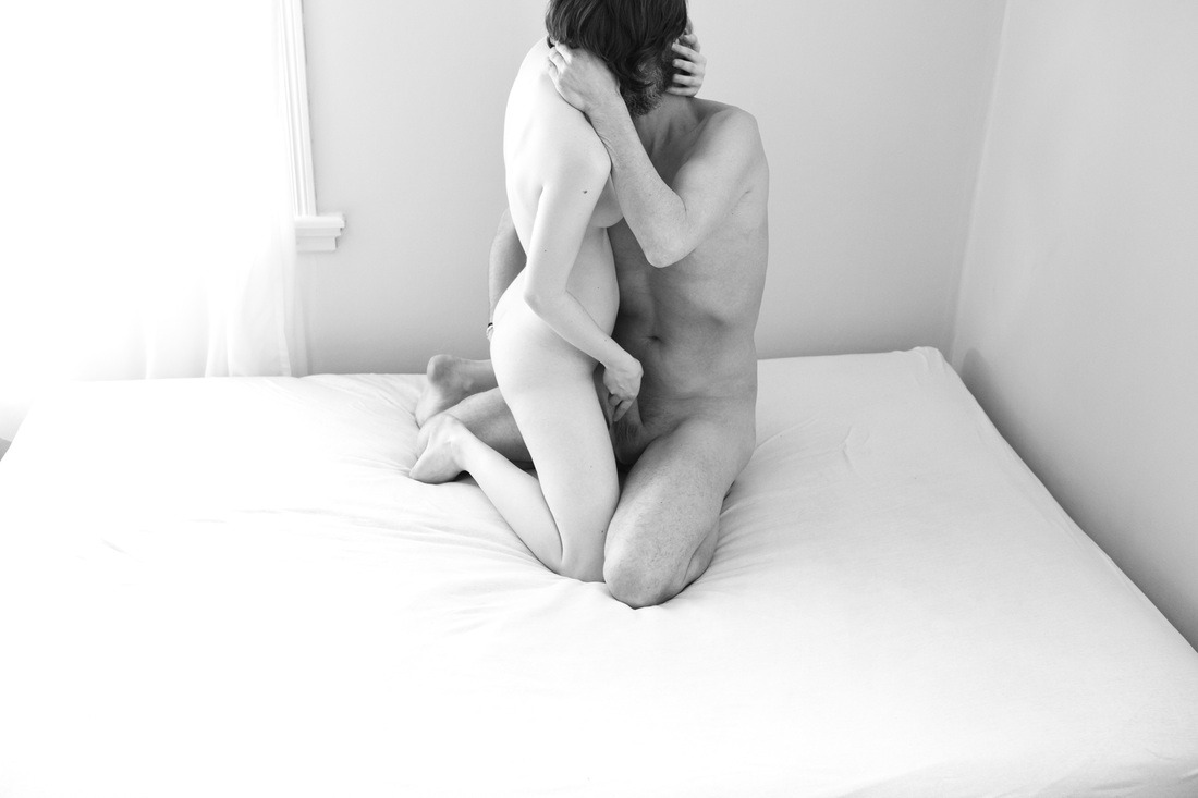
It’s a feeling not unlike the thread that runs through Slovakian-born, Dutch educated Petra Dolezova’s stunning work.

I’d very much like to share some of my impressions but her work truly deserves at least initial contemplation. So please, do the internet equivalent of closing the text around your finger and go through her entire Flickr photostream. Treat each image the way you would a savory mouthful of food, chew slowly, twenty times, before swallow. (I’ll still be here when you get back.

Oh and may I suggest a sonic pairing, this 1997 vintage Labradford enhances the oneiric grace notes rather well.

I keep fighting a strong urge to term Dolezova’s work ‘minimalist’; except as much as I’ve studied both art history and critical theory, my understanding of minimalism is a bit like those words that are their own opposites.

On the one hand–and I think this constitutes more of the general denotation: minimalism suggests a diminution of ornaments (necessarily entails additional, implicit emphasis of form). One declare Philip Glass and architecture with clean lines to be ‘minimal’.

On the other hand, there’s a tendency to think of minimalism as something additive. I add this line or that curve to negative space–the relationship of the line or curve to such space is minimal. However, if you invert it and consider empty space as the locus of meaning, the what appears maximal is actual razor sharp in its subtly and nuance. (Silence is a sound; melody is sometimes what is excluded.)

And that’s glossing over questions of conceptualization, concerns over execution.

I think my instinct to label them minimalist has to do with the way the presence of each image all but extends to the viewer the key to its own undoing. As if the image is less witnessing document and more kataphasis/apophasis perpetual motion machine.

As if there is no author [praxis] in which theory and practice are fused; as if there is no sayer to impose two words when one will do–all that is unnecessary or extraneous has been removed; there is only the image.

P.S. PH Magazine did an interview with Dolezova a few years back. The questions are underwhelming but it’s difficult not to admire her straightforward and meticulous responses.

Iwase Yoshiyuki – Untitled (1966)

Yoshiyuki, it seems, was a sake magnate who upon being gifted a Kodak camera set out to document the so-called ama girls who harvested seaweed, shells, oysters and abalone from the cold waters off Japan’s Pacific coast.

This photograph is atypical of his work which frequently featured candid shots of topless divers, water, sand and nets.

It was likely produced as part of one of his ill-advised forays into the fine art nudes. Unlike those awkward, overly self-conscious dalliances re-staging previous scenes in an effort to transform immediacy into technical rigor, this manages to encapsulate Yoshiyuki preoccupations in a manner which transcends the context of its creation and becomes at once somehow both timeless and deeply resonant in its uncomplicated humanness.

Jesús Llaríano head (2014)

As in tune as I can be with logging my own process of reading images, this short circuits everything.

I’m not sure I can explain it without getting a little TMI but it reminds me of being fifteen. (Not that I saw anything like this in the flesh until almost a decade later…)

It reminds me of random, mundane things that would inexplicably trigger arousal so extreme it was actually painful.

I had already been chasing the same oxytocin/prolactin buzz for seven years as a way of smoothing out the jagged edges of my abusive adolescent existence and suddenly it was also effecting some sort of vaguely imagined autonomy over my own body.

As a friend puts it: it’s a real wonder all the masturbation didn’t inflict permanent nerve damage.

So yes: initially seeing this image resulted in me having to release some sexual tension.

Afterwards, I found myself enchanted by the way the image works. Although I’m not sure it’s ever justifiable to employ a frame as a means of dismembering a woman’s body, I can’t technically refute the decision as Llaría observes the dictum of amputating between joints instead of at them.

And there is a notable compositional logic supporting his choice. Note the repeated angle of the elbow which is not the model’s, the line of the lower half of the dresses’ buttons, the way the seam to the left of the lower button line softens the angel to echo that of the model’s right thigh only to have the same angle emerge again in the cocked angle of her right leg.

There’s also the matter of palate: excluding her bush, the image consists of three hues. The rust colored earth figures at the darker end of a spectrum that would include the more magenta tones in her skin; while the white in her slipper and dress are virtually identical. The blue of the dress makes everything else pop.

Let’s not forget texture, either–something about which I am often preoccupied. The skin doesn’t really have texture in this image; except juxtaposed between the dirt and the fabric of the dress the absence of texture becomes a null field. Unlike the ground or the dress you can’t imagine touching the model’s legs but you can recall what it was like to have touched such legs. The visual synesthesia suggests an insistent anti-objectification that subtly reminds that this is no less or no more than what you have always known.

I would be dreadfully remiss for also not mentioning that even though I am not female bodied and if I were I would not be comfortable wearing a dress, I’m more than a little obsessed with the dress.

Ida OppenPale Afternoon from The Wicked Innocent series (201X)

Ida Oppen is an early twenty-something freelance image maker hailing from the suburbs of Oslo.

Her work transcends the perfunctory reproaches I customarily present. Honestly, I am profoundly impressed with her sophisticated compositions, precocious attention to scale and use of color.

Thus, the bifurcation into two mutually exclusive bodies of work–the editorial/‘fine art’ and the sexually explicit–really fucking baffles me.

From the standpoint of commerical viability, this is understandable: ‘professional’ clients are unlikely to appreciate graphic presentations of genitalia, intercourse and sexual effluvia.

What fails to track is the degree to which Oppen’s approach varies between disparate oeuvres.

The painstaking craft of the editorial work loosens in favor of a grittier immediacy. Not that craft is by any means lacking–pay attention to the precision of the framing (especially in the multiple image assemblages reminiscent of analog contact sheets), the manufactured multiple exposures and the–admittedly less astute–digital chromatic interventions.

Oppen admits this is what she’s after in her artist’s statement for The Wicked Innocent series. And there really isn’t much room for argument. She knows what she’s doing as well as how it is going to be read by an audience.

But as a member of that ostensible audience I would like to be pushed outside of my comfort zone and confronted a little more directly. Honestly, I mean that less as a criticism and more as a misguided compliment because although I know Oppen does not conceptualize this work as pornography, it offers me everything I look for–but rarely find–there. It’s partly that there seems to be a great deal of overlap between the kinds of sex with which Oppen is preoccupied and my own interests. But that is only intensified by the fact that vulnerability and trust factor so prominently into the process of making the images.

Viewing the work there is an unshakeable sense that the openness is equally if not more arousing than that which is explicitly depicted; the feeling that I am seeing what I am seeing not because there’s any expectation that it will turn me on but that it is a record of what gets someone else overwhelmingly aroused.

Yung Cheng Lin (aka 3cm) – [↑] 4.420 (2013); [←] 2401 (2013); [→] 9197 (2014); [↓] 6381 (2013).

When people distinguish between porn and not-porn, the difference is usually framed in terms of what is shown and what remains unseen.

A better question might: what does the manner of presentation tell us about how we are supposed to see what we are being shown?

There’s honestly too many things I could go on and on about with 3cm: his mindfuck mastery of color; precocious Photoshop manipulations, clever visual puns, recurrent images/themes, my guess that his process is highly improvisational and a repudiation of all the lazy ass characterizations of his work as ‘surreal’.

That’s all lagniappe.

Positioned as it is in the no man’s land between capital-A art and small-a art, I think there’s an instinct to round up. I’m not opposed to that. Not all of 3cm’s work is good, but almost none of it is crap outright.

What I think people have talked themselves out of is the implication of the sexual subtext in the work. The sexual subtext is not only the raison d’etre it’s much, much more than a subtext, it’s shockingly pornographic.

There aren’t even three nipples in roughly a thousand images. But that doesn’t matter, read the space between what you see explicitly in the images with the huggable elephant in the room of what the image is ultimately fixated upon. It’s a little like reading Shakespeare: read the first scene and then start over again and this time you’ll pretty much have it.

But here you aren’t searching for the rhythm as much as the correct tone. The space between what is explicit and what is implicit has a confessions of depravity feel to it. If you can stay in that space long enough, you’re initial response will probably be to blush. If you are like me though, you’ll be extremely turned on.

Rick PostonTullee (2012)

This image is such a mixed bag; but it’s a mixed bag  in a way that reflects a broad swath of conflicting feels I have w/r/t Poston’s work in general

As a strategy for preserving anonymity without dismemberment by frame edge, this pose is rather clever. Trouble is: Tullee is an established nude model; therefore anonymity wasn’t the concern.

Even it if had been, there’s the unsettling way this essentializies the female body. (That Poston is ostensibly standing over the scene holding the camera only exacerbates the matter).

Then there’s the random canting. I mean: it’s clear the aim was to align the junction of the two tile walls with the top-left corner. Interesting; but it’ll never happen handheld.

In turn, this misalignment skews the registration between the upper frame edge and the first horizontal tile seam. (Now, I understand the compositional logic here. But, I am not sure reiterating the framing so aggressively is the wisest choice when with a slight elevation of the camera, the frame would be opened to the vertical tile seams thus emphasizing one point perspective and drawing the eye downward at the same time as reiterating the actuality of the location.)

Yet, it’s not all bad. Sloppy composition notwithstanding the flubs do at least allow for a happy accident: the two little dribbled puddles where the soapy water has overflowed the tub remain visible.

Yes, it’s a thoroughly silly detail but it adds immeasurably to the truth of the image for me.

Now, if he just could’ve only bothered to slide that little sliver of that bath mat back two centimeters so it was out of the lower right third of the frame…

Miloš BurkhardtTitle Unknown (XXXX)

You know how a movie that is just plain bad is somehow always better than a film that squandered such great potential?

That’s how I feel about Burkhardt’s work–he images have potential but almost always come off as dull in their staid repetition of the female nude as a landscape within a landscape conceit.

The above is an exception. So much so, in fact, that I question Burkhardt’s editing eye–this flatly doesn’t belong anywhere near the photos with which it has been surreptitiously grouped.

Note the subtle shadow-to-highlight gradation between foreground and background sand. With the exception of her left elbow, the image is compressed to mid-tones/shadow ranges; accentuating the curving line of her back flowing into her neck and dark cascading hair. The line of her right leg jagging the eye rightward, following the angle of her thigh

Her contorted pose reframes her face and pubis within the larger composition–the focus is definitely sharper on her face.

I love the way the one strand of her hair is straggles along the back of her neck toward her throat. And I can’t really justify it but something about the position of her hands brings to mind both Gabriel Orozco’s My Hands Are My Heart and Pina Bausch’s brilliant choreography for Stravinsky’s Le Sacre du Printemps.