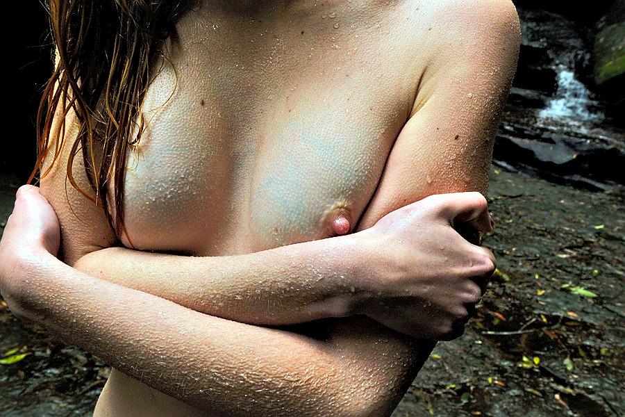
andre-jblue veins and goosebumps (2010)

Generally, I am against frame line decapitation; however, my interest in synesthesia– esp. visual conveyance of the tactile–overrides that objection here.

This is a rare instance where the tendency for digital to render textures more-or-less plastic-like contributes to the image by blurring the boundaries between beaded water droplets and goosebumps. In my opinion, the ambiguity serves to emphasize the skin.

JoLee KirkikisUntilted (2014)

Browsing Ms. Kirkikis’ work, I associate it instinctively with Erin Jane Nelson’s early work.

Both capture themselves/friends in wistful moments, awkward spaces between presence and absence. Both tend to use image making as a means of documenting performances related to text or sculptural elements. Both have images featuring finger traps.

It feels to me as if both build out off a similar foundation: a sort of belief that the world is too big to feel small. In Nelson’s case, she led with her angst–as if her creative process were an interrogation room scene, with her playing the good cop, the bad cop and the suspect.

Whereas, Kirkikis is more circumspect; evincing a confidence perhaps not yet in her work but certainly in the searching nature of her nascent process.

It’s interesting to me that it appears Nelson has disavowed her early work. That’s a mixed blessing. Yes, most of her work was disturbingly uneven and much of what worked seemed a fortuitous accident. Still, she made a handful of images which indelibly seared themselves onto my mind’s eye. (I find it interesting the degree to which the work she is making now is aggressively confrontational.)

And while Kirkikis’ work would benefit from culling her extensive output to something learner, more focused… unlike Nelson, I think we’ll probably still see the above image recur as she matures along with her work.

Mathilda EberhardUntitled (2012)

This is the fourth time I’ve featured Eberhard’s images.

I can’t lie: I am really rather fond of her work. Not all of it is good but there’s never any question as its veracity.

Mathilda Eberhard is always going to show a raw slice of her truth.

I feel as if this manifests in her work in a atypical and anti-photographic way. I am not at all sure how to say it without resorting to nebulous abstractions, so I’ll draw a metaphor: it’s as if image making is not unlike sewing. The thread pierces the fabric passes under it before piercing the fabric again to reappear. The tradition of image making emphasizes the importance of tracing the thread along the surface; and as an image maker you want to offer as vivid a glimpse of the thread as possible. It’s like Eberhard flips over the seam and then focuses on the absence of the thread–an inverted experience of negative time, a focus on the indecisive moment instead of the decisive one.

Personally, I am all about the leaning in brought by narrative tension–I want to know the story. There is no way to extrapolate any sort of story beyond something archetypally human–and therefore seemingly quotidian, mundane.

The thing is: I find myself investing far more into her work than I do with the majority of ‘narrative’ imagery. Perhaps, I have–in my own work–been looking for something in decisive moments that belongs only to the indecisive ones.

Jenny BootSauvage! for Kalblut Magazine (2013)

I won’t even pretend I understand the lighting design here. A key light aimed at the background slightly to the right of the model’s shoulder? No fill light? Her body blocks roughly a third of the light and there is almost no gradation between mid-tone detail and a complete absence of shadow detail.

It doesn’t look great but it’s not objectively terrible either. Yes: shifting the light back two feet would smooth the transition from midtone to shadow while also emphasizing her expectant stare and bringing out the green in her eyes.

I’m far more interested in the model–who is she?–than anything with fuck all to do with the photographer. Her pose, posture and the ambiguous position–somewhere exactly halfway violence and restraint–of her left hand.

Together it’s almost enough to make me overlook the seeming technical ineptitude and flagrant #skinnyframebullshit.

Almost…

Erica ShiresUntitled (200X)

Sally Mann is perhaps the contemporary artist most associated with collodion wet plates processes.

There’s a scene in the wonderful HBO documentary What Remains; while preparing a plate, Mann mentions that collodion was originally used as a means of closing up wounds.

It’s an unsettling caveat from a woman who spent the majority of her most ambitious work photographing the specters of death.

There is always too much reverence with Mann’s work to tolerate even the slightest waste.

(Will Graham would say: this is my design.)

There’s no doubt Erica Shires is good. The question is: how good is she?

Her colors pop without ever supersaturating. Her compositions are at once rigorously formal and effortless. She presents her subjects with a studied yet unassuming intimacy.

If there were a list of the best 40 photographers under 40, the viability of the list could be judged based on whether or not Shires’ appears in the top 5. (Any list where she doesn’t would be utter bollocks and for whatever my opinion is worth, the top spot belongs to her.)

Source: Unknown

This is not an objectively ‘good’ image. Overexposure leaches color from an already truncated palate; while the framing–presumably orchestrated to preserve anonymity is painfully awkward. (Scooting the camera back as little as two inches and squaring the level would have done wonders.)

Still to my eye there is something magical here–although I am not entirely sure how to explain my meaning.

It seems–in my head, at least–more of a still from an amateur sex tape than a discrete image; I keep imagining how things will proceed from here.

Not knowing the source, it seems inappropriate to project my own sexual predilections onto an image that has fuck all to do with me, instead of reading and interpreting things at face value.

Here’s somethings things that grab my attention:

  • Both are smiling in playfully curious/knowingly smirking way,
  • He is laid out, open and on display while she is more curled into herself,
  • His pubic hair is carefully trimmed,
  • Her red lacquered nails draw attention to the slightest bit of motion blur, suggesting teasing strokes,
  • Her hair is a mess, having what could be a either bed head or post-coital, shower wet hair that has dried unevenly over the course or further lovemaking sessions,
  • And, she’s wearing what may well be a wedding ring.

All of it taken together suggests to me the crucial distinction between the taking of pleasure and the receipt of it. One is a central tenet, the prerogative of patriarchy; the other: demands a willingness to surrender, to become vulnerable, to let go and in letting go, letting another.

Margo Ovcharenko01 from Without Me (2008)

‘Intimacy’, ‘vulnerability’, ‘trauma’ and ‘stories’ are terms which recur in Q&As with Ovcharenko.

Although entirely befitting, they’re ultimately terms of abstraction.

In other words: what does one mean by ‘intimacy’: loneliness, togetherness, expressions of passion, etc., etc.

Don’t misunderstand: I am hell of fond of her work’s aestheticization.

Still, deep in the mix there’s something either coy and waffling; or–worse–intellectually dishonest.

I think it has to do with the way Ovcharenko speaks about her work.

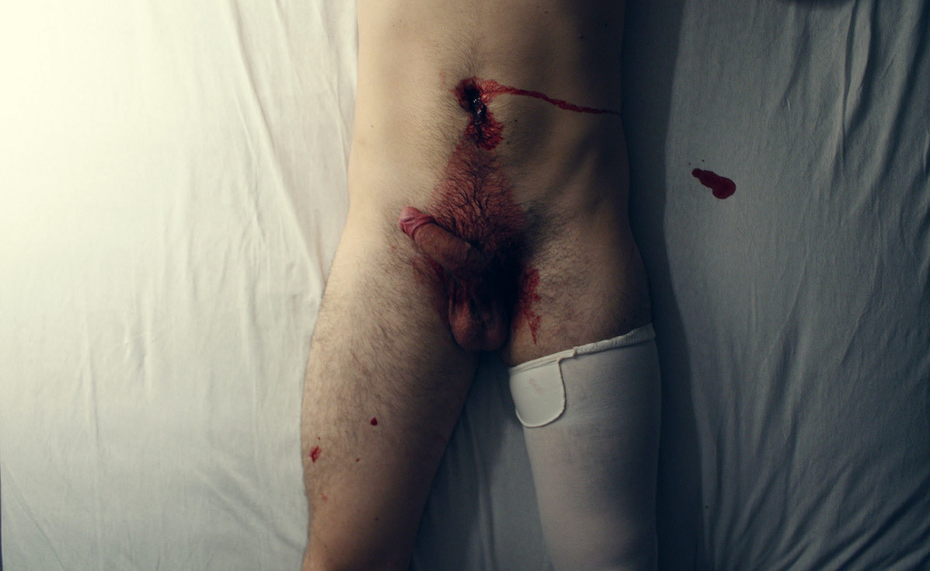
In any interview with The Calvert Journal she offers the following explanation as to the implications of sex and violence in her work:

Sex and death are two of the most sensitive subjects for humans. The fear of death and the desire to prolong life by the passing on DNA are at the heart of everything. All of the social constructions that allow us to live in cities, such as the police and government, lead to perversions of these basic instincts. I am interested in how that works. I’m like a little girl poking a dead frog with a stick: I am sad and frightened but curiosity wins out. (Emphasis mine.)

It’s an adroit response that eschews abstraction. Viewing her work it’s easy to see her as a well intending child poking a dead frog with a stick.

Yet it runs counter to something on her website. (Note: I may be wrong in attributing the remark to Ovcharenko; how the quote appears is ambiguous due to a muddled layout. It could be attributed to the attribution is the author or several subjects.)

Pornography is an ugly and disgusting phenomenon. Erotic can be beautiful, porn–never.

Besides patently disagreeing with the statement, it contradicts her own admitted impetus for creating: what drives us to pornography except being sad and frightened but having curiosity win out in the end.It’s not merely that I disagree with her here.

Also, given her interest in depicting androgynous/non-gender conforming/homosexual folk, I find the absence of any explicit statement supporting LGBTQ rights considering the total clusterfuck in Russia at the moment to be somewhere between naively, tone deaf and irresponsible/exploitative.)

The last thing rankling me about Ovcharenko needs to be unpacked.

Remember that Wired article to which I took such umbrage: 10 Photographers You Should Ignore? It bothered me that the underlying point wasn’t that you can’t or shouldn’t learn from renowned fine art photographers; it was: unless you are making the work you want desperately to make then fuck off and die because you have no business behind a camera.

Fine art photography is a starting point; a set of initial vectors for approaching material. At some point the process and material will demand a very deliberative departure.

The problem is–just like religion–fine art photography is taught as if it is little more than a trigonometric function.

Until I come up with a pithy term in line with #skinnyframebullshit, I am going to call this approach to fine art photography as a trigonometric function as ‘photography as a function’.

The notion arose earlier this week while I was trying to write about Harley Weir.

I’ve run into her work a handful of times. It’s clean, solid. There’s a unity of content and form, muted colors, grounding in art historical perspective/scale considerations–it is what I expect fine art photography to look like.

But I felt fuck all for the work itself. Until I saw this; my brain did this thing it does where it leaps free associative and anchors images to music. I heard that line where the song says: 

But for now we are young
Let us lay in the sun
And count every beautiful thing we can see

I realized this feeling of being young, in love and overwhelmed by the beauty of everything was the raison d’etre for Weir’s images.

Now: why isn’t that made obvious by the work? Perhaps because there is too much emphasis placed on aestheticization and not enough on simplicity and clarity of effect.

(I dig Heidi Systo but her work is just as much photography as a function as Ovcharenko or Weir.)

I do feel an undeniable connection with Ovcharenko, though. In fairness, while the above dates from 2008, and while her newer work does little to avoid repeating the aforementioned pitfalls, it is at least much sharper.  For example, I am in love with 07 from her Hermitage series. It stands out from the rest of the images as a young girl who is bored with poking a dead frog with a stick, so instead she pokes it because she’s suddenly curious about why poking it makes her sad and frightened.

Nina Ai-Artyan10 (20XX)

What draws me to this image is ultimately what alienates me from it: the impossible-ness of the boundary between middle-grey and nearly-black running along the inside of her left arm.

It’s meant to look like an analog print–although I’d wager it’s a digitally post-processed negative scan.

There are two dead give-aways:

  1. Although it is possible to exert God-like control over a traditional darkroom wet print; even with Edward/Cole Weston caliber perfect prints, the result will never be as clean as this.
  2. The white at the right-edge and especially in the upper right corner would not produce a tone distinguishable from the paper backing.

Ai-Artyan has done traditional darkroom work. Yes, her prints are sloppy; but accompanying the mess is a sense of struggle, of painstaking labor, a sense ennobling the resulting work in a way from which her remaining work is bereft.

I don’t mean to be overly harsh–the necessary raw materials for greatness are present. All that’s missing are some shift in perspective–inspiration maybe, more likely desperation–and a commitment to the truth underlying the image above everything else.