Creyr Glas LightworksIsola Bathing Nude (2016)

I find it positively odd how many photos of people in bath tubs there are on Tumblr. I mean, if you want to think of a room with decent lighting bathrooms are not the first option that comes to mind. (Perhaps it’s because I live in New York City where most bathrooms are windowless, feature only overhead lighting and are so small where if you turn around too fast, you’ll run into yourself.)

Most of these photos tends to strive for the sort of ideal frame within a frame as exemplified by Lee Price’s Pink Cupcake along with his latest series Surfacing.

The rest seem to juggle having a high enough angle to see into the tub while also being close enough to the subject so as to not have the composition overwhelmed by bathroom related scenery.

Chip Willis’ extremely clever use of a mirror to open up this incredible image of Nathalia Rhodes is a personal favorite. And I’d wager Creyr Glas Lightworks is familiar with it based on the image above. The pose is reminiscent and the mirrored sunglasses suggest further points of comparison.

Compositionaly the angle of the tub edges lead the eye at an upward angle toward Isola’s face, the shower curtain calls out, demanding attenting and we’re aware of the fall off of light as we move away from the tub, the eyes snap back, drifting back and forth between her genitalia and her mirrored shades.

The rule of thirds informs this shot. The inside edge of the tub at the top and the inside edge of the shower curtain.  The top of her right leg is also more or less aligned with a third segment of the frame.

I just really do not like the fact that her legs are amputated at the ankle. It implies a lack of mobility and given how wide the angle of view is I suspect the image maker lined up the shot to perfectly observe the rule of thirds and then leaned in closer to give it a little bit edgier feel. That edgier feel does not vibe at all with the tone and feel of the image. (Isola seems pretty comfortable and devil may care about what anyone else thinks about her or her body in the moment presented.)

I have no idea regarding the image makers background but this was taken with a Fuji X100T (a great for the price, MFT rig). But it’s digital and the black frame is something you’d not have the option for if you were working in traditional B&W–although it would work for B&W slides (further the mirrored sunglasses are positively made for B&W chromes, but I digress). That ultra bright bath tub edge in the lower right foreground would have to be substantially burned in to read on a traditional print, which would make getting a more or less even white across the entire bathtubs visible surface a nearly day long process in and of itself.

Still, despite the considerable flaws, it’s a memorable image in a way that 95% of the tubshots I’ve featured previously just do not accomplish. That’s worth noting, I believe.
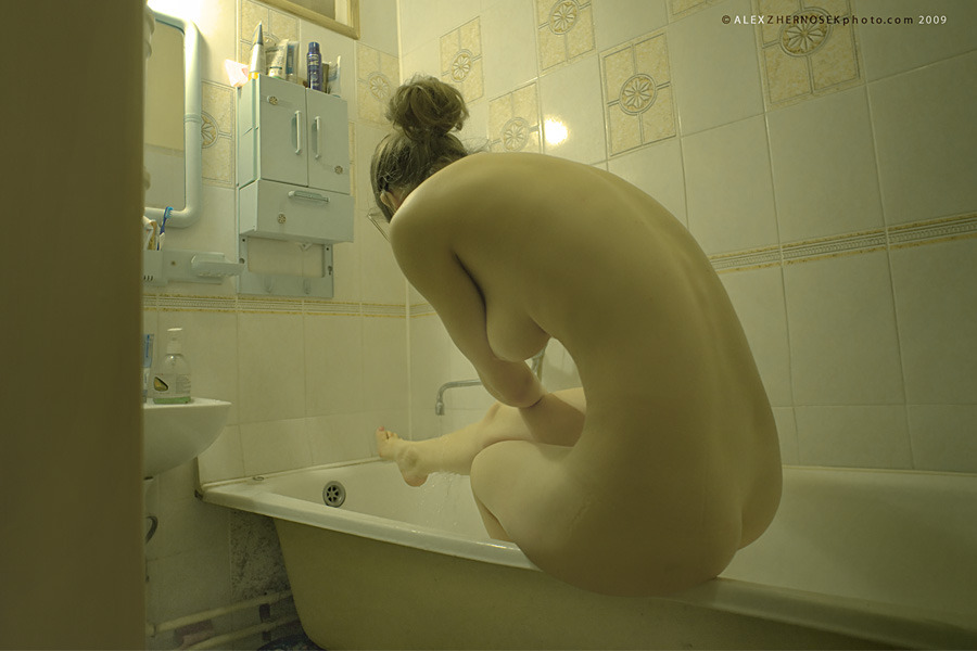
Alex Zhernosek#9633 (2009)

When I first encountered this my thought was along the lines of wow, that’s very nearly perfect.

Spending a bit more time with it has caused me to question my initial reaction. Yes, there’s a very strong sense of mood. And it’s actually rather unlike the rest of Zhenosek’s work–which reeks of objectified sexualization of bodies/run-of-the-mill straight/white/cishet misogyny.

But there’s something interesting about the documenting of a sensuous moment here (warm water splashing over her ankle) and how that pushes up against the sense of imposed voyeurism (the visible door jamb and the uncertainty as to whether or not this woman knows she’s being viewed).

And as much as the focus is the curve of her back, Shifting her several inches toward frame right would’ve better balanced the door jamb, as well as blocked the reflected hot spot on the tile with the models head, creating better separation from the background and also underscoring the fact that the water is splashing over her foot.

Tor Larsson – Fifteen 15 (1974)

I have no idea what the story is with with these images. (I very much want to know more/everything about them–so if you know anything, please share.)

I have half a mind to use them a prophylaxis against Clark and McGinley’s youth and beauty. And, I mean–yes, the above photograph is #skinnyframebullshit and not especially technically accomplished, but, at least, it embraces what it’s ostensibly about contrasted with Clark and McGinley’s constant equivocation. It’s like I always feel with maybe not as much Clark but McGinley feels like this sort of fragile fairy tale that will wilt or collapse under too much scrutiny.

I mean… maybe it’s just me–after all I was raised in an insanely regressive Evangelical environment but the stories my non-Xtian friends tell about discovering their sexuality are a great deal less curated.

Everything about this feels if not authentic then perhaps at least grounded. There’s a playfulness that serves as a sort of lubricant against what would otherwise been an arousal killing gravitas. I love the way that her sticking her tongue out conveys both a mugging for the camera–which actually de-emphasizes the way her legs are spread for the camera to get an unobstructed view of her vulva; but it also teases the implication of oral sex. (Also, I really dig that you can see the reflection of the edge of the tub in her hippie glasses.)

I don’t know. Unlike Mcginley, these resonate with me not because of some sort of false nostalgia–a wish for an experience so rarefied it might as well not exist. Instead, it reminds me of dear friends who have told me about how your best friend was someone who not only knew you masturbated but would lay side by side without under the covers masturbating, racing to see which of you would orgasm first. (Contrary to my own experience where sex was dirty and solely for the purpose of procreation.)

Also, I really–in a way I cannot clearly articulate–respond to the woman in the shorts and shirt. The way she’s participating in the intimacy but not the physicality.

Harry GruyaertTitle Unknown (1966)

My dalliances with photography began out of a certain degree of misdirection.

Long story short: I took a film-making course in college to see if I could successfully complete a film that was (by some miracle) not unwatchable. Next I knew: I was a film-making kid.

Initially, my interest was directing. However, increasingly, I gravitated towards the cinematography side of things. (If you’ve ever questioned why I am so vehemently anti-digital, I learned both platforms side-by-side and was thus able to experience first hand the possibilities/limitations of either–digital is just awful if/when analog is an option.)

The reason I ended up shooting still images was less my being proactive due to the cost of shooting 24 frames per second on film and truthfully more to do with the fact that I have an outsize problem with authority and I repeatedly ran afoul of The Powers That Be™ in my film program/institution.

Cut off from access to school equipment, I purchased a Nikon 8008s and a circa 1960s Nikkor 50mm f1.4 lens.

I mention all of this to illustrate a point. Yes, I have absolutely benefited from an albeit short-lived but thoroughly academic indoctrination to so-called fine art photography. But that arrived subsequent to a period of autodidactic exploration.

Often folks find my ideas and approach to be heavily skewed in favor of underground/outsider work. Such is not a rebellion against my late-in-the-day academnification (or not only that); I spent those first two or three years trying to find stuff I thought was cool on Flickr.

The flip side of that background is there are still large swaths of historically significant photographers that I know seriously fuck all about.

I’d never heard of Gruyaert until early this week. His work is effing stunnning. I could follow the thread of his work down the line to Storm Thorgerson and Monika Bulaj; but, what I feel is more interesting is to compare his work–entirely contemporaneous with William Eggleston’s first divergences in color.

As fond as I am of Eggleston, I realized–and this is entirely in keeping with a theory I have regarding Eggleston; namely he was a Balthus level pervert (and pervert is a word like ‘slut’ that I think needs to be reclaimed already) who never managed to figure out how to make peace with who he was–his work fetishizes color; his dye transfer prints are fetish objects.

Gruyaert, on the other hand, uses color to abstract, highlight shape and/or form.

As great as the work is, it seemed like something I’d never get to showcase here. Then this afternoon I stumbled on the above image. It was featured in a showcase of 14 Magnum Photographers explaining what image of their own making proved to be the A-ha! moment that propelled them to the next level.

Here’s Gruyaert on the above image:

In 1966, I was losing my girlfriend, to her new lover. So, I decided
to make a movie about her and him, hoping that, when she would see the
result, she would understand how much I loved her. Filming her, I was
able to create distance. I became less vulnerable. I understood her and
myself better. I was able to let her go.This became an important thing
in my photography, to be less there and more there at the same time.

Hunny BummyComfort Zone (2015)

These images are presented as a diptych even though they do not function as one.

They’re solid; neither composition holds up under scrutiny–the left appears symmetrical until you look at it a second time and discover it’s really not and that the positioning of he arms is actually makes it even more glaring; the wawkerjawed-ness of the second one is even more obvious but here the position of the arms actually de-emphasizes it ever so slightly.

Either way, together they round up to good because of the thoughtful use of color.

What’s interesting about the relationship between them not being diptypical (hurr durr) is that they imply a continuum between concept and execution.

The left image is simple, clear, the color pops and as a result it’s absolutely memorable. The right image uses negative space to draw entirely undue attention to the use of color–it’s like screaming hey, everyone look at how great I am at using color. However, the slight shift in the position of the arms on the right is utterly fucking sublime. (Also, you get water drops splattered on the side of the tub highlighted by the light pooling on the side of the tub.)

Split the difference in the distance between the left and right, make sure you line up the lines of the tile grout with your frame edge and include just a hint of the bathroom floor and keep the pose on the right and you’d have a great image.

Eric PhillipsUntitled (2010)

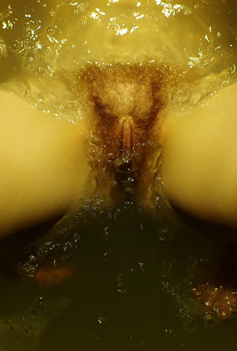
As far as motifs go, decontextualized bodies in tinted bath water will forever remind me of Chloe Killip’s utterly breathtaking, Besher-esque typologies.

This image hails from a series called Washable Sins and three or four of the images wouldn’t have appeared out of place in Killip’s project–which is (I assure you) to pay Phillips’ work quite the compliment.

However, as much as I like this image–it’s a sterling example of how a dick pic can be classy in execution–my immediate association sends me in rather a different direction than Washable Sins; and if I’m honest, unfortunately, the sort of glossy homoeroticism Phillips work insists upon is neither as interesting or edifying as Killip’s precocious presentation.

(Also, if I’d only seen this image I’d be willing to give it the benefit of the doubt w/r/t whether or not it qualifies as #skinnyframebullshit; having seen the rest of the project, Phillips is a profligate skinnyframebullshiter.)

Lux Aeterna Girl – Untitled (2014)

(I’m not 100% on the source for this. The original post appears to be a now defunct Tumblr named luxaeternagirl; thus I have credited it as such. If that’s incorrect, please let me know and I will edit the attribution.)

This isn’t a good image–not even close. The camera is off-center a foot and panned right about 15 degrees to attempt to compensate. I understand that after cars, bathrooms are some of the most difficult places to shoot due to them almost always being small and cramped but the two shadows in the upper left and right alone with the angle of the tub edge in the lower right corner is really effing distracting.

What I will say is that given what is probably a single incandescent overhead fixture, the skin tone here is very much on point. It has that natural peach tonality that you get from remembering the rule of thumb w/r/t skin tone: Red > Blue > Green.

The rendering of the skin is super important here–by getting it right, it makes the fact that both participants skin is flushed red more discernible. The edge of the left partner is obvious along the outside of the ears; while the partner on the right has reddening ears, faces and neck. It might almost be sunburn but with the pale complexion in tandem with body language, it seems more likely that she’s just extremely aroused.

And that is what distinguishes these images: chemistry. There is no questioning the primacy of their physical desire for one another. The partner on the right in the top image is doing the hesitant if-I-so-much-as-feel-your-skin-I-will-lose-any-trace-of-self-control; the way the partner on the left is leaning in, in an effort to draw the other out. The response in the second image doesn’t give in so much as beg for defenses to be laid to waste, to earn the victory by no other means except total surrender.

To me–chemistry like this is what is missing from 95% of erotic work. And it’s a shame, really… because were effort expended on facilitating it–less artful work (much like this) would shine in spite of it’s technical shortcomings because it would present a record of physical desire it would also simultaneously illustrate something true about the psychology of physical desire.