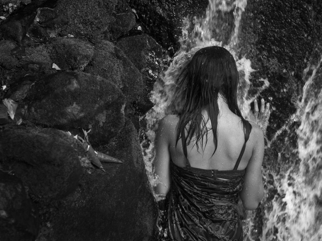
stillcrazyafteralltheseyears6Untitled (2018)

When I see this image, I can’t shake the notion that photography and digital imagining can arguably be reduced to questions regarding contrast–e.g. inclusion vs exclusion (framing), luminosity vs. opacity, near vs. far, etc.

More directly linked with this image–and it’s genius–is the quintessential question of depth vs flatness.

No matter whether it’s photography or digital imaging, the result involves compression. Spatial references are reduced to micro-fine layers in an emulsion or an array of pixels. In other words: three dimensions are rendered in two.

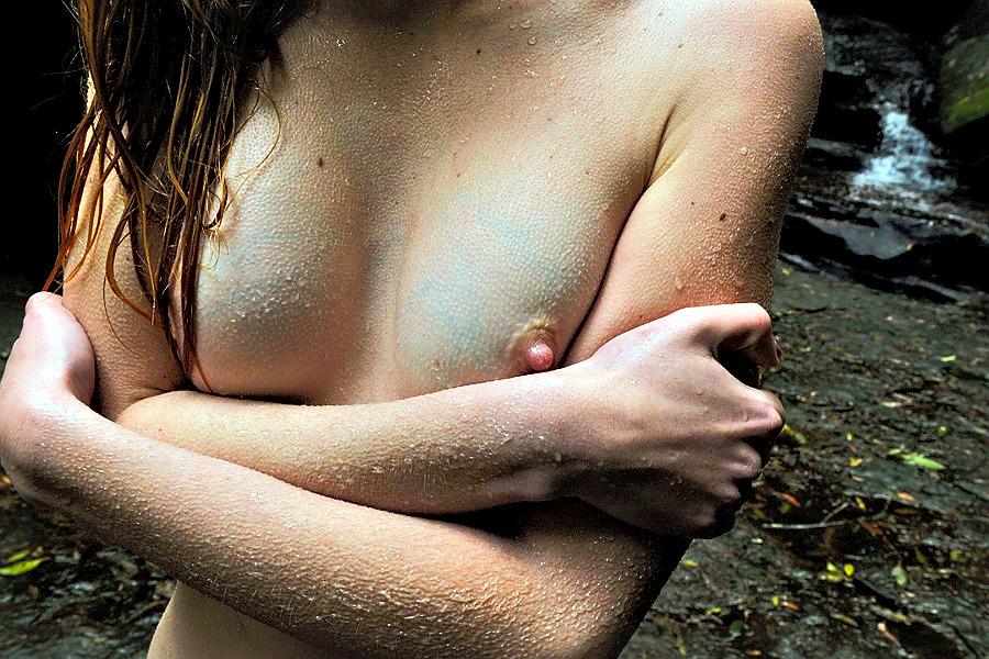
Over time certain modes of visual shorthand have become codified–e.g. with skintone we have notions interpolated based on the Zone System or the red before blue before green rule of thumb.

As best I can tell these tendencies are meant to be aesthetically pleasing but the why they are attractive has to do with stylistics–the notion of skin as smooth and/or soft. (And this is more of a psychological prejudice than a factual one–I mean look at the back of your hand up close and it looks like a muddy landscape that has been sun baked until it takes on the appearance of craquelure.)

In other words, there is a notion that as far as Caucasian models are concerned there is a preference for either an alabaster or apricot tone–an ersatz synesthesia by consensus where tonality or color is in and of itself supposed to be suggestive of texture.

As a synesthete, I am constantly befuddled by this knee-jerk approach. I mean: show me an image of a swatch of twill pictured under strong light and I can actually feel the texture of the material on my fingertips.

Here though it almost works and how it works is by taking a step back to consider how photography/image making is about contrast and then juxtaposing something which easily conveys textural information (water) against something which does not easily convey textural information (skin).

Simple, elegant and something I’ll be trying to figure out how to apply to my own work going forward.

Aimery J. JoësselHolly Waterfall (2015)

Aspects of this are wonderful: the visible band and twisted straps of Holly’s bra, water droplets dotting her skin and the way her right hand is splayed against the rocks behind the falling water.

Overall, it’s underexposed–but given the motion blur of the water this was probably the slowest shutter speed Joëssel could use handheld–which suggests the underexposure was due to an overall lack of light instead of sloppy metering.

Personally, I would’ve preferred the contrast between the porous texture of the rocks vs the smooth compliment of water droplets against skin. But the picture suggests that it was not a situation where both were technically achievable.

I don’t think much of the rest of his work, honestly–but there is something to be said for identifying (correctly) and pursuing the better of two less than pristine options in a difficult setting.

andre-jblue veins and goosebumps (2010)

Generally, I am against frame line decapitation; however, my interest in synesthesia– esp. visual conveyance of the tactile–overrides that objection here.

This is a rare instance where the tendency for digital to render textures more-or-less plastic-like contributes to the image by blurring the boundaries between beaded water droplets and goosebumps. In my opinion, the ambiguity serves to emphasize the skin.

whenitgetsheavy:

Libby EdwardsCollab (2012)

Not only a weird angle, this is rather unlike the rest of Edwards’ images.

The strobe bleaches right up to the very verge of burning away texture and color from flesh–waterline tracings still show a membranous sheen against skin.

Water fragments and refracts, a hissing sizzle bouncing between and dotting bodies; arcing strings stretching and shivering–quick silver in a vacuum tube.

And oh just look at all the secrets two hands hide in their showing.

  1. Right edge of frame: a thirty party watching, approaching; casting a shadow figure bent beneath the spray.  (The Observer Effect) EDIT: Alveoli Photography sees this differently. The ‘third’ hand is actually his left hand reaching over to trigger a short cable release. This makes more sense than my interpretation since the third person would have to be roughly 6’7" to account for the positioning i had in mind.)
  2. & her hand’s Apollian claiming a quote from the greatest sculptor, Bernini.

This is sexy a fuuuck.