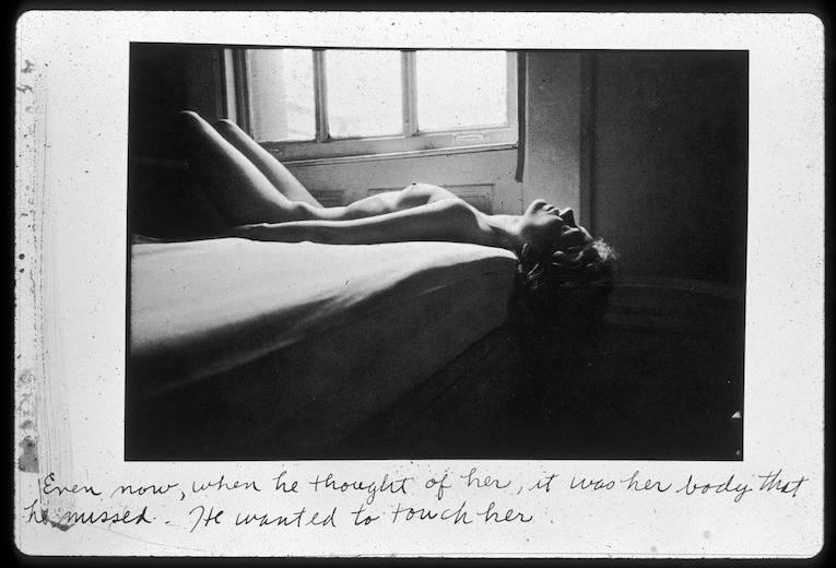
Source unknown – Title unknown (2012?)

Google image search and Tin Eye are both dead ends trying to determine authorship with the above.

A shame because it’s exquisite. (In my experience you can have the best gear in the world, meter seventeen different points and do the math to determine the perfect exposure. But in the end what allows an image to turn out like this has more to do with trusting the unconscious instinct the demands you stop down and you don’t question you just rotate the aperture dial to the appropriate setting and trigger the shutter.)

Also, I’m certain this is riffing off Michelangelo’s The Creation of Adam.

Jane BurtonLimbo #8 from Other Stories series (2008)

One-offs always a risk. By doing something that defiantly refuses to sit at the table quietly with the other children, there is always a very real danger of exposing things the artist would rather remain hidden.

In some ways this work is better than Burton’s other work. Well, maybe not better–more ambitious. The rest of her is so flat. It functions with something like the unexpected flatness in layer that is always the unexpected result of layering multiple negs to make prints in a traditional darkroom–you expect the way the sandwich looks to your eye to transfer to a dimensionality in the print and it never does.

Here: the vague reflection of the trees in the cracked glass speaks to that scrim like compression of dimensionality. Most of Burton’s work functions with the implication of one-point perspective. Whereas this is decidedly two-point. The purposeful center-weighted symmetricality of the rest of the work is thrown heavily off balance. The framing doesn’t make sense–it certainly doesn’t fit an sort of rule of third compliant framework.

In fact the composition is solely about the reflection and the cracked glass. The positioning of the character in the frame is intended to associate the violence of the broken glass with the female genitalia. Note: that the echoing cracked glass is higher and there is no one similarly positioned behind it. There is the ghost of a collapsed heteronormative relationship haunting this image.

And for how easy that all is to ready, it’s troubling that the frame wasn’t cropped. For the closer the frame gets to a 2.1:1 aspect ratio, the more appealing something more along the lines of a rule of fifths becomes aesthetically appealing. Although it’s not exactly, applying a rule fifths does actually contribute a degree of previously missing legibility to the composition.

k.flightbrobdingnagian penumbra (2009)

As much as I have a preference for work where the craft is beyond on fleek, I will ALWAYS have a bias for outsider art.

Of course, it’s a very real question as to what that word even means when it pertains to image making–with all the rampant pretense, ego and misdirection that entails.

For the sake of the point I’m trying to make here: I’ll take Lynn Kasztanovics over Stephen Shore any day of the week and twice on Sunday.

The thing that makes k.flight’s images so haunting and yes, wonderful, is that any ambiguities or equivocations/quibbles are removed from the proceedings. It’s clear to the viewer what the images concern–more often than not a sort of sultry sexuality as ontology of existence.

The image maker and I have spoken on several occasions and what I feel is relevant to communicate to you is that for all her seeming assurance in the work, she admits to rarely being certain what to make of any of it.

As lame and knee jerk of a connection as it is to suggest: k.flight’s work reminds me of this commercial I saw back in the late 80s. I think it was for Chevy and it was this skater looking kid walking along a beach maybe talking to the camera about how punk rock functioned as a wake up call to rock and roll, reminded it what had original made it so vital and important.

Not all her work is great, but it is all good–even when it falls flat. I can name hundreds of image makers whose work I rabidly support, but there’s only a few that excites me to the marrow of my bones–k.flight is very near the top of that list. And I sincerely hope that I’m able to collaborate with her at some future point in time.

Gene OryxProvocazione (2015)

I’ve stared at this enough to realize it’s a backless evening gown she’s wearing backwards.

Remember that feeling when you were young and on the threshold of sharing your body with someone new? How your back teeth were filled with bees and your knees went all jello-y electric? That’s what her line of the dress caused by her right thumb makes me feel.

(And it’s probably #skinnyframebullshit, but I’m too biased in this case to insist.)

Harry CallahanEleanor and Barbara (1954)

onlyoldphotography:

Muses throughout his career, Callahan’s wife and daughter played, posed, and aged before his lens. With their attention to the physicality of light, however, Callahan’s photographs transcend mere family portraiture by calling attention to the simple beauty of life’s fleeting moments. “He just liked to take the pictures of me,” Eleanor recalled in her nineties. “In every pose. Rain or shine. And whatever I was doing. If I was doing the dishes or if I was half asleep. And he knew that I never, never said no. I was always there for him. Because I knew that Harry would only do the right thing.”
Eleanor Callahan died in February 2012 at the age of ninety-five.

4201Title unknown (2014)

There’s an all but impenetrable mystery surrounding the site that posted the above image.

What I know is that earlier this year, the site runner posted bevy of images by a Polish photographer and friend identified only as STOTYM. The work was all exceptional; however, one struck me as evidence of a weapon’s grade visual sensibility.

Over roughly the last week, new, seemingly original work has appeared. It’s a hodgepodge of bleak, voyeuristic on-location B roll outtake frames and experimental nudes.

I can’t go as far as saying it’s all good; but, all of it is fascinating.

A leitmotif emerging in the work is an idiosyncratic interaction with reflections.

Reflections can serve a number of different purposes and given infinite time and prolonged interest, it would probably be possible to winnow their uses down to a handful of distinct categories. In general, reflections introduce notions of doubling, documenting the documentarian or allowing for an otherwise impossible angle of view. (Any categories are hardly mutually exclusive. laurencephilomene-photo, for example, shoots reflections of her subjects–without knowing it, one wouldn’t necessarily pick up on this but it is a very interesting added layer of conceptual consistency.)

Whomever is making the pictures posted by 4201 is doing something unprecedented in presenting distinguishable parts of a reflection that contribute to an intricately constructed whole.

Duane MichalsEven now, when he thought of her, it was her body that he missed. He wanted to touch her. from Person to Person
 (1974)

Quite frankly, Michals’ frustrates the piss out of me. His work is always so goddamn in-fucking-scrutable.

Take this. As with many of his prints, it’s unrefined, sloppy. But it works. And the reason it works had to do with the presentation.

Michals’ tends to present his photographs as a series. He also frequently imposes inscriptions on the image which tend to hijack mere archetypal readings. The inscriptions read like crib notes to the artists more than the audience. Their hurried, seemingly off-the-cuff character enact a strange sort of alchemy wherein the weary, ailing aspects of the image become assets instead of liabilities. 

For example:

This photograph is one of 15 photographs in a series entitled Person to Person which invokes Lynchian account of a relationship’s dissolution. (It’s a little Lost Highway (in structure), a little Mulholland Dr. (in content).

The image I’ve featured is beautiful–in spite of not being on speaking terms with mid-tones. Yet, what’ s interesting is the way the text colors the image with a wistful resignation.

Without seeing another image: the words re-contectualize the photo so that the audience understands that they are envisioning the lover for which the ‘he’ pines. He misses her and wants to touch his lover’s body but cannot. Something happened and they are no longer together.

As you browse through the series, the basic narrative is clearly presented in each frame. And with each additional frame, the story is implicitly re-stated and more details are sussed out.

In the end, although I really don’t want to, I can’t help but like Michals. He’s the type that prefers the prospect of two marshmallows later to one now. But unlike the rest of us, he somehow always manages to have one now and two later.

Sam Scott Schiavo – excerpts from La Solitudine (2013)

This post presents the images as a triptych whereas on Schiavo’s website it’s a five panel progression.

I am not sure how to process it. None of the images considered individually are especially strong.

However, re-constructed as a triptych, the separate images form a cohesive whole: water droplets and reflections in the glass separating the subject from the camera diminish as the eye moves downward; the elbow’s reiteration strangely enforces as continuity between the top and center frame, easing transition.

Whereas, the discontinuity between the absence of the hand and arm in the center frame eases what would other be an especially jarring re-framing.

I dig the the images as a triptych. The difficulty I have is the individual images aren’t strong enough to stand on their own. And to me that’s one of the prerequisites of the polyptych form. Granted I am not well-versed in the formal conventions beyond altarpieces, Van Eych and Bosch.

Familiarity with the form is certainly important but there is something disingenuous about cramming a work into a form as a remedy for one-dimensional conceptualization and lackluster execution.

And that is a shame because in the age of iPhone panoramas and automated photostitch programs there are a few image makers who are creating fascinating polyptych’s. The ones that jump immediately to mind are: David Hilliard, Accra Shepp & Tom Spianti.