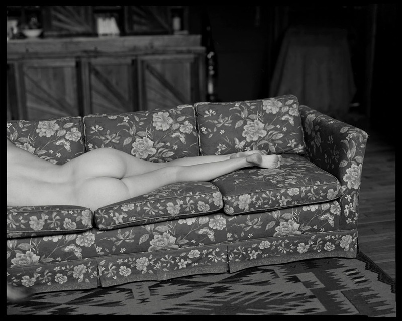
Mihail Nekrasov Title Unknown (201X)

The strong right to left key light illumination and the desaturation gives this image an arty pretense.

The composition, however, does not hold up under scrutiny. There appears to be no regard for form or logical arrangement of positive/negative space–it’s a left hand, a right hand and a phallus disembodied and floating in a void.

In other words, the impetus for this image is the gesture. Yet, since gesture consists at least partly of considerations with regard to observation of form, the image ends up establishing a criteria for conceptual success it subsequently ignores in execution.

Ultimately, it’s sloppy image making.

However, I am grudgingly willing to acknowledge that it does at the least nudge my thinking in an unexpected direction; namely, the fact that in utero all fetuses are gender neutral for the first two or so months. It’s the presence/absence/mitigating levels of dihydrotestosterone which determines whether the fetus’ genitals develop into a penis, vulva or remain indeterminate.

Society makes a really fucking big deal about gender distinctions along anatomical lines. And while, yes, the anatomy looks different. The underlying structures and functionality are not actually that different.

Helix Studios – Tailgate Fuck (2012)

Don’t get me wrong this is not a good image and there’s nothing noteworthy about this scene from which it appears to be a production still.

However, it does tie in with a preoccupation of mine: depicting sexuality in fine art.

I’m convinced its possible to create something that is indisputably Capital A Art but that also features pornographic content. I certainly don’t suggest that to do so is at all easy or uncomplicated.

A more reliable (and perhaps less artful) approach seems to be to use the notion of less is more as a starting point and designing explicit elements so the function through implication.

This is an excellent example of the second directive. It is abundantly clear what’s going on, but–strictly speaking–there’s nothing especially explicit about the presentation. In other words, what you see serves as a guide to what remains unseen, instead of presenting the unobstructed and completely unambiguous scene.

Plus, I’m always down for imagery that places actions that typical occur privately in ostensibly public places.

Christoph Boecken – Claudia (2015)

Maybe I look at too much porn but initially I thought this gesture was something more along the lines of this than hey, show me your tattoo.

Either way, it’s nice to see bokeh used as something more than just a means of highlighting a subject in a frame.

Also, check out that creamy medium format film super fine grain tonality–always shiver inducing.

thepureskin:

Hey TPS! I don’t often post pictures of my flower because it attracts the kind of creepy sexual attention that I don’t want. I really loved the movement in this photo. I think women are sexualized so quickly especially when it comes to showing breasts and flowers. So today I’m celebrating how pretty my flower is without feeling sexualized. Kisses! Willow

I completely agree with you, thewillowrae, I’m glad you shared and hope that everyone will see your body simply as the beautiful work of art that it is

This image is just effing awesome.

It’s absolutely not #skinnyframebullshit–the viewers eye is intended to move from bottom to top. The angles of the stitching on the duvet emphasize this motion as well as drawing attention to the way the light intersects (from right to left) that trajectory at a complimentary angle.

Further, I am always lambasting compositions that cut off the subjects head since there are literally thousands of ways to present an undecapitated body while maintaining anonymity; this is one of the most creative and just damn ingenious as fuck I’ve seen in ages.

Also, love the nailpolish juxtaposed against the light and shadows on the skin.

Excellent work.

Sally MannGoosebumps (1990)

I’ve introduced roughly a half-dozen folks to Mann. And I’ve had the pleasure to sit with at least three of them while they perused Immediate Family for the first time.

This image almost always solicits some sort of visceral response. Whether it’s a gasp or an unsettled comment about how the photograph maybe takes things a little farther than they should have been taken.

I’ll defend Mann to the ends of the earth and back. Her work–all of it, no matter how sentimental, overwrought or printed inexplicably pitch dark–will always render me impossibly spellbound.

And I know she’d respond to the people I’ve watched shifted uncomfortably looking this image. She’d likely offer the following anecdote:

Once,
Jessie, who was 9 or 10 at the time, was trying on dresses to wear to a
gallery opening of the family pictures in New York. It was spring, and
one dress was sleeveless. When Jessie raised her arms, she realized that
her chest was visible through the oversize armholes. She tossed that
dress aside, and a friend remarked with some perplexity: “Jessie, I
don’t get it. Why on earth would you care if someone can see your chest
through the armholes when you are going to be in a room with a bunch of
pictures that show that same bare chest?”

Jessie was equally perplexed at the friend’s reaction: “Yes, but that is not my chest. Those are photographs.”

I don’t think she’s being disingenuous–I’d go so far as to say knowing what I do about her: she’s incapable of that.

But I do think part of what she’s skillfully avoided addressing in all the controversy surrounding her work is her own voyeurism. Her images–to a one–show us things that implicate the viewer by pulling aside the curtain to reveal things we would–if we were polite–avert our gaze. We don’t though.

And what I think is so vital about her work is what shines through in this work so clearly–everything about this image feels like a private moment (and if I recall correctly, it was until Mann caught a glimpse of it and asked I think it’s Jessie here to hold still while she got her camera).

I feel what upsets people is that we judge Mann as a woman and a mother on top of being a photographer. The photographers duty is to be unflinching–but many people suggest Mann was a bad mother.

But frankly, I don’t really understand the controversy surrounding her work. Although, looking at this photograph, I do find myself wondering how much richer her work would’ve been had she not had to navigate such a puritanical society which associates so automatically nudity as categorically interchangeable with sexuality.

Sam LivmUntitled (2015)

While it’s possible and certainly important to quibble about several problematic considerations given the art historical problem of the male gaze, this is an absolutely fantastic exercise in perceiving color.

Theories on color are a dime a dozen. Color theory with regard to light is different than color theory related to pigments; digital color representation (RGB) is different than the parameters for printing work (CMYK).

I’ll be the first to admit that my (admittedly limited) theoretical understanding of color vastly surpasses my practical know-how. For example: if you consider this work as build on a foundation of Red, Green and Blue, then what becomes immediately clear is the dominance of Red and Blue.

The red highlights in the young woman’s hair, the red-brown of the foilage, skin and wood, the clump of golden leaves in the right third of the frame, the muted nectarine of the more pale skin on her back and shoulder and the more yellow cast of the weathered wood.

There’s the steely blue in the sky, gunmetal blue in the wood, even hints of it in the highlight details outlining her shoulders and hips.

It reminds me of Josef Albers. And yes, that’s a bit of a well-duh! jump to make. But I feel that it’s even more Albers-esque because this doesn’t fixated on only two colors–it uses a hierarchy that enriches the composition by unifying the elements of the image and also prioritizing what is most important about the frame (subject, setting, time of day–in descending order of importance). In the absence of the green, the image would’ve been flatter, wouldn’t have been so visually compelling.

And ultimately that’s what reminds me of Albers–the sort of feeling that rules are limiting and foolish and that when it comes to color, practice should inform theory not the other way around.

I’m not 100% on board with Livm’s work but the one thing I will say without reservation is that he is doing some righteous work with color–and is definitely worth checking out.

Laura KampmanUntitled (2015)

I’d post this just based on the exquisite tonal range and use of the depth of field–the mid-ground is soft while the background (both actual and reflected are sharp).

But really this deserves to be celebrated as a testament to discipline.

Anyone who’s ever tried to take a Traci Matlock-esque mirror self-portrait without looking through the viewfinder, knows it’s nowhere as easy as it looks.

But here Kampman is using a TLR–so she doesn’t even have the benefit of a  straight forward view as I’m reasonably certain that Rolleis mirror left to right in the waist level finder.

And she’s set things up with very thin margins as far as composition, so this is emblematic of a degree of mastery I’ll admit I lack the patience necessary to cultivate.

Pascal RenouxLizzie Saint Septembre (2007)

Orson Welles proclaimed “[t]he enemy of art is the absence of limitations.”

At first blush, it seems counter-intuitive. Exhibit A: centuries of extravagant excess in Western Art.

However, browsing Renoux’s work, I can’t help but notice how it does so much with so little.

I mean: if you’re at all familiar with the Tumblr fine art nude model community, you know there is no dearth of models huddling close to windows in tiny, dim and cramped apartments.

And the vast majority of those images play like a checklist of popular conventions: Dutch Golden Age light, beautiful bodies, oblique shadows. It tends to read more as look at this monument I erected to my own creative effort.

All the same tropes are active in Renoux’s work but their effect is much different. Whether or not you see the window in the frame or merely its illumination seems less a question dictated by the layout of the room and more organically in conversation with other compositional elements in the image. It’s the same with: eye contact vs an averted gaze or color vs B&W. Every element fits together with a breathless exactitude.

Back when I was a film student my only real rival–prior to running afoul of the administration–was this bat shit crazy kid named Igor. He was like the inverse of me. I became a film student because I wanted to make movies whereas he had always loved movies but his only training was in fine art photography.

I was working on a half dozen different projects that semester and had just returned from the lab with a batch of transfers. Igor had asked me to pick his footage up too while I was in Manhattan.

We met in the editing lab and we watched both his footage and my footage. He was intensely critical of the stuff I’d shot–going so far as to say that he could have produced better images with $10 dollars, no crew and tripping on mescaline.

One of my reels featured footage of waves rolling in on the shore. He was mesmerized by it. Made my play it back a half dozen times. He said: That’s good. Because no matter how hard someone tried, they could never–even with infinite resources–produce remotely similar images.

I wanted to strange him them. Truthfully, I still kind of want to strangle him now. But with the benefit of more than a decade to stew, I see his point more clearly.

To be Capital-A Art, work must be more than reverence for a nude body the raison d’etre must transcend monuments to individual creative effort. It’s something that many of Renoux’s images evidence in spades.

Yes, that’s really uselessly abstract. But I think I can actually illustrate what I mean (for once).

This image by Eric Englehardt was made with a 4×5 large format camera. It’s lovely. I dig the scale (you can see the subject head to toe in the frame) and there’s context (ostensibly a dumpster in what may be a junkyard or perhaps somewhat arid locale–in other words there’s an element of public vs private at play).

Here’s another from the same series. It’s medium format. You don’t have a wide enough angle of view to determine context. Like I know it’s a dumpster and I still think it looks like an empty freight train car. The eye contact with the camera, the splash of red nail polish, the windswept hair–all of it works together to make create something that is more than the sum of its parts.

Allison BarnesBlooming Sofa from Neither For Me Honey Nor The Honey Bee (2014)

While I was traveling in Europe several months back, a gallerist inquired as to who I held to be the single contemporary American photographer making the most important work.

Without so much as a pause, I suggested Allison Barnes.

That probably surprises a few of you with how much I am perpetually singing @ericashires praises…

But while Shires’ polyglotism w/r/t various, disparate image making processes along with the way the tone of her work seems to invoke a similar force as when a dream unexpected develops a malevolent undertone and you wonder if you should pinch yourself, appeal to me on an almost preternatural level, there’s a still small voice that questions whether an image maker can be a viable consideration for the gate keepers of culture without at least some degree of academnification.

With the possible exception of digital collage and the definite exception of cinema, photography is an adolescent art–what with Joseph Nicéphore Niépce’s first image being 1826ish, photography hasn’t even reached it’s bicentennial.

Further there’s a lag between the introduction of the work and it’s adoption by the academie. How long had color photography been around before it was considered a viable fine art medium? How long after Robert Frank’s release of The Americans, the subsequent backlash and the eventual promotion of it to the yard stick by which the art-worthiness of American photography is measured? Who’s the most recent photographer to achieve fine art canonization–Alec Soth?

During the two years I studied photography in an academic setting, I ran into–again and again–this antipathy to work not accepted as ensuing from the framework of fine art photography.

As someone who does a lot of work with nudes in ruins and landscapes, I was concerned about potential overlap with someone like Miru Kim (whom I fucking detest). However, she wasn’t considered to be making work under the fine art umbrella.

I object to this rigid demarcation for at least a hundred different reasons but mostly I hold that without an aggressive cross-pollination of practices, perspectives and methodologies, that which is good becomes less good. In other words, shit stagnates.

No, you shouldn’t include Miru Kim just because she gave an awkward TED talk. But if you step back and look at things with a wider lens, you can see how Miru Kim’s relationship to fine art photography vs. pop photography is the exact inverse of what Noah Kalina’s relationship to those respective categories.

So why Allison Barnes?

Well, to grossly over generalize, it has to do with that adage about a picture being worth 1,000 words. And they question–whether conscious or not–is what do we do with those words? We can explore, document, tell a story, seek out the foreign in the familiar, etc.

I don’t believe it’s an accident that the series from which the above image emerges is taken from one of Sappho’s most famous poem fragments.

There’s that great line by one of the greatest poets–whom I consider an honorary photographer–William Carlos Williams:

It is difficult

to get the news from poems

yet men die miserably every day


for lack

of what is found there.

By using her 1,000 words toward the end of poetry, Barnes does more to unify the rigid parameters of fine art photography with the impetus driving the creation of so much self-confessional pop photography than anyone else with whom I am familiar.