What I’m curious about is what I take pictures of. And I don’t know what I’m curious about until a get a photograph. It teaches me.
Category: Uncategorized
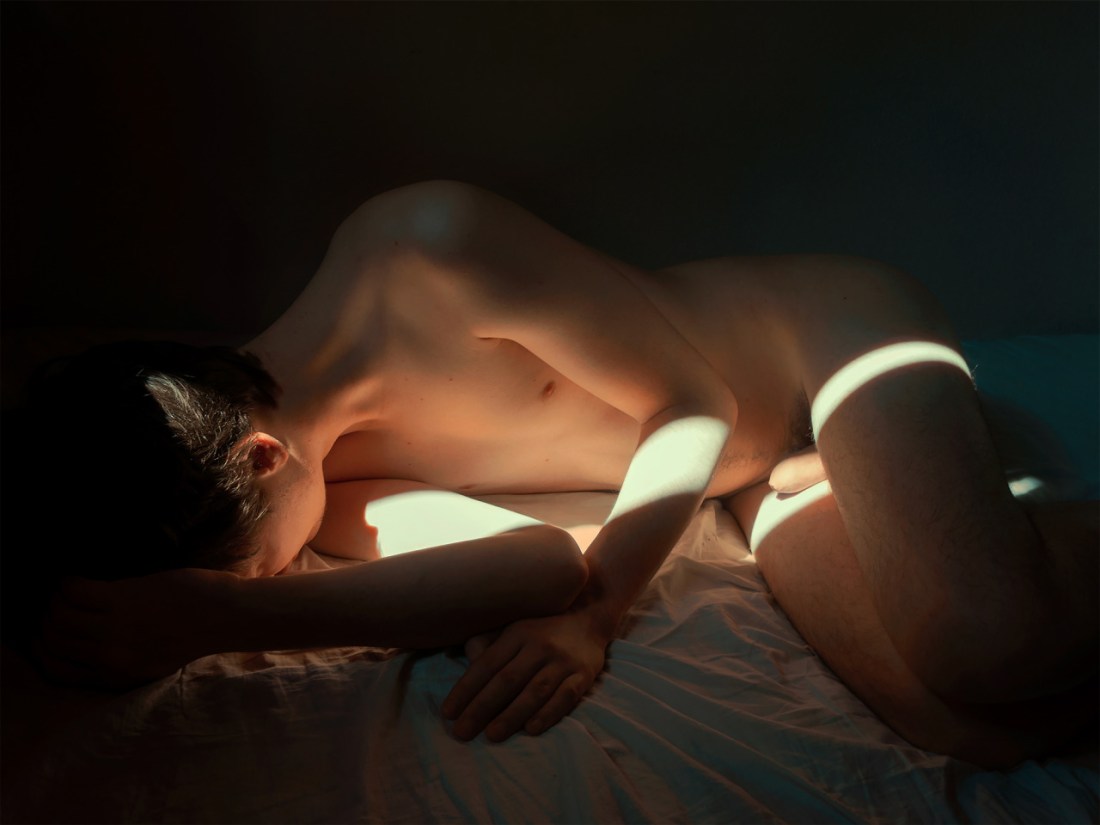
Igor Pjörrt – Dying Star (2015)
My first thought is how this is riffing on Lina Scheynius.
And I say riffing on as opposed to ripping off with intent–the distinction is the same as the difference between stealing like an artist and mere mimicry.
Where Scheynius is interested in documenting light specifically and this frequently manifests as attention to the relationship of light to her body, self-portraiture is less destination than familiar landmark along the pathway.
Pjörrt, on the other hand, seems from the outset more interested in portraiture. Light, or more correctly low-light, does figure prominently in his work–and you should seriously browse his archive because the way he uses minimal ambient light is exquisitely masterful.
The only criticism I have is the erotic works tends to diminish the formal considerations of the more cinematic images by adopting awkwardly, contrived poses. Consider this self-conscious tangle of bodies vs a more legible and evocative image which retains a sense of oddity about the mechanics of how the body’s relate to one another.

Dmitry Chapala – Title unknown (201X)
I like the idea here. Porting body rituals undertaken in private into a public setting is always going to be something that gooses me.
The problem is: this is almost certainly ripping off an incontrovertibly better image–this photo by Igor Mukhin.
Plus the execution is sloppy as fuck. There is flat out no goddamn reason this image should’ve ever been anything other than horizontally oriented. It’s some offensively egregious #skinnyframebullshit.

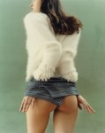
Harley Weir – [←] Agata for Baron Magazine (2014); [→] Greta Varlese for Self Service (2015)
I was not especially fond of Weir’s work, initially–it came across as frivolous, trite even.
Over the last year, my thinking on the matter has shifted; the mechanism of that shift was not solely motivated by the maturing of the work so much as the way that Weir has slowly but steadily improved by increment.
That’s an unusual progression to witness. Usually, you have someone who is making good work who disappears for a bit and then explodes back onto the scene with some skull cleaving next level shit. (Case in point: Jacs Fishburne, who has going from demonstrating obvious talent two years ago to sharing some fucking profoundly inspired and technically accomplished work.)
The sort of quantum leap tends to be the exception and not the rule. So it’s refreshing to see an artist to present such a public face to the false starts and failures that are informing behind the scenes growth in perspective and conceptual acuity.
It’s interesting to me that the now seemingly defunct Baron Magazine’s stated goal was something along the lines of exploring the space between pornography and art.
Overlooking the fact that there isn’t a proverbial no man’s land separating art from pornography, so much as a venn diagram overlapping, It’s interesting to see the image of Agata in that context. Why? Well, although she is nude, she is turned away from the camera (ostensibly also from the viewer). She’s undressing but in a way that is both sexy and awkward–she seems restrained by her clothing, in a way. There’s also the lurid 70s porn palate, super saturated red, pale rose and washed out blues. The phone on the wall, although distracting is a really nice touch that ends up selling the image.
In the second image, things on the surface appear simpler: a model in a fashionable sweater and tartan print skirt. The ¾ profile of the first image is shifted to 7/8 back to camera. The frame lines are tighter–below the eyes and mid-thigh. It’s obvious that Greta is positioned in front of one of those slightly marbled photo paper backdrops. The clumsily presented clothing as physical restriction theme is revisited… only this time the clothing is presented as something almost interchangeable with high end bondage gear. The positioning of her hands hikes up her skirt revealing a centimeter less of the cleft between her legs than would be pornographic.
With so many young women making work on the fringes of fashion and erotica, there’s a lot of talk about developing a female gaze to counter Berger’s art historical male gaze. I’m highly critical of this trend–mainly because the people who are most emphatic about claiming it really do very little in their work to justify their claims. But I think the key difference between the above images is the former is made–probably unintentionally–to cater to the male gaze. The latter won’t necessarily fail to appeal to the male gaze so much as to see it as erotic (and I would argue it’s actually far more erotic in concept and execution than the former is) requires a certain acculturation in an experience of visual culture that is decidedly feminine.

Mark Steinmetz – Title Unknown (20XX)
In 8 days this blog will have its 4th birthday.
As a direct result of this project I’ve been introduced to a number of image makers whose work astounds me: Allison Barnes, Mike Brodie, Kelli Connell, Stéphane Coutelle, Anna Grzelewska, Amy Montali, Igor Mukhin, @ericashires, Joanna Szproch, and Prue Stent.
Currently, I’m fascinated with Steinmetz and his work in a way that I’m not exactly sure how to articulate with any sort of clarity. Yes, he’s probably the best B&W analog print maker since Weston. Yes, his compositions are always impeccable. Yes, he fosters an empathy between viewer and subject that is fully radical–in every sense of the word.
I think what intoxicates me about his work is not that they’re narrative–strictly speaking they aren’t. However, the presentation of people not as objects but as haver’s of incisive, often complicated and conflicting inner lives. They aren’t synecdoches for ideas or conceptual metaphors. They are closer to characters in a film of which the audience is provided only one solitary frame.
So I was thrilled to stumble onto this image of his in a video interview he did for a workshop in Spain. Here’s an image the fit the structure and content of my blog that didn’t require me to digress and be like I know this doesn’t really go here but since I’m entirely preoccupied with it, I’m going to just leave this here.
Also, he’d never take me but I would quite my job and move to Georgia in half a heartbeat if he’d accept me as an apprentice. That is how much I’m blown the fuck away by his work. I’ve begun to consider him in much the same terms as Vermeer, Tarkovsky and Godspeed You! Black Emperor–my personal trinity of creative deities.

Eric Chang – Miki Modernica (2015)
This image appeared as part of an exclusive series for Treats! Magazine.
I could give less of a fuck about the rest of the images. This one appeals to me though.
Partly, it’s the stone tiles and the blue grey of the concrete setting off the grass’ cobalt green; Partly, it’s my preoccupation with questions of pubic vs private, so any work featuring nude figures ostensibly in public is relevant to my interests.
The question I have is: why the up-tilt? Yes, it more or less splits the frame in half, divided along lines of positive and negative space–which shouldn’t need to be stated but is a terrible composition strategy. Plus, the light reflected on the glass stairway railing is super distracting.
And actually, the more I look at this the more it irks me. I can’t dispute that Chang’s work is visually polished. It looks like quality. The issue I have is that he so frequently all but quotes from other artists. (If you like shit like Where’s Waldo, hop on over to his website and look for where he seemingly cut/pastes elements from Andy Goldsworthy and Tim Walker into his work.
The above references or borrows heavily–I can’t decide which–from Akif Hakan Celebi, Yung Cheng Lin and Miru Kim. I can’t speak for Kim–mainly because I’m in a longstanding feud with her (that she is likely to remain unaware of since I don’t usually broadcast the fact) but I take umbrage to her work. But as far as Celebi and Lin go, both wouldn’t have added an up-titled perspective to this scene even if both would’ve been drawn like moths to flame by the elements of this location.
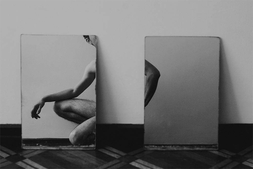
Faber Franco – 2rectangulos (2015)
When it comes to conceptualizing my own work, I’m like the cat that has to turn in circles a few times to find just the right spot/angle so that I can drift off.
I don’t know fuck all about Franco’s process; his work suggests a calculated effort in service of established momentum following a clearly planned trajectory. In other words, it’s less novice swordsman sheathing and unsheathing or otherwise sabre rattling, than samurai who only removes the sword from scabbard with the intent of using it to kill.
What I don’t understand is that although Franco seems to possess a complimentingly developed grasp of craft, I don’t follow his penchant for restricting the tonal range in his images.
Take the above for example: if it were mapped according to the zone system, we’d have roughly 5 full tones. In this the restricted tonal range does contribute to a sense of failing half-light (which is very much in character for the piece).
However, as there is a similar truncating of tonal range in virtually every image on Franco’s Flickr, it smacks a bit of a self-conscious stylistic ‘signature’–something I find frustrating given the overall quality of the work, taken as a whole.
I couldn’t swear to it but I’m reasonably sure there’s a Lynchian influence acting here–the primacy of angles in composition and interplay between super saturated complimentary colors.
And as much as I love most of Lynch’s work, I’m reminded of a criticism leveled against me after sighting Lynch as an influence back in college. Most of the people who claim or demonstrate influence from Lynch tend to use his work as an excuse to break rules before you’ve bothered to learn them properly.
In this case the tonal restrictions do evoke a Lynchian ambiance, while unfortunately overlooking the fact that although Lynch will definitely limit his tonal range for surrealistic effect, he almost always does so by amplifying those four or five zones to the moon while still maintaining a crisp, well defined luminous range. (As just one example consider Frederick Elmes’ cinematography in Blue Velvet, especially the scene where Jeffery finds Dorothy’s husband and the Yellow Man in Dorothy’s apartment.)

Source unknown – Title unknown (20XX)
Even though I suspect this is a composite–the dust scratches are not on the wall and they would necessarily move if that part of the frame were not a single repeating still frame; the wall and mirror are a mask, the mirror is transparent and footage of the masturbating boy has been strategically placed in such a way so as to appear as if reflected–it’s gorgeous.
Try an experiment: using both hands block your view of everything but the boy. Watch for a moment; then remove your hands. Note how the sense of vague exhibitionism disappears and a sense of voyeurism permeates as you consider the scene in totality.
Also, I like that he’s already orgasmed (you can see traces of semen on his abdomen), but he’s still stroking vigorously.

Apollonia Saintclair – The knack (2015)
I love this but for very different reasons that most of the material I’ve posted relating to ejaculation.
I’m usually arguing for the potential of seminal emission as a subject of artistic examination due to it’s visual dynamism. And it’s not that this image isn’t dynamic–jizz jetting 3.5 inches into inky black negative space is always going to be inherently dynamic.
But here that reads as quotidian compared to other incisive details. The lighting is discernibly motivated–presumpably falling from the window in the upper left of frame, haloing the right hand and wrestling highlight detail from the shdows. (The way the hair from his happy trail fades to scattered razor stubble and then to bare skin is lovely.)
But what’s most interesting is the attention to detail. The pinky of the left hand pressed against the skin. Even though there’s no motion it’s clear that the left hand is stroking down, while squeezing tight and the right hand is ascending, clenching tightly over the head of the penis.
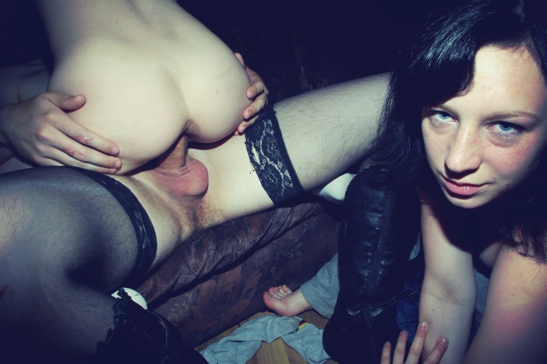
Source unknown – Title unknown (20XX)
My first partner loved the show Friends.
At the time, it seemed like a fair trade off. She’d ‘suffer’ through the latest von Trier or the odd early Bresson and in return I’d hold her while she giggled at the vapid banality of Joey and Chandler. (With hindsight, I definitely got the short end of the stick, but…)
There’s this one episode where the white cis men discover that they are getting free porn via their cable provider. They think it’s a stroke of luck but as things progress they begin questioning how it effects their perception of reality. If I remember correctly, Chandler mentions how while interacting with a teller at the bank, she never offered to take him back to the vault and seduce him.
It’s a knee-jerk, made-for-sitcom parsing of the ethics of porn w/r/t gender representation. But it does suggest a point (to me at least) that I feel is worth exploring; namely: whether the frame is an edge or a boundary.
In the case of the porn that Chandler and Ross were consuming, the frame is an edge. It is separated, so much as to be cut off from reality. However, due to the non-critical consumption–this fantastical representation of a reality that is at a remove from the one either inhabit, they begin to question why their world isn’t like the one they spend the most time considering.
In other words, when you spend too long studying a world unlike the world in which you live (without keeping in mind the fact that you are watching a discrete fantasy), you begin to note discrepancies.
However, some work–and the above image definitely fits in this category–where the frame is a boundary not an edge; a broader reality exists outside the frame. There aren’t people with stock, archetypal designations acting on sets. There are reminders that there are people, places and things beyond the limited view provided to the audience.
This is cool because there’s more hinted at beyond the frame’s boundaries. There are at least 5 people in this scene. Likely six, including the person taking the picture. (And the proximity to the action of the camera person, suggests that they are a participant in the proceedings.)
I love that the one guy is wearing stockings–which note have clearly been pulled on and off enough times that their is a rip opening in the left thigh–and cowboy boots. His scrotum is clearly still irritated from being recently shaved. And the hand that is presumably tracing it’s way up the right arm of the woman eyeing the camera. It all speaks to both the immediacy and intimacy of the moment but also that it exists within the context of a broader world beyond the outer boundary of the frame.
