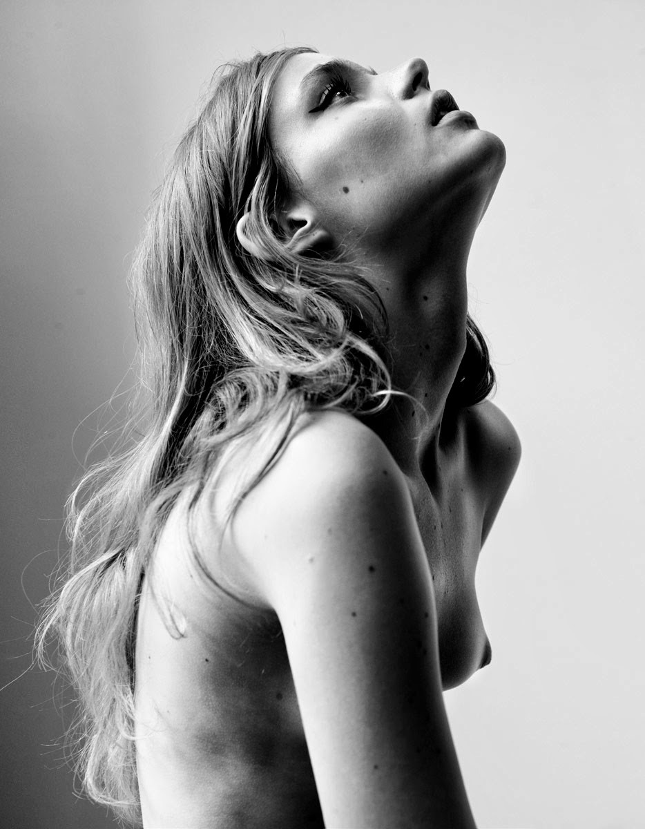
Christine DengateAude and Infinite with Avalon (2014)

Wowsa! What a thoroughly compelling image.

I’m not sure I can offer any sort of ‘proof’ of why it works so well. Part of it is likely the Caravaggio-esque chiaroscuro–with a single bright source of light that enters the frame at a severe angle.

There’s a minute depth-of-field, making her face stand out but also grounding it in the milieu in which this scene is transpiring.

And mind is being paid to the rule that all things being equal, visually speaking–balance between an odd number of things is always preferable to an even number– five hands, three rings.

Bettina RheimsSibyl Buck (1996)

This is by no means a great photograph. The strobe mutes the edges of what would have otherwise been garish palate and the pose is over stylized to the point of contrivances.

Interestingly, both those complaints end up being turned in on themselves, transformed into functional elements. Her knickers are what ties the color together–the pattern includes the color of her stockings, her top, her eyes, her hair and the backdrop; her skin tone is of the same spectrum as the duvet. (If you want to look even closer: the offset between the predominately vertical lines of her underwear which also has the implication of horizontal lines that in turn emphasize the horizontal texture of the top.)

In fact, although the color isn’t as polished and the image appears almost forcibly restricted to the foreground, the loud color does remind me of one of my favorite images I’ve posted on here.

And although the pose is precarious, it manages to telegraph a zero fucks given self-confidence.

I also really like that this is using the form of a glamour editorial but instead of obvious airbrushing, there’s clearly visible pubic hair along her bikini line.

There’s the little touches as well, the bobby pins in her hair, the way she’s pushing her lip with her finger and her septum piercing are all thoughtfully rendered. The necklace though–at least to my eye–is distracting. The line against the neck is great but the pendant part’s metal against the black of Buck’s undershirt is like the sun glinting off something bright in the distance.

Philippe VogelenzangSvea Kloosterhof (2014)

I admit that I have an outsize bias when it comes to vertical orientation in photography/digital imaging.

It’s partly that image makers tend not to be as rigorous about the logic of their composition when deploying vertical frames; the choice seems to frame the decision as a question of facilitating immediacy, emphasizing of a centered subject or just feeling the vertical more than the horizontal. Individually, those motivations are all factors leading to #skinnyframebullshit.

I know a few folks take issue with the rigidity with which I push this notion. (In fact, I’m pretty sure a few image makers favor such orientations to flout my objections.)

But the reason why I have such an issue with vertical orientation is because even if there’s logical compositional consistency, there’s a tendency to lead to geometrically legible compositions but there’s a lack of dynamism.

In the western world, we read left to right and top to bottom. I’m not sure this is true from a design standpoint but I believe when faced with horizontal compositions, we want to read across the entire frame first. Knowing this allows the image maker to guide the eye.

With vertical compositions, the subject (if it is also vertical) creates a columnar effect: the eye scans the first vertical half of the image before moving to the second.

All too often, this results in the 2nd vertical half of the frame being ignored or only half seen.

And I guess that’s my point, if you are working with a horizontal frame, the primary questions are left vs right. In vertical orientation, the primary questions are up vs down. (A note to those perhaps making vertical images to challenge my assertion: every one of you are making vertical images that insist upon left vs right compositional questions.)

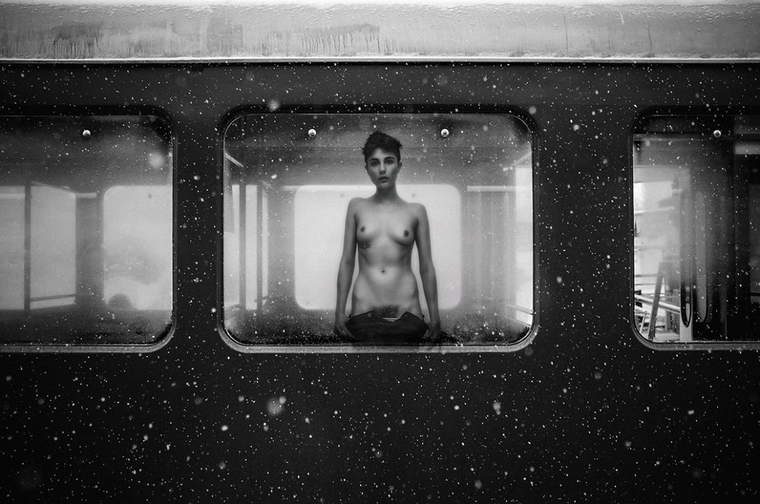
The above is interesting because it answers the up/down question firmly in favor of the former over the latter. The pose and the slight up-tilt of the camera emphasize this.

Additionally the subject is presented off center–unless you’re on a tripod and it’s geometric proof worthy, center your subject in a vertical frame is not going to work for you.

If there’s still any confusion: unless you’re skinny frame has at least the internal and external logical consistency of Caravaggio’s The Inspiration of Saint Matthew, then it’s #skinnyframebullshit.

E. E. SpurrierUntitled (2015)

This reminds me of something I witnessed in college.

There were two grocery stores within walking distance from campus. One was an off-shoot of a big chain but featured a better selection; the other was one of those football field sized containers for endless aisles stocked with crap food and the whole affair sick with dead light and saccharine pop music over the PA.

Everyone on campus went to the second place.

It wasn’t necessarily the draw of the place but one of the advantages was the store hadn’t yet discovered those wheel locks that rendered the carts immobile beyond a certain distance from the store. It was a pretty common occurrence to see classmates pushing a cart overflowing with groceries down the side of the road back to campus.

The carts that wound up back on campus were usually returned (eventually) to the store by campus security. However, during their time away from their usual service, they were drafted into all kinds of absurd shenanigans: grocery cart jousting, the hauling of care packages from home between the post office and dorm room and use sometimes even illicit prop in a drunken visual joke.

In my case, the young woman in whom I was interested–but stupidly didn’t realize for another three years didn’t feel mutually–would get extremely drunk off of vodka and would assume an atrocious Russian accent. She would insist that she was Svetlana and Svetlana was crazy and down for just about anything.

So this image reminds me of Svetlana and one of her friends (both straight and cis), climbing into a cart and miming lesbian hi-jinks for the boys looking on.

And I guess that’s what appeals to me with this–it certainly isn’t the image makers aesthetic which is pretty much hideous even if despite it he does seem to manage to frequently capture what appear to be earnest expressions of sexuality among close friends: this does not appear to be a coy, ostentatious mime for an audience.

I mean sure it starts off with that–the appreciative but toothily self-conscious grin is quickly replaced by the focus of surrendering to someone who you trust and who knows you as well as if not better than you know yourself.

Creator Credit/Attribution

I’m trying not to get all in a twist over this but it’s difficult.

Look: regardless of the questionable design decisions that Tumblr implements, if you aren’t posting original content, then you have a goddamn fucking responsibility to due diligence with regards to properly sourcing the material you post.

I know, I know… it’s a pain in the ass. Tin Eye was never especially good and Google’s image search grows worse seemingly by the hour. But you should at least make an effort.

And let me preempt the customary rejoinders:

  • If you are one of those folks with the boilerplate this came from the internet and is assumed to be public domain disclaimers, you suck and by virtue of having that posted on your web page, I pretty much view your intellectual acumen as similar to someone who has experienced a craniotomy, had their brain removed and had a Pantera fanatic who hasn’t eaten anywhere other than 7-11 for a week use your brain pan as a toilet before you’re stitched back up. That’s not how public domain works. Not even close.
  • But, even worse than the shit brains are the folks who piss and moan about how attributions fuck with their aesthetic. Okay, look–here’s the thing cock noses, contrary to popular belief image makers out there making bank are the exception that proves the rule: frequently those people whose work you dig enough to repost will never make a dime off their work. In effect, they do it because they can’t not do it. It always a struggle, the expense if fucking monumental and frequently the only thing they’ll ever get out of it is people associated the name of the maker of the work with the work they made. That’s it. So, if you’re like oh, many credits/attributions are such a bummer, man; they ruin my blogs aesthetic. So you mean you’re blogs aesthetic that exists completely of work made by folks other than yourself? And in case that’s too subtle for you, let me translate into less equivocal language: you’re not creative enough to develop a personal aesthetic, so you steal one and call what you’ve stolen an aesthetic. (An illustration: if you see a car abandoned by the side of the road–door open, keys in the ignition. Why don’t you just jump in and take it? Well, you know that once it’s reported stolen, if the cops pull you over it’s going to be you carted off to the pokey for grand theft auto. Same principle applies here. Just because you found it like that doesn’t mean it’s yours to do with as you please. Further, so many people who get pissy about how credits ruin their personal aesthetic have shitty grid layout, infinite scroll Tumblrs. Fuck outta here, you idiots.)
  • You don’t get to claim academic fair use either. Your aesthetic doesn’t teach fuck all to anyone–it’s just pompous pretentiously self-fawning masturbation in public.

I feel like none of this really needs to be said–but within the last 24 hours I’ve had a spate of reblogs where folks have stripped credits/attributions–yep, I mean you @fanaticluck; fix it or I’m blocking you.

Look, I realize probably 95% of you follow for this blog for the pictures and could give less of a rat’s ass fuck about the commentary. That makes me sad but it’s fine. Delete my comments. Go for it. But you have a responsibility to keep the credits (as applicable–if I haven’t found the source then I can’t very well fault you for kicking my reference to my difficulty in finding a source to the curb) in-fucking-tact. Period. End of story. If that’s too much to ask, then get fucking lost, you parasite ass douche backwash Slurpee. And if you keep reblogging from me and removing credits/attributions, I will block your ass.

A final note to image makers: I mostly side with you in this. However, I take issue with the prevailing trend where it’s expected that captions will be left 100% in tact, as-is, no alterations. Many of you include links to all your various (excess of, if you ask me) social media portals. I understand, you want people to see your work. But–in this single small way–you are being kinda of entitled and arrogant. If someone likes your work, they’ll Google you and get to see more. The typical user who just consumes the picture and scrolls on doesn’t give a fuck less.

Galleries and Tumblr are nowhere near comparable. But think of it like this: you think a gallery is going to put your every social media account under every picture? Get the hell over yourself. The minimum is: artist (with link to portfolio site) – work title (if any) and date produced. If those minimums aren’t met, raise holy hell. But if they are and you get shitty with curators about not respecting your ostentatiously formatted self-promotional links, then you aren’t in this for the love you are in it for recognition and you need to check yourself because you’re just as much a part of the problem as the folks you excoriate for fucking with your captions.

A writer or any artist can’t expect to be embraced by the people. I’ve done records where it seemed like no one listened to them. You write poetry books that maybe 50 people read. And you just keep doing your work because you have to, because it’s your calling.

But it’s beautiful to be embraced by the people.

Some people have said to me, “Well, don’t you think that kind of success spoils one as an artist? If you’re a punk rocker, you don’t want to have a hit record…”

And I say to them, “Fuck you!”

One does their work for the people. And the more people you can touch, the more wonderful it is. You don’t do your work and say, “I only want the cool people to read it.” You want everyone to be transported, or hopefully inspired by it.

When I was really young, William Burroughs told me, “Build a good name. Keep your name clean. Don’t make compromises. Don’t worry about making a bunch of money or being successful. Be concerned with doing good work. And make the right choices and protect your work. And if you can build a good name, eventually that name will be its own currency.

oan-adn:

The passenger

oan-adnThe passenger (2015)

The word ‘surreal’ has been so thoroughly abused as to render it now nearly impotent of meaning.

I hear people use it all the time interchangeably where terms like ‘oneiric’, ‘transcendent’ or ‘fantastic’ might better serve.

To me this image is surreal. Yes: there’s an element of it that is oneiric, i.e. the way text you read in a dream shifts as you read it. Yes: it’s–in some small way–transcendent because upon seeing this I experienced an in rush of breath and for the briefest nano second my subject perceiving an object shattered; yes, it’s also fantasic in that the train and the nude woman staring–ostensibly at me via the conjured space-time magic of a camera lens.

The reason I suggest it’s surreal is it has a feel to it of your mind playing tricks on you. For example: many years ago on what was perhaps my second trip to MoMA, I was walking to Grand Central. Although it wasn’t late, it was already dark–the sort of weather where you can smell the promise of snow in the air and the wind makes you shrink into your own core heat.

There were very few people on the streets and I remember passing a restaurant with tinted windows that looked in on the type of establishment that you’d need reservations in order to be seated and served. I wasn’t even paying attention really but I could’ve sworn there was a woman in a beautiful evening gown sitting across a candlelit table from a man, who wasn’t a man so much as a sunflower dressed in a well-heeled suit. The image stopped me in my tracks and I actually took a step back craned my neck for a second look.

Of course, it had been a trick of light, reflection and imagination. Still though, the oddity of the scene I perceived has stuck with me. It still feels strangely more real to me than the reality.

It’s that feeling I mean to convey when I term this image surreal. I feel like if I look away and look back, I will see the less interesting reality. Yet, due to some strange magic, the initial moment of mistaken perception has been transformed from passing ephemerality into something permanent. Yes, exactly that and beautifully so.

I Feel MyselfThe Procedure featuring Strawberry (2011)

I have no idea where this is from and that’s sad because there is so, so much to love about it.

The initial overhead shot establishes a sort of dreamlike space. We’re watching a surgery being performed. Not how there’s a ‘nurse’ stroking the patients hair and that same stroke shifts with the cut in the second frame to a sort of fever dream where instead of a surgical procedure there’s a scene where the patient is being sexual stimulated. It’s disquieting; but the oneiric feel is carried over by the comforting hand shifting to more carnal caresses and the scene plays out like a twisted mix between a fever dream and anesthetic hallucination.

It strikes me that the feeling this imparts is what Inside Flesh is asymptotally approaching–never quite arriving because they get so caught up in the aesthetic element of their nightmarish perversions. This certain lacks the expansive production design but it embraces it’s lo-fi limitations and pulls together something that is compelling and uncomfortably arousing.