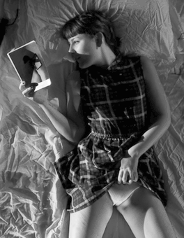
I Feel Myself – literotic featuring Georgiana (20XX)

I am reasonably certain this hails from I Feel Myself–the lighting and overhead cam setup are all in keeping with their studio stuff. (If so then the gif has been desaturated and cropped into some #skinnyframebullshit, explaining why neither Google image search or Tin Eye can source it.)

And I’ll have you know that I really did try to practice due diligence by browsing through the first couple of pages of the studio section, but I am impoverished at present and the urge to just break down and subscribe to the site was so strong that I had to X out of the tab before I got myself into trouble by spending money I don’t have.

EDIT: A thousand thanks to wyyoh for sourcing both original and the progenitor of this particular gif.

Perhaps I’ve said it before but given an endless supply of energy and time, I’d run a blog separate from this one focusing solely on the politics of depicting masturbation. There’s a billion reasons I’m so interested in the topic–both related to my own photographic practice as well as my personal experience of sexuality. But if I had to put it in a simple and direct way, I’d probably spout something like: if the purpose of porn is to motivate masturbation, then imagery featuring masturbation is really one of the few things that actually functions in my case the way porn should.

But this image–despite being cropped and desaturated (two things I go out of my way to eliminate from my curation–really effing resonates with me. Yeah, it’s partly that I’m a nerd and a bookworm. So I can totally relate to laying there reading and removing undergarments in nearly an identical fashion to this. But I love how although this is unequivocally performative, it’s unselfconscious. The book and not the voyeur are the motivation.

It’s that last bit that I relate to with such a fierceness. Also, in keeping with the understanding that gender identity and sexual orientation are not necessarily concomitant, the feeling of this pretty much nails how I would foolishly hope people interpret my sexuality and gender identity in a vacuum. (As far as how I’d hope to be seen by a lover, it would be pretty much exactly like the lady on the bottom in this image.)

No wonder I’m terminally single…

Oleksandr PankovetsUntitled from Meadow Nymphs series (20XX)

There’s something at once intolerably pretentious and vaguely creepy about Pankovets’ work.

He claims Edward Weston as an influence. Um, just no. It’s obvious you have no idea what you’re talking about of you’re relocating mission control from your brain to you ass.

As far as the creepy you can flip through his images and note his MO of using genitals to essentialize his subjects. And even I’ll admit that it’s not as straightforward as all that but notice the way he’s always like sorry-not-sorry-I-am-totally-staring-at-your-junk in this image and also this image for which he’s likely gotten the most Tumblr traction.

And although there’s an effing laundry list of reasons the above images don’t work–just picking w at random: 1.) they’re total #skinnyframebullshit, i.e. when tracking lateral motion vertical orientation isolates the movement in space instead of inviting the potential for it to logically stretch across the frame following the trajectory of the subject; 2.) even given the diptych presentation, were you are supposed to see two comic book panels with an implied ellipsis between them, the actions here would be seen as reversed due to the tendency of the Western eye to scan both images and text from left to right. [As a note: if he would have swapped the images and flipped both left to right… the would read as a diptych where the figure is running and further the odd incomplete auto-focus would actually read as a sensible addition.]

The reason I like these in spite of their failings, is because they represent an honest representation of the unrefined and quite frankly sloppy technical chops of the image maker. The set, setting and motion blur were truly solid ideas–that in a horizontal frame, given a little bit of manual focus dexterity would have produced a breathtaking image.

Sam HaskinsJapanese Bamboo Forest (197X)

Hallelujah! A skinny frame photograph that isn’t bullshit.

Why? You ask.

Well, it’s partly because it’s a super wide angle (or fisheye) lens. But that doesn’t mean that just because you use a fish eye lens that you’ve suddenly gotten a license to skinny frame all over everything.

What makes this work is that it wasn’t take as a skinny frame image, it was taken horizontally with the intention of eventually being displayed vertically.

What makes it in-fucking-credible is the way the direction of several of the bamboo stalks is so inconsistent from the rest, the suffused light and the fact that you see the warping distortion of the ground that makes you wander if you’re laying in a ditch looking up or suspended from above looking down into a strange upside down world.

Milan Vukmirovic – Marlon Teixeira for Made in Brazil (2015)

I feel like this is almost certainly at least subconsciously referencing Jeff Wall’s Milk–the color of the car in this matches is only a smidgen darker than the bricks and both include areas that are at least two stops below the minimum threshold for shadow detail.

The above lacks Milk’s rigorous form and restraint; however, I’m not here to discredit Vukmirovic. For what this is: it’s ingenious. Wall would’ve been shooting on a tripod. If you check the reflection in the chrome bumper you can see that the image maker is laying on his back on the asphalt to take the picture. And if you look closely, you’ll note that there’s roughly a five degree axial tilt that’s off from the horizon line. It emphasizes the overtly sexual nature of the pose.

The cloud perfectly haloing his head is inspired and was probably a happy accident. Still, short of the other car that you can just make out in the lower right edge of frame, this is an awesome image. That chooses two colors (blue and brown) and presents a dynamic spectrum within that scope.

Also, pro-tip: if it’s clean and you nail your 18% grey exposure, chrome looks fucking killer in color. Although if you are shooting B&W analog, you want to swear you can see your reflection now in the present moment showing up in the negs.

k.flightbrobdingnagian penumbra (2009)

As much as I have a preference for work where the craft is beyond on fleek, I will ALWAYS have a bias for outsider art.

Of course, it’s a very real question as to what that word even means when it pertains to image making–with all the rampant pretense, ego and misdirection that entails.

For the sake of the point I’m trying to make here: I’ll take Lynn Kasztanovics over Stephen Shore any day of the week and twice on Sunday.

The thing that makes k.flight’s images so haunting and yes, wonderful, is that any ambiguities or equivocations/quibbles are removed from the proceedings. It’s clear to the viewer what the images concern–more often than not a sort of sultry sexuality as ontology of existence.

The image maker and I have spoken on several occasions and what I feel is relevant to communicate to you is that for all her seeming assurance in the work, she admits to rarely being certain what to make of any of it.

As lame and knee jerk of a connection as it is to suggest: k.flight’s work reminds me of this commercial I saw back in the late 80s. I think it was for Chevy and it was this skater looking kid walking along a beach maybe talking to the camera about how punk rock functioned as a wake up call to rock and roll, reminded it what had original made it so vital and important.

Not all her work is great, but it is all good–even when it falls flat. I can name hundreds of image makers whose work I rabidly support, but there’s only a few that excites me to the marrow of my bones–k.flight is very near the top of that list. And I sincerely hope that I’m able to collaborate with her at some future point in time.

Alexandra SophieSecret Garden (2014)

I have no idea which came first this project or Natalie Fressel’s Forbidden Fruit but there is absolutely overlap between them.

Fressel is all about color and blunt synecdoche; Sophie is more subdued but she also presents a coy playfulness.

I’d be willing to give both the benefit of the doubt and tout them as promising up-and-comers. Except, well, when you get down to the nitty gritty, Sophie’s work is actually categorically better.

No, it doesn’t have to florid color. The skin tone is a little flat and the grass doesn’t quite pop the way you’d maybe hope from an artist working in color. What is exceptional about these are the positing of the hands.

Now before you start lecturing me about how you didn’t even notice the hands, so why am I banging on about them. Well, that’s my point. Look closer–remembering the oft repeated frustration people express about being in a photograph: I never know what to do with my hands.

The hand positions in this are very obviously staged but not in a way that stands out. (The hint of the fingers in the third frame from the top is freaking ingenious.)

I’m super hesitant to impose meaning on work by artists with which I am only passingly familiar, but the way this is about touch and so much of the dynamic effect depends on the hands, I think under the darlingness of these pretty pictures is a very intense effort to develop a visual language to address representation of a woman’s sexuality. Specifically, I’d be pretty willing to be this project is actually about the relationship between young women and masturbation.

Christian Schnalzger Untitled (201X)

I’m posting this less as an endorsement of the artist–alright not as an endorsement of the artist at all (I mean he has some okay ideas, but his technique just is not anywhere near where it needs to be)–but more because this isn’t cropped. The image is actually that wide.

I’m verklimt–talk amongst yourselves. Here’s a topic: the Holy Roman Empire was neither ‘holy’, ‘Roman’ or an ‘empire’. Discuss.

Seriously though, I found out about this format on Wednesday. It’s depending on where the camera originated either the Hasselblad Xpan i/ii or the Fuji TX-1. It uses regular 35mm film and fits 21 shots per roll and features an aspect ratio equivalent to Ultra Panavision 70mm. (Think Ben-Hur or Tarantino’s forthcoming The Hateful Eight.)

The cameras are extremely rare and exorbitantly priced. It would also solve a half dozen different problems I’ve been struggling with in my own work for the last three years.

Really, someone out there has to love my blog enough to get me one. You don’t understand. I need this camera like woah…I can’t even.

WowPornSize Matters! featuring Bella Baby (2013)

Despite what tend to be better than the run-of-the-mill online porn outlet production values, I object to the over-the-top heteronormative tropes in which WowPorn traffics.

And as much as this video is emblematic of everything I detest about the company, this shot actually has a great deal of inherent potential–I mean I’ve never seen framing quiet like it before.

Granted, the camera probably needs to pull back about two feet and perhaps angle up slightly. Cover that too hot key light source–probably a west facing window–with a couple layers of frost; gel what ever is casting that godawful purple sodium vapor tinge that’s working as the fill here (I’d say CTB but then I like everything to match and correct via a grade in post, CTO could work too.)

Also, production design dropped the ball. Sure the wood floor is nice, but how about some sort of rug to add some color. And the difference between the color of the wall and that cabinet needs either color or at least two stops greyer.

Lastly, this is one of those situations, where the default 16:9 aspect ratio isn’t quite as wide as you’d want. Ideally, this scene would’ve benefited from the abbreviated depth of field an anamorphic adapter would’ve brought to the table. However, given that those tend to be expensive, they camera guy could’ve opted for a wider lens and then letterboxed during editing. (Something I’m discovering is that the more rectangular your image, the more it invites a narrative reading–which is not to saw every movie made needs to be shot in 2.35:1 but there are cases where it is appropriate; this is one, IMO.)

Molly SteeleNaked, happy, and muddy (2015)

As much as I freaking adore vivid, super saturated color work (William Eggleston pretty much being the progenitor), my own personal aesthetic preference involves work like this that thoughtfully presents a broad spectrum of two or three different complimentary colors.

Note: with this how the grass and lichen runs from green to brown and how given the hint of blue-green in the water, serves to make the skin tone positively pop out of the frame. Other than that there’s not a lot of color to speak of but with regard to brown and green there is a vast spectrum on display with this.

I also love that it’s raining. I’m always so paranoid about damage to my gear that any time it’s raining like this, I stow everything. I maybe need to figure out a way to make my gear at least vague water resistent.

Also, as someone who skinny dipping is in the top ten items on my bucket list, this image captures exact what I envision as the concept underlying the term.