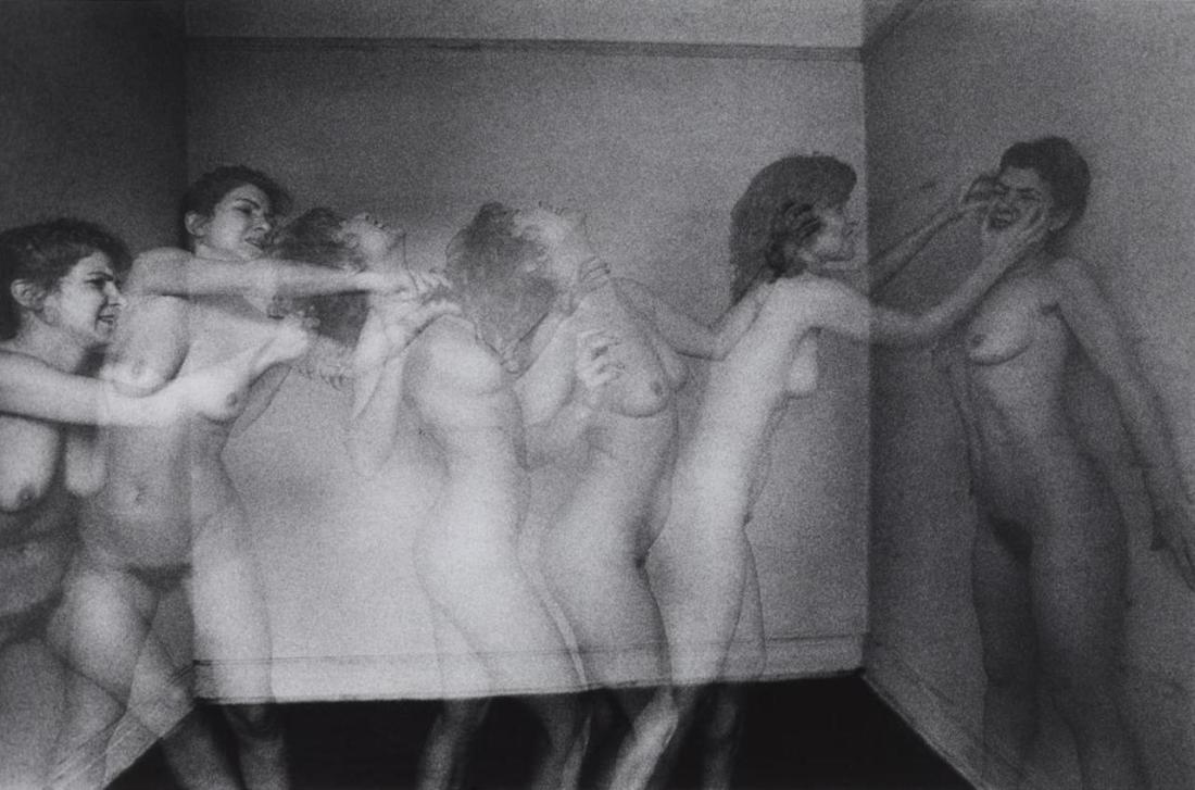
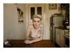
Duane Michals – Violent Women (1982)
In this short Life that only lasts an hour
How much – how little – is within our power
–Emily Dickinson, #1292
Duane Michals – Violent Women (1982)
In this short Life that only lasts an hour
How much – how little – is within our power
–Emily Dickinson, #1292

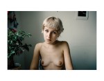
Mike Larremore – Title Unknown (2013)
I’m not 100% convinced the attribution on this is correct. I can’t find this on any of Larremore’s portfolio pages. Also, his images tend to have more depth, range and contrast.
If he did make this image, then I like it a good bit more than the rest of his work.
I mean as an image it’s hardly perfect. Overhead lights are the scourge of color photography. And it’s even worse when it’s on overhead light in a bathroom–where there often aren’t any sources of natural light (i.e. a window) and the walls are typically bright white.
Still, I think the idea behind this image–a candid portrait of a woman showering is actually solid. I’d have liked better skin tone, and if the shower curtain could’ve had a tinge of color that would’ve helped contribute some sort of tension to the image.
The soft focus flattens everything too much and that clashes harshly with the shower curtain in the left foreground and the shower curtain rail imposing a sense of depth in the upper fifth of the frame.
And with the gorgeous trails of water, drawing attention to them would’ve added to the enchantment.
But it’s really the expression that sells this while at the same time making me wish that the rest of the image was equally as stellar. Bottom line this is a potentially exquisite shot that was fumbled and botched in terms of execution.
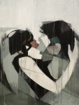
Jo Jankowski – Title Unknown (2014)
I am intrigued by the odd confluences acting in Jankowski’s work.
I’ve maintained for years that there is a Russian/Eastern European visual aesthetic. Perhaps, it’s just a psychosis from spending entirely too long immersed in Russian cinema, but I feel like there’s a certain grimy patina leavened with pre-fab brutalism, an ostentatious minimalism and an almost obsessive mediation between extremes–labor perpetually balanced against leisure, dour pessimism countering a perhaps misplaced belief in better days to come. (It’s something I’ve thought for ages–but wasn’t something I was certain of until after I spent so much time exploring Berlin. The wall may be gone and the permeability has been in place for so long that while it’s no less glaring–you fundamentally feel the difference between East and West as you move from one to the other.)
Jankowski has that Russian/European it-ness.
If you go solely based on his website, it would be easy to lump him in with his fellow countryman Fred Huening–there’s a large degree of overlap in their conceptual and thematic elements.
But that’s not as interesting as examining how there’s an essential French-ness to his work also. I mean the look and feel of his images is heavily informed by Cartier-Bresson. But there’s also whole cloth from Brassai and Atget.
I don’t believe it’s an unconscious affectation on his part. For example: there’s a way in which his work–at least to my eye–is obsessed with questions of revealing vs concealing. It’s not something you’d automatically get from the above image. But it’s a little more clear in this:
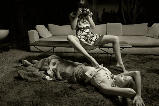
Pay attention to the way the reveal–the woman with the camera using her foot to hike up the model’s blouse seems to be revealing but is merely contributing an erotic charge to the parabola of the woman with the camera’s skirt hem.
Further, I can’t look at this image and not think of this shot by Helmut Newton. Newton’s image hinges on lurid colors and insinuations of lesbianism; a thinly coded, sugary confection designed to do little more than superficially titillate. Jankowski–by contrast–is not interested in serving up kink for kink’s sake. Instead he shows us a scene where we’re allowed to see but are shut out from any sort of interaction. The scene isn’t for or about us–we’re just being granted an opportunity to observe it.
Go placidly amid the noise and haste,
and remember what peace there may be in silence.
As far as possible without surrender
be on good terms with all persons.
Speak your truth quietly and clearly;
and listen to others,
even the dull and the ignorant;
they too have their story.Avoid loud and aggressive persons,
they are vexations to the spirit.
If you compare yourself with others,
you may become vain and bitter;
for always there will be greater and lesser persons than yourself.
Enjoy your achievements as well as your plans.Keep interested in your own career, however humble;
it is a real possession in the changing fortunes of time.
Exercise caution in your business affairs;
for the world is full of trickery.
But let this not blind you to what virtue there is;
many persons strive for high ideals;
and everywhere life is full of heroism.Be yourself.
Especially, do not feign affection.
Neither be cynical about love;
for in the face of all aridity and disenchantment
it is as perennial as the grass.Take kindly the counsel of the years,
gracefully surrendering the things of youth.
Nurture strength of spirit to shield you in sudden misfortune.
But do not distress yourself with dark imaginings.
Many fears are born of fatigue and loneliness.
Beyond a wholesome discipline,
be gentle with yourself.You are a child of the universe,
no less than the trees and the stars;
you have a right to be here.
And whether or not it is clear to you,
no doubt the universe is unfolding as it should.Therefore be at peace with God,
whatever you conceive Him to be,
and whatever your labors and aspirations,
in the noisy confusion of life keep peace with your soul.With all its sham, drudgery, and broken dreams,
it is still a beautiful world.
Be cheerful.
Strive to be happy.

Berlin Rain – [↖] L1001433 (2016); [↗] a berlin portrait (2016); [↙] L1010211 (2016); [↘] L1001387 (2016)
Garry Winogrand famously claimed that the reason he was a photographer was that he “[had] a burning desire to see what things look like photographed by [him].”
Regardless of what you think of Winogrand–I’m on the record as holding a dim view of his work–it was (if nothing else) distinctive.
I sometimes wonder if Winogrand was the last person who could get away with making such a claim. I mean during the prime of his career, everyone was/everywhere was inundated with lens based visual media. Even if everyone didn’t necessarily have a camera, they were familiar enough with them that if push came to shove they could be handed a camera and have a notion of how to use it–if only in the most most rudimentary fashion.
And while I absolutely agree with the notion that the way visual space is parsed through composing a frame might as well be as distinctive as a thumb print, I don’t think anyone is invested in knowing what a picture looks like that they’ve taken.
It occurs to me that instead, folks have an idea in mind of what they want a picture to look like and image making is the process of squaring what’s in one’s head with what the emulsion/pixels show.
I think it’s rather obvious that the image maker who calls himself Berlin Rain is heavily indebted to both Alexander Bergström and @mrchill; he borrows Bergström‘s diffuse lighting and watery color and the tone with which those he captures make eye contact with the lens is v. much in keeping with Chill’s more straight portraiture stuff.
But what I find interesting about the Berlin Rain is the way the work feels almost self-consciously photographic. Like I think, generally speaking, that most people today embrace photography/image making as a means to an end. Like there’s a pathological drive to document, to remember, to use the visual as a means of interrogating the conceptual/philosophical, as a means of bearing witness, etc.
Berlin Rain seems to have his finger on the pulse of the notion of what it means to see in images. To reintroduce the previous notion of making images as a means of bridging the distance between the vision in someone’s head and the light that reaches the emulsion/is translated into pixels, Berlin Rain strikes me as someone who is interested in what makes an image read as self-consciously aware of it’s position as an image.
Now, although he’s clearly a good editor, not all the work is good. He tends to work in a very circumscribed space. But the results are surprisingly well realized. Definitely worth spending some time exploring in depth.

Source unknown – Title unknown (201X)
If she says come inside I’ll come inside for her
If she says give it all I’ll give everything to her
[←] Alisher Kushakov – Объятия. Hug. 2. (2016); [→] Source unknown – Title unknown (201X)
Juxtaposition as commentary.

Nicola Bensley – Leap, Amanda Dufour in Westbourne Grove (2016)
I really, really effing adore this image.
Upon first glance, it sends my brain skittering in two diametrically opposed direction. On the one hand, it’s obviously a work of pastiche–riffing on both Klein’s infamous Le Saut dans le vide and HC-B’s hyper-stylized staging as a form of invoking a sense of unmediated immediacy a la Derriere la Gare Saint-Lazare.
Yet, what’s notable is that the viewer doesn’t have to be even passingly familiar with either image to fundamentally appreciate the dynamic and compelling sense of physicality captured in the scene. (One of the things I feel that capital A Art has lost is a certain baseline accessibility. Recall Renaissance oil painting: there were intensely rigorous examinations of perspective, implicit critiques of religion and sexuality, double-edged political satire but also the work centered around themes and/or narratives that could be immediately apprehended by any one of the populace that encountered them–regardless of education or lack thereof. In other words, ‘high art’ was codified as emerging from something not entirely unlike the lingua franca.
That’s not to say there aren’t small criticisms to be lobbed at this image. The contrast has been dialed up a bit but in the process there’s this sort of weird juxtaposition between expansion and compression of space–the shadowed traffic signals pop out against the white facade behind them, creating a sense of distance between the two things. Yet, the dark pants of the two men standing in front of the dark van waiting for the signal to safely cross the street are compressed.
Dufour’s right hip and leg also lack separation from the background, yet the limited brightness on the back of her leg creates this strange push and pull, which contributes a further surreal effect to her levitation.
In truth, this image teeters precariously on not working. The reason it does hinges partly on the relationship between Dufour and her shadow.
The other, arguably bigger part is the way the up tilt of the camera exaggerates the sense of Dufour levitating instead of jumping at the perfect moment.
I have some additional thoughts that I can’t quite fit to words just now. But I really like the uptilt of the camera in this. I am usual very much a stickler for squaring verticals with the frame edge; however, there is a compositional justification for the decision here which demonstrates a ridiculously incisive understanding of the dynamics of framing a scene in order to parse visual information in such a way to convey a specific sense to the viewer.
It’s unfortunate that Bensley website is so horridly constructed–’cause her work is actually sterling and she’s doing so excellent and exciting analog photographic work.
Source unknown – Title unknown (197X)
Don’t we touch each other just to prove we are still here?
— Ocean Vuong, from ‘On Earth We’re Briefly Gorgeous’ (via soracities)

