If you limit your choices only to what seems possible or reasonable, you disconnect yourself from what you truly want, and all that is left is compromise.
Anaïs Nin (via jrmgh)
If you limit your choices only to what seems possible or reasonable, you disconnect yourself from what you truly want, and all that is left is compromise.

Jaśmina Stysiak – only when i lose myself. (2012)
Jesus Harold & Maude fucking Christ in the ass on Christmas: what are they putting the water over there in Poland?
The sheer concentration of great-to-outstanding photographers/image makers living and working there presently is un-effing-real.

Denis Piel – Heat, Santa Fe, NM from New Mexico portfolio (1984)
Here’s an image which triggers so many associations/causes memories to effervesce unbidden, causing me question my own objectivity in appraising its merits.
The frame is bifurcated: upper half vs lower half. Several interesting things are going on with this. First, the upper half does take up slightly more of the frame (like just eyeballing it I’d say that top is 55% and the sand in the lower half is about 45%).
The upper half has all the detail, contrast, dynamic range–all the positive space; whereas the lower half remains (except for the inspiredly disturbed sand between her right elbow and his left hand and the contrast added to the texture of the sand to create a slightly darker swath of sand radiating up and rightward from the lower right corner of the frame).
This has an odd way of perfectly balancing the composition.
Perfect symmetry is one of my interests as an image maker. But once you get right down to it, actually perfect symmetry is virtually impossible. Even the best lenses have some sort of distortion. Thus, my interest is always piqued when photographers find ways of invoking the spirit of the law of symmetry without being slavishly beholden to the letter of those law.
But I’m also fascinated with this image because of the way it simultaneously reveals and conceals–which is a stellar example of the conceptual underpinnings of the image echoing the physical form (composition). It literally both reveals and conceals the lovers–rendering the visible but also wedged in deep shadows. There’s the desert sand juxtaposed with the chrome and tires. Also, this is ostensibly a public space wherein something that is supposedly private is occurring, presumably surreptitiously.
It’s a narrative image–even if it is too vaguely defined for the viewer to penetrate further than the scenario. A man and a woman taking shelter from the sweltering mid-day sun to communicate their physical passion for one another. There are no indicators of who they are–although I’m inclined to say she’s aristocratic (pale skin); whereas, judging by the depth of his tan, he would almost certainly have to worked outside under the sun for years.
What resonates about this most with me is it invokes a memory of my last trip to Iceland. I’d spent the day in Skaftafell and was taking the bus back to Reykjavik. The bus stopped at Seljalandsfoss in the final half an hour of light– Everything washed in an thin orange patina. I remember being impressed with the vistas but feeling that there wasn’t really a incantatory photo waiting to be discovered.
Yet, as we boarded the bus and continued on our way and the light emptied from the landscape and the sky, we passed through the seemingly endless stretches of lava fields between Seljalandsfoss and Skogafoss. Beside the road, there was what looked like a small campfire.
As the bus sped closer, I just had time to make out two young woman huddled with their backs against the front bumper of their rental car they’d pull off onto the shoulder–more screen and mud than shoulder–of the Ring Road. They were both extending their hands, warming them in the glow put off by one of those camp stoves you peel back the top and set alight. Thus I see something here that reminds me of the intimacy of shared shelter in inhospitable environments.
On top of that, I believe that the car is probably a more blunt symbol. you can also read the photo as if the couple has been run over. In my own experience, when physical intimacy is good, it very much makes you feel as if you’ve been run over but have some how survived uninjured and, in fact, more alive than you ever imagined you could be.
افتح فمك فقط إن كان ما ستقوله أجمل من الصمت
Open your mouth only if what you are going to say is more beautiful than silence.
Source unknown – Title unknown (201X)
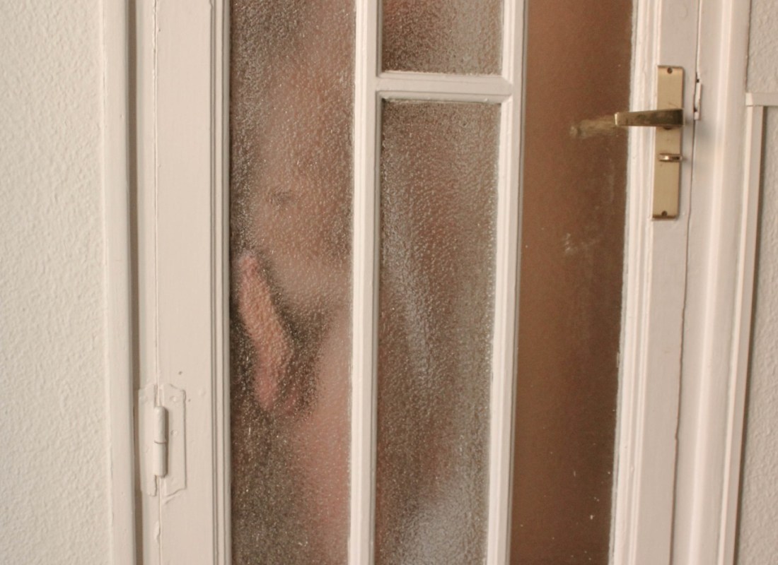
One of the things of which I’ve becoming more and more convinced over the course of my engagement with this project is that a good image shows us both some thing and something about how we should view the thing which we are being shown.
The question of what we are shown is the easier of the questions to answer. In this case we might say: a picture including a section of wall and a door paneled with privacy glass behind which someone is pressing their erect cock against the glass.
In the above image the question of what were seeing is the focus. The question of how we’re supposed to see it is muddled due to the fact that the impetus for the composition seems primarily focused on conveying clearly an answer to the question what is being shown; whereas the composition is willy-nilly. The left vertical of the door jamb doesn’t allign with the left frame edge (and I’m inclined to think the angle of view and hint of barrel distortion seems straight out of an iPhone 6.
Yes, the placement of the penis loosely adheres to the rule of thirds; however, because everything else is so wawker-jawed, your eye slides over it and then moves right along. I think that’s a shame because I think if you scratch a little bit at the what, there’s some interesting things going on.
I suppose the elephant in the room is that it’s a dick pic. But at the same time it’s unusually almost demure. I mean there’s no question what you’re seeing but there’s a degree of anonymization provided by the glass. (Implicit is the notion that privacy glass only serves the purpose for which it was designed if you are far enough away from it so that the glass appropriately fragments and blurs.
And although the composition is godawful, the door handle is at least shown as being latched. There’s an inviolable boundary separating the viewer from the subject’s nakedness. The subject is not touch the door, so the question of whether the door remains closed or may perhaps yawn open is closed off from the subject and instead directed solely at the viewer.
I also like the implication that it is possible to push up against privacy so closely that there isn’t really privacy but there’s also still not public encroachment.
In other words, this is a clever picture that unfortunately suffers from piss poor execution.
Failure is an opportunity.
If you blame someone else,
there is no end to the blame.

Victor Stamp – Colonial Exhibition from The Garden of Oblivion series (201X)
Of The Garden of Oblivion, Stamp embraces the contrived label post-photography.
Being the type who is inherently suspicious of folks who prefix trends, tendencies and or movements with the word post-, I’m not sure what that means–if it means anything at all.
Let’s examine the image itself and try to reverse engineer a working understanding of what post-photography might entail.
It’s reasonably clear that the images are of a particular vintage–early 20th century; and that the titles have been added as ex post facto interventions.
On one level the title verifies this initial impression. As we’re informed here: the images are from an early 20th century provenance and were distributed as a tabloid in French colonial Africa.
Also, apparently the images have been carefully re-sequenced to imply a more equitable relationship between the parties in the photos.
However, the text that has been added as an additional intervention points back to the colonial history of exploitative export practices–listing material resources harvested en masse from Africa and then shipped back for European consumption.
The conceptual purpose of this would seem to be an reclaim the erotic potential of the images while still concretely linking the work to its ugly colonial history.
Don’t get me wrong, I think several of these would be compelling, artistic pieces if you could divorce them of their initial context. The trouble is: I don’t think it works like that.
To illustrate this point let’s consider a divisive symbol in the U.S.: The Battle Flag of The Confederacy. As I was raised primarily in the south, I’ve encountered a great many people who proclaim that the flag is about heritage not hate.
It’s an entirely specious, willfully ignorant assertion. William Porcher Miles was ostensibly the designer and he ardently supported the 3/5 compromise–a premise that couldn’t be more racist af.
When presented with this fact, most heritage-not-haters will counter that it represents that notion of the sovereignty of states’ rights–again completely glossing the fact that the US Civil War was fought over a states right to own slaves.
My default response to confederate flag strokers has become simplified over the years. I point out that to the Navajo, the swastika had a history much longer than its association with National Socialism. Only they called it a whirling log.
Yet, after WWII–and due to the now indelible association with the Nazis–the Navajo voted to retire the symbol due to the horrors with which it’s use was now tainted.


[↑] Source unknown – Title Unknown (201X); [↓] Source unknown – Title Unknown (XXXX)
Juxtaposition as commentary