Cecilia WachterLips (2014)

Lips is a reaction to a culture in which female sexuality
and sex organs are depicted as dirty, shameful, and wrong. The slang
words for female genitalia are crude and degrading; ‘meat wallet,’ ‘fish
taco,’ ‘beef curtains,’ and ‘axe wound’ are all terms that aren’t
uncommon colloquially as well as in pop culture and mass media. Slang
words for ‘penis,’ however, carry themes of strength and domination
(e.g., ‘man muscle,’ ‘anaconda,’ ‘pocket rocket’). Whilst researching
and producing this series, I often thought of an article I once read
that printed the word ‘penis,’ but ‘vagina’ was written as a series of
asterisks. Why are the genitals of one person vilified while comparable
organs on another person are not only socially acceptable, but symbols
of power? From childhood, people with vaginas are told that their vulvas
are embarrassing, abnormal, disgusting, and smelly. As airbrushed
images of the idealized naked human body are increasingly more
accessible to young people, our perception of what is normal has become
flawed and distorted; perhaps as a result, in the past five years, the
numbers of people seeking to alter the external appearance of their
genitals has increased more than fivefold (Hogenboom 2012). Lips is
an attempt to appreciate, embrace, and encourage the divine,
unparalleled beauty of female genitals…. I sought to capture the
intimate intricacies of each of my model’s unique forms, emphasizing
their singularity and beauty.

I believe that this series will be confronting and triggering to my
audience, particularly those with vaginas, and I hope that some of them
may have the same realization that I did while viewing my negatives:
that we are more beautiful than we can imagine. Viewers may be drawn
into a reality that I have imagined, where genitalia can be body parts,
not political statements, and where what we are capable of is not
informed by our gender.

Elina BrotherusBlack Bay from Artist and Her Model series (2010)

I’m frequently asked how I know so much about art history. My response is usually two fold:

  1. I don’t really, and
  2. What I do know is the result of having a Survey of Western Art professor that while not an especially dynamic classroom presence was passionate about the ethos embodied during the Renaissance and the endless possibilities for conceptual interrogation presented by modern art; also, he took a personal interest in my endless reserve of irreverent curiosity.

People usually tell me that by virtue of being able to identifying the latter proves the erstwhile as a fallacy.

While I can certainly follow the logic leading to such an assertion, I feel like there’s a lot that I learned that never took. Given a a list of epochal buzzwords, I can probably do a workperson-like job of putting them in proper chronological order. I can probably even identify a half dozen famous works that sprung from various movements. But it all seems so arbitrary to me, I have a difficult time applying factual trivia I memorized in order to be able to fill in a blank on an exam towards an sort of practical purpose.

In other words the relationship between/ruptures/disjunctions governing the disparity between say Expressionism and Impressionism is something about which I have a really difficult time giving more than half a fuck.

On the other hand, I am INTRIGUED by mapping the evolution of representation of 3D space in 2D (aka perspective) from Giotto to Fra Angelica through Masaccio to Perugino and Rapheal in the Italian Renaissance on to the deconstruction of perspective that was Cubism.

Brotherus’ image reminds me of Adi Putra’s Once in a Blue Moon. Yet that similarity is likely less due to influence (think of influence as pouring a portion of wine from one glass into another) than a sort of positioning in an art historical context (thing of the art historical context as the grapes that are used to make Cabernet Sauvignon, it grows virtually everywhere and is the same grape but climate, soil and other conditions shifted the taste so that two different wines that come from the same fruit taste entirely different).

The one image reminding me of another actually cued a third image. I couldn’t remember the title but I remembered enough of what’s depicted–a man, dressed like a dandy, standing on what appears to be a mountain peak staring into the clouds.

It’s not a mountain, in fact; it’s a jagged shoreline–not just clouds but also fog. The painting is of course the definitive work of romanticism, Caspar David Friedrich’s Wanderer above the Sea and Fog.

Friedrich famously proclaimed:

[T]he artist’s feeling is his law.

It strikes me that both Brotherus and Putra are working within a similar scope as romanticism–Brotherus is likely influenced directly whereas Putra is almost certainly unaware of any connection to the broader art historical context. (That’s an assumption but one based on the fact that I’m not inclined to suggested Putra is a fine art photographer whereas there’s nothing else that better applies to Brotherus’ work.)

Interestingly, I think a goodly amount of the work produced by internet famous photographers and their ilk actually embodies an unconsidered, knee-jerk affinity for a romantic approach.

So while I’m not 100% on board with Brotherus’ work, I do appreciate that she definitely appears to know what she’s doing with it. I just feel like her work would benefit from a shift away from a sullen reimagining of Wordsworth and instead striving for something closer to a Walden era Thoreau as itinerant nomad.

Titti GarelliLa pagelle (2003 – 2004)

As an undergraduate, I studied Ludwig Wittgenstein’s later works extensively.

W. has a reputation for being demanding, founded on the fact that his first foray into philosophy–the Tractatus Logico-Philosophicus–was considered and continues to be considered one of the most singularly visionary/revolutionary philosophical works to emerge in the 20th century.

With such a stunning entry on the scene, you’d expect W. was rather pleased with the reception. In point of fact, he was not. He felt that very few people who professed their affection for the work actually understood fuck all about it; to the point where he all but disavowed the Tractatus and swore off philosophy, opting to become an elementary school teacher in rural Austria.

He returned to philosophy, in time. A goodly number of self-proclaimed experts present him as The Philosopher Who Changed His Mind. Going on to do work that sought to revoke his already monumental contribution to the discipline. I don’t see it that way. The Tractatus is heavily steeped in philosophical form, tone and procedure. The later work seeks to address the ways in which philosophers go wrong in striving to understand philosophy or anything else. What’s so fascinating about it is his tone completely diverges into something that’s half stodgy middle school teacher with the driest ever sense of humor and half trickster therapist.

W’s trip is essentially this: words do not convey meaning in the way a candle gives light to a lantern, words have meaning because of how they are used in the stream of life (in context).

My professor had all these grand notions about me applying W.’s ideas and methods to a comprehensive deconstruction of the creative process. She had me reading Eliot’s Tradition and the Individual Talent alongside Bloom’s The Anxiety of Influence.

It was difficult. I was a full time student at one of the best colleges in the northeastern US who was also working 35 hours a week. The workload was daunting and I chafed under the pressures of this assignment–mostly because I was insistent that in order for something to be good it had to be entirely original.

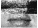
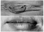
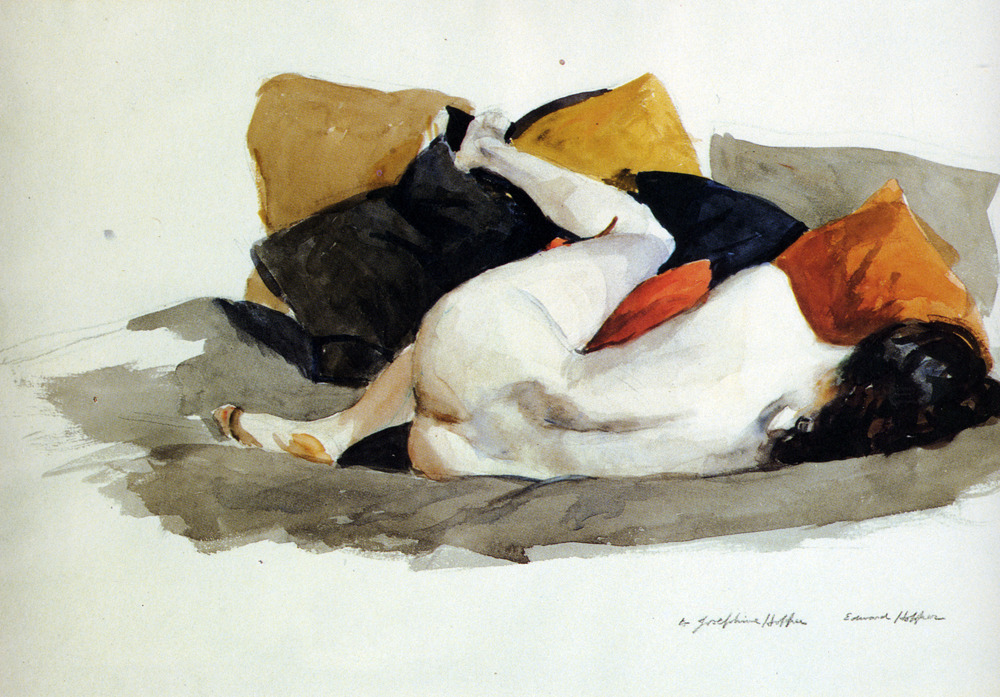
Garelli’s watercolor (above) is not original. The woman is an exact redention of an erotic French post card circa 1920s. The style is reminiscent of that artist whose name I cannot recall at present who made erotic sketches on ledger pages.

But there’s a clever nod to modern art cognoscenti, in that this woman is reading and has been painted onto an academic report card.

I never wrote that paper applying W’s ideas to the notion of originality in Art. There are a number of reasons for this but I think the most important to convey is that I think it lends itself a little too cynically towards the notion that the passing of time/underlying trends in taste and fashion and privilege determine what constitutes originality more than you know, being original.

The difficulty is that being original isn’t really something you can consciously accomplish. The eye sees without a need to see itself seeing. Or, as the Zen master would offer: don’t put another head on top of the one you already have.

I do think W.’s ideas are useful for analysis and criticism. However, I think too many ‘experts’ want to separate knowing from doing.

The less abstract way of saying it is you’ll jump much farrther with a running start than from a standstill. Doing the work day in and day out is indispensable. It’s hardly easy and rarely involves any sort of ground breaking originality. It’s one foot in front of the other, nothing more and nothing less.

Originality rises not when you seek it out but when in the course of ritualistically doing the work you find something unexpectedly intriguing. An errant thought, a wild hair that leads you far afield and when you look up you find yourself lost in a completely unfamiliar landscape.

The mistake is to search for the originality in the destination instead of realizing the endless and infinite is only open to you while you are moving.

If I were going to write that paper on Wittgenstein and the Creative Process, I’d almost certainly begin it with that line from Heraclitus about never stepping into the same river twice.

wonderlust photoworks in collaboration with @kyotocat – [↑] Vestibular; [+] Hasp; [↓] Wombs & Tombs (2016)

I’ve highlighted Emma’s intensity, poise and versatility several times already.

When I found out she was passing through NYC on her way back from overseas, I contacted her to see if she wanted to work together.

Given her work, my expectations were impossibly high and she still managed to exceed them by a factor of at least 20.

The hardest part of editing was selecting scenes where I managed to–through some fumbled bumbling miracle–make a photo that didn’t completely distract from her cultivated sense of her body in space/time, her meticulously considered poses and affinity for experimentation.

Honestly, I held back about a half dozen good images; simply due to the fact that afforded the opportunity to work with her again, I am certain we can do them better than they turned out this time ‘round…

Edward HopperReclining Nude (1927)

Just because I can easily spot a Hopper from across a crowded gallery doesn’t necessarily mean I ‘know’ him or his work all that well.

Everyone knows Nighthawks; most folks know Automat and Summer Evenings. However, his style is so singular that’s all you need as a framework for sussing out the rest. A Hopper is a Hopper is Hopper.

I am extremely conflicted about his work. When I was first introduced to his work in my mid-to-late teens, I detested it. (But I was a surly teenager and was angstily wrong about more things that I was right.)

To this day, I still can’t honestly say I like his work. And if you’re thinking that given my background in filmmaking, this fact is a bit odd, you’ll hardly be the first person to think so and point it out to me.

There is something inherently cinematic about most of Hopper’s work. And what’s especially challenging is that it’s difficult to point to any one thing. Yes, he typically employs longer frames. Yes, there’s a way in which detail increases immediately surrounding the characters and diminishes in the foreground and background. For example: Nighthawks could be a Hollywood set or an approximation of narrow depth as a cinematographic means of emphasizing the area that is supposed to draw the viewer’s attention. (And in researching this post, I discovered Girl at a Sewing Machine, which I think is a great riff on the Dutch Baroque–specifically Vermeer’s Milkmaid and Woman Holding a Balance.

Additionally, the narrative suggestion of most of his renowned work should also draw me in. It doesn’t though…

I think this is due to two different factors. First, I’m not super into the French painters who influenced Hopper. (Some of Degas’ stuff is okay and Hopper unquestionably owes him a huge debt.) Second, I always feel like there’s a fine line between iconic and pop art–no, that’s not entirely accurate; I think Hopper’s iconic is always a little too pop art-y for my taste.

Another thing I don’t especially like that I suppose I picked up on by osmosis is his problematic relationship with his wife Josephine Nivison–the subject in the above image.

There’s an article in The Guardian from more than a decade ago present in anticipation of a Hopper retrospective at The Tate. It goes to great pains to paint the couples relationship as stormily complicated but sidesteps matters of sexism and misogyny. (Especially absurd given that the article presents Josephine as Hopper’s ‘muse’–a concept which is inherently mired in the consumption of women by entitled white cis-het men.)

But the reason I posted this was because a dear friend is currently convalescing with me. She had a health emergency overseas and I flew her back to the US and she’s been staying with me in an effort to get healthy. (It’s been a bit trying–mostly due to the fact my roommates initially agreed to her staying with us and have subsequently changed their tune to giving me 30 days notice to find a new space and move out… but that’s an entirely different story.)

This image resonated with me because it’s how my friend lays when she’s in the throes of a particular bad episode of pain. (it’s certainly inspired the way he uses the tones from the mustard and saffron throw pillows to accentuate her right heel, ankle, flank and back of her neck.. it doesn’t manage to come even close to offsetting her cadaverous pallor.)

Vincent SerbinPhotogram no.65 (2009)

What fine art photography is and today entails is largely due to the legacy of John Szarkowski.

A talented photographer in his own right, he’s now known primarily, however, as the Director of Photography at MoMA for just shy of three decades; where he proved almost singularly responsible for shepherding the black sheep medium that was photography into the fold of western canonical art historical and critical acceptance as capital A Art.

One of his endearing critical notions was that photographs function in only one of two ways:

  1. As windows looking out onto the world, or
  2. Mirrors in which we come face to face with ourselves.

I’ve always been flummoxed by this dichotomy. Partly because dichotomies translate a little too readily into dialectical propositions and partly just because when presented with a rigid either/or divergence, I’m always inclined to search for a third option. (Here’s I’ve purposely chosen ‘third’ as opposed to ‘middle’ due to the fact that although I’m always striving for balance, I am frequently too far outside the box to accept a middle way when others have established what I often feel as arbitrary/artificial extremities.)

Anyway, the point of this post isn’t to take Szarkowski to task, exactly–the windows/mirrors opposition is useful when dealing with say coming to terms with someone like Larry Towell vs say Jerry Uelsmann

Windows/Mirrors do contribute to my understanding of Serbin’s work insofar as Serbin’s work holds up a mirror to my own art historical imagination, causing me to return to artists I know well but are not always at the forefront of my mind.

I think the most obvious point of resonance is William Blake. The titling of the works as well as the way figure(s) are position bear an uncanny resemblance.

Then there’s the same gumbo of spirituality, metaphysics and philosophy that animates Duane Michals work. (To show my work with this assertion, consider Michals’ The Spirit Leaves the Body alongside Serbin’s The Omega Point Theory.)

And to state the patently obvious: there’s clearly some unresolved da Vinci issues at play in the work.

The above appeals to me for its simplicity. It’s more a coup de grace of design acumen than photographic insight. The seamless tonality and the layering of the ink blot reminiscent of Ralph Steadman serves not only as an enticing background but also interferes with the negative and x-ray in ways that further, seamlessly unify the disparate elements of the print.

I think you could read it as a momento mori, except that those seem to function more as a glitching insinuation than a front and center provocation. For example: the negative could be a Tarkovsky polaroid. And while it could be read as life being smaller in the scheme of things than death, there’s a sensual tone to the neg which rather pointed undercuts that notion, rendering the entire print a sort of darkly sinister, yet life affirming joie de vivre.

#1100

It’s great to have the time and resources to be able to pursue what translates ultimately into a frivolous vanity project running off at the mouth about the intersections of art, pornography and transgression.

It’s also an enormous privilege–one I try not to take lightly. As such, I dedicate every 50th posts to news and current events that have had an impact on me or managed to get up under my skin:

The fight over the environmental disaster that the Dakota Access Pipeline will unequivocally entail if it’s construction is allowed.

Maternal Mortality in Texas is a “National Embarrassment”

Keith Olbermann gives 176 reasons Trump Shouldn’t Be President