Jacques Biederer Women in Love (1930)

If your thing is top shelf vintage (think 20/30s & not 60/70s) erotica and porn, drop everything and check out The Venusberg. (Note: the URL is mispelled, the ‘u’ and ’s’ are inverted.)

The Venusberg came to my attention due to another breathtaking menage a trois post. It deserves far more attention than its received but the sense in this of unabashed intimacy is something for which I am craving desperately tonight.

Prue Stentselections from Pink series (201X)

choomathy:

soulsandfishbowls:

7knotwind:

Prue Stent is a 20 year old photo student from Melbourne. The themes of her photography center around femininity and the struggle of identity in women. The color pink is used to represent femininity either physically or emotionally throughout her work.

Her Pink series explores feminine beauty. Stent uses the element of color to raise questions about society’s standard of beauty; breasts, buttocks, and lips are slathered with pink paint to illustrate these commodities are a woman’s own.

found via: http://www.ignant.de/

love it

If this is the future of fine art photography, then Bring. It. On.

Prue Stent = Pure Genius.

Source unknown – Title Unknown (198X)

I consider it a damn shame that I can’t trace exact attribution for this image. All I know is that it seems to have been a popular set shot in Russia circa the 1980s.

Its #skinnyframebullshit is so egregious it’s laughable. However, setting that point aside this and the rest of the images from the aforementioned set are disarmingly charming.

I love how he’s naked and she’s clothed. Her exposed labia are a little too dimly lit to comply with porn expectations–instead I read it as reading as the boy going down on her prior to the scene in the above image (which appears to be supported by the set).

I love how he’s stroking her hair and her visual preoccupation to the proceedings in the majority of photos from the set.

Taken together the set suggests a curiosity the mirrors the rapt, passionate explorations of the couples. Nothing about it feels staged, artificial or contrived.

X-ArtSex and Submission feat. Teal & The Red Fox (2014)

I run–ostensibly–a sex blog. Porn flits across my dash on the daily. Surprisingly, in the two years I’ve maintained this site I’ve found myself seeking out pornographic content less and less frequently.

Recently, I did go rather out of my way to check out two videos–the above [based on the intriguingly atypical way the money shot is handled, i.e. not in close-up/ not involving a(n intentional) facial and the way the stud doesn’t disengage just because he’s come] and Courtney Trouble’s indiequeer Fucking Mystic [based on the glowing recommendation from a genderqueer acquaintance].

Viewing both in the same week, there’s definitely an added push to compare and contrast. The first thing I feel should be noted is the above is not only the highlight of the X-Art video, it’s the only thing you need to see of it. Despite high production values–horizontal tracking shots, holla–everything remains paint-by-numbers pro forma porn.

Alternately, if you can squint passed the paper thin ‘plot,’ Fucking Mystic is hands-down-your-pants haute–even if it does suffer exstensively from a questionable-to-downright-shite production values–wild tracks and tripods, yo; learn them, live them, love them–and despite it’s amazing anything goes approach to sexuality, it ends up turning a little pro forma (anal penetration) itself. [A justification along the lines of it’s a queer critique of mainstream porn holds a few ounces of water at most.]

It all leaves me wondering, why high production values and real-ish depictions of non-exclusively heteronormative content can’t sit side by side more often.

I know the adage be the change you want to see in the world. And truth be told, I confess that I am very interested in the prospect of directing a (singular) porn movie. Unfortunately, I have zero idea how to go about it.

A note on criticism

As much as I don’t miss MFA crits, I sort of do.

Visual culture matters to me immensely. I’m not sure if anything I do here is necessarily good or even coherent and although it’s not easy to sit down and write I manage it with some regularity. (That’s a big deal for me.)

Rest assured that if I post an image of yours, even if I don’t exactly agree with certain decisions you made, the fact that I posted it means that I believe some facet of your effort is meritorious.

I am a highly critical person, yes. But I do not see my role as a critic. I’m here and I do what I do because–well, I hate to admit it but I am kind of not exactly lazy but prone to inertia.

Unfortunately, I’ve found that progress requires momentum and I am shit at building it. I don’t always have things figured out and honestly I’d say ¾ of the time, by writing the posts I do, I am trying to work through some question I have about an image or a technique/process. It doesn’t always get me anywhere. But sometimes it does.

If it helps you work through something to, then all the better.

Masha DemianovaUntitled from Badlands series (201X)

By her own admission, Demianova is preoccupied with establishing a female gaze countering Berger vis-a-vis Benjamin’s art historical male gaze.

I won’t argue that her assertion is unfounded–the work does supports it. I just think that perhaps the notion might be more effective applied in analysis of Rita Lino’s work. Further, when she’s asked about the female gaze she trots out flippant non-answers a la I am a female so is my gaze.

In fairness, that half-assed quip comes from a painfully bad interview with DAZED in which they compare Demianova’s images to Petra Collins’. (As an aside: it seems if you want to talk about Collins you’d really be better suited using Arvida Byström or laurencephilomene-photo.)

Demianova’s work–preoccupation with the female gaze, notwithstanding–has far more in common with Igor Mukhin (a fellow Russian who also shoots both B&W and color) or, in an inversion of style, Noah Kalina (who is similarly caught up in fashion/editorial work and who favors skin tone just beyond the edge of overexposure, an equal but opposite effect to the way Demianova often lets her backgrounds edge dark and muddled to render a somewhat sinister Floria Sigismondi/Kubuki effect.)

But I’m not really especially critical of Demianova’s work. It doesn’t all appeal to me but like so many other artists of Russian and/or Eastern European extraction, there is an edge that draws me like a moth to a flame.

I think it has something to do with–and I may be off base her because I know little about Catholicism and even less about Eastern Orthodoxy–but there seems to be a different perspective on physicality. In the West, the body must by brought under rigid control, but I always feel very much as if in Russian and Eastern European work (at least modern work) there is a way in which physical sensuality is a spiritual realm.

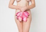
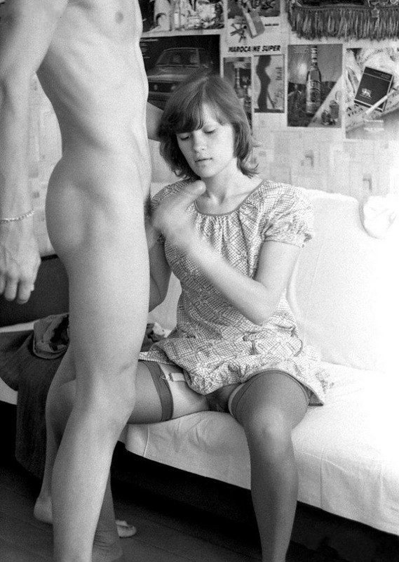
So that is the bias which makes me without hesitation think the boy above is posed to recall the Blessed Virgin. The genderfucking undertone is satisfying. But what sells the photo–and (at least in my mind) suggests that even if Demianova hasn’t quite learned how to express it in interviews, she is not being even slightly pretentious when she mentions her aesthetic of a female gaze–is the fact that the way it’s shot with the photographer ostensibly standing over the subject and using a strobe, this feels like it’s also trying to re-appropriate an aesthetic now very nearly ruined by its association with predatory scum bags like Terry Richardson.

Andrés Castañeda – Untitled (2014)

I see a lot of Castañeda’s work featured on a lot of the blogs I follow.

Until the set of images from which the above image emerges (and is the best), I’ve liked a handful of his images but have remained mostly ambivalent about his work.

Encountering this made me realize that what makes one image and breaks another is Castañeda seemingly pathological obsession with capturing raucous colors.

The difficulty–at least for me–is given the more explicit focus of the majority of these images, the lush profusion of color for the sake of color, or colorlust, if you prefer is inconsistently (at best) and haphazardly (at worst) applied.

In the case of the above, the riot of colors cause the orange stockings to pop. However, in popping they compliment the diminished range of skin tone which actually shifts attention to the unspoken focal point of the  the image: the suffused, milk-white light.

In other words, the fixation on color in this image is less raison d’etre and more conceptually unifying than most of the work.

Also, I was reading something on typography a few days ago and it observed that the best typeface choice is the one you don’t notice. I haven’t quite worked out the corollary but I have a feeling this suggestion also works when considering notions of composition. Too often, Castañeda is (Stephen) Shoring when he should be (Jeff) Walling.

Digital changed the landscape. Before the pixel, craft was still an elemental component of the narrative. A process that involved trusting strips of cellulose in a mysterious dark box was replaced by instant, impeccable rendering, in situ on vast monitors. The photographer’s role as sorcerer and custodian of the vision was diminished: The question ‘have we got it?’ became redundant. Now it was the photographer asking the art director asking the client. Which is a big deal. Because the previous dialectic was that you engaged people who brought something to the party you couldn’t provide yourself. Like Magi, the ‘creatives’ brought creativity; photographers, vision. By abdicating those responsibilities to the guy who’s paying, you’re undergoing a sort of self-inflicted castration. A culture of fear and sycophancy develops. Self-worth diminishes, because nobody really likes being a eunuch, even a well-paid one. There’s less currency in having a viewpoint. The answer to the question ‘What have you got to say?’ drifts towards ‘What do you want me to say?’ There’s reward in being generic, keeping one’s vision in one’s pocket. Trouble is, when your vision has spent too long in your pocket, sometimes you reach for it and it’s not there any more.

Photographers’ Rep Julian Richards on Why He Abruptly Quit the Business  (via photographsonthebrain)

See also:

[W]hen a film-maker says he will produce a pot-boiler in order to give himself the strength and means to make the film of his dreams—that is so much deception, or worse, self-deception. He will never make his film.

                     -Andrei Tarkovsky

Year: Three

Acetylene Eyes was born two years ago today.

I have thoughts and things I would like to be able to articulate but I think it’s better if I limit myself to offering my completely and unqualified thanks to my followers. Thank each and every one of you for bothering with this weird little experiment.

I hope we keep getting better together.