parkerfitzgerald:

Benjamin Koelewijn [Anxiety (2012)]

This is definitely some #skinnyframebullshit.

Glossing over that whole hot mess, the fire, the obscured face and the smeared black ooze recall Sarah Michelle Hoey’s kick-ass Requiems.

I am becoming irked as I look into this though. It’s fine to riff on your inspriations; but it’s another to claim someone else’s idea as your own.

Hoey posted Requiems on January 12, 2012, including a bad (but charmingly so) explanation of her inspiration and process.

Koelewijn subsequently posts Anxiety to his DeviantArt in late June/early July.

It’s not that Anxiety–which couldn’t be more knee-jerkily named–owes an obvious debt to Requiems and brings nothing its own to the table; it’s not Koelewijn failure/refusal to credit Hoey; it’s that Hoey’s work is of a fundamentally higher level of quality and skill, yet it still hasn’t achieved half the Flickr likes and comments that this post of Koelewijn’s has achieved on Tumblr.

If you agree, please don’t like this post; instead duck over here and like the only post of Requiems there seems to be on Tumblr.

[

Normal
0

false
false
false

EN-US
X-NONE
X-NONE

/* Style Definitions */
table.MsoNormalTable
{mso-style-name:”Table Normal”;
mso-tstyle-rowband-size:0;
mso-tstyle-colband-size:0;
mso-style-noshow:yes;
mso-style-priority:99;
mso-style-parent:””;
mso-padding-alt:0in 5.4pt 0in 5.4pt;
mso-para-margin-top:0in;
mso-para-margin-right:0in;
mso-para-margin-bottom:10.0pt;
mso-para-margin-left:0in;
line-height:115%;
mso-pagination:widow-orphan;
font-size:12.0pt;
mso-bidi-font-size:11.0pt;
font-family:”Garamond”,”serif”;}

↑] Les KrimsFall, Fargo Avenue, Facing the West Side Armory, Buffalo, New York (1969)

[

Normal
0

false
false
false

EN-US
X-NONE
X-NONE

/* Style Definitions */
table.MsoNormalTable
{mso-style-name:”Table Normal”;
mso-tstyle-rowband-size:0;
mso-tstyle-colband-size:0;
mso-style-noshow:yes;
mso-style-priority:99;
mso-style-parent:””;
mso-padding-alt:0in 5.4pt 0in 5.4pt;
mso-para-margin-top:0in;
mso-para-margin-right:0in;
mso-para-margin-bottom:10.0pt;
mso-para-margin-left:0in;
line-height:115%;
mso-pagination:widow-orphan;
font-size:12.0pt;
mso-bidi-font-size:11.0pt;
font-family:”Garamond”,”serif”;}

↓] Masha Sardari – The Ashen Heart (2013)

Juxtaposition as commentary.

Scarlett Hooft GraaflandTurtle (2013)

While in Amsterdam, I ended up at Huis Marseille instead of FOAM. (If this seems improbable, let me reiterate “while in Amsterdam…”)

My mistake turned out to be fortuitous.

The entire gallery was taken up by The Rediscovery of the World, a group show featuring work from up-&-coming Dutch image makers.

Huis Marseille is a sprawling, disjointed space. Despite this, the work was arranged to ensure each of the fourteen artists had their own space & that the work flowed logically from one space the next. Intrusions of the curatorial hand were minimal and always concise. Any accompanying information set aside from the work and limited to pertinent biographic details, conceptual/process related notes only.

I love the photographic medium but I am not always enamored with ‘fine art’ photography. Not the case here. I preferred some work more than the rest (In particular: Juul Kraijer, whose work gave my goosebumps goosebumpy and made me feel all light-headed & tingly), but a facet of each of the artists work managed to resonated with me.

For example: I can’t pretend I understand Scarlett Hooft Graafland’s work. Her schtick seems to be going to exotic locals (in this case Madagascar) & using naturally occurring material to create oneric imagery. She definitely has mad chops when it comes to capturing supersaturated color color: the consistency of her blue skies is wild and the yellow in We are not your Enemies is fucking insane.

Turtle stuck out like a sore thumb next to the rest of the work, though. When everything else is about color intervention in the landscape, the appearance of what seems the photographer herself, nude and kneeling next to a muddy river with a tortoise shell on her back.

The image isn’t entirely out of character with the rest of the works in the exhibit; but it’s hardly in line with them, either. Seeing it as relating to the other work, suggested a narcissism–the Westerner who travels to foreign lands and in a well-meaning effort to present the indigenous people’s as they are, ends up co-opting a culture to which she has no right.

I am not sure my instinct was off, so much as it jumped three to five steps further than it should have. Graafland made photos of herself nude, bent over the peak of roofs in Iceland almost a decade ago. Turtle like represents a continuation of that practice.

I feel like there’s a trap here, in a way. Seeing a bare ass, there’s a tendency to see the frame through a lens of sexuality. I am pretty sure that is not what the work is about; still, there is an undeniable element of narcissism. And that complicates things further–making the question of the sexualized body inescapable for this image.

Interesting enough, this image passed across my dash maybe a week ago. Echoing Turtle’s pose it seems strangely less sexual than the above, at least to my eye. I am not sure why that is, but I think it’s probably not just me.

Year: Two

Acetylene Eyes was born a year ago today.

To begin, I want to thank my followers. I’d be doing this even without you, but it is far more rewarding with you here: thank you.

Motivations & Hindsight

When asked why they do what they do Godspeed You! Black Emperor gave the following explanation:

“We play for the kids in the front row because we used to be the kids in the front row.”

This sentiment eviscerates all the pretense, all the art for arts sake bullshit & fixes the whole strum und drang to a noble, perhaps naive economy of gratitude: the overwhelming desire to give back some of the beauty that’s sustained you through the shit & piss & horror, horror, horror.

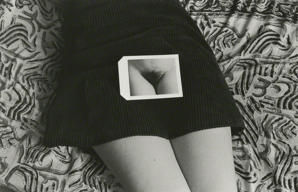
It’s the self-same sentiment that inspired Acetylene Eyes. Well, that and the fact that from a very early age I’ve been both exceedingly visual & insatiably curious about sexuality making a collision with explicit imagery inevitable.

My first encounter with porn was exquisite. & if it hadn’t been so unique, I probably would’ve washed my hands of the whole thing.

But you play it as it lays. It was already under my skin. I’d seek out explicit images hoping they might hold some of the same light as those illicit Polaroids. Without fail I’d find myself reduced to a warm, wet quivering mess by the staggeringly beautiful sexual capacity of the body while at the same time feeling repulsed by what I can only think to call a lack of appropriate reverence for the proceedings. I’d cover my eyes with my hands but no matter how much I wanted not to look or how much what I had already seen made me feel alienated from my body, I always peaked out from between my fingers.

For both good & ill this desire to look in spite of the consequences has played arguably the biggest role in defining who I am today.

A year ago, I was beginning my yearly descent into the hell of seasonal depression. Creatively, I was stagnant: I hadn’t made a photograph in months & my case writer’s block felt terminal.

After four hours of staring at a blank Word document, I’d end up trawling the internet. Despite not having an account, I unofficially followed a half-dozen Tumblr sex blogs.

What I saw surprised me.

Not all the images, not even most, but some of the smut put me off less.

I really didn’t set out with any misplaced vanity that I could do the whole sex blog thing better; I merely knew I could do it different.

For example: I had zero interest in perpetuating another carefully curated record of consumption in an effort to ‘self-define’ by projecting preference and taste. (Read: fuck if I was gonna be another lame-ass mass re-blogger.)

The second thing was the realization that I had fuck all to offer in the way of original content. After all participation is not equal to contribution. & I wanted to make something, to give back. Not just to the blogs that gave me glimpses of what I had been waiting for but although I didn’t see it at the time, it presented a way to give something back, if not to my actual fourteen year-old self, then to some other confused, very alone fourteen year-old. (Note: if you are not 18+, you can’t legally view this blog. & yes, only saying that to cover my ass. No, I won’t know if you are looking anyway.)

But as someone much wiser than me once advised me: the great end in life is not having your questions answered, it’s learning to ask better questions.

Moving Forward

I’d love to be able to promise a post a day in year two. Honestly, it’s not that easy. As terse and still unfocused as some of my writing is, it sometimes takes me six hours to put together 250 words of commentary. Words are slippery stubborn things & there almost always exists a vast rift between what I want to convey and what I manage.

That said, my goal is 250 posts this year.

Toward this end, I am hoping to have at least six (6) guest curators. (Year One’s only guest curator, azura09, did a wonderful job. Plus, guests curation encourages a plurality of perspectives–something I feel to be of vital importance.)

There are several other things I have in the works. But they aren’t quite solid enough to share yet & I’d rather not jinx them.

Lastly, with a few notable exceptions, I have kept this project a secret from my friends. I’ll be outing myself today. I’ll likely lose a few people. But if they are offended by this, they weren’t really doing me much good were they?

Stats

At present, I follow 60 blogs. To put that in practical terms, I scan an average of 600 images almost every morning. Weekends: it’s closer to 1000.

A fair ballpark estimate would be that I’ve scanned 200,000 something images over the last year.

Of those 200,000 images, I’ve marked 1350 ‘likes’, or: 6.75% of all the images I scanned this year.

Content is culled from liked posts. As it stands–just shy of 200 posts to date (roughly a post every day-and-a-half)–15% of likes become posts.

Thus, approximately 0.1% of the total images scanned this year became posts. (In reality, it’s probably closer to 0.05% once you figure in text posts and original content.)

scherbius:

constructed/deconstructed

model Cam Damage

If you aren’t following Cam,  you’re doing Tumblr wrong. Her work is singular, distinctive and almost without exception is of the highest quality.

The above (shot by Zeitgeist Photography) is hand’s down my favorite image of hers. Each panel functions in and of itself so well that even divorced from the others, it would retain its dynamism.

Additionally, breaking the image out in this fashion works more or less like showing your work which solving an equation; the choices the went into constructing them image are implicated in how the image is seen.

It’s damn engaging. And not to detract from it but I would be remiss were I to overlook the obvious parallels with Benoit Paille’s recent work–specifically: Visions/Hyper-reality/suburb as well as the loading docks backdrop.

Paille uses a staggering number of manipulations. (Here’s a glimpse at his process.) For all the fuss, these manipulations only change the images insofar as clarifying the impetus for creating them–highlighting matters of shape, line and form designed to nudge viewers toward noticing how their eyes scan an image.

angmodel:

andrea margaret

Margaret has made work with a veritable a who’s-who of Tumblr image makers: Darren Ankenman, Babak Ghaemian, Todd Hido, Brittany Market, Megan Sample, Erica Shires (whose work is INCREDIBLE), Art T (aka Creative Rehab) & Chip Willis.

Her appeal is understandable: she effortlessly shifts between ingenue, coquette, muse and provocateur. Yet, the shift is not so much like donning a mask as assuming an entirely new identity.

A desirable knack, certainly, but what further distinguishes her work is the fiercely assertive, in-your-face independence that shimmers just below the surface. Andrea Margaret can appear disdainful, bored, playful–often all at once–but it is always evidently she’ll tolerate no sort of foolywang whatsoever.

That’s what makes this picture stand out to me; it’s a self-portrait (as far as I can tell) with a severely limited dynamic range suggestive of a low-end digital rig–an iPhone 4, if I was forced to guess. It’s hell of muddy; but not in a someone tracked-mud-onto-the-floor-you-just-mopped way, in a simpering Delta blues way.

Here, Margaret seems less overtly confrontational. Instead, her provocation is cut with an aching, frustrated determination, perhaps some loneliness as well.

Quite nice, really.

Source: unknown

In the best case, this essentializes female-bodiedness to genitalia. (Duchamp’s Etante Donnés being a likely point of departure isn’t a good enough excuse.) Worst case–which isn’t all that different from the best case–it operates as misogynistic synecdoche.

The presentation is rather clever (mounted Kodachrome slide as a winking meta-joke on fetishization); but, not so clever as to dismiss criticisms.

(There’s maybe also a #skinnyframebullshit argument to posit.)

With these foibles, it‘s still motherfucking gorgeous. I don’t care how expensive and difficult it was to manage, Kodachrome ran circles around later color positive stocks.

And now that Fuji discontinued Astia, there is no longer a world class color transparency stock. Yes, there are good stocks–I use Provia 100, to better than middling results. And a good chrome–in terms of color reciprocity–is indisputably preferable to the best negative stock. (Whereas neg stocks compared to digital are like comparing the illumination of the sun to pitch darkness encroaching on a guttering flame.)

I mention this partly to provide context on my fetish object assertion and as a result of recent speculation that Fuji may be leaving the E-6 party in the next five years; a move that would mark the end of color positive film stocks.

Motherfucking megapixels suck at B&W due to digital only theoretically supporting 75% of the range of blacks the human eye can see. That’s why there will always be B&W film stocks. But despite still remaining grossly inferior, digital is killing color. I categorically don’t want to live in a world where representing colors like those in Steve McCurry’s so-called Afghan Mona Lisa have been rendered obsolete due to an insistence on following the path of least resistance.

Kenneth JosephsonPolapan (1973)

First things first: I have gotten flack for the wordiness of my posts. I post what I post because I believe in contribution as a prerequisite for participation in a community. I don’t have much in the way of original content, so I offer what I can: commentary.

I realize that most of you couldn’t give less of a fuck what I think about images. I don’t give fuck one if you discard what I’ve written when you reblog shit from me. That’s cool. No offense taken.

What I can’t abide is deleting attribution. Don’t do it. If you do, you suck shit through a fucking tube.

Case in point, this image was properly credited in the original post. Somewhere along the line, credit was removed.

It may seem like a small thing. But this has come across my dash several times. Seeing it, i’ve thought to myself: self, the blacks look kinda shallow so this is probably an image created through digital means. It has a bit of the picture-in-picture thing happening, maybe a touch of the album-cover-instead-of-a-face trend. In other words, due to my lack of pre-extant familiarity with the work, I end up mistaking it for a copy cat instead of an instigator.

Further, knowing that this was made in 1973 immediately connects it with Duane Michals Things are Queer and sharpens my ‘inspired picture-in-picture’ formulation toward an insinuation of mise en abyme.

And what is particularly interesting to me about mise en abyme and what Michals focuses on is that you can not only travel inward in such images, it is equally possible–and I would argue more interesting–to travel outward.

epicnudesofcinema:

Alexander Wolff
Pauwen en reigers

[Cinematographer: Geert Lautenschutz]

Peacocks and Herons is a half-hour comedic series which aired on Dutch television in the late aughts.

As far as what its about: search me (There’s nothing about it in English.)

I don’t make a habit of posting shit I know fuck all about but this not only has a nice Jeff Cronenweth vibe, it represents something of which there should be a lot more: depictions of male nudity in visual culture.

Granted I haven’t seen a single episode Peacocks and Herons, it could be packed with graphic depictions of female bodied nudity. But I would still give kudos to the Dutch.

Why kudos? Unfortunately we haven’t made very much progress in the more than thirty years since the instance of full-frontal male nudity in Fast Times at Ridgemont High was eight-sixed due to erect genitalia being perceived as ‘aggressive’ by the MPAA censors.

Meanwhile for every scene of male bodied nudity managing to somehow slip through unchallenged, tens of thousands of instances of female bodied nudity flood in unchecked. A proliferation which pushes the boundaries of what is considered edgy/graphic. To the point where the majority of instances of female bodied nudity carry an instinctive and compelling correlation to sexual activity.

I’m with Blake on his assertion that “the naked woman’s body is a portion of eternity to great for they eye of man.” But the glaring double standard and inequality it facilitates piss me right the fuck right off.

We need more Micheal Fassbender in Shame, more Alexander Skarsgård, more Viggo Mortensen in Eastern Promises, more Peacocks and Herons.

danish-principle:

Joanna Szproch [also : The Quiet Front & Dripbook]

Welcome to Swoon Town. Population: me.

This. Is. Just… woah & woah again & amen.

Yes, it flouts conventions I drone on & on about: hands cut off at the left frame edge, legs amputated mid-calf by the right third of the upper margin.

Underlying these choices, however, is a logic strengthening the ambiguity of Eva’s pose: is she being lowered into the water or pulled from it?

& ambiguity in keeping with the image’s liminality; lingering as it does between color & desaturation; at once strong & vulnerable, artful & lascivious.

I cannot even begin to list the host of things that go through my head when I look at this image. But two things seem vital to mention. First, I am jealous of Eva. Not because she is so much prettier than me & not because I wish this was me instead of her (even though I do a little, okay: a lot.). It’s that I want to be seen by someone (anyone, honestly) the way Szporch sees Eva through her camera.

Also, in the interest of full disclosure: I wish I had made this image. It is chapter & verse the sort of work I try–& more of than not fail–to make.