wonderlust photoworks in collaboration with @marissalynnla – [↑] Marissa Lynn (2017); [↓] Pellucid (2017)

As I’ve mentioned, I had two photo collabs while I was out in L.A. last month.

It’ll be another three weeks or so on the B&W–I use a specialty lab that I ADORE (but they are impossibly slow).

Anyway, so for now here’s the edit of the color stuff from the afternoon I spent with Marissa.

I was extremely nervous about the lack of light. (In an irony that wasn’t lost on me, it rained almost the entire time I was in L.A. while it was 60°F back in Brooklyn…)

But it just goes to show–trust your materials, measure twice, cut once and things have a way of sorting themselves on their own.

(I’ve clearly been thinking about Alexander Bergström & Akif Hakan Celebi more than I realized…)

@house-of-fortitudeUntitled (2014)

This blog gets it’s fair share of garden variety Internet trollery. After that, the most common query I receive is people making reasonably cogent arguments that I present myself as an infallible authority.

Uh… no. I’m wrong. Frequently. However, the frequency is less a function of idiocy and more a matter of the fact that I really do put my ideas out there a lot–which presents more opportunities to be wrong.

(For the record: I encourage everyone to take what I say with a Gibraltar sized grain of salt. Always think for yourself. If you think I get something profoundly wrong, drop me a line. I have zero qualms with substantive disagreement–the point of this project is actually to facilitate dialogue that I find to be currently lacking and which I feel is both vital and important to have within the medium and those who appreciate the medium.)

Case in point: very early on, El Desouky submitted a photo for publication. I don’t really accept submissions–although I have something in the works that won’t necessarily change that but will shift it slightly. (Hoping to make that announcement during the back half of the month. Stay tuned.)

I turned up my nose at it.

Now? Well, now I feel like an arse about it.

I mean I’m super hard pressed to name another photographer with as singular a visual voice, who works in both B&W and color in ways that underscore the necessity of that particular image preferencing one medium over the other and who can be bothered with the notions of melancholy as neither inherently positive or detrimental so much as necessary or perhaps even suggestive of a form of radical self-exploration.

I freaking L<3VE the above photo. It’s partly the simplicity of it. A cluttered kitchen and a woman. Nothing about this is in any way so complicated as to be prohibitive to arrange. Yet, there’s something magical about it. It really does look as if she’s drifted off into quiet reverie as a result of looking at snapshot. The snapshots–splayed as they are on the table, clearly legible as photos but not clear enough to distinctly discern what the portray–suggest a glimpse into the woman’s thoughts in a way that let’s the mystery be.

Then there’s the light–which as far as I can tell comes from two sources. An ugly, bare overhead bulp as well as a single very direct light source just beyond the left edge of the frame angling down on the table, her face, neck, shoulders, back of the chair and the little leak filtering through the shadowed triangle formed between her neck, shoulder, bicep and forearm, drawing attention to her left breast, accentuating the nipple.

The magic of it is that anyone with a camera could have made this image but only El Dosouky could make it in a way that is both insinuating of a narrative and resistant to such interpretation, that feels so vibrantly alive and authentic. It’s a scene that is so mundane, we might overlook it we happened upon it unaware. But now we get to revel in it’s glorious wonderment.

Karen KuehnUntitled from MetropoLOVE (2010)

Confession: I find this ineffably effing sexy.

It’s really all the little things in concert that get me worked up into a lather. The texture–his pants (the bunching of the rolled down waist band against the velveteen texture of the rest of the garment), the thickness of the cotton of the waistband and leg holes of her panties (and the visible stitching!!!) vs. the busy pattern on the thinner, inner cotton. His skin against her skin (the sheen and grain of it so tactile.

I love that the picture in and of itself communicates–without a single word–some of the truth underlying the image. The illumination as well as the background (what you can see of it) is very clearly arid and dry. And it turns out that Kuehn is a burner and travels to Burning Man every year with her camera gear.

But it’s really the intimacy of it. His thumb is clearly inside her underwear but the position makes it clear that it’s in the crack of her ass. Further, his index and ring finger are positioned in such a way that he’s almost certainly touching her anus through the material.

Given a wider frame, you would’ve lost the emphasis on the graphicness of the touch while–presuming nothing in the background–contributing a sense of two lovers alone in an empty world.

But the close up here in combination with the gesture, brings in questions of public vs private. With this frame there’s no way to know if anyone else can see this but given that the photographer can, we presume others can but since we don’t see others in the frame, they are both engaging in amorous foreplay with a potential for the behavior to be occurring simultaneously private and in public. (It’s a clever way of invoking the thrill seeking mind set that drives most people to attempt to have sex in public in the first place: the balancing of the risk of being caught with not actually being caught.


Lúa OcañaUntitled from Don’t Break series (2011)

I first featured Ocaña’s work roughly a year ago. I liked it quite a bit but it didn’t really reach out and grab me by the throat like say Allison Barnes or Sannah Kvist, and after just a single encounter I compulsively spend days meditating on the work.

This popped up on my dash the other day and I’m glad for that because I have been meaning to spend further time with her photos–it’s just that frequently in the rushed fuss and bustle to keep this blog running, work that I like but doesn’t necessarily immediate worm its way under my skin falls (unfortunately) by the wayside.

For now I have two additional observations to offer regarding Ocaña‘s photos. First, it’s interesting how her visuals play with the ubiquity of a certain minimalism embraced by hordes of internet famous image makers–a naked model against a white wall in medium close up with light falling in such a way that you know a window is just beyond the edge of the frame.

However, there is an intense vitality to Ocaña‘s work; a vitality absent from 99.9% of thematically adjacent imagery. I think the best I know how to point to that vitality is to refer to it as ‘intense introspection as a route to surreal experience’.

This leads to the second point: there is another image maker working in a similar style: Els Vanopstal. Yes, her work is a bit more varied and formal. But I can’t look at this image and not automatically connect it with Ocaña.

wonderlust photoworks in collaboration with Kelsey Dylan– [↑] Not a Place–a Feeling (2016); [-] The Anchorite’s Niche (2016); [↓] Opia (2016)

Kelsey and I were able to pull together a quick session while she was in New York in November.

There was nowhere near enough light and I only had 100 speed film on hand but I think we still managed some good snaps.

Also, I think I’m getting a better handle on how to communicate with photographic collaborators. And I’m super excited now that my B&W slide lab is back online. (Can’t wait to get back into serious B&W work again.)

alveoliphotography:

August, 2015.

Tiffany Helms x Alveoli Photography

This post is guest curated by @suspendedinlight.

As someone usually preoccupied with stillness, my favourite thing about
Alveoli Photography’s work is actually how it always feels on the verge
of coming to life. I can look at his images and feel that they are
moving and breathing. Also I genuinely think
Tiffany Helms is one of the most talented faces out there right now.
Her expressions are so genuine, she can tell an entire story, sell an
entire image with her eyes. I can’t decide with this one whether she
might be inviting the viewer in or walking them
out.

Andrea Torres BalaguerUntitled from hypnogogia series (2013)

It’s probably just a knee-jerk response but there’s something about this image that feels melancholic.

I mean: yes, it’s a function of the rain; it’s also how the image is composed. From left to right, we see what is presumably a boy dressed in black trying to climb up on the rock and the young woman already atop the rock but her position there looking decidedly temporary–as if she’s going to jump down as soon as the boy manages to climb onto the rock.

It feels very cyclic–a play on the notion of the yin-yang symbol.

But looking at this I can’t help but thinking of two children on a playground. One sitting at the top of the slide and the other climbing the ladder to the slide–the endless repetition of work and reward–climbing the ladder, hurtling down the slide. Again and again and again–all day long if the bell never rang calling all back to desks, books and irritable teachers.

Historically, Mozart remains a psychological anomaly–an artist from who work emerged Athena-like, fully formed and final drafted on the first go round. And as valuable as repetition is to learning and mastery, the educational faculties insist that at a certain point, we should be able to crap out work that’s good enough on the first try. This is actually a dangerous precedent to accept. Unless you’re writing a fugue–which I can say from experience is difficult as fuck–repetition is one of many tools that contributes to the notionality of a ‘form’,

It’s a shame that we allow what we deem worthy of repeated actions generally orbits a sense of social obligation. I go to work each day in order to pay my bills. Whereas we feel as if we’ve wasted time by watching a movie we love or listening to a song that moves us for the billionth time. We feel that the former is a good use of time and the latter extravagant, frivolous–wasteful even.

However, the things that truly matter, we pursue with that same dogged child-like determination–up the ladder, down the slide. Repeat ad infinitum.

Nicola BensleyLeap, Amanda Dufour in Westbourne Grove (2016)

I really, really effing adore this image.

Upon first glance, it sends my brain skittering in two diametrically opposed direction. On the one hand, it’s obviously a work of pastiche–riffing on both Klein’s infamous Le Saut dans le vide and HC-B’s hyper-stylized staging as a form of invoking a sense of unmediated immediacy a la Derriere la Gare Saint-Lazare.

Yet, what’s notable is that the viewer doesn’t have to be even passingly familiar with either image to fundamentally appreciate the dynamic and compelling sense of physicality captured in the scene. (One of the things I feel that capital A Art has lost is a certain baseline accessibility. Recall Renaissance oil painting: there were intensely rigorous examinations of perspective, implicit critiques of religion and sexuality, double-edged political satire but also the work centered around themes and/or narratives that could be immediately apprehended by any one of the populace that encountered them–regardless of education or lack thereof. In other words, ‘high art’ was codified as emerging from something not entirely unlike the lingua franca.

That’s not to say there aren’t small criticisms to be lobbed at this image. The contrast has been dialed up a bit but in the process there’s this sort of weird juxtaposition between expansion and compression of space–the shadowed traffic signals pop out against the white facade behind them, creating a sense of distance between the two things. Yet, the dark pants of the two men standing in front of the dark van waiting for the signal to safely cross the street are compressed.

Dufour’s right hip and leg also lack separation from the background, yet the limited brightness on the back of her leg creates this strange push and pull, which contributes a further surreal effect to her levitation.

In truth, this image teeters precariously on not working. The reason it does hinges partly on the relationship between Dufour and her shadow.

The other, arguably bigger part is the way the up tilt of the camera exaggerates the sense of Dufour levitating instead of jumping at the perfect moment.

I have some additional thoughts that I can’t quite fit to words just now. But I really like the uptilt of the camera in this. I am usual very much a stickler for squaring verticals with the frame edge; however, there is a compositional justification for the decision here which demonstrates a ridiculously incisive understanding of the dynamics of framing a scene in order to parse visual information in such a way to convey a specific sense to the viewer.

It’s unfortunate that Bensley website is so horridly constructed–’cause her work is actually sterling and she’s doing so excellent and exciting analog photographic work.

Denis PielHeat, Santa Fe, NM from New Mexico portfolio (1984)

Here’s an image which triggers so many associations/causes memories to effervesce unbidden, causing me question my own objectivity in appraising its merits.

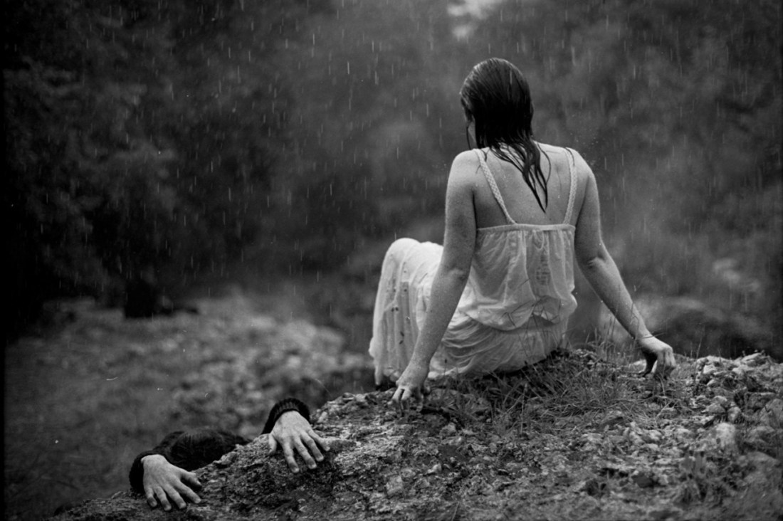
The frame is bifurcated: upper half vs lower half. Several interesting things are going on with this. First, the upper half does take up slightly more of the frame (like just eyeballing it I’d say that top is 55% and the sand in the lower half is about 45%).

The upper half has all the detail, contrast, dynamic range–all the positive space; whereas the lower half remains (except for the inspiredly disturbed sand between her right elbow and his left hand and the contrast added to the texture of the sand to create a slightly darker swath of sand radiating up and rightward from the lower right corner of the frame).

This has an odd way of perfectly balancing the composition.

Perfect symmetry is one of my interests as an image maker. But once you get right down to it, actually perfect symmetry is virtually impossible. Even the best lenses have some sort of distortion. Thus, my interest is always piqued when photographers find ways of invoking the spirit of the law of symmetry without being slavishly beholden to the letter of those law.

But I’m also fascinated with this image because of the way it simultaneously reveals and conceals–which is a stellar example of the conceptual underpinnings of the image echoing the physical form (composition). It literally both reveals and conceals the lovers–rendering the visible but also wedged in deep shadows. There’s the desert sand juxtaposed with the chrome and tires. Also, this is ostensibly a public space wherein something that is supposedly private is occurring, presumably surreptitiously.

It’s a narrative image–even if it is too vaguely defined for the viewer to penetrate further than the scenario. A man and a woman taking shelter from the sweltering mid-day sun to communicate their physical passion for one another. There are no indicators of who they are–although I’m inclined to say she’s aristocratic (pale skin); whereas, judging by the depth of his tan, he would almost certainly have to worked outside under the sun for years.

What resonates about this most with me is it invokes a memory of my last trip to Iceland. I’d spent the day in Skaftafell and was taking the bus back to Reykjavik. The bus stopped at Seljalandsfoss in the final half an hour of light– Everything washed in an thin orange patina. I remember being impressed with the vistas but feeling that there wasn’t really a incantatory photo waiting to be discovered.

Yet, as we boarded the bus and continued on our way and the light emptied from the landscape and the sky, we passed through the seemingly endless stretches of lava fields between Seljalandsfoss and Skogafoss. Beside the road, there was what looked like a small campfire.

As the bus sped closer, I just had time to make out two young woman huddled with their backs against the front bumper of their rental car they’d pull off onto the shoulder–more screen and mud than shoulder–of the Ring Road. They were both extending their hands, warming them in the glow put off by one of those camp stoves you peel back the top and set alight. Thus I see something here that reminds me of the intimacy of shared shelter in inhospitable environments.

On top of that, I believe that the car is probably a more blunt symbol. you can also read the photo as if the couple has been run over. In my own experience, when physical intimacy is good, it very much makes you feel as if you’ve been run over but have some how survived uninjured and, in fact, more alive than you ever imagined you could be.

wonderlust photoworks in collaboration with @kyotocat – [↑] Vestibular; [+] Hasp; [↓] Wombs & Tombs (2016)

I’ve highlighted Emma’s intensity, poise and versatility several times already.

When I found out she was passing through NYC on her way back from overseas, I contacted her to see if she wanted to work together.

Given her work, my expectations were impossibly high and she still managed to exceed them by a factor of at least 20.

The hardest part of editing was selecting scenes where I managed to–through some fumbled bumbling miracle–make a photo that didn’t completely distract from her cultivated sense of her body in space/time, her meticulously considered poses and affinity for experimentation.

Honestly, I held back about a half dozen good images; simply due to the fact that afforded the opportunity to work with her again, I am certain we can do them better than they turned out this time ‘round…