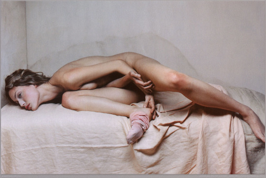
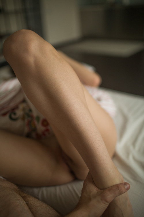
Kirill KikiboyTitle unknown (2016)

Under the usual circumstances, I’d advise you to steer clear of this guy and his work. It’s just another example in an interminable string of dime-a-dozen cishet asshat male image makers who possess a modicum of technical acumen and believe this gives them the right–nay: obligation–to produce work that has no raison d’etre whatsoever beyond the beatific rendering of sexually objectified femininity.

But as much as I detest the rest of his work, this image is difficult to disavow.

I find it exceptional because of the way that it uses the extremely shallow depth of field to shift the emphasis away from her genitalia and to the way he’s holding her foot. (If I was a better person, I’d say that bokeh is consistent with Canon glass.)

This being the case: the focus is less implicitly carnal and more tied up in a symbolic shift in power dynamics.

Another point: I won’t suggest this is #skinnyframebullshit–given the angle of her left leg, it reads up and down as opposed to left and right.

Interestingly though, while there is a compositional logic to support the vertical orientation, I’m pretty sure this was originally a horizontally oriented frame that was cropped down in post. (I think this for a number of reasons but the main two are that it’s not exactly easy to square a camera vertically with only one hand–you end up with your elbow thrown up like you’re doing the funky chicken in a Jazzercise class; also, the top 15% of the frame is negative space–yes, it ends up balancing out the fact the the image is decidedly bottom heavy… yet that’s not something that would be easy to see in the moment of trying to visually parse the scene.

I’d actually be super interested in the original framing of this–assuming my gut feeling on this is correct. I think it’s probably a more immersive image for the added narrative implication.

Michel ComteCourtney, New York (2008)

As best I can tell Comte has presented this image as it appears above–you can apparently buy it as an archival inkjet print here–as with ever so slight variations (pay attention to her eyes and the position of her left leg) as the way it was originally made, i.e. in color and part of a fashion shoot.

I am primarily interested in the presence absence of color but insofar as either image works it’s because of the way Herron’s pose mimics the water mark on the set wall behind her.

The B&W version of this has been in my queue for months. I have mixed feelings about it. As I’ve already mentioned the pose is exquisite. There aren’t any real highlights to speak of–if we’re using the Zone System, then I’d say we’re dealing with zones 0 through V only. This results in less than ideal skin tone but it works within the context of the image–drawing attention to the resonance between the pose and the water mark as well as giving it a vintage feel.

I can’t look at it without positing that whoever made it has a massive hard on for Weston’s nudes.

But it doesn’t quite work for me. There’s something off about it.

So in a way the color iteration makes more sense as a total package. The form pose as echo of water spot is de-emphasized. The color is meticulously controlled–what appeared to be a limiting in the B&W version now makes sense–the apricot top sheet and the beige grey of the wall and mattress offer just enough of a dash of color to keep the scene from going flat, cause’s the pink of her sock and the red in her skin to dynamically pop in the frame.

The acute angle of the corner where the two set walls meet is not vertical in either frame–however, it stands out more prominently in the color version. (Probably because the B&W version includes the entirety of her left foot–thus distracting from the odd angle, whereas the color one chops off her toes.)

This is really one of the prime reason I hate digital. An image that is intended to be in B&W needs to be approached with a completely different mindset and tools than a scene that is intended to be presented in color.

Now I don’t know that Comte used a digital camera. It’s entirely possible that he had two cameras set up side by side and triggered the shutter at almost the same time–one with B&W stock the other with Color. But I’m of a mind that this was one digital camera and the files were manipulated post process.

Traci Matlock & Ashley MacLean – Title Unknown (2006)

This was the first image from Matlock and MacLean’s collaboration that I encountered.

I remember being profoundly impressed with the simplicity of it. The edge of the bed perfectly aligned with the top-left corner and the exact middle of the frame to the right. The woman’s body stretched out intersecting the bottom of the bed plane at a perfect 90 degrees.

It was simple but so intricate in its mannered specificity.

And the light–fuck me, the goddamn perfectly sublime light: the way the right hand is almost blown out and the rest of the skin is so exquisitely perfect.

It was as if someone had taken Caravaggio’s stylized lighting and mashed it up with Helmut Newton’s can’t-decide-whether-it’s-fashion-or-trash/heavily-expressionist-inflected work (some of the very little work of merit the shit heel ever made).

I immediately went through everything they had posted on Flickr, then clicked over to their absolutely gorgeous website (which like most gorgeous websites, turned out to be nearly impossible to navigate). Hell, I even bought a year’s subscription to Nerve to follow their column.

Almost a decade later, I still find the effect of this photo to be hypnotic. And I think if there’s one thing their work has taught me it’s that good creative work doeen’t answer all your questions–instead it ensures that the questions you ask of the work are productive.

And honestly the questions their work asked of me–continues to ask of me–is the reason (for better or worse) I’m still out there fumbling around with a camera myself.

Jessica YatrofskyTitle unknown (2010)

If you’ve ever thought to yourself: Self, you know what? I really, really wish Ryan McGinley had a female twin who was a photographer, too; only I wish she limited her output to stuff in keeping with McGinley’s Yearbook project then Yatrofsky is exactly the image maker you’ve been waiting for. 

It sounds like I’m throwing shade–and, in fairness, I probably am a bit (really, I can’t think of an image maker who embraces such a limited scope of exploration)–but occasionally it pays off for her. The above for example is derivative as fuck but it also captures an open, honest, in-the-moment immediacy that so much made-for-Internet-aggrandizement sorely lacks. And, although her seeming lack of any familiarity with cinematic form is appalling, she is actually putting together interesting, boundary questioning video work. (Please, please for the love of all that is good, pure and holy–if you are shooting video and not celluloid, the resulting work is not ‘film’, it’s ‘video’ or ‘digital cinematography’.)

@sugarmagnohlia – mood indigo (2016)

For those of you who don’t know, Sugar (Magnohlia) is one-half of @slide-2-unlock–the best couples sex blog on Tumblr. (King is the other half; both are breathtakingly beautiful humans. Full disclosure: the linked image of King always makes me drool. ALWAYS.)

Following their story over the last year and a half or so has been a constant source of fascination.  Unlike most couples blogs, they relay the good, the bad and the ugly with the same careful, honest attention. It’s in this way that you’re truly able to see the breadth and depth of their commitment and passion for each other.

A while back King reported that Sugar was struggling with mental health issues and needed to step back from slide-2-unlock. It’s been inspiring and humble to watch her fight off her demons and slowly but surely emerge from the ashes of the way life can try to burn you to the ground.

I’m not 100% sure of this but it seems that Sugar has started to use her interest in image making as a tool to help beat back some of the darkness. Her work has evolved and improved at an unprecedentedly pace. (Really, her recent work with the incredible Kyotocat is among the best work from either.)

I love the way this image appears to be riffing on Duane Michals.

Also: I’ve featured one of slide-2-unlock’s photosets before. It resonated with me strongly because Sugar bears more than a passing resemblance to an erstwhile partner that I’ve never managed to completely get over. Given the intensely personal nature of that resonance, I was worried about appropriating the image. I reached out to Sugar and she gracefully allowed me to reblog the photoset with my personal commentary appended.

Anyway, by way of update, there’s still a lot to work through and figure out but my former partner and I are tentatively working on reconciling in order to get back together. I feel like I may be jinxing something but admitting it but it’s all so unexpected and disarming that I can’t help but shouting it from the rooftops–or in the case posting about it on Tumblr.

Source unknown – Title Unknown (201X)

People speak to me about boundaries.
This is work. That is play. This is public. That is private.
This is for friends. That is for lovers.
I don’t understand imaginary lines in the sand.

I want to know the ones like me. Daughters whose mothers
Left them to wolves, trusting the tutelage would
Lead–one day–to understanding the words
tattooed over their shivering hearts:

There are no lines. There are no boundaries.
A horse will run until it dies.
And death, death is better than dreaming about
what it might’ve been to run free
.

Barry MarréUntitled from The Last Boys book (2015)

There’s this zen aphorism: don’t put another head on top of the one you’ve already got.

At it’s core, it’s a statement about the relationship between conceptualization and praxis and relates to another far more familiar zen-ism: do or do not; there is now try.

One of my struggles–particularly with writing but it bleeds into every corner of my life–is a deeply rooted commitment to ‘being original’. More often than not, obsessing over whether or not the thing I am going to do has been done before transforms into an insurmountable obstacle to the doing itself.

The truth is: while I don’t exactly agree with the prognosis that it’s all been done already–in my experience the exceptions to that rule are so few and far between that they almost don’t even warrant discussion.

Take this image. The pose is clearly a reference (with some slight variation, namely the mirrored pose, the subject’s gaze acknowledging the camera and supporting leg bent instead of fully extended not only balances the composition–the available light falling from the implied window beyond the left edge of the frame balanced against the off-center right positioning of the bulk of the body) on Michelangelo’s Adam.

The light itself is reminiscent of later Caravaggio’s.

Yet for these obvious influences, the resulting work is hardly beholden or otherwise limited via similarities.

I feel like I’m circling what I really want to convey–my point has something to do with the way people who don’t have a great deal of experience posing for the camera frequently question what they are supposed to do with their hands. Yes, one solution is to throw it all at the wall and see what sticks but this is where an intimate familiarity with art history is a boon. As far as visual representation goes, when artists’ find something that works, it tends to become enshrined as a part of the form. You can consider contrapposto, pietas or the fascinating history of the coded visual language used to ‘label’ apostles and saints.

Such poses and coding function much like cliches–the present a ready, pat way of communicating something that is otherwise complicatedly nuanced. (And here I would note as an aside: one of the many purposes of good poetry is it’s mapping of new ways to express what would otherwise function as cliche–there may be a lesson here about what distinguishes lower case a art from upper case A Art.)

In other words: the conventions are there because they have proven to be an exceedingly relevant way of addressing universal concerns w/r/t visual representation of bodies. The convention is not unlike a platonic form–but as always the devil is in the details. The ideal form will always be sterile, lacking in resonance. It’s the slight variations, the obsessive fixation on the mechanics of gesture within a rigid framework that tilts beauty either towards abstraction or towards something grounded in an observed and unmediated moment of transcendent seeing.

thepureskin:

Hey TPS! I don’t often post pictures of my flower because it attracts the kind of creepy sexual attention that I don’t want. I really loved the movement in this photo. I think women are sexualized so quickly especially when it comes to showing breasts and flowers. So today I’m celebrating how pretty my flower is without feeling sexualized. Kisses! Willow

I completely agree with you, thewillowrae, I’m glad you shared and hope that everyone will see your body simply as the beautiful work of art that it is

This image is just effing awesome.

It’s absolutely not #skinnyframebullshit–the viewers eye is intended to move from bottom to top. The angles of the stitching on the duvet emphasize this motion as well as drawing attention to the way the light intersects (from right to left) that trajectory at a complimentary angle.

Further, I am always lambasting compositions that cut off the subjects head since there are literally thousands of ways to present an undecapitated body while maintaining anonymity; this is one of the most creative and just damn ingenious as fuck I’ve seen in ages.

Also, love the nailpolish juxtaposed against the light and shadows on the skin.

Excellent work.