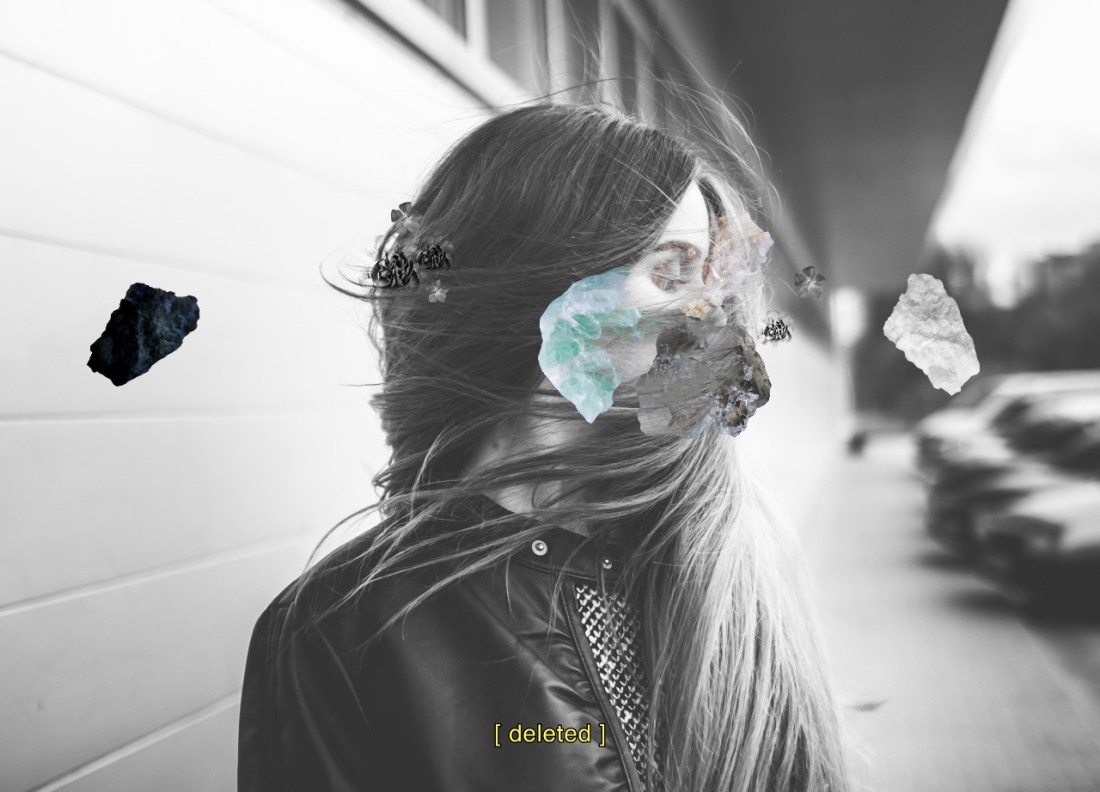
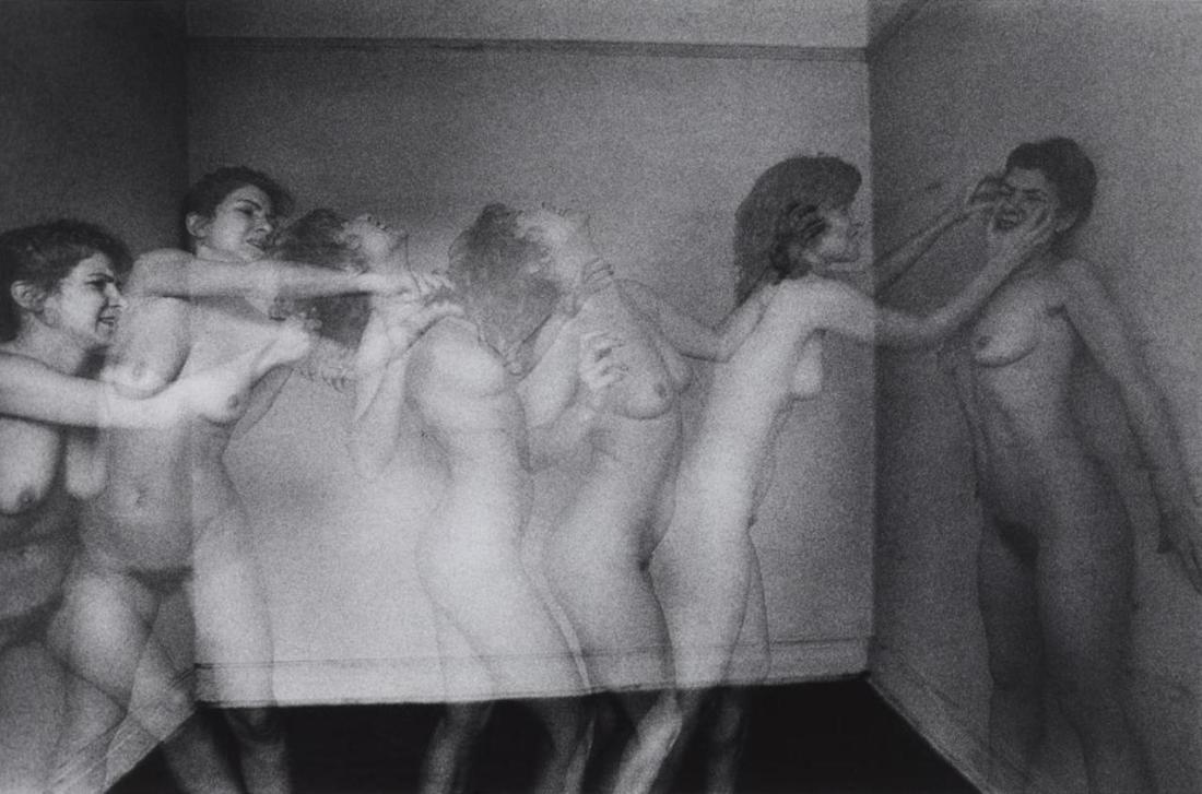
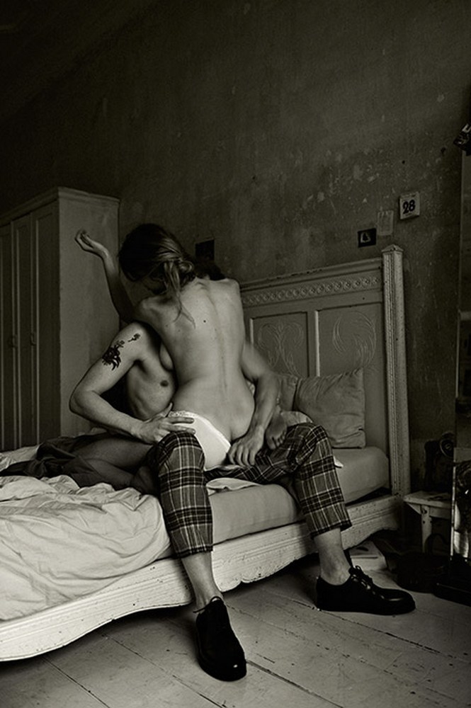
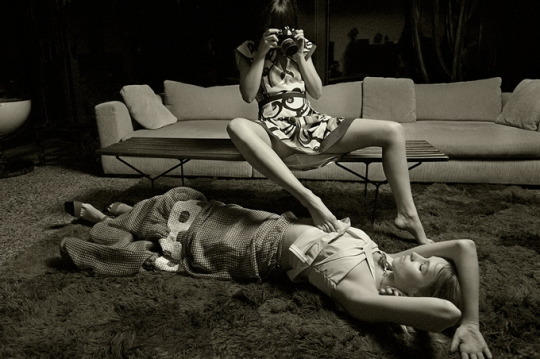
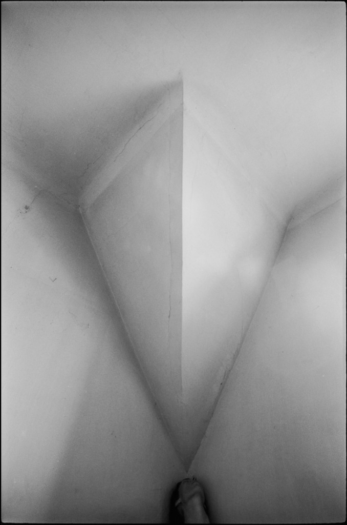
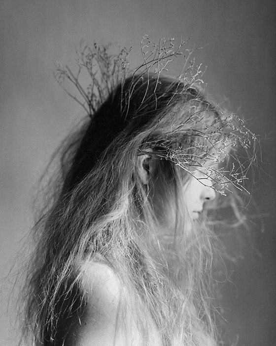
Jessica SlagleThis world we live in (2016)

Physical things are eloquent tokens of ideas,enriched by new meanings
through time even when the tokens are no more than evanescent paper
representations.

Mary Catherine Bateson Peripheral Visions: Learning Along the Way

***A note: I’m reblogging this from @lisakimberly. Seriously, if you aren’t following her already, go forth and do not pass go, do not collect $200, follow her immediately. Her curation has been KILLING IT.

Julia KlemUntitled (2014)

I’ve been thinking a lot about the difference between ‘good’, ‘better’ and ‘best’.

As with most of my mental tangents, it started as a digression; specifically, a friend was talking to me about their post-election anxiety.

They said: I feel gutted.

Gutted: a harsh word–the choked G, the clot of Ts; a former presence (I had guts before) and current absence (I no longer have guts); an implicit violence resonates.

Good/better/best?

Gutted: a word intimately connected with hunting and fishing–you gut the fish you caught, the deer you shot before you can eat it. Something dies so that something else might live on. If you’re gutted the benefit of your body is no longer something for which you may lay claim/benefit.

Eviscerated?

Like ‘gutted’ it conveys a similar sense of former presence and current absence, except presence or absence are connected more to uselessness of the presence. The word itself is violent but there’s a matter-of-factness to the treatment that feels sterile–the corpse on a slap with a Y incision and the visera packed into a plastic bag placed somewhere off to the side on a scale.

Hollowed out?

The former presence is downplayed to focus on the current absence. Did it happen slowly? Was it violent. Is it figurative or literal?

Good? Better? Best?

Initially, I thought that ‘gutted’ was good; ‘eviscerated’ was better and ‘hollowed out’ was best.

Now I’m not so sure. I think if I were speaking, ‘hollowed out’ would be the best choice. For someone else, it might be different.

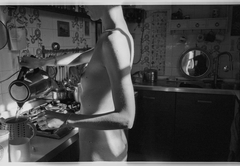
I’ve been thinking about this in terms of artistic influences–that’s the prism through which I’m approaching Klem’s fucking FANTASTIC photographs.

Any schmuck who knows a bit about Internet famous photographers, can probably spot the overlap between Klem and Laura Makabresku. (And there’s almost no way that Klem doesn’t consider LM an influence–it’s much more than the repeated crow motifs.)

I don’t like LM’s work; it’s Brooke Shaden directing a Stabbing Westward music video based upon a little known Edgar Allen Poe short story aesthetic has always struck me as pure posturing (at best) or sycophantic contrivance.

Is it unique? Without a doubt. But does her gauzy, soft-grunge aesthetic compliment yearning and mournful–or is it yearning to be mournful– favors concepts and content.

It’s almost like hearing someone say they felt ‘gutted’ and then every time they find yourself in a situation that they think is similar they respond by saying they feel ‘gutted.’

And that’s not necessarily a bad thing. We learn what feelings apply to which situations through empathy.

Artistic influence is not unlike this. We find comfort and derive solace from work that moves us. So it’s easy to say: this moves me the most and therefore I am going to make this the example that I follow. Our heroes say they feel gutted and we are inclined to follow suit.

But none of us are our heroes. And part of being a gifted artist is knowing when to stay the course and part ways.

I’ve always felt that LM say she feels “gutted” when she might be better served by identifying as “hollowed out”. 

That not a bad thing, inherently. Although in my experience is does limit the range, resonance and accessibility of the work. What frustrates me about LM is that her choices always seem to so completely undercut what I feel is the central tact of her work–slow dirge for new oneiric feminine; and she stands behind those choices with such bravado.

Why doesn’t that diminish the value of Klem’s work–I mean if she’s influenced by LM, then doesn’t that discount her work? I would argue no. There’s a way in which Klem’s work manages a unified aesthetic but the aesthetic expands outward to engage with concepts. (LM on the other hand tosses concepts like darts at the bullseye that is her aesthetic.)

In other words, Klem work is comparable to the person who says “hollowed out” because it’s the fullest way of expressing their own multiplicity of meaning even though ‘eviscerated’ might make her feel smarter and/or ‘gutted’ might appeal to her desire for visceral resonance.

The two other observations I can offer on approaching Klem’s work:

  1. While I’m less fond of her experiments with color but her use of it is entirely in keeping with notions of what role color should play in fine art photography–her color work insists on its own colorness in exactly the way color fine art photography should.
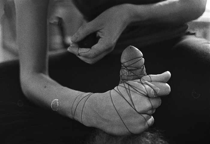
  2. Less in style or execution but when it comes to the relationship Klem seems to wish her audience to have with her subjects, there is more than a passing reminiscence to one of my favorite photographers of all time: Lynn Kastanovics.

Bonus: Klem really knows when and where to preference vertical orientation over landscape. (It’s actually a subject to which I  am considering the dedication of a future post .)

Giangiacomo Pepe – Untitled (2016)

Everything about this photograph is effing exquisite.

If we’re evaluating it in terms of the Zone System, the majority of bright areas in the frame are either close to overexpsoure or legitimately blown out. In other words: zones IX and X.

It’s similar with shadow details, there’s pure black (zone 0) and black with hints of tonality.

This compression of both highlights and shadows, stretches the dynamic range of the mid-tones.

There aren’t really enough instances to really distinguish zones VII and VIII. I mean they’re there but the objective underexposure of the frame effectively renders fucking dynamic ass microtonal variations in zones III through VI.

The staging leans heavily towards frame left. The young woman’s back bifurcates the frame. Her pouring water into the teapot and the visible kitchen accoutrements pull the viewer’s gaze leftward.

As an photographer/image maker, you always want everything in your frame to work together to not only present a visually interesting moment cut from the fabric of space and time but to also present it in such a way that the viewer not only sees something but sees something in a particular way.

There’s a general rule regarding composition: that due to the tendency for the human eye to miss things that are center field, we tend to favor things slightly right or left of center. (Part of why the rule of thirds is so sacrosanct.)

A technique frequently employed to unify positive and negative space in the frame is (when you’re representing people) have their eye line look off into the negative space.

For example: if you position someone so they are in the left third of the frame, the should be looking to the right; whereas if they are in the right third of the frame, they should look left.

This breaks that rule but it does something else that is ingenious: due to where the young woman is standing the frame is divided into light and darker halves. This allows the viewer to see more of what she’s doing while also render the reflection of the light on her back in the what is it a silver serving platter leaning against the backsplash.

I would be very surprised if Vermeer’s The Milkmaid wasn’t some sort of inspiration for this shot. They make almost completely opposite technical decisions but the reasons for those decisions are governed by practical concessions to the limitations of the available space.

Also, I’m head over heels for the way the angle of the light accentuates the fine hair on her arms. Freaking gorgeous work.

Source unknown – Title unknown (19XX)

Free love? As if love is anything but free! Man has bought brains, but
all the millions in the world have failed to buy love. Man has subdued
bodies, but all the power on earth has been unable to subdue love. Man
has conquered whole nations, but all his armies could not conquer love.
Man has chained and fettered the spirit, but he has been utterly
helpless before love. High on a throne, with all the splendor and pomp
his gold can command, man is yet poor and desolate, if love passes him
by. And if it stays, the poorest hovel is radiant with warmth, with life
and color. Thus love has the magic power to make of a beggar a king.
Yes, love is free; it can dwell in no other atmosphere. In freedom it
gives itself unreservedly, abundantly, completely. All the laws on the
statutes, all the courts in the universe, cannot tear it from the soil,
once love has taken root.

Emma Goldman, Marriage and Love

 Anna BlockUntitled feat. Konstantin Ladvishchenko from Black Red series (2013)

Block was born in an grew up in Moscow.

She’s currently pursuing a post-graduate photography degree in the Czech Republic.

I’m honestly struggling not to follow the rabbit trail of interrogating influences. Partly because I think of the three dozen or so folks whose names I could drop here–maybe four of them actually ‘hold up’ next to Block’s work.

I’ll let one slip…she shares an almost identical angle of view to Lina Scheynius, only I feel given the same space, Block does for more complicated and nuance things.

What’s much more interesting to me is to compare Block’s work with someone like Inside Flesh.

At first, that’s going to seem absurd. One is porn, the other is ostensibly art. (I’d argue that capital A is in order here; others might disagree.)

But, take this image and compare it with the one above. There are similar motifs–thread/wire, graphic depictions of sexuality: yes; however, the results couldn’t be more different.

Think of them in terms of an aesthetic of desire. If you are familiar with Inside Flesh’s work, you can spot them from twenty yards out. Same with Block. They diverge quite substantially in where they end up–but they’ve accomplished similar feats.

But there’s another difference I think that is also important to address. Of her work, block says:

I
use photography as a space where I can mix my fantasies and desires
with what is called reality. (via redeye)

I don’t think it’s necessarily as cut and dried but I do think that another crucial difference between Block and Inside Flesh is a matter of process ending in production vs product fueling further process, respectively.

Jo JankowskiTitle Unknown (2014)

I am intrigued by the odd confluences acting in Jankowski’s work.

I’ve maintained for years that there is a Russian/Eastern European visual aesthetic. Perhaps, it’s just a psychosis from spending entirely too long immersed in Russian cinema, but I feel like there’s a certain grimy patina leavened with pre-fab brutalism, an ostentatious minimalism and an almost obsessive mediation between extremes–labor perpetually balanced against leisure, dour pessimism countering a perhaps misplaced belief in better days to come. (It’s something I’ve thought for ages–but wasn’t something I was certain of until after I spent so much time exploring Berlin. The wall may be gone and the permeability has been in place for so long that while it’s no less glaring–you fundamentally feel the difference between East and West as you move from one to the other.)

Jankowski has that Russian/European it-ness.

If you go solely based on his website, it would be easy to lump him in with his fellow countryman Fred Huening–there’s a large degree of overlap in their conceptual and thematic elements.

But that’s not as interesting as examining how there’s an essential French-ness to his work also. I mean the look and feel of his images is heavily informed by Cartier-Bresson. But there’s also whole cloth from Brassai and Atget.

I don’t believe it’s an unconscious affectation on his part. For example: there’s a way in which his work–at least to my eye–is obsessed with questions of revealing vs concealing. It’s not something you’d automatically get from the above image. But it’s a little more clear in this:

Pay attention to the way the reveal–the woman with the camera using her foot to hike up the model’s blouse seems to be revealing but is merely contributing an erotic charge to the parabola of the woman with the camera’s skirt hem.

Further, I can’t look at this image and not think of this shot by Helmut Newton. Newton’s image hinges on lurid colors and insinuations of lesbianism; a thinly coded, sugary confection designed to do little more than superficially titillate. Jankowski–by contrast–is not interested in serving up kink for kink’s sake. Instead he shows us a scene where we’re allowed to see but are shut out from any sort of interaction. The scene isn’t for or about us–we’re just being granted an opportunity to observe it.

Nicola BensleyLeap, Amanda Dufour in Westbourne Grove (2016)

I really, really effing adore this image.

Upon first glance, it sends my brain skittering in two diametrically opposed direction. On the one hand, it’s obviously a work of pastiche–riffing on both Klein’s infamous Le Saut dans le vide and HC-B’s hyper-stylized staging as a form of invoking a sense of unmediated immediacy a la Derriere la Gare Saint-Lazare.

Yet, what’s notable is that the viewer doesn’t have to be even passingly familiar with either image to fundamentally appreciate the dynamic and compelling sense of physicality captured in the scene. (One of the things I feel that capital A Art has lost is a certain baseline accessibility. Recall Renaissance oil painting: there were intensely rigorous examinations of perspective, implicit critiques of religion and sexuality, double-edged political satire but also the work centered around themes and/or narratives that could be immediately apprehended by any one of the populace that encountered them–regardless of education or lack thereof. In other words, ‘high art’ was codified as emerging from something not entirely unlike the lingua franca.

That’s not to say there aren’t small criticisms to be lobbed at this image. The contrast has been dialed up a bit but in the process there’s this sort of weird juxtaposition between expansion and compression of space–the shadowed traffic signals pop out against the white facade behind them, creating a sense of distance between the two things. Yet, the dark pants of the two men standing in front of the dark van waiting for the signal to safely cross the street are compressed.

Dufour’s right hip and leg also lack separation from the background, yet the limited brightness on the back of her leg creates this strange push and pull, which contributes a further surreal effect to her levitation.

In truth, this image teeters precariously on not working. The reason it does hinges partly on the relationship between Dufour and her shadow.

The other, arguably bigger part is the way the up tilt of the camera exaggerates the sense of Dufour levitating instead of jumping at the perfect moment.

I have some additional thoughts that I can’t quite fit to words just now. But I really like the uptilt of the camera in this. I am usual very much a stickler for squaring verticals with the frame edge; however, there is a compositional justification for the decision here which demonstrates a ridiculously incisive understanding of the dynamics of framing a scene in order to parse visual information in such a way to convey a specific sense to the viewer.

It’s unfortunate that Bensley website is so horridly constructed–’cause her work is actually sterling and she’s doing so excellent and exciting analog photographic work.