Photography is not–as it were–my first visual ‘language’. I studied cinema for almost a decade before pursuing film making specifically.
Yet, similar to any first language–when I’m having difficulty expressing a thought in my second visual language, my tendency is to fall back on the first.
It‘s a work by Malick–so all the things you typically associate with his style (multiple characters thoughts illustrated through stream of consciousness voice-over, so gorgeous they’re painful scenes and just a general profusion of beauty). It’s also so inexcusably vacuous, it’s vapid.
The mix of cinematography and digital cinematography is incredible. (Chivo is one of a teeny tiny group of indisputable ‘young’ masters.)
But what’s truly ground breaking about the proceedings are the way the roving camera approximates a dream. Chivo frequently fluidly transitions from one moving shot into another by trailing out of the first and then swinging into the second. By this I mean that you could say that the camera keeps moving without the actor and the motion becomes subjective, almost a POV and then it cuts to another subjective perspect that the actor then enters. It’s exceedingly well done and pulls together compellingly what would otherwise have been unwatchable.
But it’s frustrating: Chivo so frequently works with auteurs who’ve grown intractable in their approach to how and what the cinematic experience should convey (Malick) or godawful hacks who are only celebrated because of abject arrogant public masturbation sold to idiots as audacity married with technical precociousness (Iñárritu, who can kiss my whole asshole).
Sadly, Alfonso Cuarón is the closest Chiva routinely gets to a great artist and even that isn’t enough to push him to greater heights.
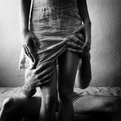
Really, I feel like Stano has quite a bit in common with Chivo. His work is consumately well made and presented but it lacks a conceptual clarity that it’s sorely missing.
For example: there are two image makers producing similar work–Dara Scully and Beatrix Mira. Scully is clearer in concept and execution than she is in presentation. Mira lacks Stano’s dynamic compositions but here’s seem motivated by a unifying personal obsession.
Stano’s work just looks cool as fcuk. But when you ask yourself what it’s about or what purpose it serves, the work reduces rapidly to an exercise in style over any sort of discernible content.
Ideally, the work I love most features both style and content but I’ll always taken the latter over the former. And that’s why I think ultimately, Scully and Mira are better artists.
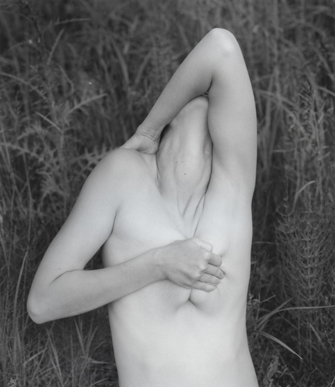
Oh and here’s another example of how not cutting your head out of the frame is possible but still allows for anonymity and makes an infinitely better picture.
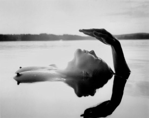
I’ve posted about Suarez before and I remain just as if not maybe a bit more enamored with his work now.
Spending more time with the work I’ve discovered a conceptual reflexiveness between his tendency to focus on picturesque interiors and a concern for a psychological interiority.
In some photographs the subject acknowledges the camera but it’s rare to feel that the gaze is directed at any audience. Instead, it feels more like the audience is intended to serve as a mirror.
I also can’t help but note how this image feels different than the rest of Suarez’s work. Whereas the rest of the work features mostly woman, in darkened, oneric locations, all of it feels very different than the way so many of the image makers who are producing quasi-narrative work that is a hybrid of portraiture and documentary, there tends to be a feeling of loneliness to it.
I don’t feel that with the rest of the work but I do very strongly with this image. A tenacious melancholia. The image offers no clue as to what might be the cause of that feeling. But it does strike me not that the feeling is incidental so much as a closely held secret that wants to be told but is not sure the telling won’t just bring about more harm.
Truly lovely.
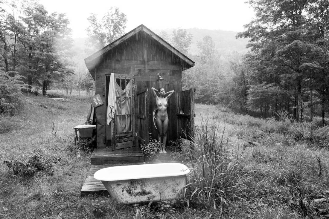
Tim Barber – Untitled [rain/shower] feat. Kaya Wilkins (2013)
I’ve probably seen this image at least three dozen times but today is the first time I noticed that it’s raining.
A good part of why I’ve never noticed is that the most circulated version features compressed contrast and lower resolution.
As a result, I checked out Barber’s work and discovered that not only is it of an especially high quality, it’s also categorically interesting. He’s rigorous about formality of composition while showing a rare ability to make color vs. absence of color integral to the image.
Further there’s something about his work that transforms rather typical, nearly-prosaic scenes into something that feels autonomous, distinct and thoroughly singular.
The above image was included in a 2014 show at Capricious 88 in NYC’s SoHo.
In relations to that show, Barber claims:
I’m interested in the slippery
narratives that my photos can communicate, and a good narrative always
involves relationships of some kind […] Photographs can be so literal, but I’m
more interested in them as entry ways rather than finales; windows on a
wall, question marks. Another way to put that is I’m less interested in
what they are about then what they could be about.
And while I don’t think he has an especially good grasp of what narrativity actually entails, there is a strong sense that this image “could be about” a sort of Thoreauean search for existential vitality.
In the same breath, however, there’s an undercutting of that notion: the absurdity of showering in the rain; the out of order sign on the cabin–a sort of winking glance toward the ‘backwards-ness’ inherent in the proposition.
I could never abandon the hustle and bustle of big city life but there is a part of me that craves departures, ruptures and disjunctions with that life. Is it too much to want to stand naked on your front porch drinking coffee and staring off into the forest or to bathe in the falling rain?
Regardless of the discipline, I think anyone interested in pursuing the visual arts in an academic setting should be given a single sheet of paper printed on both sides.
The front would read:
Nobody tells this to people who are beginners, I
wish someone told me. All of us who do creative work, we get into it
because we have good taste. But there is this gap. For the first couple
years you make stuff, it’s just not that good. It’s trying to be good,
it has potential, but it’s not. But your taste, the thing that got you
into the game, is still killer. And your taste is why your work
disappoints you. A lot of people never get past this phase, they quit.
Most people I know who do interesting, creative work went through years
of this. We know our work doesn’t have this special thing that we want
it to have. We all go through this. And if you are just starting out or
you are still in this phase, you gotta know its normal and the most
important thing you can do is do a lot of work. Put yourself on a
deadline so that every week you will finish one story. It is only by
going through a volume of work that you will close that gap, and your
work will be as good as your ambitions. And I took longer to figure out
how to do this than anyone I’ve ever met. It’s gonna take awhile. It’s
normal to take awhile. You’ve just gotta fight your way through. –Ira Glass
Partly, I think it’s good form. Also, I feel like the assumption is made that the student wants to learn or they wouldn’t have enrolled in the course. But wanting to learn and having to learn are very different states–for example: as I approach middle-age I still want to learn to play the cello but when I was a toddler I didn’t so much want to learn to walk as I had no other choice.
Those who want to learn are a dime a dozen. The majority of them will become bored, will shirk the work or drop out.
But what academia does a shit job at is teaching you how to keep going when you don’t have a choice because to cease would be tantamount to death. Students are direly ill-prepared for those plateaus, brick walls and handfuls of hair pulled out frustrations that come part and parcel with practicing a craft.
I feel like leveling from the beginning–admitting it’s hard and dispirit but reminding folks that the process–no matter how wearying–is far more important than the product.
Or to put it another way: practice doesn’t make perfect. Only perfect practice makes perfect.
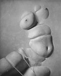
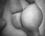
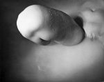
I’m not sure these are necessarily good–Torso gebunden 2 is trying to round up a golden spiral. The others are thinly veiled attempts use the study of form as a strategy to sublimate an erotic fixation.
I’m not saying they are bad, either. More that they are interesting but I’m not entirely sure they work.
If these look a little different than your usual B&W images, then congratulations on your sharp eye. These are actually heliogravures AKA photogravures.
I’m not super adept with this process. As I recall you transfer the image from the emulsion onto a sheet of copper and then etch the copper, so the copper can be used to create prints. (This photo of Victor Hugo from Wikipedia is more or less what I’m accustomed to thinking of when I think of heliogravures.)
I do really like the texture in these. The water on the skin and the way the skin stretches and folds in on itself. And the consideration to render heliogravures was likely driven by a smallish negative or digital processes. However, given a 120 or 4×5 neg, I think a platinum print would’ve provided a more consistent tonal range that would’ve increased contrast and sharpened the resulting print.
Hell, if the originals were negs, gimme them along with some amidol, Bergger Prestige Variable CM Baryta paper in semi-matte finish, a bit of selenium toner, a bit of gold toner and a week of dark room time and I can make split grade prints that are objectively better than these.
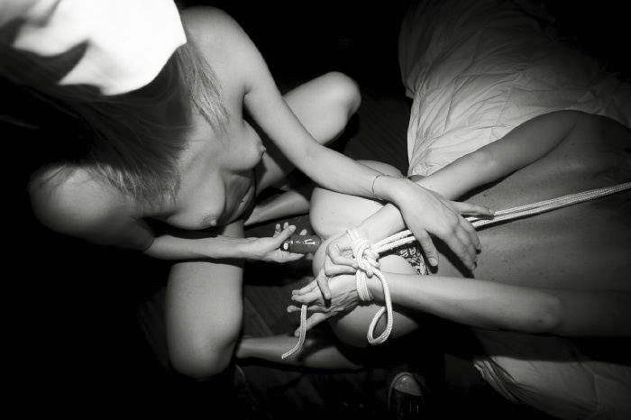
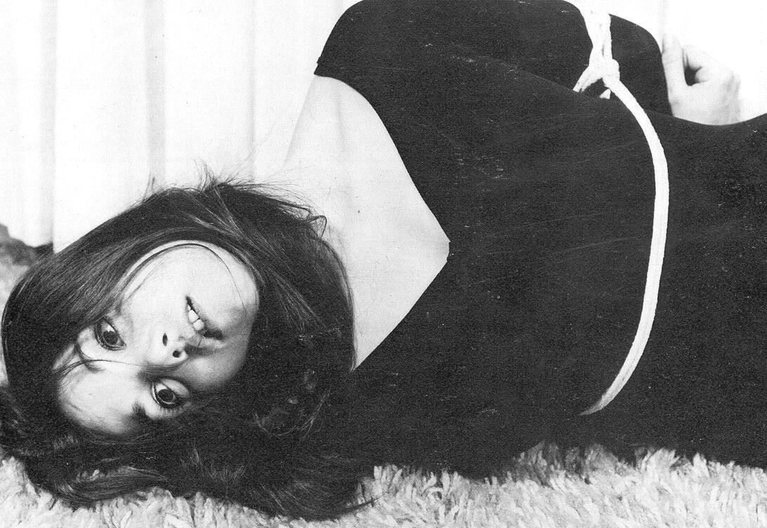
Excepting her face, the carpet and too a lesser extent the curtains, there’s almost no mid-tones to speak of here. Everything is bright white or deep shadow black–there’s enough of a hint of grey to insinuate the clavicle, differentiate her left hand from the background and keep things from going completely flat.
The black dress conceals her figure but the rope is enough to emphasize the curve of the body, imply a bust line.
The composition filters the gaze from the loop in the rope, to the hollow of her fist and then back to her vaguely dissociated expression–which is highly reminiscent of Renée Falconetti in The Passion of Joan of Arc.