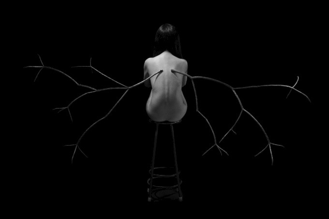
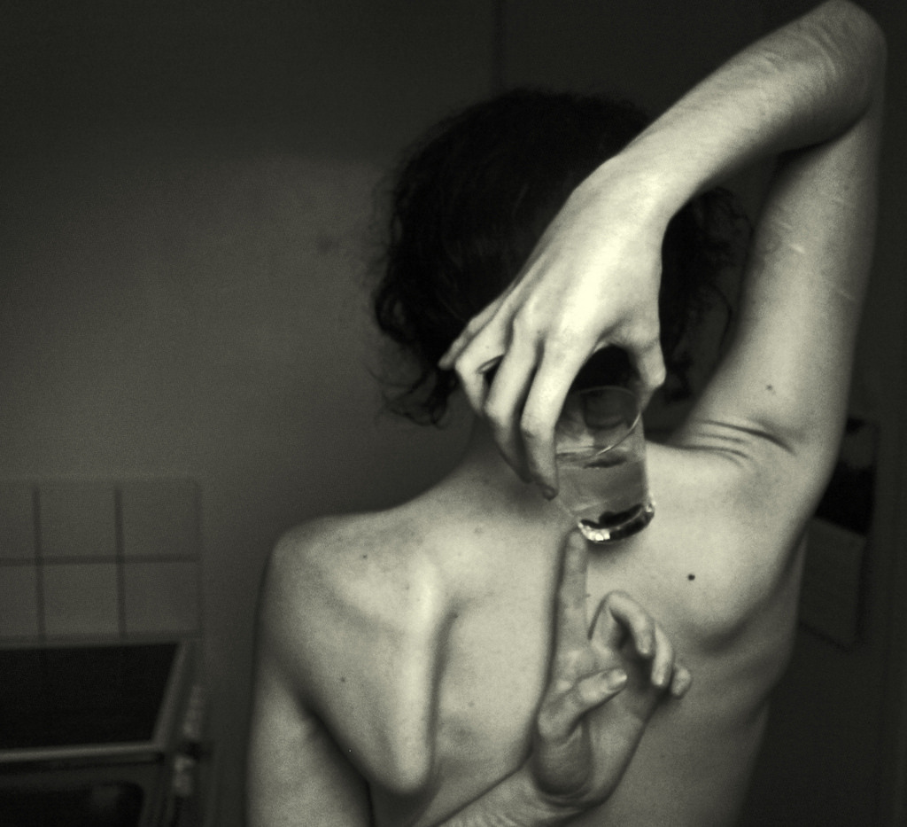
Peng Yun I also have a pair of wings (2013)

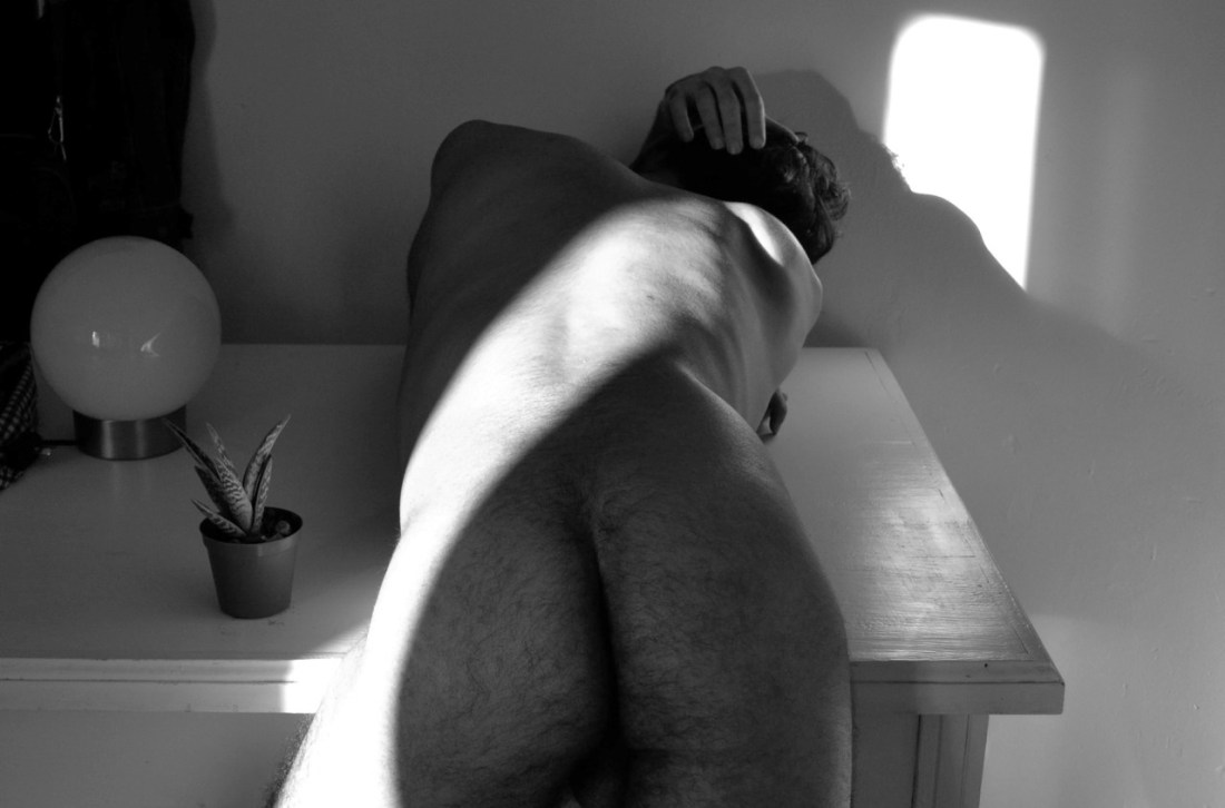
Typically, I’m not fond of excessive pitch dark negative space for the same reason I’m skeptical of close-ups–both tend to diminish context. And, if you haven’t already figured it out: I’m all about that context, ‘bout that context, ‘bout that context. No vagaries.

This though, this I like.

I think what renders it especially resonate for me is that I rarely dream anymore; or, if I do, I do not remember my dreams upon awakening. It’s probably partly that I don’t ever sleep especially well–which is almost certainly exacerbated by my dependence on self-medicated with a variety of substances.

That’s not really the point. One of two dreams I’ve remembered in the last six months or so, involved these gargoyle like creatures. They appeared more or less human–except on a slightly larger scale; like a short one would be about 7 feet tall.

What made them resemble gargoyles was they had tree branches grafted to their backs. Walking around and interacting normally, they looked like two Groot arms trailing down their backs. But when expanded, they revealed green leaved branches that could be flapped like wings and allowed for limited flight.

I wanted to do something with the idea since I had the dream but I’ve been struggling to figure out what fits. Thus, it’s unnerving to see someone a world away with a stunningly similar notion.

One other note: while I hardly dig all Yun’s work–a lot of it is a little two reminiscent of lazy liberal arts students who easily invent compelling concepts and then execute them in a half-assed, haphazard fashion to a Radiohead track. But, I do absolutely love the way there’s also an explicitly erotic tinge to her work. For example: this is an image of which I am murderously jealous I can’t claim ownership.)

Alex Zhernosek#9633 (2009)

When I first encountered this my thought was along the lines of wow, that’s very nearly perfect.

Spending a bit more time with it has caused me to question my initial reaction. Yes, there’s a very strong sense of mood. And it’s actually rather unlike the rest of Zhenosek’s work–which reeks of objectified sexualization of bodies/run-of-the-mill straight/white/cishet misogyny.

But there’s something interesting about the documenting of a sensuous moment here (warm water splashing over her ankle) and how that pushes up against the sense of imposed voyeurism (the visible door jamb and the uncertainty as to whether or not this woman knows she’s being viewed).

And as much as the focus is the curve of her back, Shifting her several inches toward frame right would’ve better balanced the door jamb, as well as blocked the reflected hot spot on the tile with the models head, creating better separation from the background and also underscoring the fact that the water is splashing over her foot.

Raven MacabreAimee IV American Beauty (2009)

I can’t remember who said it but a noted photographer–doubtlessly riffing along the lines of Warhol’s infamous 15 minutes assertion–claimed that in the future everyone will take one good photo in their lifetime.

This is Raven Macabre’s one ‘good’ photo.

I use the scare quotes because Macabre is one of those image makers whose work I just freaking detest–super-saturated colors limited to aggressive strip club chromatic palates, completely bereft of even the vaguest understanding of compositional logic (to wit: Macabre treats #skinnyframebullshit as his default orientation, earning my wrath) and despite being a ‘visual’ artist employing a text-only watermark (I pointedly opted to find a version of the image that excluded the watermark).

All that said: there is something about this image. It’s digital–so there’s some color exchange between the bright light flooding in and the area between Aimee’s right shoulder and the window; but this is a sublime exposure given the scene–yes, her left eye is a little too dark but a negative shot at the same settings would’ve rendered just enough of a kiss of extra latitude to distinguish the white from the pupil.

The slight tilt of her head and the play of the light accentuates the perfect classical shape of her face and flouts the conventional wisdom that when both a subjects head and shoulders are square to the lens, the resulting affect is to render the person as if they were dead.

The skin tone skews a little to yellow and magenta but were you to get in there and edit it, you’d have to be careful about losing some of the grace notes (i.e. the darker pink of her right nipple against the lighter pink of her areola and the slight reddening around her vulva indicating less than eight hours from her last depilatory session).

In summary: there’s no reason this should be vertically composed and it breaks a number of rules but the moment it captures is authentically unmediated enough that the stillness of it makes it a surprising editing choice for an image maker who seems desensitized to anything that isn’t loud and obvious.

M▲NU

Untitled (2012)

This image doesn’t quite work. The swath of light falling across the back and the hard shadow cast by his hair, shoulder and arched back is freaking gorgeous.

This is digital, so assuming a RAW file (which if you are shooting digital and not shooting RAW, then like why bother), there’s definitely going to be enough detail of the reflection in that globe to pull out details in order to evoke a better picture of the room (a la Escher’s famous self-portrait).

And the lighting is weird. The highlight by his left hip is probably, what 5 stops over. The pool over his right shoulder 3 stops. You’re getting bounce back from that pool onto the surface of the desk and light ostensibly reflecting off the floor is spilling around under the desk.

Further, I really don’t understand the two objects choice–compositionally an odd # of things is almost always preferable; I think the left hand that you can see curled under the right side is supposed to balance this. It doesn’t and wouldn’t even if it was more apparent. It would need to be holding something.

Thus, there either needed to be a third object, the plant needs to move from his left side to his right or that black drape behind the globe light needs to be removed. Actually, any way you slice it that black drape–although it does extend the dynamic range of the image–adds zilch to the proceedings.

Sophie van der PerreSarah (2014)

Overall, I find der Perre’s work perhaps a little too self-consciously editorial/fashion in genre.

I do not mean to suggest it’s bad. It’s just that there’s almost a self-same ubiquity to it and it looks to me like all the rest of effectively executed, even thoughtful but ultimately dull editorial/fashion work I see.

But I do really like this image and a few others in her Flickr photostream. And although I could make easy correlations to Lina Scheynius or Chip Willis, I am more interested in my realization that although I consider Erica Shires to be one of the best photographers working today, der Perre’s work actually suggested the closest thing I have to a criticism of Shires’ work: namely, her didactic use of nudity.

Shires is teaching a workshop in Tuscany this month. And one of the first topics she mentions in her course description is: [s]hooting nudity but being thoughtful about it. Does it make sense? Go beyond the literal.

This sensibility is pervasive in her work. And I feel that now that I know to look for it, a great deal of the nudity in her images comes across as preachy.

It is always a very fine line between leading by example and insisting on leading by example. I feel it’s actually the same margin between showing and telling. But one should never tell where it is possible to show and I think what der Perre does is feature nudity in images that are intrinsic to the images themselves. There’s no question of how it happened or whether it was motivated, it merely is a discrete, moment presented without commentary as-is.

The result is playful without being the least bit coquettish or flirtatious.

Igor Koshelev – Утро доброго дня (2010)

My Russian was never exactly, how you say: хорошо and the title of this seems untranslatable in an idiomatic sort of way. Best guess, it means something along the lines of the way you might pass a neighbor on the street and as if to indicate the pleasant weather, you were to say: looks like it’s gonna be a wonderful day.

I like the way the title functions here. It doesn’t add anything–only reifies what’s there. It’s the way a narrative image should be titled. Not that this is a narrative image, mind you but it’s at the very least on the right track: you have characters, setting and an inference of what’s happened previous and what will almost certainly follow (i.e. this is a new couple who’ve probably been up late into the night fucking and are about to digress into a diversion that will result in eating their breakfast cold).

There’s too many questions for me to suspend my disbelief enough to accept that this is representative of a narrative. I have no idea if this is her place or his. My suspicion is it’s neither–it feels like a while the parents are away the kids will play sort of scenario; yet there is nothing in the image that speaks to that question. (Also, I’m reasonably willing to bet this image was not taken in the morning. You stare at B&W negs long enough and you start to pick up subtle tones and textures. Gun to my head, I’d swear this was shot on an autumn evening in a decidedly northern latitude.)

This is really the only image of Koshelev that is tolerable. The rest are complete garbage–like truly fucking terrible–which is odd considering despite it’s flaws, this would seem to suggest that this might be the early work of a wonderful photographer.

Lisa Kimberlyfern (2014)

Of the titans of fine art photography, Jeff Wall is one of my favorites. I remember seeing Milk for the first time and being just blown the fuck away by its simple audacity.

In the early to mid-90s, Wall deviated from his more straigh-photography-as-occasion-for-excess-&-spectacle approach and began experimenting with photomontage. The results were completely unexpected–rendering worlds appearing simultaneously hyper real & computer generated; the perspective not quite right but not obviously wrong either; a projecting of the fact that there are seams but as soon as looking for them they scurry from sight.

I see similarly simple audacity in lisakimberly’s effect wizardry enhanced self-portraits. (There’s a bit of 3cmlin there, as well.)

Admittedly, that may not be obvious. Both Wall and Yung Cheng Lin employ a blank for the audience to fill in as they see fit. In the case of the former, it’s a narrative insinuation (settings, props, characters), whereas in the latter everything points to either a perverse visual pun or explicit insinuation towards which every element of the image points.

Kimberly’s images are possessed with a similar feeling that the individual elements reference a sum greater than their parts and there is a sense of a very specifically felt and experienced vision.

However, there’s an absence of cues that might allow the viewer to parse what that larger understanding of the work might entail. Yes, there are exquisite colors, subtle, nuanced effects (check how her face is completely in shadow, yet you can still see the crown of her head through the halo) and a beautiful woman.

In other words, Kimberly has a painters feeling color and and a careful eye for detail. At the same time, her photos granted a glimpse into something which feels like a complete, autonomous world; yet, given the image there is little offered other than an assurance that it exists and exists elegantly.

Very strong work from a young, entirely self-taught photographer. You’d do well to familiarize herself with her efforts.

Mathilda EberhardUntitled (2014)

Mathilda EberhardUntitled (2014)

Flickr retains little more than a ghost of its late aughts glory.  In fact, it’s pretty much a completely clusterfuck.

There are some notable outliers whose photostreams’ always showcase bona fide next level shit–looking at you: im_photo, chill and 3cm.

I’d include Eberhard to that list except well although I wouldn’t ever suggest that her work is better than those guys, I am just flat out enamored with her work.

This should surprise no one having followed me for any period of time–after all this is the fifth image of hers I’ve posted.

You’ll notice I tend to favor appending quotes to her images instead of commenting on them–partly because I am so awed by them that my fumbled attempts at expression seem entirely cross juxtaposed with the work and partly because I get self-conscious about the fact that I tend to compare things that move me to the very limited set of work I adore (at least initially) instead of come to terms with them on their own ‘ground’.

For example: for as many image makers as will either claim or accept the critical assignment of overlap with Francesca Woodman’s work, Eberhard is probably the image maker who most completely takes up Woodman’s mantle.

But to state that and consider the matter settle is intellectually dishonest. There’s more to it than that it and leaving it there does a disservice to both image makers.

Unfortunately, it’s not something I can express in the positive–i.e. I can say this is what makes Eberhard’s vision singular. However, it did occur to me that there’s a way I can, for the time being, point in the right direction.

Think of the word ‘desire’. We use it primarily as a noun–to describe a visceral wanting. It’s also a verb. I can say to a friend: I desire a delectable brie.–Although grammatically correct it sounds to the ear unbalanced.

In actuality when we desire, there is a tendency to express desire with metaphor–’craving’, ‘hunger’ or ‘thirst’.

Now, consider the qualifications we add to these metaphors when we use them non-metaphorically. We might say her appetite was ‘insatiable’ but we would be much less likely to say his hunger was insatiable unless we are using ‘hunger’ in some metaphorical sense. One eat until one’s hunger is sated.

I’m not sure if it’s just my pushing the point to reach a satisfactory conclusion, but it seems that we speak of thirst differently. Thirst isn’t sated, it is ‘slaked’–implying satisfaction. The space between ‘hunger’ and ‘being sated’–when measured in time–is less ephemeral than the space between ‘thirst’ and ‘slaked’.

I think when you extend this realization of the tendency in the literal to the metaphorical–desire when expressed via a thirst metaphor is more insistent than desire as expressed via a hunger metaphor.

What makes Eberhard’s work so singularly compelling is the way it methodically charts the terrain of thirst as a metaphor for desire.

FWIW: the self-portrait I submitted to this weeks ‘art’ themed nymphoninjas submission Sunday was accepted.

(Extra special thanks to sporeprint for not being at all bothered when I asked him about helping me edit less than 24 hours before I needed the finished product and managing to remain effortlessly patient with my damned demanding ass during the editing process.)

nymphoninjas:

Wonderlust Photoworks (Editing courtesy of Alveoli Photography) – Desolate Elements II (2014)

There’s a zen proverb that runs somewhere along the lines of comparing yourself to someone else is like sticking your head in a bucket of glue.

I constantly offer this advice to others; but rarely heed it myself.

The last two years have been very difficult for me. Trauma, loss and angst compounded by unemployment and persistent health problems. During this time, creativity—the only thing in my life that has presented consistent refuge—has been limited to thinking the work I’m trying to make doesn’t matter. I get stuck in this self-defeating-Orson-Welles-made-Citizen-Kane-at-26/Arundathi-Roy-wrote-The-God-of-Small-Things-at-28-what-have-I-done-of-any-consequence loop.

I’m always so focused on how precious little time humans have and as a result I focus on trying to make everything count to the fullest. It’s not a bad way to live so long as you give yourself permission to make mistakes. Mistakes are how you learn + grow emotionally, spiritually and artistically. I forget that so often…

The above is a frame from a video I shot several months ago. I don’t like shooting video—I’m an analog snob—but desperate times, desperate measures. The video itself was a disaster and I haven’t looked at it since I shot it. But when I saw that this weeks theme was ‘art’, I searched desperately for something to submit. Re-watching the awful video, this one frame jumped out at me so with the a little help from Alveoli Photography to clean it up I decided to share it as a reminder to myself and others that showing up is just as if not more important than having a devastating aesthetic sensibility.

Sometimes we have to create many things to get one thing we are happy with, and it this case it seems like you captured hundreds or thousands of frames for your video and found one frame you were happy with. I think in the end it was definitely worth it, and I’m glad you put in the time to find the right moment and thanks for sharing it with us.