bLod Lodblue (2010)

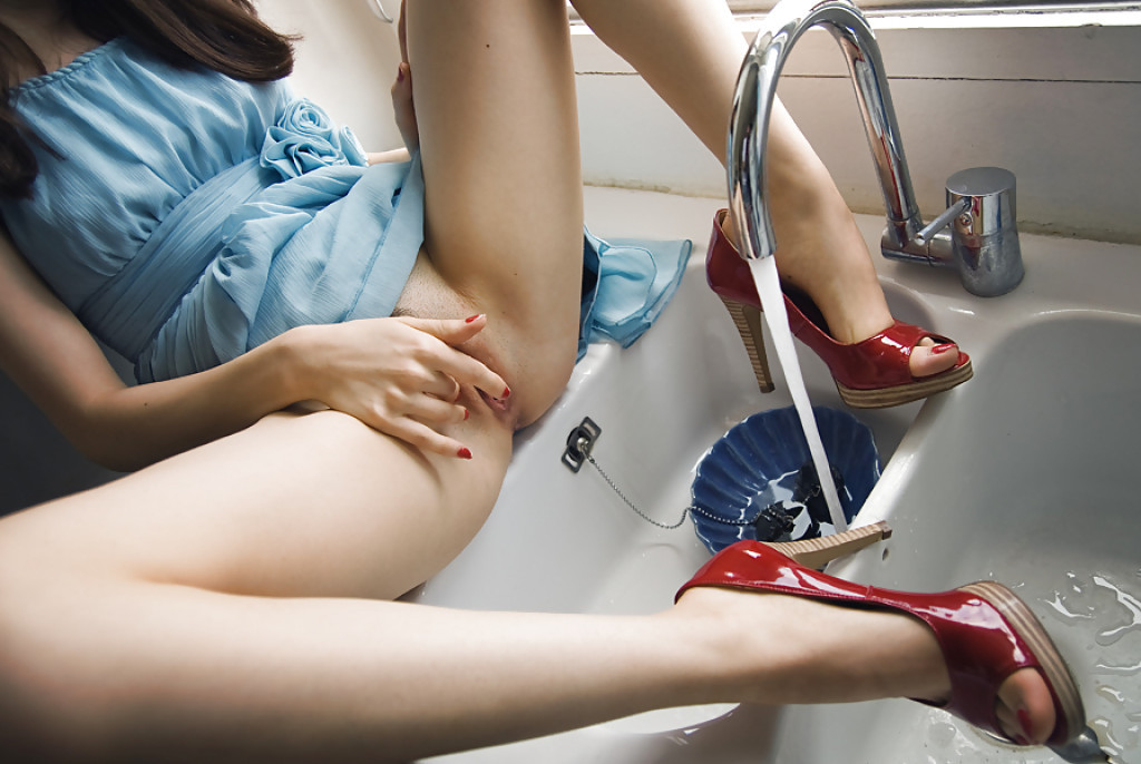
Okay… so I am 120% infatuated with this image even though I don’t think for even a second that it’s objectively ‘good’.

The light is nice and the limited palate–the white-white light falling through the window behind the sink with the white of the counters and sink, the red high heals and vermilion nail polish, the dark blue dish in the sink and the cerulean dress–are all extremely effective.

But the–what are those 3 inch heels–push things over the line into porn territory; while the carefully positioned right index finger seems less like an honest attempt to pull things back and more like a winking see-what-I-did-there?

(EDIT: a reblog called into question whether or not I’m implying that porn is objectively bad and suggested that I’m implying that based upon heel height. The suggestion is arguably missing the forest for the trees but I’ll admit that it’s possible to take things that way just based on the evidence that someone clearly took it that way. I was referring more to the porn trope where heels remain on in situations that are grossly unfit for heels. I mean I really can’t image climbing up on a counter wearing heels and not legit fearing about breaking my neck. So I was referring more to contrived artifice and less to the objective good or bad of porn. Alternately, I was absolutely imply that contrived artifice in image making is a godawful thing.)

And the framing is super problematic. The angle of view is awkward and the way her left knee, head and shoulders and right knee are cut out of the frame offers no suggestion that there exists a continuity extending beyond the frame edges.

But when I look at this I see the angle corrected so that the camera includes the entirety of the subject from head to toe and suddenly all the things that are problematic about it disappear and it’s a hauntingly perfect, narrative image.

Why narrative? Well, maybe not a detailed narrative but there’s a sense that the subject has masturbated to orgasm and is enjoying the post orgasmic afterglow. (The erotic is after-all the conceptual structure which most closely mirrors narrativity, i.e. attraction, arousal, negotion, climax, post-climax.)

I love the way that the water standing in the sink basin furthest to the right is poetically suggestive of ejaculation while the water filling the blue bowl in the sink suggests that the arousal has not yet been completely sated.

I’ve tried several times to recreate this image. None have succeeded. Largely because I can’t find a sink facing a window, partly because I can’t decide whether or not I want to take a picture of a friend and sometimes collaborator or if I want the same friend and collaborator to make a portrait of me like this.

Well see. Until then I hope you enjoy the potential of this concept as much as I do.

Karmabella – Reflection (2010)

The subject in this image is a Flickr user who goes by the alias Tangolarina; she documents her life with an emphasis on a curious and unflinching examination of her own sexuality. (I’ve previously featured an image in which she captures herself masturbating.)

I can’t and won’t argue she’s a good image maker–though she does deserve credit for her brash audacity and seeming fearlessness in what she shows of herself.

The above image–presumably made by a friend–is from the stand point of technique–better than the majority of images in Tangolarina’s photostream.

Yes, it has a nice tonal range: it’s segmented between what you might call sepia-lite (in the skin tones), sepia-mid (in the area surrounding the subject) and sepia-heavy (in the reflection). The way it almost looks as if her reflection is staring back up at her is an inspired touch.

Unfortunately, the canted angle distracts from everything else. (What’s that? You say it’s a reference to the cinematic tradition of using an unleveled camera to convey a sense of nightmarish anxiety. Uh, no. I realize that the vast majority of photographers and image makers don’t have the budget of someone like say Annie Leibowitz. That means that we can’t always control everything about rendering the location an exact match to the initial vision. If the fence hadn’t been there, it’s arguably that this might have worked. (And it might’ve worked better given a vertical composition–the trade off being that the aspect of up-down flow would’ve been de-emphasized.)

My point is merely this reads like a back yard that someone is trying to use as an oneiric setting. The tilt isn’t severe enough to fully convey the aforementioned sense of expressionist foreboding and the fence actually blocks additional light that could’ve filled in allowing the reflected face to be fully visible.

As something between proof of concept and a preliminary storyboard, this is a stellar concept that I would like to see executed with greater attention to detail and working towards a clear conceptual end.

I really need to make one more crucial point here–and this is also sooo much more important than any of the preceding observations: I ADORE the way that Tangolarina is pushing the envelope on at what point depicting the body becomes pornographic. While some of her preoccupations and concerns are decidedly prurient, at no point does she allow things to drift across that nebulous line into the realm of pornography.

That alone is worth the time and energy necessary to explore her work.

FTVGirlsBrea (2010)

As far as porn outfits go, FTVGirls is tres problematic. First, there’s the use of the word ‘girl’–which I find more problematic than ‘teen’ and ‘barely legal’ porn. A girl is 11 or 12; in the US someone has to be at least 18 years old to appear in pornographic images/videos. At which point they’re no longer a girl but a grown ass woman.

Also, with FTV there seems to be a fixation with IPD–improvised penetrative devices, especially with extremely large or otherwise unusual props.

That being said–although I loathe their bright, airy SoCal meets daylight studio suffusion of white-on-white light aesthetic–they are at least head and shoulders above most other mainstream porn purveyor in that they actually demonstrate some creative use of technology.

For example: with the image above, You’d expect most porn to have a greater depth of field that would’ve render both her genitals and her face in focus simultaneously. And while the shallow depth of field is intended to draw attention to what’s happening w/r/t her genitalia, I love the way it diminishes the camp value of her expression. (My instinct–if I’d been shooting this would be to focus on her face, while letting the foreground and background bokeh. But I’m pretty sure that would’ve resulted in awkwardness that would render the frame pretentiously arty yet still too porny to really ever be even remotely close to artistic.)

Either way, I really do love the way Brea’s expression scans her.

EDIT: Due to travel related distraction, I neglected to un-queue this. I still agree with my superficial observations; however, I think it would’ve been more interesting to compare/contrast with this image by Natalia Nobile. I feel like both have entirely identical aims that neither quite manages to achieve completely.

Anastasia TikhonovaUntitled (2014)

I’m intrigued by Tikhonova, or as she calls herself: Antipictures.

‘Anti’ meaning to stand against and also a clever contraction based upon the first two letters of her given name and patronymic.

It’s the exactly the same sort of multivalent turn upon which most of her work hinges.

She introduces her self in her anti-artist statement, as follows:

Photography is
a survival mechanism for me. My generation was the first to come of age
following the collapse of communism – my youth coincided with an
esthetic and existential wasteland experienced on the national scale. We
were caught between the institutional aesthetic of the Soviets and the
gaudy taste of the nouveau riche, and there was no established cultural
norm, no expectations to rebel against. That lack of expectations was
disorienting, but also liberating
– and I focused on drawing out the
sublime from the surroundings both vulgar and mundane. Photography is a
way to carve beautiful moments out of the habitual, and I live for that.

Projects followed, with magazine deals and exhibits. I moved to London
and sought to give a conceptual focus to the most basic of my drives –
to reveal the beauty and to show it to those who share a similar sense
of life… Yet the yearning for prestige and recognition gave me nothing
but panic attacks. I am back now – we haven’t met yet but take your
chances.

The added emphasis is mine because it hits upon something I’ve been trying to pin down for years; namely: the sort of It-factor that allows you to spot a mid-career Eastern European or Russian image maker from thirty paces is exactly that space between ruins and crass, resplendent decadence.

It’s a prescient observation. Unfortunately, it’s much more in keeping with say Igor Mukhin than Tikhonova.

I’m only halfway intending to knock her though. For example: the image above is–without question–pretty. Beyond that I’m not sure what it’s purpose is. There’s not enough context to determine what’s being said about notions of public vs private. And the ‘work’ tattoo on the subject’s right wrist suggests there might be something to do with notions of images as means of person expression vs agency-less objectification. But it’s all too muddle to decrypt.

Still, even though I don’t necessarily like all of her work it still resonates with me. I think she has excellent instincts. For example: I appreciate her artist statement for the fact that it functions in a way that mirrors the majority of artist statements splayed on gallery walls–except it replaces superficial pretension with something real. (Every statement I’ve ever written has made a similar gambit.)

And although it’s unspeakable poor form from the standpoint of webdev standards and practices (animated splash pages are just the worst, y’all), I do appreciate the way Tikhonova overlays her images with quasi-religious/meditative aphorisms. It underscores the degree to which her work is preoccupied with searching.

Ultimately, I think that’s what appeals to me about her work. I think, I’ve mentioned before that my training is as a film maker. Essentially, I stepped away from that world because I had developed extensive, existential doubts about narrative structure and the authentic telling of a story. A decade later, I’m still wrestling with messy questions but the crux of the debate boils down to two questions:

  • How do you known where to begin?
  • What details are inescapably relevant/what details are extraneous?

Looking at Tikhonova’s work I can’t help but think that she’s still trying to resolve for herself:

  • How do I know when a picture is worth taking?
  • Is the point to remember the moment or to render the moment intelligible to those who will only ever witness it second hand and in a heavily cloistered form?

These may not be the questions she’s asking herself exactly but despite some of her works failings, with regard to the process with which she’s addressing these considerations, her work is shockingly forthcoming if you’re willing to put in the time with it.

I can’t think of another contemporary image maker who show there work more faithfully and completely. So even if her work isn’t quite there, her process is very much on point.

Source unknown – Title unknown (2014)

I am super supportive of work that’s trying to recast bullshit heteronormative assumptions pertaining to MMF.

The frustrating thing is the vast majority of it is artless garbage. (I mean seriously, do a Google search and see how fast you X out of the image results tab.)

I like this for two reason–first there’s at least a baseline of thought with regard to composition. Her body shifts the gaze from left to right. The angle of the cock she’s kissing the head of pushes back against that drift and subsequently you follow the angle of guy in the rear’s erection which he’s pressing into the boys puckered lips.

The lighting is warm and inviting and there’s just enough black in the frame to invoke the tone and tenebrism of someone like Rembrandt.

Second: this is one of those things that I look at and think, oh hey, decent concept but I think it would be better if…

In this case: I don’t care for the way this lens compresses space. (It’s probably a result of optical zoom on a zoom lens paired with APS-C sensor pushing towards the telephoto edge of the spectrum.) Also, the angle of view is super porny as far as let’s make sure everyone gets a good view of the action.

I can see pulling the camera back a couple of feet but then you’d have to deal with some of the additional negative space. In which case, she would have to have a finger in his anus or something to justify the wider perspective.

I’d actually love to restage this and execute the following adjustments: Turn the action so that the boy laying on his back is about 15 degrees off parallel to the focal plane (instead of perpendicular to it as above). Reposition the other guy so that he is kneeling behind the boy with respect to the camera, so that it’s possible to still present his action so that it is legible for the camera.

The woman would stay in more or less the same position she is now, but with the scene rotated 90 degrees so that you can see both the way she’s kissing him as well as her genitals since her butt would be facing towards the camera. Maybe angle her slightly so that it’s visible but not blatant.

The frame would be closer to a panorama and I’d play up the sort of Baroque lighting to sort of recall the gratuitously over-the-top everyone-rolls on molly and relives their birth scene from Sense8–which is actually a decisive nod to Eugenio Recuenco’s work.

Madeleine FromentUntitled from Accord/#1 DM series (201X)

I make a pretty solid effort when it comes to familiarizing myself with the work of the artists I post here.

Frequently, I find that while a particular image resonates it seemingly telegraphs to my eye that the I will end up considering the rest of the work an–at best–mixed bag.

It’s frustratingly rare to find work which truly fans the flames of my curiosity.

But when @reverdormir2 posted this drawing by Froment, I was immediately taken by it; I don’t know, I think it’s the obsessive and perhaps even a little awkward details of the hair–the way her hair obscures her face, the careful rendering of the hair on his back, arms and legs, the texture of his beard contrasting against her tightly cropped pubic hair.

I clicked over to her web site and promptly dropped into a sensual erotic K-hole for the better part of an hour.

For the record, not all of her stuff works. But unlike the majority of intellectually dishonest wannabe creatives out there, she doesn’t foist the work on her audience despite its flaws. Instead, she presents the work in a fashion that patiently bridges the gap for the audience between the impetus for the work, the details that drive and enliven it–all subsequently recontextualized in the final work.

It’s really goddamn ingenious. However, what makes it even more exceptional is the degree to which Froment understands her own aesthetic peculiarities and formulates her installations in such a way as to further compliment it, but to also enrich the complex relationship between the work and the world it inhabits.

If you think I’m being a pretentious blowhard and talking out of my ass, just browse through her website and notice how the work flows from documentary like snapshots, to more refined images which in turn provide prima materia for her spare, meticulous drawings. Note: also the holistic way each project is presented to emphasize how the work is supposed to be viewed–ethereal (representative) vs actual (representational).

This is extremely high end work. And it’s thrilling to see an artist this young and this preoccupied with the sort of topics that I think are all too often excluded from artistic discourse–much to the detriment of Capital A Art, unfortunately.

@sugarmagnohlia – mood indigo (2016)

For those of you who don’t know, Sugar (Magnohlia) is one-half of @slide-2-unlock–the best couples sex blog on Tumblr. (King is the other half; both are breathtakingly beautiful humans. Full disclosure: the linked image of King always makes me drool. ALWAYS.)

Following their story over the last year and a half or so has been a constant source of fascination.  Unlike most couples blogs, they relay the good, the bad and the ugly with the same careful, honest attention. It’s in this way that you’re truly able to see the breadth and depth of their commitment and passion for each other.

A while back King reported that Sugar was struggling with mental health issues and needed to step back from slide-2-unlock. It’s been inspiring and humble to watch her fight off her demons and slowly but surely emerge from the ashes of the way life can try to burn you to the ground.

I’m not 100% sure of this but it seems that Sugar has started to use her interest in image making as a tool to help beat back some of the darkness. Her work has evolved and improved at an unprecedentedly pace. (Really, her recent work with the incredible Kyotocat is among the best work from either.)

I love the way this image appears to be riffing on Duane Michals.

Also: I’ve featured one of slide-2-unlock’s photosets before. It resonated with me strongly because Sugar bears more than a passing resemblance to an erstwhile partner that I’ve never managed to completely get over. Given the intensely personal nature of that resonance, I was worried about appropriating the image. I reached out to Sugar and she gracefully allowed me to reblog the photoset with my personal commentary appended.

Anyway, by way of update, there’s still a lot to work through and figure out but my former partner and I are tentatively working on reconciling in order to get back together. I feel like I may be jinxing something but admitting it but it’s all so unexpected and disarming that I can’t help but shouting it from the rooftops–or in the case posting about it on Tumblr.

Eva RubinsteinJane Standing, Minneapolis, USA (1977)

This does several things very well.

First, it’s simple. Distinct foreground (Jane), mid-ground (the chair with a dress draped over it) and background (unfinished walls). The light travels from right to left–countering the art historical precedent established by the Dutch Baroque.

Second, while Jane’s position in the frame is governed by the rule of thirds, nothing else in the frame fits that mode.

Third, the lenses hyperfocal distance is set in such a fashion so that focus fully sharpens at the outer edges of her body. This accentuates the bright light and also manages to make her both disappear into the heavy shadows behind her while standing out from them–the placement of the chair keeps this optical illusion from becoming distracting.

Fourth, it’s not easy to see right away but the camera is angled downward ever so slightly–as if the photographer is adopting a posture similar to the model. It’s a small thing but it’s really what makes the image work so stunningly.

I was completely unfamiliar with Rubinstein before seeing this and I have to say her work is extraordinary–minimal without ever crossing over into minimalism as justification for vacuity.

10/10. Recommend.

Source unknown – Title Unknown (2010)

For the record: this ISN’T #skinnyframebullshit.

Which is not to say I entirely understand or agree with the orientation, but there is a persistent logic to it–the verticals are level with the left and right frame edge and the way the horizontal seams stand in relationship to the horizontals recalls Piet Mondrian.

To understand, why the vertical composition isn’t as problematic here, it’s necessary to examine the complications presented by a horizontal frame. There’s only two ways it can go: either you increase the amount of the kitchen around the subject or you place the camera closer to her.

Both these options diminish compelling facets of the original. In the first case, a wider shot of the kitchen increases negative space while decreasing immediacy/intimacy; in the second, you’d lose a good bit of the way the upper cabinet’s glossy finish blurrily reflects the rest of the room the viewer cannot at present see–suggesting a holistic and somewhat immersive totality of space.

Thus, whether I completely agree with the orientation or not, there is a clear, legible logic guiding it.

Yet, that’s not even what I like most about this image. What gets me is the way that it manages to stipulate it’s own context. Namely, if you’ve spent any time on Tumblr you know that disgusting creeps who bully, belittle or attempt to shame folks who post nudes–as if naked bodies are always inherently sexual.

I 120% support people who want to post nudes and not get shit for it. At the same time, I do often wonder to what extent failure to address such work from the vantage of its position in a particular traditions, be that nudes or fine art nudes… I do feel that there is a pervasive thread of believing that the master’s tools will eventually dismantle the master’s house.

In other words, we all just need to do better. To insist our work isn’t about sex or sexuality when it includes nudity and that’s it. Unfortunately, that ignores a shit tonne of subtlety and nuance. It can be both or neither or something else entirely.

What I like about this is it feels like a self-portrait. A sort of this is who I am when I’m authentically me–I get up in the morning and sit my bare ass on the counter while I drink my coffee.

The image conveys a real sense of comfort in one’s own skin. Simultaneously, there’s an awareness of the relationship between the subject and the camera. A sort of hey, this is how I roll and I want to document that but at the same time someone else isn’t necessarily going to see it the same way I do.

The way her eyes are closed and the way her left hand is positioned completely frustrated any sexualization of the image. And the brilliant thing about the work is it makes it seem incidental. There’s no sense that I’m covering myself because I’m ashamed, it’s more an: oh, this way I’m sitting which is super comfortable to me might be more than you want to see of me, so I’m going to address that in a way that doesn’t diminish how comfortable I am rn.

PS Super bonus points to you if you noticed the Fairy dish soap. It’s apparently a brand distributed in the UK, in case you care.

Adrian Sztruksportra 400 (2014)

Kodak Portra is NOT my cup of tea. It tends toward muted pastels with compression in the highlights that I find unappealing.

Plus: if you’re working analog and making portraits or so-called fine art nudes, you likely use Portra. And call me an iconoclast but: girlfriend, ubiquity is an enormous turn off.

That being said, three things about this scan interest me:

  1. It’s medium format with a shallow depth of field, check the way that the bokeh seethes against the grain structure–a nice, thoroughly cinematic effect that highlights the young woman while also clearly grounding her in her environment.
  2. Because it’s medium format, there’s a good chance the camera doesn’t have built-in metering. As a result, this is slightly underexposed. (Little known oddity about cameras, unless you’re actually measuring the amount of light in exact relationship through the lens onto the focal plane, then you get hit up by the discrepancy between F* and T* stops.
  3. The highlights aren’t compressed, you’re retaining a full range of detail in the sheets but further more note how the tonal range of the wall–ostensibly yellow–is not replicated within the woman’s skin tone. The result is an appealing warm tone–which is 120% in keeping with the image. However, from the standpoint of color correction, such separation offers a ridiculous range as far as color balancing. (For example: I’d apply basic color correction, monkey around until I got Prue Stent-esque skin tone and lastly add a little bit of the amber glow back.)