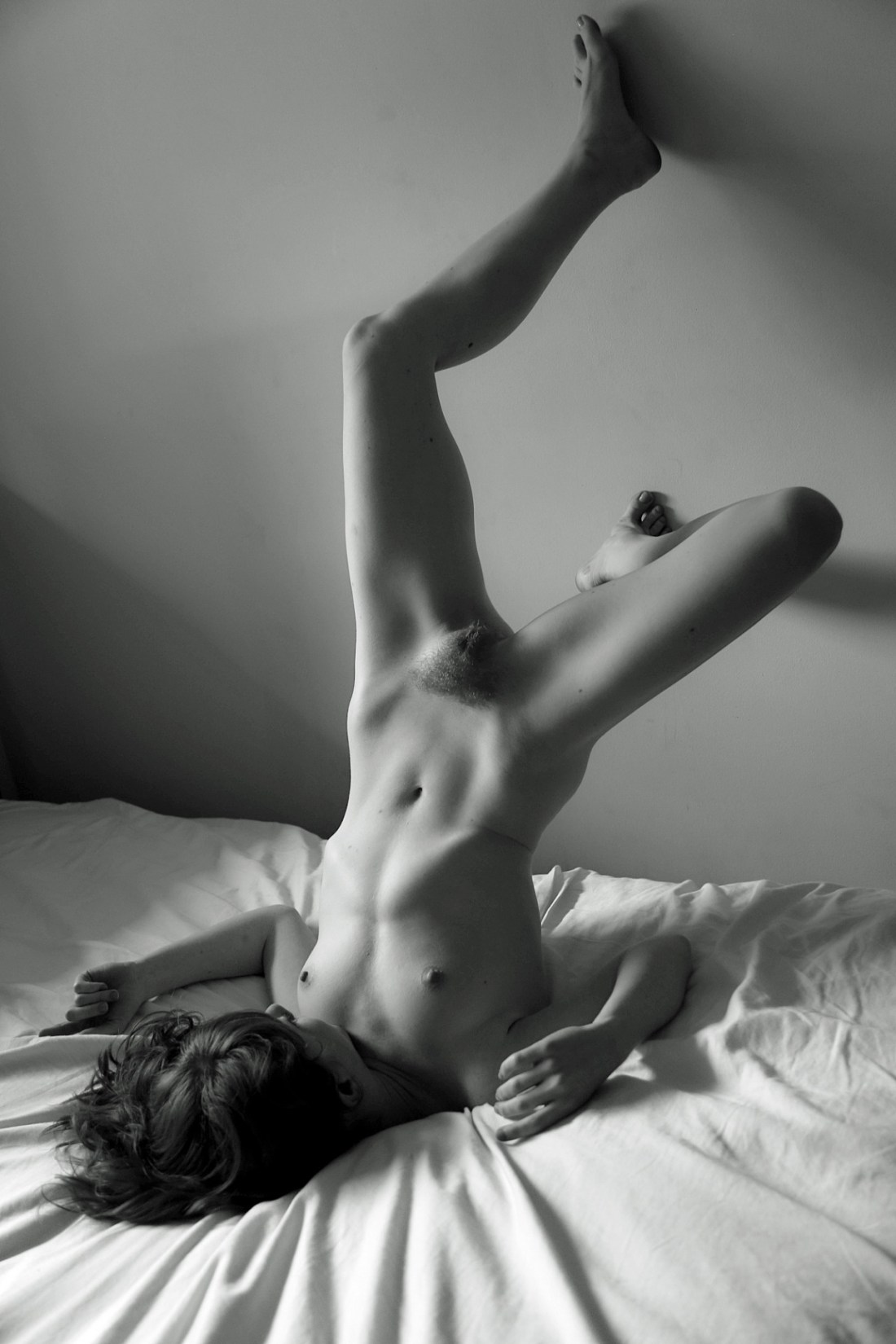
Nicholas Noisenestglamourmatic glowstick . subclitoral squirt gun (2012)

Believe it or not–despite my many misspellings, myriad grammatical errors and the fact that I routinely forget to include the sort of quantum connective tissue that connects my various notions–I am exceedingly self-conscious about my writing.

So I’m aware that by this point it’s almost a formula for this blog: I start of a post saying I really don’t like X, Y and Z but I’m super down with P, D and Q.

Yeah, yeah–sometimes I invert the order but mostly with the exception of the confessional personal posts or unmediated compositional analysis, I’m an appallingly predictable writer.

For example: the only way I know how to approach the above image is by first subtracting the things I (strongly) dislike about it. The combination of monochrome and strobe clearly asserts an affection for Nobuyoshi Araki’s Tokyo Lucky Hole.

There’s less than no love lost between Araki and myself. But from a technical standpoint this isn’t even thoughtfully derivative work–yes, Araki was using flash and B&W to capture salacious scenes but despite my distaste for most of his work, you can’t dispute the man’s tech chops. Whereas Noisenest–while at least not using the strobe mounted on his device, positions it in such a way that it casts an obtrusive shadow behind the woman. (It’s also #skinnyframebullshit.)

And for a work that appears so self-conscious about its family resemblance, the execution with the strong and the stylized tonal gradation, all work at cross purposes given the Araki impetus. (Araki is afterall and if nothing else grossly immediate in his presentation.)

However, all these (admittedly damning) critiques aside, it does strike me that this instinctively gets something about erotic photography that I haven’t realized before–specifically with regard to ostensible depictions of masturbation; namely: there’s a knee-jerk tendency to frame the scene as something habitual instead of something novel.

The distinction I am trying to draw is that we tend to make work featuring folks masturbating in bedrooms or bathrooms–spaces that exist hand in hand with a degree of personal privacy. Thus, images produced given that sort of framing, tend to serve more as mirrorrs; the viewer responds to them based on their response to the person depicted.

While that is probably an honest depiction of probably about 65% of masturbatory experience, there’s also the part that is experimental and boundary transgressive. The instinct that doesn’t want to be caught but wants to press up against the notion of this is private and that is public and never the twain shall meet.

I mean I don’t think I’m the only one who has masturbated in strange places either because the moment felt right to do so or a libidinal itch demanded scratching without recourse to all the locks and catches of safe privacy.

And I think there are certainly ways of hybridizing these two extremes, but I think if you can’t be bothered to present indications of a fully developed, three dimensional individual when depicting masturbation, that you can at least bother to recall the sense of urgency that drove you to transgress boundaries and use that as a conceptual starting point.

What Noisenest intended to do that with this image or not, he succeeds stunningly in at least that one regard.

Werner LorbertLiv Sage (2013)

Liv Sage posted this image as a part of a photo set over on her Tumblr.

I’ve excised the above image from the set and re-posted instead or reblogging for several reasons.

First: Tumblr’s layout interface can place two vertically oriented frames side by side with minimal cropping. However, any time you add more than two vertical images, the default grid presentation clips the shit out of vertical frames. Sadly, the layout ends up being a huge detriment to the images.

Second: I have (admittedly insignificant) quibbles with three of the other five images.

Third: I really want to showcase this image on its own because it’s exceptional and absolutely NOT #skinnyframebullshit.

Why? You ask. Well, my eye enters the frame in the upper left third, follows the line of angled light at a downward diagonal and then I follow the left edge of her body down to the bed. The way the wrinkles in the topsheet radiate halo-like from her head and shoulders–and this is the way I think most peoples’ eyes first enter the frame–makes her head a focal point of the image; her gaze is directed back upward and the viewer naturally follows this upward.

So why isn’t it #skinnyframebullshit? Simple: it insists upon your eye moving up and down the frame–not left to right across it.

It’s a great image because it uses this compositional logic to guide the eye toward all the treasures this image holds–as I’ve mentioned the wrinkles forming a halo, the compression of highlights, mid-tones and shadows in order to expand the range between highlight and mid-tones and mid-tones and shadows, respectively.

And it may seem like a small thing but you can clearly see both her hands and both her feet, which contributes a sensuous sinuosity to her exquisite muscle town which is not only extraordinarily flattering, it also lends a naturalism to an otherwise unnaturally contorted posture.

Renee Kingself portrait (2015)

This photograph takes my breath away.

There’s room for improvement: the background–a patio/porch, a sliding glass door and a door leading into a laundry room–is ho-hum; the basket is an interesting touch and the depth of field does a good bit to focus attention on the subject; conversely, the three items intruding into the frame on the lower left are ultimately distracting.

But look at the way her hands are perfectly aligned with the bottom of the frame! And the tautly sinuous effortlessness of it. (Perhaps half a demerit for the oddness of not being able to see her right foot–a slight shift so that it would be seen protruding behind her right thigh would’ve accent the dynamics of her pose.)

Anyway you slice it, Renee King is splendidly talented photographer. I hope you’re all following her.

Raven MacabreAimee IV American Beauty (2009)

I can’t remember who said it but a noted photographer–doubtlessly riffing along the lines of Warhol’s infamous 15 minutes assertion–claimed that in the future everyone will take one good photo in their lifetime.

This is Raven Macabre’s one ‘good’ photo.

I use the scare quotes because Macabre is one of those image makers whose work I just freaking detest–super-saturated colors limited to aggressive strip club chromatic palates, completely bereft of even the vaguest understanding of compositional logic (to wit: Macabre treats #skinnyframebullshit as his default orientation, earning my wrath) and despite being a ‘visual’ artist employing a text-only watermark (I pointedly opted to find a version of the image that excluded the watermark).

All that said: there is something about this image. It’s digital–so there’s some color exchange between the bright light flooding in and the area between Aimee’s right shoulder and the window; but this is a sublime exposure given the scene–yes, her left eye is a little too dark but a negative shot at the same settings would’ve rendered just enough of a kiss of extra latitude to distinguish the white from the pupil.

The slight tilt of her head and the play of the light accentuates the perfect classical shape of her face and flouts the conventional wisdom that when both a subjects head and shoulders are square to the lens, the resulting affect is to render the person as if they were dead.

The skin tone skews a little to yellow and magenta but were you to get in there and edit it, you’d have to be careful about losing some of the grace notes (i.e. the darker pink of her right nipple against the lighter pink of her areola and the slight reddening around her vulva indicating less than eight hours from her last depilatory session).

In summary: there’s no reason this should be vertically composed and it breaks a number of rules but the moment it captures is authentically unmediated enough that the stillness of it makes it a surprising editing choice for an image maker who seems desensitized to anything that isn’t loud and obvious.

Tono StanoUnidentifiable (2000)

Photography is not–as it were–my first visual ‘language’. I studied cinema for almost a decade before pursuing film making specifically.

Yet, similar to any first language–when I’m having difficulty expressing a thought in my second visual language, my tendency is to fall back on the first.

I had the opportunity to see the forthcoming Terrence Malick project Knight of Cups earlier this week.

It‘s a work by Malick–so all the things you typically associate with his style (multiple characters thoughts illustrated through stream of consciousness voice-over, so gorgeous they’re painful scenes and just a general profusion of beauty). It’s also so inexcusably vacuous, it’s vapid.

The mix of cinematography and digital cinematography is incredible. (Chivo is one of a teeny tiny group of indisputable ‘young’ masters.)

But what’s truly ground breaking about the proceedings are the way the roving camera approximates a dream. Chivo frequently fluidly transitions from one moving shot into another by trailing out of the first and then swinging into the second. By this I mean that you could say that the camera keeps moving without the actor and the motion becomes subjective, almost a POV and then it cuts to another subjective perspect that the actor then enters. It’s exceedingly well done and pulls together compellingly what would otherwise have been unwatchable.

But it’s frustrating: Chivo so frequently works with auteurs who’ve grown intractable in their approach to how and what the cinematic experience should convey (Malick) or godawful hacks who are only celebrated because of abject arrogant public masturbation sold to idiots as audacity married with technical precociousness (Iñárritu, who can kiss my whole asshole).

Sadly, Alfonso Cuarón is the closest Chiva routinely gets to a great artist and even that isn’t enough to push him to greater heights.

Really, I feel like Stano has quite a bit in common with Chivo. His work is consumately well made and presented but it lacks a conceptual clarity that it’s sorely missing.

For example: there are two image makers producing similar work–Dara Scully and Beatrix Mira. Scully is clearer in concept and execution than she is in presentation. Mira lacks Stano’s dynamic compositions but here’s seem motivated by a unifying personal obsession.

Stano’s work just looks cool as fcuk. But when you ask yourself what it’s about or what purpose it serves, the work reduces rapidly to an exercise in style over any sort of discernible content.

Ideally, the work I love most features both style and content but I’ll always taken the latter over the former. And that’s why I think ultimately, Scully and Mira are better artists.

Oh and here’s another example of how not cutting your head out of the frame is possible but still allows for anonymity and makes an infinitely better picture.

Little Liza Jane – Title Unknown (201X)

It seems the person who made this image deactivated her Tumblr–I’m pulling it from @wyyoh‘s reblog of it as part of a photoset.

I may not get this entirely right but I think Little Liza Jane was a frequent Coffee Club submitter.

As you can see from the aforementioned photoset her work while definitely a cut above the typical nude submission kind of lacks variation beyond a certain template.

That’s not to diminish the work at all. She does quite a lot within what I consider to be an aggressively restrictive form. However, the above image really does not to be singled out for it’s stunning display of creativity.

To start, I want to draw attention to the peep hole-esque vignetting. But–for now–let’s just note that it serves to render what would’ve otherwise been an ugly dorm or hostel bathroom, into something that appears as if at least some sort of cursory production design preceded the image.

Use of color has always been a feature in LLJ’s images–even if it isn’t always as readily discernible as it is here. Note: the aquamarine tile, the sea form bath curtain and the drab olive towel; the variation between the tungsten vanity light, the soft-white overhead bulb (seen reflected in the interior of the shower), the wooden door and the orange hand towel.

Together these elements coordinate to render a highly stylized but extremely appealing skin tone–something anyone who strives for a degree of photo-realism working with mixed lighting sources knows is a damn accomplishment.

But this is all superficial compared to the brilliance of the pose, the line of the bra and the way it both accentuates her back and draws attention to the one glint of light you can see between her thighs.

This image is composed in a way so as to underline the point of the implicit nudity while refusing to put it on parade.

But back to the peep hole–the pose and everything else suggest a coy awareness of the viewer. However, the audiences’ gaze is only permitted to see what the subject wants them to see.

Patricio SuarezUntitled (2013)

I’ve posted about Suarez before and I remain just as if not maybe a bit more enamored with his work now.

Spending more time with the work I’ve discovered a conceptual reflexiveness between his tendency to focus on picturesque interiors and a concern for a psychological interiority.

In some photographs the subject acknowledges the camera but it’s rare to feel that the gaze is directed at any audience. Instead, it feels more like the audience is intended to serve as a mirror.

I also can’t help but note how this image feels different than the rest of Suarez’s work. Whereas the rest of the work features mostly woman, in darkened, oneric locations, all of it feels very different than the way so many of the image makers who are producing quasi-narrative work that is a hybrid of portraiture and documentary, there tends to be a feeling of loneliness to it.

I don’t feel that with the rest of the work but I do very strongly with this image. A tenacious melancholia. The image offers no clue as to what might be the cause of that feeling. But it does strike me not that the feeling is incidental so much as a closely held secret that wants to be told but is not sure the telling won’t just bring about more harm.

Truly lovely.