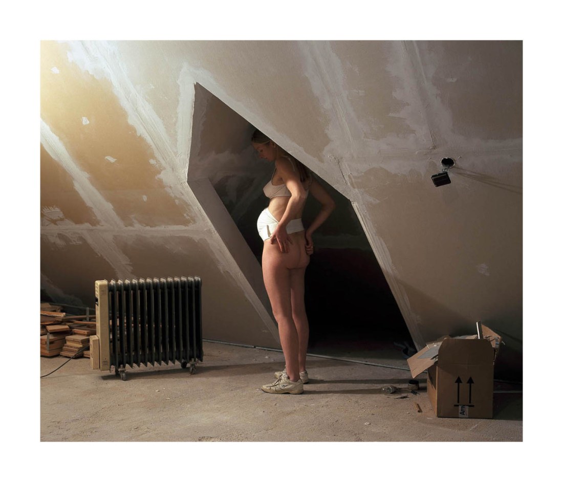
Gábor Arion Kudász – The Attic [Bogi] from Middle series (2005-2011)

There are critiques to be made here but I’ll not be making them since they don’t interest me.

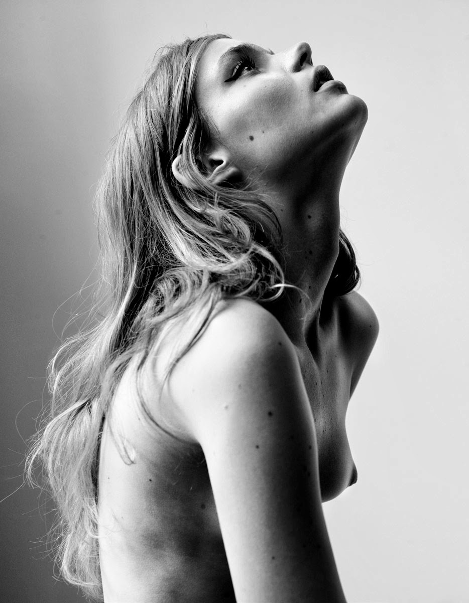
Instead, I would like to point out how much this work diverges from Kudász’s early work which can really only be described as aggressively formal. And by that I mean it’s all very thoughtful features lucid clear conceptualization and technical accomplishment.

It also reeks of a self-conscious fine art photographic raison d’etre.

Middle is almost playful. Yes, it continues to evince top shelf skill–I’m still reeling from this exquisite image of a child (eyes closed) hiding behind a glass faced door, leaning up against a textured wall in a courtyard.

But there’s also whimsy: a picture featuring a woman standing in the middle of dense brush holding a chainsaw–naked except for work goggles and her jeans and knickers pulled down around her ankles; another picture of a presumably partially disrobed woman sitting on a chair in a field, a naked man stands over her framing her through a camera that blocks his face–the woman tracing the index and middle finger of her right hand upward along the inside of the man’s left thigh.

It’s all ultimately flawed–but it’s as if the flaws are the cracks that allow a sense of life to get into the work. And much of the life is the result of the pithy, clear eyed notes extracted from the diary of Kudász‘s wife which presented as a time line corresponding to the images, contextualize them in the stream of day-to-day family exigencies.

Edward YsaisUntitled (2013)

I’ve had this image saved as a draft for almost a year. There’s no arguing that it’s chiaroscuro is executed with skillful aplomb. It’s memorable, quality work and I like it… but I’m conflicted about it.

At first, I thought that the both women were the same person. That’s largely because I am absolutely awful when it comes to facial recognition. For example: If I’m meeting someone I don’t know all that well, when I scan a crowd I’m noting things like height, hair color, build and body language.

I don’t think these are the same women (it’s not entirely clear but the woman entwined with the man appears to have longer hair than the one in the mirror). So my initial impression of this as a critique of the male gaze–wherein the male surrenders to sexual bliss while the woman is condemned to a duality of experience wherein she not only experiences sensation but also stands detached monitoring and critiquing her the relationship between her experience and the male consumption of her experience.

Without that anchor, I’m not really sure what to make of the image. Is this a threesome? There’s a sheen on the woman in the mirror’s skin that could be suggestive of such a scenario. But it fears more like a nightmare–a woman dreaming about her lover cheating on her.

And that’s kind of where things start to unravel for me. In my experience as a dreamer, mirrors straight up DO NOT work like they are represented here. In other words, my experience is that the mirror only reflects a part of me–i.e. my head or I don’t have a reflection.

This dissonance opens a door to some critical considerations about the work. Yes, it’s pretty. Yes, the lighting is sumptuous. Yes, it’s almost certainly riffing on Velázquez‘s Las Meninas.

However, note the way Velázquez uses available light as the primary motivation for his composition. In other words, the perspective the viewer is presented is one which given the light renders a composition built around a masterful understanding of space–especially distance and depth.

Ysais’ image is alarmingly flat. The light functions to render the scene legible and in no way informs the composition. And once you follow that rabbit trail, you realize that due to the slight down tilt of the camera–presumably to compliment the mirror–the vertical slat of the partition at the extreme left of the frame is put askew. Further, the horizontal and vertical slats, transitioning to the bas relief to the damask pattern to the drape and the echoing drape in the reflection–the artifice of the frame becomes hard to suspend in favor of disbelief.

It’s something I’m discovering in my own work of late: the distance between a bad image and a good one is exponentially less than what separates good from great.

vivipiuomeno1:

Emmanuel Sougez 

ph. (French, 1889-1972)

There’s not a great deal of information on Sougez floating about in the digital aether.

From what I’ve gleaned he was part of the New Objectivity which was among other things a rejection of Expressionism.

The term New Objectivity originates from the German, specifically: Neue Sachlichkeit.

Via Wikipedia:

Sachlichkeit should be understood by its root, Sach, meaning “thing”, “fact”, “subject”, or “object.” Sachlich could be best understood as “factual”, “matter-of-fact”, “impartial”, “practical”, or “precise”; Sachlichkeit is the noun form of the adjective/adverb and usually implies “matter-of-factness”

I’m not about to say such a definition is useless; however to me it is practically useless–I have no idea what purpose it serves much less how I am intended to apply the information henceforth.

The question this image begs–at least for me–is: what constitutes the primary focus of the image: the woman or the draped fabric?

As to an anwer: I’m inclined to say both; therefore neither.

Well, a clever interlocutor might inquire: how is it both and neither?

Here I can do little more than point. But I suspect the question of whether it’s the woman or the drape is functionally identical to the reason Uta Barth isn’t a minimalist.

It’s something to do with the interpenetration of human perception of space and human intervention in space that is perceived–in this case the area over which the camera hoveringly waits.

Harley Weir – [←] Agata for Baron Magazine (2014); [→] Greta Varlese for Self Service (2015)

I was not especially fond of Weir’s work, initially–it came across as frivolous, trite even.

Over the last year, my thinking on the matter has shifted; the mechanism of that shift was not solely motivated by the maturing of the work so much as the way that Weir has slowly but steadily improved by increment.

That’s an unusual progression to witness. Usually, you have someone who is making good work who disappears for a bit and then explodes back onto the scene with some skull cleaving next level shit. (Case in point: Jacs Fishburne, who has going from demonstrating obvious talent two years ago to sharing some fucking profoundly inspired and technically accomplished work.)

The sort of quantum leap tends to be the exception and not the rule. So it’s refreshing to see an artist to present such a public face to the false starts and failures that are informing behind the scenes growth in perspective and conceptual acuity.

It’s interesting to me that the now seemingly defunct Baron Magazine’s stated goal was something along the lines of exploring the space between pornography and art.

Overlooking the fact that there isn’t a proverbial no man’s land separating art from pornography, so much as a venn diagram overlapping, It’s interesting to see the image of Agata in that context. Why? Well, although she is nude, she is turned away from the camera (ostensibly also from the viewer). She’s undressing but in a way that is both sexy and awkward–she seems restrained by her clothing, in a way. There’s also the lurid 70s porn palate, super saturated red, pale rose and washed out blues. The phone on the wall, although distracting is a really nice touch that ends up selling the image.

In the second image, things on the surface appear simpler: a model in a fashionable sweater and tartan print skirt. The ¾ profile of the first image is shifted to 7/8 back to camera. The frame lines are tighter–below the eyes and mid-thigh. It’s obvious that Greta is positioned in front of one of those slightly marbled photo paper backdrops. The clumsily presented clothing as physical restriction theme is revisited… only this time the clothing is presented as something almost interchangeable with high end bondage gear. The positioning of her hands hikes up her skirt revealing a centimeter less of the cleft between her legs than would be pornographic.

With so many young women making work on the fringes of fashion and erotica, there’s a lot of talk about developing a female gaze to counter Berger’s art historical male gaze. I’m highly critical of this trend–mainly because the people who are most emphatic about claiming it really do very little in their work to justify their claims. But I think the key difference between the above images is the former is made–probably unintentionally–to cater to the male gaze. The latter won’t necessarily fail to appeal to the male gaze so much as to see it as erotic (and I would argue it’s actually far more erotic in concept and execution than the former is) requires a certain acculturation in an experience of visual culture that is decidedly feminine.

Eric ChangMiki Modernica (2015)

This image appeared as part of an exclusive series for Treats! Magazine.

I could give less of a fuck about the rest of the images. This one appeals to me though.

Partly, it’s the stone tiles and the blue grey of the concrete setting off the grass’ cobalt green; Partly, it’s my preoccupation with questions of pubic vs private, so any work featuring nude figures ostensibly in public is relevant to my interests.

The question I have is: why the up-tilt? Yes, it more or less splits the frame in half, divided along lines of positive and negative space–which shouldn’t need to be stated but is a terrible composition strategy. Plus, the light reflected on the glass stairway railing is super distracting.

And actually, the more I look at this the more it irks me. I can’t dispute that Chang’s work is visually polished. It looks like quality. The issue I have is that he so frequently all but quotes from other artists. (If you like shit like Where’s Waldo, hop on over to his website and look for where he seemingly cut/pastes elements from Andy Goldsworthy and Tim Walker into his work.

The above references or borrows heavily–I can’t decide which–from Akif Hakan Celebi, Yung Cheng Lin and Miru Kim. I can’t speak for Kim–mainly because I’m in a longstanding feud with her (that she is likely to remain unaware of since I don’t usually broadcast the fact) but I take umbrage to her work. But as far as Celebi and Lin go, both wouldn’t have added an up-titled perspective to this scene even if both would’ve been drawn like moths to flame by the elements of this location.

Source unknown – Title unknown (20XX)

My first partner loved the show Friends.

At the time, it seemed like a fair trade off. She’d ‘suffer’ through the latest von Trier or the odd early Bresson and in return I’d hold her while she giggled at the vapid banality of Joey and Chandler. (With hindsight, I definitely got the short end of the stick, but…)

There’s this one episode where the white cis men discover that they are getting free porn via their cable provider. They think it’s a stroke of luck but as things progress they begin questioning how it effects their perception of reality. If I remember correctly, Chandler mentions how while interacting with a teller at the bank, she never offered to take him back to the vault and seduce him.

It’s a knee-jerk, made-for-sitcom parsing of the ethics of porn w/r/t gender representation. But it does suggest a point (to me at least) that I feel is worth exploring; namely: whether the frame is an edge or a boundary.

In the case of the porn that Chandler and Ross were consuming, the frame is an edge. It is separated, so much as to be cut off from reality. However, due to the non-critical consumption–this fantastical representation of a reality that is at a remove from the one either inhabit, they begin to question why their world isn’t like the one they spend the most time considering.

In other words, when you spend too long studying a world unlike the world in which you live (without keeping in mind the fact that you are watching a discrete fantasy), you begin to note discrepancies.

However, some work–and the above image definitely fits in this category–where the frame is a boundary not an edge; a broader reality exists outside the frame. There aren’t people with stock, archetypal designations acting on sets. There are reminders that there are people, places and things beyond the limited view provided to the audience.

This is cool because there’s more hinted at beyond the frame’s boundaries. There are at least 5 people in this scene. Likely six, including the person taking the picture. (And the proximity to the action of the camera person, suggests that they are a participant in the proceedings.)

I love that the one guy is wearing stockings–which note have clearly been pulled on and off enough times that their is a rip opening in the left thigh–and cowboy boots. His scrotum is clearly still irritated from being recently shaved. And the hand that is presumably tracing it’s way up the right arm of the woman eyeing the camera. It all speaks to both the immediacy and intimacy of the moment but also that it exists within the context of a broader world beyond the outer boundary of the frame.

Philippe VogelenzangSvea Kloosterhof (2014)

I admit that I have an outsize bias when it comes to vertical orientation in photography/digital imaging.

It’s partly that image makers tend not to be as rigorous about the logic of their composition when deploying vertical frames; the choice seems to frame the decision as a question of facilitating immediacy, emphasizing of a centered subject or just feeling the vertical more than the horizontal. Individually, those motivations are all factors leading to #skinnyframebullshit.

I know a few folks take issue with the rigidity with which I push this notion. (In fact, I’m pretty sure a few image makers favor such orientations to flout my objections.)

But the reason why I have such an issue with vertical orientation is because even if there’s logical compositional consistency, there’s a tendency to lead to geometrically legible compositions but there’s a lack of dynamism.

In the western world, we read left to right and top to bottom. I’m not sure this is true from a design standpoint but I believe when faced with horizontal compositions, we want to read across the entire frame first. Knowing this allows the image maker to guide the eye.

With vertical compositions, the subject (if it is also vertical) creates a columnar effect: the eye scans the first vertical half of the image before moving to the second.

All too often, this results in the 2nd vertical half of the frame being ignored or only half seen.

And I guess that’s my point, if you are working with a horizontal frame, the primary questions are left vs right. In vertical orientation, the primary questions are up vs down. (A note to those perhaps making vertical images to challenge my assertion: every one of you are making vertical images that insist upon left vs right compositional questions.)

The above is interesting because it answers the up/down question firmly in favor of the former over the latter. The pose and the slight up-tilt of the camera emphasize this.

Additionally the subject is presented off center–unless you’re on a tripod and it’s geometric proof worthy, center your subject in a vertical frame is not going to work for you.

If there’s still any confusion: unless you’re skinny frame has at least the internal and external logical consistency of Caravaggio’s The Inspiration of Saint Matthew, then it’s #skinnyframebullshit.

oan-adn:

The passenger

oan-adnThe passenger (2015)

The word ‘surreal’ has been so thoroughly abused as to render it now nearly impotent of meaning.

I hear people use it all the time interchangeably where terms like ‘oneiric’, ‘transcendent’ or ‘fantastic’ might better serve.

To me this image is surreal. Yes: there’s an element of it that is oneiric, i.e. the way text you read in a dream shifts as you read it. Yes: it’s–in some small way–transcendent because upon seeing this I experienced an in rush of breath and for the briefest nano second my subject perceiving an object shattered; yes, it’s also fantasic in that the train and the nude woman staring–ostensibly at me via the conjured space-time magic of a camera lens.

The reason I suggest it’s surreal is it has a feel to it of your mind playing tricks on you. For example: many years ago on what was perhaps my second trip to MoMA, I was walking to Grand Central. Although it wasn’t late, it was already dark–the sort of weather where you can smell the promise of snow in the air and the wind makes you shrink into your own core heat.

There were very few people on the streets and I remember passing a restaurant with tinted windows that looked in on the type of establishment that you’d need reservations in order to be seated and served. I wasn’t even paying attention really but I could’ve sworn there was a woman in a beautiful evening gown sitting across a candlelit table from a man, who wasn’t a man so much as a sunflower dressed in a well-heeled suit. The image stopped me in my tracks and I actually took a step back craned my neck for a second look.

Of course, it had been a trick of light, reflection and imagination. Still though, the oddity of the scene I perceived has stuck with me. It still feels strangely more real to me than the reality.

It’s that feeling I mean to convey when I term this image surreal. I feel like if I look away and look back, I will see the less interesting reality. Yet, due to some strange magic, the initial moment of mistaken perception has been transformed from passing ephemerality into something permanent. Yes, exactly that and beautifully so.