I Feel MyselfThe Procedure featuring Strawberry (2011)

I have no idea where this is from and that’s sad because there is so, so much to love about it.

The initial overhead shot establishes a sort of dreamlike space. We’re watching a surgery being performed. Not how there’s a ‘nurse’ stroking the patients hair and that same stroke shifts with the cut in the second frame to a sort of fever dream where instead of a surgical procedure there’s a scene where the patient is being sexual stimulated. It’s disquieting; but the oneiric feel is carried over by the comforting hand shifting to more carnal caresses and the scene plays out like a twisted mix between a fever dream and anesthetic hallucination.

It strikes me that the feeling this imparts is what Inside Flesh is asymptotally approaching–never quite arriving because they get so caught up in the aesthetic element of their nightmarish perversions. This certain lacks the expansive production design but it embraces it’s lo-fi limitations and pulls together something that is compelling and uncomfortably arousing.

John LorenziniTrish (2014)

This is an effing goddamn gorgeous image–which is something coming from me given that my default seeting with regards to studio work is best labeled: ‘intense antipathy’.

From the stand point of scale, it’s interesting that the distance between the tip of her toes and the baseboard is identical to the distance between the top of her head and the top frame edge. (Further, I suspect those echoed distances can be subdivided into three equal parts which are the same height as the space between the lower frame edge and the tips of her toes.

The way the one point perspective of the floor boards recedes drawing your eye toward the woman and then having the beautiful gray background blossom in variegated light is an extremely effective compositional flourish. (Also, the light in most of his other work seems to fall at a very contrived 35-40 degree downward slant. It’s doing the same here but the light is broken up, inconsistent and thus appears more natural.)

That Trish is not acknowledging the camera seems to be a nod towards and awareness of the highly problematic art historical ‘male gaze’. However, there’s some downright maddening inconsistencies with regard to acknowledging the camera/not acknowledging the camera across the work that suggests less underlying subversion and more edits made to foster a personal aesthetic.

And even though I love this image and super wish that I’d shot it, I do have to take the image maker to task–rather pointedly–on two fronts. First, given solely this image, I wouldn’t be inclined to call #skinnyframebullshit. Unfortunately, considering the rest of the work, yeah, it’s used as a means of hyper-stylization. Which is fine but use it consistently. Things get in a muddle when the seemingly suggested strictures governing the use are abandoned for seemingly no reason or rigidly followed to the diminishment of visual effect.

My second objection has to do with the impetus for nudity in this image. I don’t think, for example, that this work is nearly as vapid and frivolous as this image–which features superior lighting but is otherwise vapid and positively seethes pushy/sleazy heteronormative suggestion. Alternately, consider this image which features garbage lighting design and asinine composition but actually conveys a logic behind the nudity it is exhibiting (note: the discarded top and knickers on the arm of the couch and on the floor near the edge of the frame; also, the acknowledgement of the camera)–in this case a semi-coy I want you to see me naked (which is entirely valid but does require a certain responsibility on the part of the image maker to address the legacy of white, cis-male heteronormative entitlement).

Lorenzini’s image is exceptional except there’s no context for her to be seen nude–sell the studying figure and form BS elsewhere, we’re full up here–other than to be seen nude. Thus, although it’s good natured and probably entirely well-intentioned, this image–while extremely aesthetically pleasing and technically prescient, is unfortunately at it’s most basic level: an exercise in objectification.

mrchill:

Pierrine, waiting in the woods
Canon AE1 & Kodak TRI-X 400
(expired film from 1969, found on a flea market)

© Chill
tumblr · portfolio · facebook

I’m a fan of Chill’s work. So much so that a bit over a year ago, I interviewed him.

He continues to do breathtaking things with color. (This recent image is not only one of my favorite of his, it’s an exceptional example of color as intrinsic to both composition and legibility of the image.)

But I wanted to take a minute to draw special attention to the above image. Consider the parenthetical note about how this image was made on 46 year old analogue film. Looks good, no? A bit grainy but Tri-X has always been super grainy. (I dig how the focus is ever so slightly behind Pierrine. Lovely.)

Here’s the thing: even expired B&W film renders better results than digital. Yeah, yeah. You can get ‘passable’ B&W if your camera allows you to shoot in monochrome natively–if you are shooting in color and then desturating in post, it’s my humble opinion you have no business anywhere near B&W.

The reason B&W film will always be the only way of shooting monochrome is simply this: digital’s Achilles’ heel is that it lacks the depth of black that analog provides. Film renders a depth of black exceeding what can be read by the human eye. But, operating off what the human eye can interpret, given the existing digital frame work, the math is something on a scale of given 0-255 as a range of black, you’d need a theoretical bit depth of 256 to get you to within spitting distance of what the human eye sees. Digital flat out wont scale to anywhere near that level… (And for the record, I realize I’m playing fast and loose with science here; this example is intended to be descriptive not empirical.)

foldingsoulsSelf Portraits (2015)

Back when I was a film student, I recall reading about an argument between an auteur (it may have been Buñuel) and a cinematographer. The cinematographer took issue with the fact that they were shooting on an iconic street using more or less the same frame as at least seven previous films. The auteur responded: yes, but this is the first time I’m shooting it.

Minimal body scapes with white sheets/walls are a dime a dozen on Tumblr. Which is precisely what makes these so freaking compelling: they take a tired conceit and with simple, specificity transcend the easy trappings of cliche and remind the viewer of the freedom limitation can bestow when approached with a humble, patient eye.

Loreal PrystajUntitled from Byrdcliffe series (2014)

There’s a fucking shit ton of image makers producing work with a sort of super high contrast, post-urban decay nightmarish feel.

Unfortunately, as appealing as any one of those facets are in and of themselves, taken together they almost always signify shitty work attempting to glorify style over content.

Prystaj appears to have discovered a means of making what should be an archetypal aesthetic and fuses it with a rigorously formal approach to composition.

Consider the above: the position of the subject is utterly perfect–curves balanced against the rectilinearity of the room and an awareness of the weight and ghost-like forms of shadow and light.

Normally, I’d be inclined to dock points for the 2-3 degree up tilt of the camera. A lesser image maker would’ve down this as a new jerk way of goosing the viewer into attributing a greater dynamic fluidity to the upward stretch/downward pull of the model. However, note how the tilt actually pulls additional angular symmetry between the light pouring into the room via the doorway and windows, the angle of the open door and most importantly the way the spill bouncing off the curtains and rising up towards the unseen ceiling echoes the angle of the falling direct light.

Harry GruyaertTitle Unknown (1966)

My dalliances with photography began out of a certain degree of misdirection.

Long story short: I took a film-making course in college to see if I could successfully complete a film that was (by some miracle) not unwatchable. Next I knew: I was a film-making kid.

Initially, my interest was directing. However, increasingly, I gravitated towards the cinematography side of things. (If you’ve ever questioned why I am so vehemently anti-digital, I learned both platforms side-by-side and was thus able to experience first hand the possibilities/limitations of either–digital is just awful if/when analog is an option.)

The reason I ended up shooting still images was less my being proactive due to the cost of shooting 24 frames per second on film and truthfully more to do with the fact that I have an outsize problem with authority and I repeatedly ran afoul of The Powers That Be™ in my film program/institution.

Cut off from access to school equipment, I purchased a Nikon 8008s and a circa 1960s Nikkor 50mm f1.4 lens.

I mention all of this to illustrate a point. Yes, I have absolutely benefited from an albeit short-lived but thoroughly academic indoctrination to so-called fine art photography. But that arrived subsequent to a period of autodidactic exploration.

Often folks find my ideas and approach to be heavily skewed in favor of underground/outsider work. Such is not a rebellion against my late-in-the-day academnification (or not only that); I spent those first two or three years trying to find stuff I thought was cool on Flickr.

The flip side of that background is there are still large swaths of historically significant photographers that I know seriously fuck all about.

I’d never heard of Gruyaert until early this week. His work is effing stunnning. I could follow the thread of his work down the line to Storm Thorgerson and Monika Bulaj; but, what I feel is more interesting is to compare his work–entirely contemporaneous with William Eggleston’s first divergences in color.

As fond as I am of Eggleston, I realized–and this is entirely in keeping with a theory I have regarding Eggleston; namely he was a Balthus level pervert (and pervert is a word like ‘slut’ that I think needs to be reclaimed already) who never managed to figure out how to make peace with who he was–his work fetishizes color; his dye transfer prints are fetish objects.

Gruyaert, on the other hand, uses color to abstract, highlight shape and/or form.

As great as the work is, it seemed like something I’d never get to showcase here. Then this afternoon I stumbled on the above image. It was featured in a showcase of 14 Magnum Photographers explaining what image of their own making proved to be the A-ha! moment that propelled them to the next level.

Here’s Gruyaert on the above image:

In 1966, I was losing my girlfriend, to her new lover. So, I decided
to make a movie about her and him, hoping that, when she would see the
result, she would understand how much I loved her. Filming her, I was
able to create distance. I became less vulnerable. I understood her and
myself better. I was able to let her go.This became an important thing
in my photography, to be less there and more there at the same time.

Source unknown – Title Unknown (19XX)

Ultimately, this isn’t technically a good photograph–it’s unclear what the woman at the extreme right of the frame is doing and given her position where the upper horizontal third of the frame insects with the frame edge and the dark shelf or curtain directly behind her, the eye drifts across the frame to her and her eyeline isn’t accurate enough to draw attention back to the act of cunnilingus.

Still I like the feeling of the image–the weary-yet-curious way she’s taken his hard on into her mouth, the way he’s watching her but also gently pulling her hair away from her face so that’s out of her way allowing him and the camera an unobstructed view. I love the way her hand is pressed against the other boys side–a means of communicating her own sexual response through touch since vocal cues may not be as readily interpretable given the present configuration.

Yes, everything is staged toward the camera but not in an overly winking exhibitionist sort of way. This is another example of an image where I wish I had been present with a camera to document things. (Although I admit, my personal preference would be for the woman and the boy going down on her to switch places. (MMF scenarios with bi-men are v. haute.)

Also, something that gets me about this picture and honestly any depiction of group sex is that seem to allow for something I feel stymied by in my day-to-day–namely, they allow a safe space for those participating to perform their sexuality in a way that isn’t intrusive, unwarranted or unwelcome.

That openness is something completely absent in my life and as much as the advice is: be the change you want to see in the world, this blog is really the only means I’ve found at maybe halfway accomplishing that feat.

ericashires:

P magazine with kara neko : ph erica shires
styling : heather newberger
h/m : amanda wilson

Pushed with enough force, out of all the photographers who consistently blow me the hell away with their vision and craft, I’d name Erica Shires the most consistent and thoroughly exceptional contemporary photographer.

On some level it’s a result of her technical chops–from wet plates to digital she knows various processes fluently enough to use each to pristine effect.

Yet, underlying even that is the interplay between her use of color and her incisive eye for photographing women.

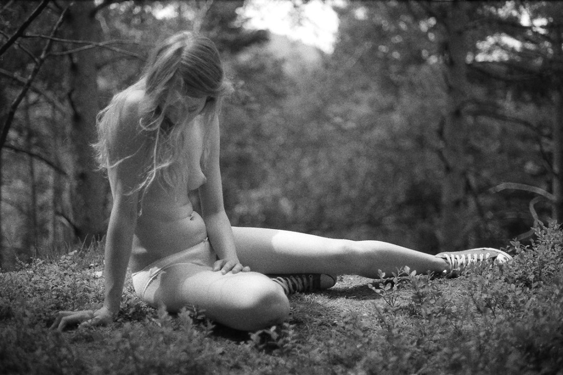
It’s a fact you can take to the bank: no one in the world shoots Johanna Stickland anything like Shires. There’s an unfeigned stillness, an objectless/subjectless presence in the moment–like the pause in the storm where for a split second the surface of the water appears as a darkened windowpane.

It’s taken me a while to pick up on it but virtually everyone Shires chooses to shoot, the resulting images present something entirely distinct.

Kara has commented repeatedly that no one has ever understood her quite like photographer Jonathan Waiter. (And really, you need look no further than those images to be certain of the accuracy of the statement.) Yet, in the above images there is something uncharacteristically light about Kara’s mein. Something allowing her to walk effortlessly on the tightrope between her intensely focused, fiercely sophisticated and confident modeling persona and something uncomplicated, skirting joyfulness and abutting playfulness.

I’m abstracting. Let me attempt to be concrete. Kara is elegant, statuesque and grave in so much of her work. Yet, she also clearly enjoys herself (consider this image of her with rapper El-P). In these there seems less opposition between her ‘modeling persona’ and her unselfconscious performance of identity.

There’s more I could say but I feel like I’m rambling a little like an idiot. So moving right along: there  another reason I posted this.

You know how I’m always talking about editing? Well, I wanted to illustrate what I mean.

First, given only this contact sheet which images do you think are the most effective?

Now, the answer is going to depend on a host of things. This appears to have been for an editorial. So, you’d need to consider the taste/aesthetic of the publication. I’m not privy to any of those things–I’m just going by things like composition, context and the dynamics of what the frame conveys.

The benefit here is that from the standpoint of exposure–the images are crazy uniform. (Like, seriously: my own shit is nowhere close to this consistent…) Thus you can pretty much choose to use any of the shoots.

My edit would be: Column 1 Row 4, Column 2 Row 1 & Column 3 Row 4.

Why? Well, Column 1 Row 1, Column 4 Row 3 & 4 are vertically oriented. This is one of the reasons I’m always screaming about #skinnyframebullshit–not how on the contact sheet given the orientation with which the contact sheet is presented, these shots are actually impossible to read without flipping the sheet so that it matches their orientation. (For the record I did flip them and I just don’t find these images as compelling. In the last two, it’s difficult to understand why anyone in that level of undress or not would be bending over the fence in that manner; it just seems awkward to me & while Column 1 Row 1 is a good image, it lacks the dynamism of other shots.)

Column 1 Row 2 and Column 1 Row 3 would have worked if you split the difference. The position of Kara’s arms is better in the C1R3, the position of her head is better in C1R2.

C2R2-4 increasingly diminish context and position Kara an increasingly abstracted landscape. The sense of audacity and spectacle is lessened.

C3R2 would’ve been the second best of the bunch but the hilltop house directly behind Kara’s head and the fact that even though it’s out of focus in the distance her eye line leads right into it and my eye sort of gets stuck there as a result. C3R1 and C3R3 have the same problems as C2R2-4.

C4R1 has something similar in mind to C3R2 but the less steep angle of the hillside is nowhere near as compelling. (This is the rare time I’d ever say closer is better but in this case it would’ve also blocked out that little bit of the house you can see in the background.)

C4R2 might’ve worked wider but as it is I’m not really sure what the hell is going on.