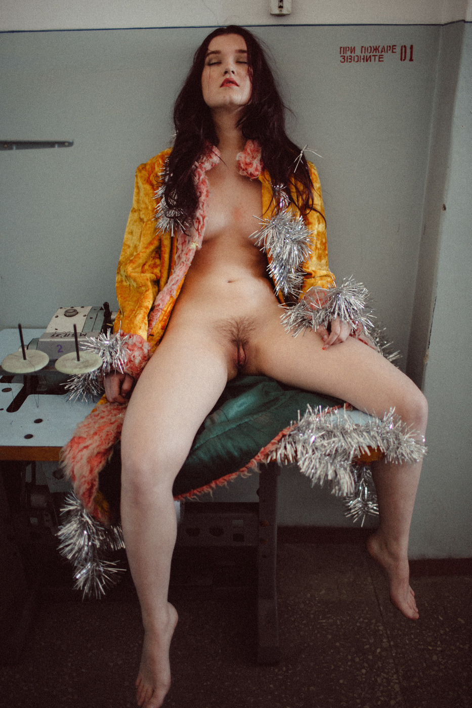
Pierpaolo Morra – Untitled (2015)

If you know a lot of cineastes and they irritate you with their endlessly self-conscious meta-commentary, ask them to name the best example of film noir. Sharks mid-feeding frenzy are a solemn affair by comparison. (I once saw someone successfully defend the Coen Brothers’ Blood Simple as the last true noir–a statement with which I hardly agree but you have to appreciate the audacity of choosing that as a last stand and managing to rout multiple attackers.)

This image gets me thinking about film noir. Particuarly Jules Dassin as the prototypical noir auteur. If you want to understand what noir entails, you could do much worse than studying The Naked City and Riffifi.

Ultimately though, I grudgingly agree with the camp that suggests Out of the Past as the last true noir. (I do understand the desire to attribute a more decisive dividing line a la Touch of Evil where you can pretty much say film noir was B&W and neo-noir is predominantly in color, but I think that glosses over a bunch of nuances–I’d argue Touch of Evil is neither noir nor neo-noir and instead exploited distinctions that subsequently demanded differentiation.)

Back to Dassin though: he’s interesting because he employs the ratcheting of tensions common in noir to a pointedly different effect. (Seriously, if you haven’t seen Riffifi, you’ll never be able to watch that scene in the secure vault in Mission: Impossible without shaking your head in visceral disgust.)

Dassin’s films are quite a bit more formal than your typical noir. They may share a common roster of themes and devices, but even after he was blacklisted and moved to Europe, his films never quiet shook the cast of the Hollywood Three Act structure.

That’s both why his films tend to be so bloody good but it’s also why they’re neo-noir or maybe preferable noir-ish.

In late 30s and 40s Hollywood studio films, if you watch closely you’ll notice that as far as B&W cinematography is concerned, there’s a zone system as applied to motion pictures at work. Things are lit in such a way that there is a pure white and a pure black in every frame and as many interval tones as is provided given the latitude of the film stock, creates a gray scale. It’s crazy. I know people who can’t light green screens as evenly as they lit white walls in studio films.

And yes, Dassin is willing to get muddy and grainy–but it’s usual in service of adding immediacy to the action at hand. Noir just didn’t function like that. It’s not that the DPs weren’t as skilled, it’s just that lighting was used in a far more expressionist fashion than as merely a means of illumination.

That’s why I dig this image. The rest of Morra’s work is (in my opinion) overly mannered. He’s definitely got a solid grasp on controlling tones but working in micro-shifts as he does, his editing needs to be much tighter. This image is underexposed but the underexposure works as a sort of life giving spark.

And I guess that’s really my underlying point. Modern image making gear has made it so you can point a camera in more or less the right direction and without thinking produce a pretty decent image.

But what will make you a better photographer is not what you get right or what you get wrong, it’s what you learn from what you get right and wrong.

So with that in mind, if you really want to become a stronger image maker: ditch shutter priority, aperture priority and matrix metering and embrace full manual everything.

EL3 Imageryromahni-7 (2014)

The B&W work EL3 Imagery has authored is so bad it borders on offensive.

It’s
mostly that his compositions are either utterly dull or nonsensical.
Yet, there is sometimes interesting considerations show with regard to
color.

He’s clearly going for and falling well short of a portraiture of immediacy feeling a la the fabulously talented ryanmuirhead;
and while he lacks the brashness, audacity and stones of radical
reinterpretation of what constitutes complimentary colors that vk-photography​‘s work, there is something instinctively compelling about EL3 Imagery’s crisp rendering of ultra vivid reds, greens and blues.

In
the case of the above, I don’t have 3D glasses handy but I’m reasonably
sure this would likely take on added dimensionality if I were to look
at this while wearing them. That’s not quite enough to carry the image
but it’s not something I can recall thinking of an image previously.

Source unknown – Title unknown (20XX)

This is an interesting picture. I’d have preferred if it were a bit more evening exposed–all the shadow detail in her hair is gone whereas there’s still hints of detail in the cabinet or table to the left of the couch; also, if the camera had been raised perhaps a foot and moved back by a foot, you’ve have gotten both of them more or less fully in frame and enhanced the visual dynamism of the shot.

And as nice as I think the little details are here–i.e. her hand covering his and helping to hold her legs in position, her tongue and clitoral piercing and the books behind her legs on the couch cushion (hell, even the presentation of his erection and testicles is aesthetically pleasing)–what appeals to me about this is the question it perpetuates in my brain: is there a relationship between symmetrical representation and subjectivity?

I’m not at all certain the following applies anywhere outside my own head but I know that there’s always been this rupture or disjunction between the vision in my head and the final print. Generally, the small that rift, the better the photograph.

I think the thing is we tend to look at the world askew. The human brain is amazing at filling in blanks unbidden–sometimes to our detriment (most optical illusions are such because the brain straight up accepts its own grandiloquent assumptions on the regular).

I’ve gotten a bit ahead of myself. I need to backtrack momentarily.

Usually, I’m of a mind that there are two types of people in the world those that separate everything into two arbitrarily ‘oppositional’ extremes of a spectrum and everyone else who isn’t a pretentious douche nozzle. Yet, as blunt tools, things like Szarkowski’s windows vs. mirrors dichotomy do at least provide a set point of departure.

I think there’s another potentially useful distinction–images that are found vs images that are constructed.

It’s easy to just blame street photography as the singularity from which all found images emerge. Even in rigorously constructed studio work, there’s still an element of finding in the eventual edit. Yet, I think the distinction between objective and subjective, has something to do with symmetry.

Constructed work tends to flow outward from a place of symmetry. The trouble with symmetry is… well, it’s mostly an illusion. Spend enough time with a large format camera and you’ll begin to actually see the fruit of the whole Euclidean geometery projected into three-dimensional space. (In simpler terms: try drawing an equilateral triangle on the surface of a sphere. It’s impossible.)

When I’m trying to find an image, I’ll tend to see it but when I lift the viewfinder to my eye–the thing I saw that sparked my interest disappears. I sort of think it’s because what I saw came as a result of my brain projecting a symmetry onto the scene that either wasn’t there or was merely implied by what I saw.

When I experience this discrepancy between what I saw in my mind’s eye and what I see through the lens, I’ve learned to force myself to be patient. To do the heavy lifting, to search for something approximating the symmetry I perceived initially.

On the rare occasion that I succeed in finding it, there’s a sense that the image is less an image and more a window. The image maker steps aside in order to reveal the viewer the objective experience of seeing.

In the above image, there is a literal asymmetry. It’s not so much interested in the ordering of physical space as the conveyance of the moment. Yet, in that it is very clearly subjective. The camera’s focal plane is not a window but instead an approximation of some observer’s perspective.

The thing about symmetry is that we think of it as bilateral–in other words, vertical and horizontal mirroring in one point perspective. But symmetry can exist without centering.

I actually think that is what the brilliant street photographer Paul Graham means when he says:

I have been taking photographs for 30 years now, and it has steadily
become less important to me that the photographs are about something in
the most obvious way. I am interested in more elusive and nebulous
subject matter. The photography I most respect pulls something out of
the ether of nothingness… you can’t sum up the results in a single
line.

His work is full of found images that are more window than mirror and as much as Graham wants to chalk it up to elusive and nebulous subject matter, his work shines because of the way he finds a meta symmetry that doesn’t get in your way, doesn’t distract you from what your seeing but instead functions as a feeling.

The distance between the subjectivity of above image and the window-like objectivity of Graham’s best work is identical to the distance separating artful porn from pornographic Art.

Alexander Tikhomirov*** (2015)

Honestly, Tikhomirov’s work makes me feel like I need to take a scalding shower after looking at it. It’s sleazy, heteronormatively entitled and objectifying as fuck.

Further, it’s mostly garbage. Except for the one-offs where he seems to demonstrate something like an understanding of when to use landscape vs. portrait orientation–and it has to be noted that most of these smack of nothing so much as spending a week binging on Garry Winogrand and deciding you’re suddenly by osmosis: a street photographer, Tikhomirov couldn’t find a thoughtful composition if that thoughtful composition was his ass and he was given the use of both his hands and a fucking map.

And although the above is some downright egregious #skinnyframebullshit, there is something to this that grabs my attention.

Perhaps it’s the table and the strange device on it. Even with a horizontal frame, that would probably still remain a mystery. BUT, I did take a year of Russian in college and while I only remember dribs and drabs, it seems the stenciled Cyrillic text means something like Fire Command Station 01 And to me that suggests that if not exactly a public area, this is not an entirely private area either.

With the interpenetration of public and private and the flagrant, zero fucks given coyness of the pose, eye contact with the camera (vis-a-vis the audience) would have been too suggestive. Similarly, sans the coat, it would’ve also been too much. As it is–even though a vertical frame would’ve done more to ground her in the space and to mitigate the sexualization of the tableau,

It’s probably a totally wild hair conjecture, but I sort of feel like this probably happened sometime between Xmas and New Year’s. Tikhomirov was out drinking and this young woman came home with him.  He came, she didn’t and while waiting for the second shift, she became fixated with the tinsel on a tree.

And like all men who use their minimal familiarity with a camera as an excuse to ask women to disrobe for them in the panty dropping name of Art, he figured maybe a couple pictures are as good as popping a couple Viagra. She threw on a coat, tossed the tinsel on like a boa and they proceeded to Fire Command Station 01.

It’s still sleazy but it inadvertently communicates something determined and fiercely optimistic about the subject in a way that also manages to critique the narcissism of the image maker.

Plume Heters Tannenbaum – [↖] Je serai un combat; [↗] Je serai tes yeux; [↙] Je serai ton intérieur; [↘] Je serai tout ton amor featuring Misungui from GenderNoGender Room Series (2015)

GenderNoGender Room includes 30 images. It positively crackles with fascinating ideas. However, there is a very real sense that everything is a little too muddy, too abortively realized, too goddamn fucking frantic.

When it manages to remain still long enough to act with deliberation, it’s nothing short of spectacular. The problem is: it only really does that in maybe 1 out of every 5 images.

The seemingly random reframing of other images to create diptychs comes across as either arbitrary or so knee-jerk and lacking in subtlety as to be lazily feckless.

Yes, the conceptualization could be more tightly twined to the material but it’s not the improvised nature that irks me–there’s sort of a charming punk rock playful desperation to it which I find ridiculously charming. It’s really the presentation that dissimulates. The project as a whole needs to either make the throw everything at the wall to see what sticks approach more interpenetrative–it seems like there is supposed to be a notion of continuous physical space which is not at all supported by the work; or, the presentation needs to abide a more minimal approach.

This edit I’ve put together attempts to imply a sense of continuous physical space while attempting to invoke a minimalism in-line with Beatrix Mira.

I need to look at Tannenbaum’s work more closely but if it suggests as much raw potential as these images do, then she could easily become one of those artists I follow with something not unlike religious devotion.

Russell PebordeZu (201X)

I’ve had this saved as a draft for several months because the model makes me feel like I need to stare at the ground and shyly kick at imaginary dirt with my boots.

But despite the fact that Peborde favors absolutely inexcusable #skinnyframebullshit (I mean come on guy, your landscape stuff is super on fleek) and the fact that he’s another boudoir photographer using the minimalist Tumblr theme to showcase a barrage of beautiful women in suggestive states of undress/poses, there is substance to his work.

I’m not really sure I can say it better than comparing it to something not unlike the way mrchill‘s work and its obsessive meditation on the interplay of color actually dignifies the work and belies the artists profound respect for those he photographs. There’s an undertone in Peborde’s work that he somehow manages to foster an environment wherein the people with whom he works seem to possess a bedrock comfortability and confidence in their own bodies. It comes off as almost magical, really.

Jane BurtonLimbo #8 from Other Stories series (2008)

One-offs always a risk. By doing something that defiantly refuses to sit at the table quietly with the other children, there is always a very real danger of exposing things the artist would rather remain hidden.

In some ways this work is better than Burton’s other work. Well, maybe not better–more ambitious. The rest of her is so flat. It functions with something like the unexpected flatness in layer that is always the unexpected result of layering multiple negs to make prints in a traditional darkroom–you expect the way the sandwich looks to your eye to transfer to a dimensionality in the print and it never does.

Here: the vague reflection of the trees in the cracked glass speaks to that scrim like compression of dimensionality. Most of Burton’s work functions with the implication of one-point perspective. Whereas this is decidedly two-point. The purposeful center-weighted symmetricality of the rest of the work is thrown heavily off balance. The framing doesn’t make sense–it certainly doesn’t fit an sort of rule of third compliant framework.

In fact the composition is solely about the reflection and the cracked glass. The positioning of the character in the frame is intended to associate the violence of the broken glass with the female genitalia. Note: that the echoing cracked glass is higher and there is no one similarly positioned behind it. There is the ghost of a collapsed heteronormative relationship haunting this image.

And for how easy that all is to ready, it’s troubling that the frame wasn’t cropped. For the closer the frame gets to a 2.1:1 aspect ratio, the more appealing something more along the lines of a rule of fifths becomes aesthetically appealing. Although it’s not exactly, applying a rule fifths does actually contribute a degree of previously missing legibility to the composition.

Sam HaskinsJapanese Bamboo Forest (197X)

Hallelujah! A skinny frame photograph that isn’t bullshit.

Why? You ask.

Well, it’s partly because it’s a super wide angle (or fisheye) lens. But that doesn’t mean that just because you use a fish eye lens that you’ve suddenly gotten a license to skinny frame all over everything.

What makes this work is that it wasn’t take as a skinny frame image, it was taken horizontally with the intention of eventually being displayed vertically.

What makes it in-fucking-credible is the way the direction of several of the bamboo stalks is so inconsistent from the rest, the suffused light and the fact that you see the warping distortion of the ground that makes you wander if you’re laying in a ditch looking up or suspended from above looking down into a strange upside down world.

k.flightbrobdingnagian penumbra (2009)

As much as I have a preference for work where the craft is beyond on fleek, I will ALWAYS have a bias for outsider art.

Of course, it’s a very real question as to what that word even means when it pertains to image making–with all the rampant pretense, ego and misdirection that entails.

For the sake of the point I’m trying to make here: I’ll take Lynn Kasztanovics over Stephen Shore any day of the week and twice on Sunday.

The thing that makes k.flight’s images so haunting and yes, wonderful, is that any ambiguities or equivocations/quibbles are removed from the proceedings. It’s clear to the viewer what the images concern–more often than not a sort of sultry sexuality as ontology of existence.

The image maker and I have spoken on several occasions and what I feel is relevant to communicate to you is that for all her seeming assurance in the work, she admits to rarely being certain what to make of any of it.

As lame and knee jerk of a connection as it is to suggest: k.flight’s work reminds me of this commercial I saw back in the late 80s. I think it was for Chevy and it was this skater looking kid walking along a beach maybe talking to the camera about how punk rock functioned as a wake up call to rock and roll, reminded it what had original made it so vital and important.

Not all her work is great, but it is all good–even when it falls flat. I can name hundreds of image makers whose work I rabidly support, but there’s only a few that excites me to the marrow of my bones–k.flight is very near the top of that list. And I sincerely hope that I’m able to collaborate with her at some future point in time.