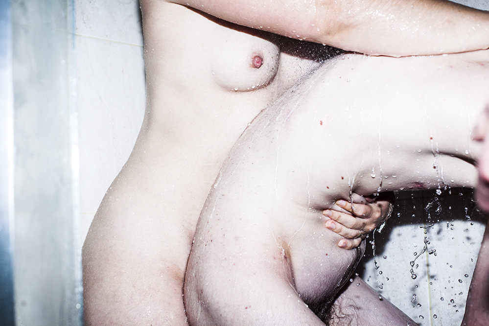
whenitgetsheavy:

Libby EdwardsCollab (2012)

Not only a weird angle, this is rather unlike the rest of Edwards’ images.

The strobe bleaches right up to the very verge of burning away texture and color from flesh–waterline tracings still show a membranous sheen against skin.

Water fragments and refracts, a hissing sizzle bouncing between and dotting bodies; arcing strings stretching and shivering–quick silver in a vacuum tube.

And oh just look at all the secrets two hands hide in their showing.

  1. Right edge of frame: a thirty party watching, approaching; casting a shadow figure bent beneath the spray.  (The Observer Effect) EDIT: Alveoli Photography sees this differently. The ‘third’ hand is actually his left hand reaching over to trigger a short cable release. This makes more sense than my interpretation since the third person would have to be roughly 6’7" to account for the positioning i had in mind.)
  2. & her hand’s Apollian claiming a quote from the greatest sculptor, Bernini.

This is sexy a fuuuck.

Danilo Pasquali – from Bagno (2010)

As far as explicit images go, depictions of masturbation are among my favorites. On that level at least, I find this interesting.

And I’m not sure I want to go full-blown feminist killjoy screaming exploitation every time I run across something sexually provocative but something about this really sketches me out.

It’s partly the composition–was it really necessary to frame the water streaming over her genitals at the exact fucking center of the frame?!?!!

And partly that fact that this is meant to convey the notion of masturbation, it’s clearly staged. Fake–not a problem in itself  I suppose, despite my distaste for affectation.

What irks me is the feeling–despite the compositional flaws, this image is as superior to any of the others in the series as it is more blatantly sexual–that depicting masturbatory tableau was the aim of the shoot but that wasn’t conveyed to young woman.

More likely, during the shoot Mr. Pasquali asked the model to pose as if she was using the faucet to masturbate. She probably didn’t think much of it and may have not been displeased with the final results. To me there is something untoward and skin-crawlingly sleazy about that sort of disregard for personal integrity.

Beyond that it even has an effect on the image. The position of the body reads masturbating with a faucet head. Nothing else about it conveys any sort of derivation of pleasure–except on the part of the person holding the camera.

Ryan McGinleySomewhere Place (2011)

This is easily my favorite McGinley creation–followed closely by Pickup Truck, 2013, Untitled (Bathtub), 2005,  Running Field, 2007, Dakota (Hair), 2004 + Ann (Windy Truck), 2007.

As for the rest of it? I’m conflicted.

What attracts me to the work–its restless + vital physicality as well as the way the images I like thrum with a dreamlike unbounded anarchic togetherness–stems directly from party line criticism: the fuel of charmed youth, the match of absented consequences.

Plus, the work is goddamn pretty as you please; and when you tall that with it’s unmediated immediacy–so rarely seen in galleries–and it’s cleary how + why McGinley became the youngest artist to have a solo show at the Whitney.

What, to me, is off putting is the artist’s reliance on goosing the viewer’s reptile brain. I wouldn’t go so far as to say that McGinley is conceptually vacuous–but his work lacks anything even remotely resembling the conceptual sophistication of his predecessors (i.e. Nan Goldin + Larry Clark).

In the same breath, though, I can’t think of another imagemaker who so fairly divides his focus between male bodied and female bodied subjects. And that’s not nothing. Especially, given his impressive ability to unify contrived naturalism with an ultimately hollow aesthetics that still has the capacity to resonate deeply with the viewer.

boudoirboudoir:

(via Gilles Berquet la chair)

According to the American Cancer Society one (1) in eight (8) female bodied individuals will develop invasive breast cancer.

Breast cancer is the second leading cause of death for female bodied individuals (after lung cancer).

It’s great news that new instances have decreased and that prognoses have grown more optimistic. The American Cancer Society, Pink Ribbon and other organizations have done a solid job raising awareness, emphasizing early detection and spurring research.

For all that–which should not be diminished–what about the eight person in that room. What part does that individuals fear, suffering and, hopefully, heroic recovery have in the conversation about breast cancer?

Some photographers have started asking these questions. I chose the Gilles Berquet’s image its fetishization of the body (and some definite #skinnyframebullshit).

Still, there is a regal, animal fierceness to the image. A strength and dignity in the face of fashion lighting and overtones of sexualization.

It’s a sight better than the more focused but less adept work of The SCAR Project.

Although the best image I’ve seen encountered is Sandra Blánquez’s stunning Ponte el pañuelo contra el Cáncer de mama.

Matters of respective quality aside: this is important work and it deserves a much wider audience.

See also: this.

[

Normal
0

false
false
false

EN-US
X-NONE
X-NONE

/* Style Definitions */
table.MsoNormalTable
{mso-style-name:”Table Normal”;
mso-tstyle-rowband-size:0;
mso-tstyle-colband-size:0;
mso-style-noshow:yes;
mso-style-priority:99;
mso-style-parent:””;
mso-padding-alt:0in 5.4pt 0in 5.4pt;
mso-para-margin-top:0in;
mso-para-margin-right:0in;
mso-para-margin-bottom:10.0pt;
mso-para-margin-left:0in;
line-height:115%;
mso-pagination:widow-orphan;
font-size:12.0pt;
mso-bidi-font-size:11.0pt;
font-family:”Garamond”,”serif”;}

↑] Les KrimsFall, Fargo Avenue, Facing the West Side Armory, Buffalo, New York (1969)

[

Normal
0

false
false
false

EN-US
X-NONE
X-NONE

/* Style Definitions */
table.MsoNormalTable
{mso-style-name:”Table Normal”;
mso-tstyle-rowband-size:0;
mso-tstyle-colband-size:0;
mso-style-noshow:yes;
mso-style-priority:99;
mso-style-parent:””;
mso-padding-alt:0in 5.4pt 0in 5.4pt;
mso-para-margin-top:0in;
mso-para-margin-right:0in;
mso-para-margin-bottom:10.0pt;
mso-para-margin-left:0in;
line-height:115%;
mso-pagination:widow-orphan;
font-size:12.0pt;
mso-bidi-font-size:11.0pt;
font-family:”Garamond”,”serif”;}

↓] Masha Sardari – The Ashen Heart (2013)

Juxtaposition as commentary.

scherbius:

constructed/deconstructed

model Cam Damage

If you aren’t following Cam,  you’re doing Tumblr wrong. Her work is singular, distinctive and almost without exception is of the highest quality.

The above (shot by Zeitgeist Photography) is hand’s down my favorite image of hers. Each panel functions in and of itself so well that even divorced from the others, it would retain its dynamism.

Additionally, breaking the image out in this fashion works more or less like showing your work which solving an equation; the choices the went into constructing them image are implicated in how the image is seen.

It’s damn engaging. And not to detract from it but I would be remiss were I to overlook the obvious parallels with Benoit Paille’s recent work–specifically: Visions/Hyper-reality/suburb as well as the loading docks backdrop.

Paille uses a staggering number of manipulations. (Here’s a glimpse at his process.) For all the fuss, these manipulations only change the images insofar as clarifying the impetus for creating them–highlighting matters of shape, line and form designed to nudge viewers toward noticing how their eyes scan an image.

toutdroitaller:

Irina Zadorozhnaja

Whether she is shooting street-travel hybrid images, landscapes or portraits, Ирина Задорожная demonstrates a precocious formal consistency.

Her images feel symmetrical. Yet, upon closer inspection they instead employ an objects implicit extension beyond the frame edge to balance out an equal amount of negative space on the opposite side.

For example: the lower frame edge cuts awkwardly below the model’s wrist + mons pubis. Notice though how this is balanced by the negative space above the model’s head at the limit of the upper frame edge.

It’s a sophisticated, compelling tactic.

I really like this image. The expression in tandem with the pose is both aloof and fragile; the visible texture of the sweater expertly counters the otherwise problematic flatness. The light is probably too harsh but I can forgive that.

#skinnyframebullshit still needs to be called, however. It baffles me how the same artist responsible for this image showcasing how portrait orientation ought to be used, resorted to the typically knee-jerk, portrait-orientation-for-portraits in an otherwise nearly impeccable image.

rawpix:

Jun3rd♥hide…†o/dream(Matthieu Soudet)★

Untitled/Ophelia 2010

Browsing this kid’s work makes me think I’d be better off selling my gear, taking a vow of silence and dedicating whatever remains of my life to asceticism.

A year from now I will still almost certainly be reeling in response to his Different Ways.

Then I find out he shoots with a Canon 5D mark II (GAH, digital!); that Photoshop was never invoked on this image and he remained unaware of any correlation with Hamlet or J. M. Millaispainting of Ophelia until Flickr users inquired whether or not he intended such striking similarities.

How much is true and how much is personal mythology– I haven’t the foggiest notion, honestly. The answer doesn’t change fuck all, though– talent is talent is talent.